写真加工・フィルター
단색 포인트 컬러 사진
단색 또는 단 1~2색만 강제한 강한 컬러 제약 사진. warm amber·딥 블루·시안 모노크롬 + 단 1점 코랄·옐로우 액센트. 강한 시그니처 톤.
단색 포인트 컬러 사진の概要
写真加工・フィルター画像を作るためのChatGPT画像プロンプトです。主題、背景、スタイル、構図を整理し、すぐに試せるよう構成しています。
関連キーワード: 단색 포인트 컬러 사진, 단색 포인트 컬러 사진 프롬프트, 写真加工・フィルター 프롬프트, 写真加工・フィルター AI 이미지 프롬프트, ChatGPT 이미지 프롬프트, AI 이미지 생성 프롬프트, AI 프롬프트, 이미지 프롬프트
단색 포인트 컬러 사진の活用方法
元の構造を保ちながら、被写体、背景、色、構図を変更して別案に展開できます。
- 主題を維持し、ブランドや季節、媒体に合わせて色と背景を変更してください。
- 結果が複雑な場合は背景要素を減らし、被写体、構図、照明を具体化してください。
- コピー後、ChatGPTに媒体、アスペクト比、文字の有無を追加で指定できます。
プロンプト原文
[Input]
- language: Korean
- output_size: 1024x1536

[Purpose]
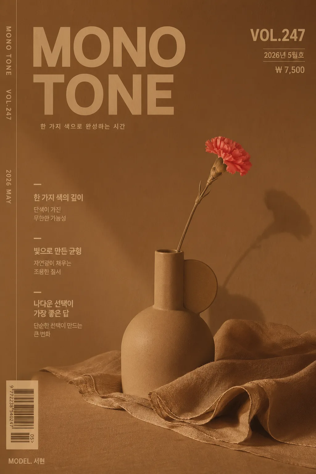
Editorial monochrome color-block photography for a premium magazine cover or art poster. Create a real, tactile studio image dominated by one hue, with one precise accent point that becomes the visual hierarchy peak while the surrounding cover details, props, textures, and typography stay within the base-color family.

[Composition]
- Main subject occupies 60–70% of the frame, with {베이스 컬러} covering 90–95% of the image and {액센트 컬러 (1점)} confined to 5–10% as a single focal point.
- Use {피사체} as the central visual anchor, arranged according to {구도}, slightly off-center with a refined editorial magazine-cover balance.
- Build a believable set in the {베이스 컬러} family: painted wall, fabric backdrop, matte tabletop, tone-matched clothing, paper textures, ceramic or metal props, and natural surface imperfections all harmonized into the dominant hue.
- Add cover/poster publishing details as part of the photographed design: issue number, date label, barcode area, 2–3 short Korean feature blurbs, small spine/credit text, and a model-name credit, all printed or overlaid in darker/lighter tones of {베이스 컬러} so they do not create new accent colors.
- Keep the accent element clearly separated from the base field so the eye reads one dominant color first, then the single {액센트 컬러 (1점)} detail.

[3. CORE STRUCTURE]
- Hero zone: build the entire frame around {베이스 컬러}, using a realistic studio set with painted backdrop, visible paper grain, soft fabric folds, subtle scuffs, controlled shadows, and editorial depth so the image feels intentionally monochrome rather than digitally tinted.
- Subject block: render {피사체} as a clearly readable object or person, with wardrobe, makeup, surfaces, props, and surrounding objects all aligned to the base hue family while preserving natural material differences.
- Accent point: place {액센트 컬러 (1점)} as one small but unmistakable detail only — for example a flower, lipstick, umbrella tip, fruit, ribbon, pin, earring, glove button, book tab, or accessory — positioned near the subject and integrated into the story of the scene.
- Magazine/poster layer: include a masthead-like title area such as “MONO TONE”, an issue label “VOL.247”, date “2026년 5월호”, price “₩7,500”, a small barcode block, thin spine text, model credit “MODEL. {피사체}”, and short feature lines in Korean such as “한 가지 색의 깊이”, “빛으로 만든 균형”, “나다운 선택이 가장 좋은 답”.
- Composition tension: use tonal blocks, shadow geometry, fabric folds, and object placement to guide the eye toward the single accent point without adding other competing color pops.
- Camera treatment: capture with {카메라·렌즈} to keep editorial sharpness, realistic lens rendering, shallow-but-controlled subject separation, and clean tonal transitions.
- Lighting pass: apply {라이팅} with consistent color temperature and believable falloff across face/object, wall, floor, typography, and props to avoid mixed-color contamination across the frame.

[4. STYLE RULES]
- Typography: set Korean cover lines accurately in Pretendard SemiBold or Noto Sans KR Bold, with a large clean masthead, 2–3 compact feature blurbs, small credit text, and a barcode/date/price cluster. All typography must be tonal variations of {베이스 컬러}, not a second accent.
- Color palette: prioritize {베이스 컬러} as the dominant field and keep {액센트 컬러 (1점)} as the only contrasting note. Suggested tonal control: #c08858, #d3a06e, #e7c295, #f5e0b8, with accent #ff6b6b or a single chosen substitute.
- Surface realism: allow visible paper stock, brushed paint, textile weave, skin texture, ceramic glaze, hair strands, product edges, small dust, and photographic shadow detail, all moderated within the same hue family.
- Layout details: place barcode and micro credits near the lower edge or side spine, feature blurbs along one side, and issue/date near the masthead; make them feel like a real printed editorial cover or poster proof.
- Shadow treatment: use soft studio shadow, gentle edge falloff, 8px y-offset, 20px blur, 12–18% opacity, with natural contact shadows and realistic object grounding.

[5. VISUAL STYLE]
- Camera / lens: shot on Hasselblad X2D 100c, 80mm f/2.8, ISO 100, f/2.8, editorial medium-format clarity with restrained depth separation.
- Lighting: single-direction studio light or flat daylight, such as a large softbox from upper-left at 45° or side key from camera-right, with color temperature kept constant for the entire set.
- Color grade: precise monochrome toning with one accent color; emulate a polished fashion editorial look with warm amber, deep blue, cyan, sage, or magenta families depending on {베이스 컬러}.
- Texture and finish: make the final image feel photographed on a professional set, with tangible materials, believable lens contrast, subtle halation on highlights, and {결·무드} expressed through surfaces and posture.

[6. MOOD]
High-fashion editorial still with Wes Anderson palette discipline and Wong Kar-wai color tension, like a real magazine cover shoot where tactile monochrome styling, elegant Korean cover text, and a single chromatic interruption create a memorable visual story.

[7. CRITICAL]
- Korean text accuracy: render all Korean text cleanly and legibly, including “2026년 5월호”, “한 가지 색의 깊이”, “빛으로 만든 균형”, “나다운 선택이 가장 좋은 답”, and any small Korean cover copy.
- Maintain strict monochrome dominance: {베이스 컬러} must cover 90–95% of the frame, and {액센트 컬러 (1점)} must appear only once as the only contrasting color point.
- Cover/poster details such as “VOL.247”, “₩7,500”, barcode area, feature blurbs, spine text, and “MODEL. {피사체}” must remain secondary and tonal within {베이스 컬러}.
- Keep the image free of extra accent colors, duplicated focal points, or mixed-tone clutter while allowing realistic textures, props, shadows, and printed editorial details.
- If {피사체} is a person, anatomy must be natural and proportionate, with realistic hands, facial structure, skin texture, hair, and posture.

[8. 🚫 PROHIBITED]
- Fake official seals / certifications
- Broken Korean characters
- Celebrity composites or unauthorized likeness