写真加工・フィルター
감독별 영화 톤 사진 시리즈
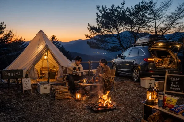
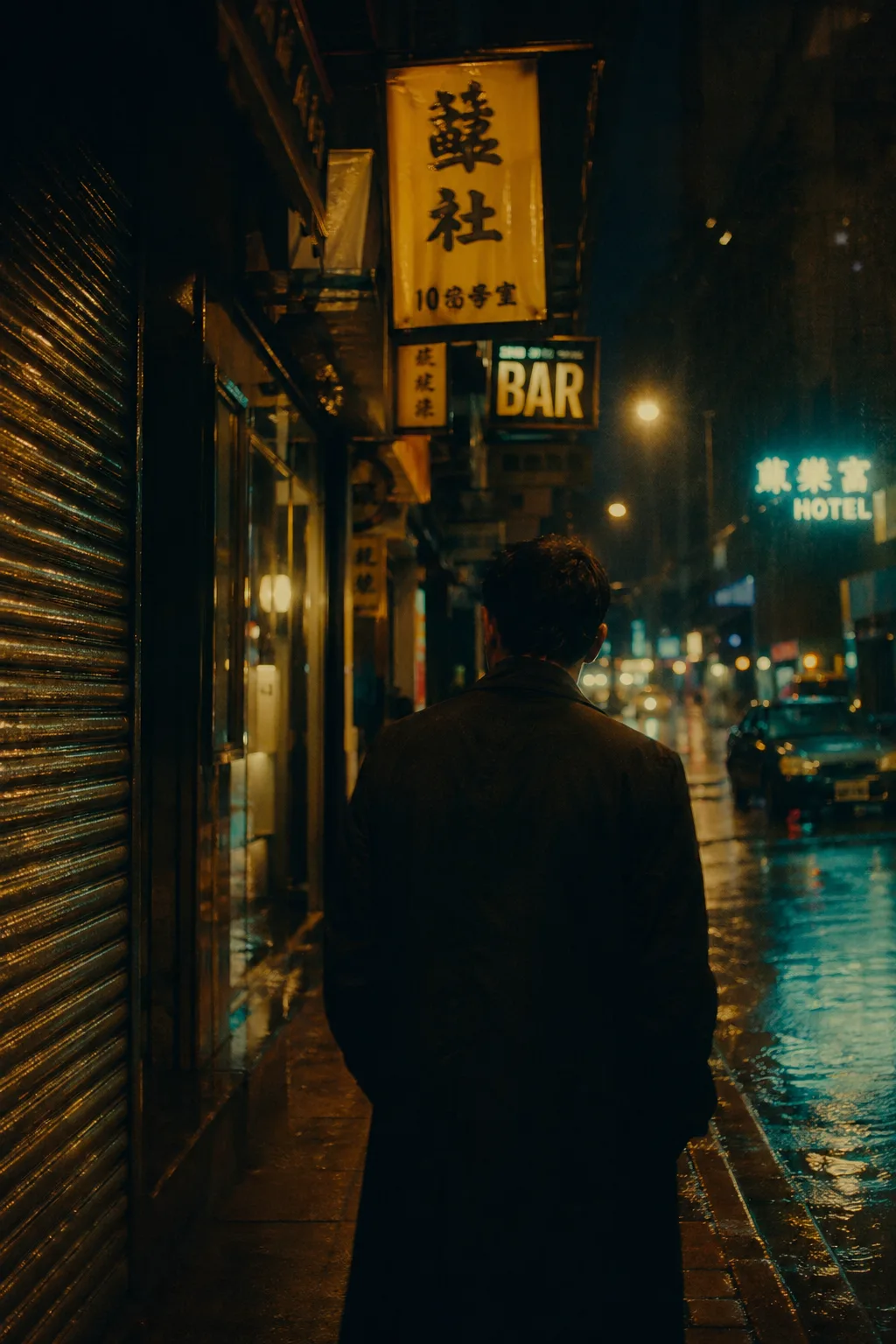
감독·영화 시그니처 톤 적용 사진. Wong Kar-wai (네온·홍콩 야경) / Wes Anderson (대칭·파스텔) / Miyazaki (지브리 풍경) / Tarkovsky (슬로우 자연) / Christopher Doyle / Roger Deakins.
감독별 영화 톤 사진 시리즈の概要
写真加工・フィルター画像を作るためのChatGPT画像プロンプトです。主題、背景、スタイル、構図を整理し、すぐに試せるよう構成しています。
関連キーワード: 감독별 영화 톤 사진 시리즈, 감독별 영화 톤 사진 시리즈 프롬프트, 写真加工・フィルター 프롬프트, 写真加工・フィルター AI 이미지 프롬프트, ChatGPT 이미지 프롬프트, AI 이미지 생성 프롬프트, AI 프롬프트, 이미지 프롬프트
감독별 영화 톤 사진 시리즈の活用方法
元の構造を保ちながら、被写体、背景、色、構図を変更して別案に展開できます。
- 主題を維持し、ブランドや季節、媒体に合わせて色と背景を変更してください。
- 結果が複雑な場合は背景要素を減らし、被写体、構図、照明を具体化してください。
- コピー後、ChatGPTに媒体、アスペクト比、文字の有無を追加で指定できます。
プロンプト原文
[Input]
- language: Korean
- output_size: 1024x1536

[Purpose]
Cinematic director-inspired still image series, formatted as a single premium editorial film poster with a believable film-still atmosphere. Designed to feel like a cinephile exhibition key visual, magazine-feature poster, and curated mood-board print, with {감독·영화 톤} as the main creative axis and the surrounding poster details supporting the world of the image.

[Composition]
- Main subject area: {감독·영화 톤} should define the visual language across the frame, with the scene reading instantly as a recognizable film-toned still rather than a generic portrait.
- Center of attention: the emotional core should sit in the mid-to-lower 60% of the frame, letting the silhouette, corridor, alley, room interior, vehicle window, landscape, or weathered street lead the eye naturally.
- Background treatment: keep the environment specific and cinematic, using Hong Kong night streets, neon reflections, hallway depth, motel curtains, rain-slick asphalt, mist, pastoral fields, river fog, station platforms, diners, old apartments, or sun-faded rural roads depending on {모드 변주}.
- Framing direction: use {구도·앵글} as a concrete cinematic camera decision, allowing intimate close-up, symmetrical frontal staging, over-the-shoulder framing, low-angle street perspective, or widescreen-inspired vertical poster cropping.
- Poster enrichment: integrate believable film-poster/editorial information around the image, including a short Korean title line, issue-style label, date/time/venue, ticket info, small credit block, sponsor row, and subtle graphic marks that feel printed rather than digitally pasted.
- Scene logic: {장면} must remain legible as an intentional story beat, with the added typography and poster details supporting the cinematic world instead of distracting from it.

[Core Structure]
1. Establish the director signature first: translate {감독·영화 톤} into the dominant spatial rhythm, facial distance, environmental texture, light behavior, and pacing of the scene.
2. Build the emotional tone next: {시그니처 무드} should appear through body language, weather, worn surfaces, reflections, practical lights, posture, distance between people, and light falloff rather than through literal symbols.
3. Place the scene anchors: render {장면} with clear environmental cues, such as wet pavement reflections, warm lamps, cigarette-smoke haze, corridor depth, fog banks, tiled walls, paper notices, old signage, sunlit field haze, train windows, or textured curtains.
4. Lock the composition: apply {구도·앵글} as a concrete camera framing decision, with balanced visual weight, clear subject separation, foreground/midground/background layering, and believable film depth.
5. Apply the color system: use {컬러 톤} as the dominant grade, ensuring the palette feels like a coherent film frame rather than isolated color accents.
6. Add editorial poster information: include small but readable Korean poster text such as “감독별 영화 톤 사진 시리즈”, “VOL.247”, “2026년 5월호”, “시네마 무드 아카이브”, “상영 토크 19:30”, “서울 필름하우스 B관”, “예매 ₩12,000”, “사진 기획: 무드랩”, and “Model: 이서윤” where appropriate.
7. Finish with capture texture: emulate {카메라·렌즈·필름} through grain, motion blur, highlight rolloff, anamorphic breathing, halation, gate weave, slight dust specks, and filmic edge behavior.
8. If multiple styles are needed, use {모드 변주} as a selectable branch while preserving the same editorial finish and cinematic realism.

[Style Rules]
- Typography: use Pretendard SemiBold or Noto Sans KR Bold for Korean labels, 24–46px range for poster labels and 12–18px for micro credits, with clean tracking, strong editorial hierarchy, and film-festival poster spacing.
- Required Korean text elements: set a bold cover/poster line in Korean such as “나다운 장면의 온도”, plus 2–3 short feature blurbs like “네온 아래의 고백”, “안개 속 롱테이크”, “빛이 남긴 여백감”; include a small date label “2026.05.18”, venue label “서울 필름하우스 B관”, and ticket label “예매 ₩12,000”.
- Color palette: base the frame on {컬러 톤}, then anchor it with deep shadow black, tungsten amber, midnight blue, neon cyan, muted cream, desaturated sage, dusty rose, sodium-vapor orange, or rainy asphalt gray depending on the selected director mood.
- Poster details: add a small barcode area, vertical spine-like credit text, tiny production notes, sponsor strip, page/series marker such as “SERIES 03 / 12”, and understated registration marks or crop marks as printed editorial artifacts.
- Border/shadow: use a subtle film-poster finish with soft drop shadow 4px y-offset, 14px blur, 18% opacity, and no hard digital outline.
- Surface treatment: keep textures photographic and slightly imperfect, with natural grain, light halation, paper tooth, fine scratches, soft ink density variation, fingerprints on glossy print, and restrained contrast.

[Visual Style]
- Camera / lens: emulate Arriflex 35-III with 35mm Lomo Anamorphic and Kodak Vision3 500T, plus a subtle 1/30 motion blur feel where applicable.
- Lighting: use practical cinematic lighting matched to the director mode — for example tungsten street lamps, neon spill, low-key hallway lighting, overcast diffused daylight, greenish fluorescent interiors, sodium-vapor rain reflections, candlelike room glow, or golden-hour rim light; keep directionality obvious and filmic.
- Color grade: follow the selected branch in {모드 변주}, but preserve a coherent film-grade look with tungsten amber, cool cyan, pastel symmetry, misty greens, dusk blue, faded cream, or dense nocturnal contrast depending on the reference.
- Realism cues: include believable environmental details such as damp fabric, dust on windows, street puddles, worn posters, scratched metal, peeling paint, folded paper tickets, grainy signage, old theater walls, and natural imperfections in skin, clothing, and scenery.

[Mood]
Premium cinephile editorial — like a curated film-festival poster, a serious Korean cinema magazine feature spread, and a Christopher Doyle / Roger Deakins reference still printed on tactile archival paper.

[Critical]
- Korean text accuracy: all visible Korean text must render perfectly without broken characters. Use realistic short Korean copy such as “감독별 영화 톤 사진 시리즈”, “나다운 장면의 온도”, “네온 아래의 고백”, “안개 속 롱테이크”, “서울 필름하우스 B관”, and “예매 ₩12,000”.
- Composition invariants: maintain a fully cinematic still-image look, with believable depth, film-like grain, tactile print detail, authentic environmental texture, and no generic stock-photo staging.
- Style fidelity: {감독·영화 톤}, {시그니처 무드}, {장면}, {구도·앵글}, {컬러 톤}, {카메라·렌즈·필름}, and {모드 변주} must remain consistent with the chosen director aesthetic.
- Poster realism: typography, barcode area, credit block, sponsor row, issue/date labels, and ticket/venue information should feel like part of a professionally printed cinephile poster, not floating UI overlays.

[8. 🚫 PROHIBITED]
- Fake official seals / certifications
- Broken Korean characters
- Unauthorized celebrity likeness composites