グッズ・モックアップ
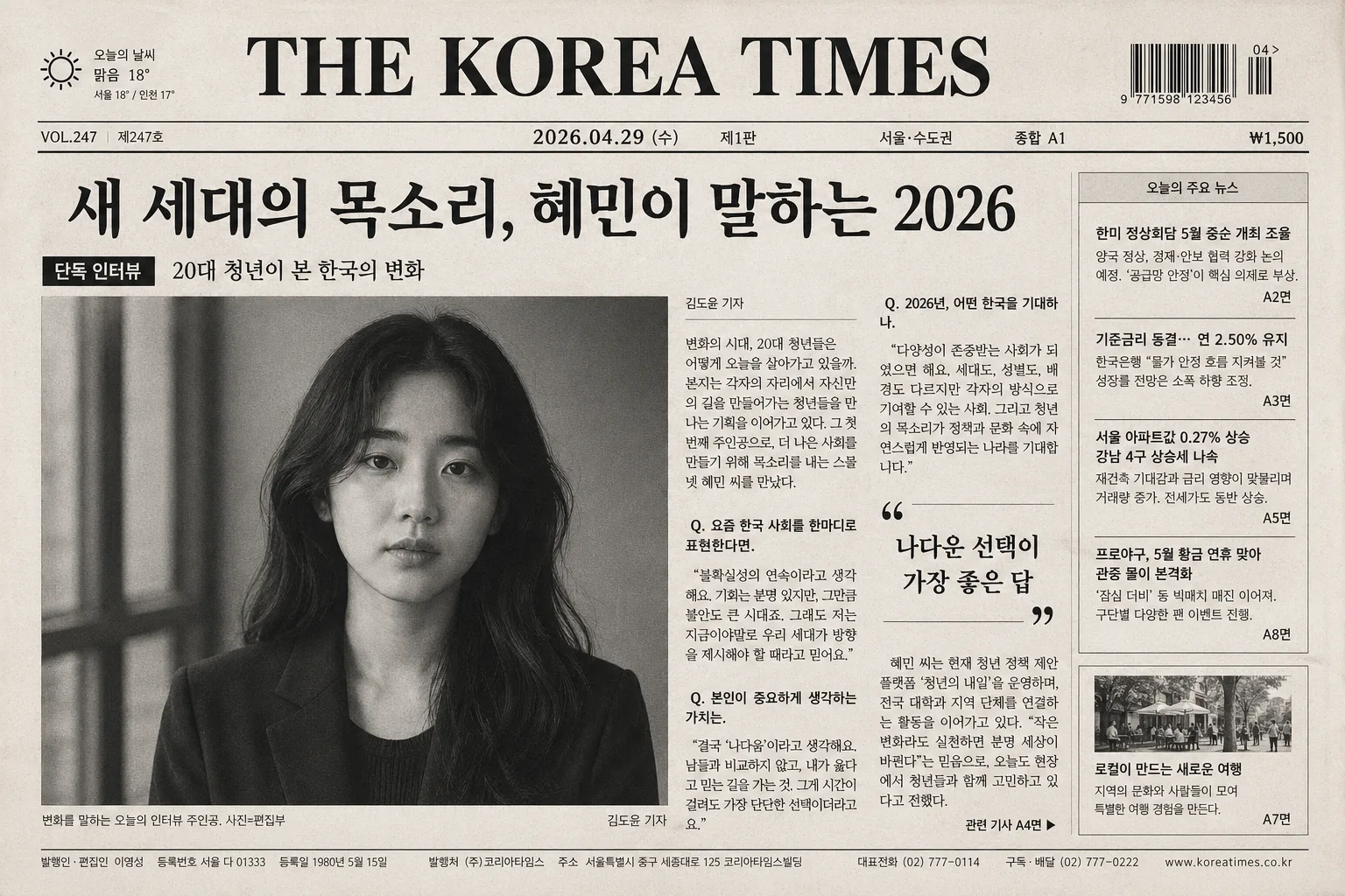
신문 1면 기사 목업 (본인이 인터뷰 주인공)
신문 1면 mockup. 본인이 메인 인터뷰 인물 + 큰 헤드라인 + 사진 + 본문 컬럼. 한국 신문·뉴욕타임스 톤.
신문 1면 기사 목업 (본인이 인터뷰 주인공)の概要
グッズ・モックアップ画像を作るためのChatGPT画像プロンプトです。主題、背景、スタイル、構図を整理し、すぐに試せるよう構成しています。
関連キーワード: 신문 1면 기사 목업 (본인이 인터뷰 주인공), 신문 1면 기사 목업 (본인이 인터뷰 주인공) 프롬프트, グッズ・モックアップ 프롬프트, グッズ・モックアップ AI 이미지 프롬프트, ChatGPT 이미지 프롬프트, AI 이미지 생성 프롬프트, AI 프롬프트, 이미지 프롬프트
신문 1면 기사 목업 (본인이 인터뷰 주인공)の活用方法
元の構造を保ちながら、被写体、背景、色、構図を変更して別案に展開できます。
- 主題を維持し、ブランドや季節、媒体に合わせて色と背景を変更してください。
- 結果が複雑な場合は背景要素を減らし、被写体、構図、照明を具体化してください。
- コピー後、ChatGPTに媒体、アスペクト比、文字の有無を追加で指定できます。
プロンプト原文
[Input]
- language: Korean
- output_size: 1536x1024

[Purpose]
Create a realistic Korean newspaper front-page article mockup in a horizontal A3-like newspaper format, with the interview subject as the main feature and a classic Korean daily + New York Times editorial feel. The page should look like an actual printed A1 front page photographed or scanned on warm newsprint, with credible editorial details, dense Korean typography, captions, section markers, and production text.

[Composition]
- Overall canvas: wide newspaper front page layout, top masthead and date/edition bar across the full width, large headline below, then a dominant main photo with multiple article columns surrounding it in a believable front-page hierarchy.
- Main subject placement: {인터뷰 사진} positioned as the primary visual anchor, occupying about 35–45% of the page area, aligned slightly left-of-center for a real front-page editorial composition.
- Background treatment: warm white newsprint surface with subtle paper grain, faint off-white undertone, natural ink absorption, fine gray rule lines, column guides, fold marks, and light print registration imperfections.
- Spacing and framing: realistic newspaper gutters, crop marks, thin dividers, column rhythm, crisp vertical alignment, and a dense but readable front-page information structure.

[3. CORE STRUCTURE]
- Masthead zone (top 12–15%): place {신문명·날짜} in a strong newspaper masthead style, black ink, centered or slightly left-aligned, with thin divider rules, compact date spacing, edition text such as "제1판", "종합 A1", "서울·수도권", and a small price label like "₩1,500".
- Utility details near masthead: add a small barcode box, issue number such as "VOL.247", weather snippet "오늘의 날씨 맑음 18°", and tiny publisher/credit text in Korean to make the page feel printed and authentic.
- Headline zone (next 14–18%): set {메인 헤드라인} in oversized bold serif or newspaper headline type, spanning multiple columns, with strong visual weight and tight editorial line breaks.
- Subhead zone: place {부제} directly under the headline in smaller serif or clean sans-serif text, with a short kicker label above or beside it such as "단독 인터뷰" or "사람과 시대".
- Main photo zone (mid-left or mid-center, 35–45%): place {인터뷰 사진} as the featured 1면 portrait, treated like a newspaper print photo with subtle halftone-like softness, realistic grayscale contrast, and clean rectangular cropping.
- Photo caption: under the main portrait, include a compact Korean caption such as "변화를 말하는 오늘의 인터뷰 주인공. 사진=편집부" plus a small photographer credit line.
- Body copy zone (lower half and/or right-side columns): fill {본문 컬럼} into 3–5 dense newspaper columns with justified Korean text, short paragraphs, drop cap or first-line emphasis, and at least one pull-quote block like "나다운 선택이 가장 좋은 답" if space allows.
- Additional front-page realism: add a secondary small article teaser box, a continuation note such as "관련 기사 A4면", page number "A1", fold/section marker, and small footer text with newspaper address/contact line.
- Layout coherence: {레이아웃} should read as a believable front-page editorial arrangement, with clear hierarchy from masthead to headline to photo to columns, while preserving the classic newspaper structure.

[4. STYLE RULES]
- Typography: use a classic newspaper serif for headline such as Noto Serif KR or Nanum Myeongjo Bold, headline size very large, body in Pretendard or Noto Sans KR Regular at small newsprint size, with compact leading, narrow column width, and justified Korean spacing.
- Color palette: black #111111, paper white #F4F1EA, cool gray #B9BCC2, faint charcoal #4A4A4A; keep {컬러 톤} faithful to a restrained newspaper print palette with warm paper and matte ink.
- Ink and print detail: include subtle halftone dots in photos, slight ink spread on small characters, thin rules, understated gray boxes for metadata, and realistic newspaper edge shadow like a printed sheet laid flat.
- Editorial embellishments: use small section labels, caption lines, page indicators, barcode area, issue/date details, and column dividers as authentic newspaper elements rather than decorative poster graphics.

[5. VISUAL STYLE]
- Camera / lens: editorial portrait photographed on a full-frame camera with an 85mm f/1.8 lens for the main interview image, or a 70–200mm at around 135mm for a serious press-photo look.
- Lighting: soft diffused window light from upper-left at roughly 45°, with gentle shadow falloff and restrained contrast, similar to an NYT-style portrait shoot.
- Color grade: monochrome or near-monochrome newsprint grade, slightly warm paper tone, neutral blacks, low saturation, print-friendly contrast, and realistic matte paper texture.
- Rendering approach: make the page feel physically printed, with tangible paper fibers, faint center fold, slight edge curl, and authentic offset-print softness without losing legibility.

[6. MOOD]
Serious, authoritative, and content-rich newspaper editorial — The New York Times front-page feature meets a polished Korean daily press mockup, credible enough to feel like a real published interview issue.

[7. CRITICAL]
- Korean text accuracy: 반드시 정확히 보여야 하는 문자열: {신문명·날짜}, {메인 헤드라인}, {부제}.
- Add believable Korean newspaper microcopy such as "단독 인터뷰", "종합 A1", "제1판", "관련 기사 A4면", "사진=편집부", "VOL.247", and "₩1,500" with clean typography.
- The main interview subject in {인터뷰 사진} must look like a real person portrait, not a stylized illustration, and the page must feel like a plausible front-page newspaper mockup.
- All body text in {본문 컬럼} must remain legible Korean with proper spacing and no broken characters.

[8. 🚫 PROHIBITED]
- Fake official seals / certifications
- Broken Korean characters