写真加工・フィルター
비건·헬시 푸드 매거진 사진
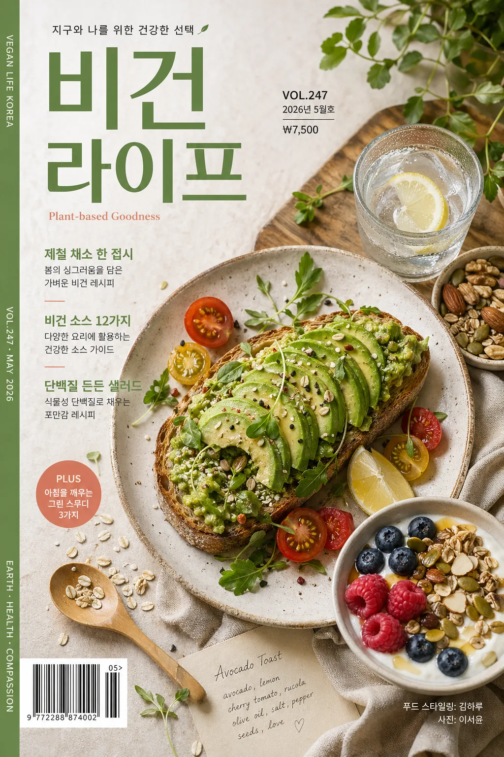
비건·헬시 음식 매거진 푸드 포토. 식물 식재료·아보카도·곡물·그릭 요거트·샐러드·스무디. 자연·웰빙 톤.
비건·헬시 푸드 매거진 사진の概要
写真加工・フィルター画像を作るためのChatGPT画像プロンプトです。主題、背景、スタイル、構図を整理し、すぐに試せるよう構成しています。
関連キーワード: 비건·헬시 푸드 매거진 사진, 비건·헬시 푸드 매거진 사진 프롬프트, 写真加工・フィルター 프롬프트, 写真加工・フィルター AI 이미지 프롬프트, ChatGPT 이미지 프롬프트, AI 이미지 생성 프롬프트, AI 프롬프트, 이미지 프롬프트
비건·헬시 푸드 매거진 사진の活用方法
元の構造を保ちながら、被写体、背景、色、構図を変更して別案に展開できます。
- 主題を維持し、ブランドや季節、媒体に合わせて色と背景を変更してください。
- 結果が複雑な場合は背景要素を減らし、被写体、構図、照明を具体化してください。
- コピー後、ChatGPTに媒体、アスペクト比、文字の有無を追加で指定できます。
プロンプト原文
[Input]
language: Korean
output_size: 1024x1536

[Purpose]
Korean vegan and healthy food magazine editorial photo, vertical cover-style composition for wellness, plant-based lifestyle, and recipe-feature use.
Premium real-food photography with natural ingredients, tactile surfaces, cover typography, issue metadata, feature blurbs, barcode area, and realistic print-magazine details.

[Composition]
- Main dish cluster occupies the lower 62% of the frame, with {음식·식재료} arranged as the visual hero and secondary elements supporting a layered magazine cover layout.
- {구도} with deliberate asymmetry: the main plate or bowl sits slightly off-center while the upper third carries the magazine masthead, issue label, short feature lines, and small editorial credits.
- Background surface uses {배경·소품} on a matte, tactile setting such as pale oak, warm stone, washed linen, ceramic tile, parchment, cotton napkin, wooden spoon, glass cup, herb bundle, seed bowl, or recipe note with visible material texture.
- Include believable food-styling details: scattered sesame, quinoa, oat flakes, herb leaves, citrus wedges, olive oil sheen, sauce smear, crumbs, condensation on a glass, and handmade plate imperfections where suitable.
- Add a small barcode area near the lower-left or lower-right edge, a price/date line, a short spine-style vertical credit strip, and a compact cover-food credit that does not obscure the hero dish.

[3. CORE STRUCTURE]
1) Hero food area: {음식·식재료} presented in a polished editorial arrangement, with crisp ingredient separation, visible freshness, natural irregularity, and a slightly elevated styling treatment.
2) Supporting surface styling: {배경·소품} placed naturally around the hero, including realistic crumbs, seeds, herb leaves, folded linen, a small bowl of dressing, handwritten recipe card, or cutlery to create a lived-in magazine shoot atmosphere.
3) Cover architecture: {구도} used to create a strong focal path from masthead to headline blurbs to the main dish; integrate magazine elements such as masthead, issue number, date label, price, barcode, feature callouts, photo credit, and small section markers.
4) Light behavior: {라이팅} should shape gentle highlights on glossy ingredients like avocado, tomato, citrus, olive oil, yogurt alternatives, or sauce while preserving soft shadow detail under the plate and props.
5) Capture look: {카메라·렌즈} with a high-end medium-format editorial clarity, shallow-to-moderate depth of field, and finely controlled texture rendering across grains, greens, linen weave, ceramic glaze, and matte paper.
6) Palette and finish: {컬러 톤} with a matte print-like finish, subtle contrast, and natural saturation so the image reads as premium wellness media.
7) Magazine copy system: {텍스트 (선택)} may appear as the main cover line near the top or upper-right, supported by short Korean feature blurbs, a date/issue label, and small credit text such as “푸드 스타일링: 김하루” and “사진: 이서윤”.

[4. STYLE RULES]
- Typography: Pretendard or Noto Sans KR for Korean, medium to bold weight, masthead 72–96px equivalent, headline 34–46px equivalent, feature blurbs 20–28px equivalent, micro credits 10–14px equivalent; small English subcopy in Inter or Helvetica Neue at 16–22px equivalent.
- Color palette: use {컬러 톤} anchored by soft cream #F5F1E8, leaf green #7E9B6A, oat beige #D9CBB7, and coral accent #D98C76 where appropriate.
- Cover typography: add a realistic Korean magazine masthead such as “비건 라이프”, issue marker “VOL.247”, date label “2026년 5월호”, price “₩7,500”, and 2–3 short feature blurbs such as “제철 채소 한 접시”, “비건 소스 12가지”, “단백질 든든 샐러드”.
- Editorial details: include a small barcode box with black bars and tiny numbers, a compact credit line “커버 푸드: 그린볼 05”, a vertical spine-style line “PLANT-BASED WELLNESS MAGAZINE”, and a small page/section cue like “RECIPE SPECIAL”.
- Border/shadow: subtle soft drop shadow, 4px y-offset, 14px blur, 12–16% opacity; cover elements should feel printed on matte magazine stock, not floating like stickers.
- Paper/print feel: matte magazine stock texture, slightly muted ink density, gentle halftone-like print softness in typography, realistic crop edges.

[5. VISUAL STYLE]
- Camera / lens: shot on Hasselblad X2D 100c or equivalent medium-format look, XCD 90mm f/2.5, ISO 100, f/4, precise food-detail rendering.
- Lighting: natural window light from upper-left at 45° with a soft fill from the opposite side, producing gentle shadow falloff and realistic ingredient texture.
- Color grade: natural editorial grade with green-beige-coral accents, slightly warm whites, controlled contrast, and a matte magazine finish.
- Surface realism: preserve pores in citrus, fibrous greens, grains, toasted seeds, sauce thickness, ceramic micro-scratches, linen weave, wood grain, and slight printing texture over the final cover.

[6. MOOD]
Kinfolk x Bon Appétit wellness spread feel — premium plant-based editorial with calm, modern, Scandinavian-influenced food styling, but with the full visual richness of a real Korean monthly magazine cover.

[7. CRITICAL]
- Korean text accuracy: “오늘의 건강한 한 끼” must appear exactly if {텍스트 (선택)} is included as the main cover line.
- Korean text accuracy: include intact Hangul for magazine details such as “비건 라이프”, “2026년 5월호”, “제철 채소 한 접시”, “비건 소스 12가지”, “단백질 든든 샐러드”, “푸드 스타일링: 김하루”, and “사진: 이서윤” when used.
- Korean text accuracy: any Korean food labels, headline text, date labels, or credits must render with intact Hangul, no broken syllables, no mojibake.
- Food anatomy/layout: ingredients must remain visually recognizable and appetizing without artificial deformation, excessive gloss, or CG-like smoothness.
- Composition invariant: keep the hero food as the dominant subject while integrating a believable magazine cover system with masthead, issue information, feature blurbs, barcode, and editorial credits.

[8. 🚫 PROHIBITED]
- Fake official seals / certifications
- Broken Korean characters