Infographics/Guides
컨셉별 결혼식 무드보드
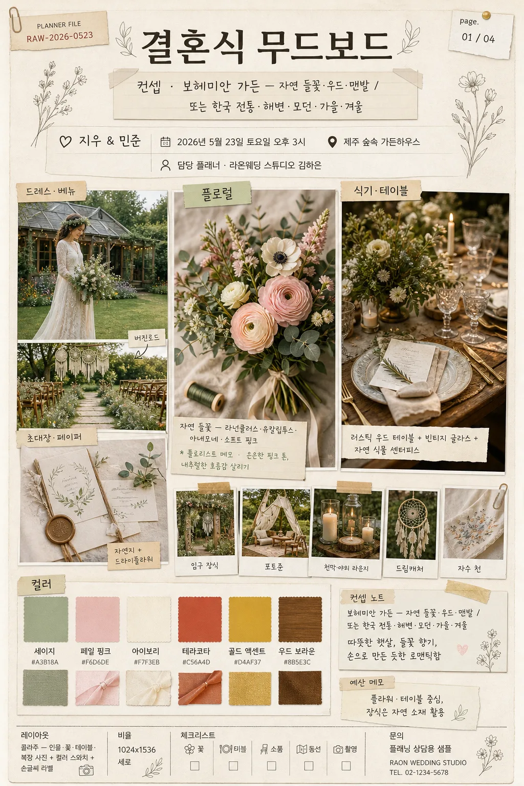
결혼식 컨셉별 무드보드. 보헤미안·한국 전통·해변·모던·가든·가을 등 컨셉 + 컬러·소품·인물·꽃·식기 콜라주.
컨셉별 결혼식 무드보드 summary
Copy this ChatGPT image prompt to create Infographics/Guides results. Its subject, background, style, and composition are organized for quick iteration.
Related keywords: 컨셉별 결혼식 무드보드, 컨셉별 결혼식 무드보드 프롬프트, Infographics/Guides 프롬프트, Infographics/Guides AI 이미지 프롬프트, ChatGPT 이미지 프롬프트, AI 이미지 생성 프롬프트, AI 프롬프트, 이미지 프롬프트
How to use 컨셉별 결혼식 무드보드
Keep the prompt structure and swap the subject, background, palette, or composition to create new variations.
- Keep the main subject and adjust the palette and background for your brand, season, or channel.
- If the result feels busy, simplify the background and make the subject, composition, and lighting more specific.
- After copying, ask ChatGPT to adapt it for your platform, aspect ratio, or text requirements.
Original prompt
[Input]
- language: Korean
- output_size: 1024x1536

[Purpose]
Korean wedding moodboard editorial, vertical collage poster for wedding planning inspiration.
Concept-driven visual board that combines style references, floral direction, table settings, props, schedule notes, venue cues, and color chips in a polished planner-meets-magazine layout.
The final image should feel like a real printed wedding planning board photographed or scanned from a premium studio sample sheet, with tactile paper, taped photo references, handwritten notes, and practical planning details.

[Composition]
- Center composition: a 3-column collage grid with the main concept anchor occupying the upper 35% of the page, supporting reference tiles filling the middle 40%, and color swatches + planner memo cards grounding the lower 25%.
- Background treatment: warm ivory paper texture #F4F0E6 with faint recycled paper grain, subtle deckled-edge feel, soft vellum overlays, washi tape pieces, pencil guide marks, and tiny pinhole impressions.
- Framing direction: editorial wedding-planner sheet with slightly asymmetrical handmade collage feel; {레이아웃} guides the tile arrangement while keeping image tiles, labels, swatches, and notes clearly readable.
- Use {결혼 컨셉}, {컬러 팔레트}, {플로럴 디자인}, {소품}, {식기·테이블}, {무드 키워드}, {예식일}, {장소}, and {커플명} as semantic anchors for each visual block.
- Include small realistic printed details: planner file code, page indicator, venue/date label, florist memo, table checklist, budget note, and subtle decorative line drawings matching the wedding theme.

[Core Structure]
1. Top hero band (upper 18%): large title area reading “결혼식 무드보드” with a smaller subtitle card showing “컨셉 · {결혼 컨셉}”. Add {커플명}, {예식일}, {장소}, and “담당 플래너 · {플래너명}” as compact planner metadata.
2. Main collage zone (middle 42%): arrange image tiles showing dress or venue cues, bouquet/floral close-ups, ceremony aisle texture, invitation paper, table styling, and prop styling in a balanced scrapbook grid with thin white photo edges and soft lifted shadows.
3. Floral focus tile: feature {플로럴 디자인} in a close-up botanical image with layered petals, greenery, ribbon tails, florist wire, and soft natural shadow, styled like an editorial flat-lay insert. Label it “플로럴” and add a tiny handwritten florist note.
4. Table styling tile: show {식기·테이블} with tactile detail — ceramic glaze, vintage glass reflections, linen folds, menu card edge, candle wax texture, natural centerpiece depth, and rustic wedding elegance. Label it “식기·테이블”.
5. Prop strip: place {소품} as small supporting visuals or cutout object photos, each framed like pasted reference snippets with tiny hand-drawn arrows, fabric tape, and Korean note tags such as “입구 장식”, “포토존”, “버진로드”. Label the strip “소품”.
6. Color palette area (lower 16%): display {컬러 팔레트} as 5–6 rectangular paint swatches with handwritten Korean labels, small HEX-style color chips, fabric/ribbon samples, and a label reading “컬러”.
7. Concept note area: include {결혼 컨셉} and {무드 키워드} as a handwritten callout card, making it the connecting thread across all collage pieces. Add “예산 메모 · {예산 메모}” as a practical planner note.
8. Footer planner band: include “레이아웃 · {레이아웃}”, “비율 · {비율}”, “페이지 · {페이지 표기}”, a tiny checklist row “꽃 / 테이블 / 소품 / 동선 / 촬영”, and a small studio-style contact placeholder “문의 · 플래닝 상담용 샘플”.

[Style Rules]
- Typography: Pretendard SemiBold for main headings, Noto Sans KR Regular for labels, and a hand-drawn script style for annotations; title around 48–64px, labels around 18–24px, micro metadata around 12–16px.
- Color palette: use the provided {컬러 팔레트} as the primary scheme, with ivory paper #F4F0E6, muted taupe #B7A89A, soft charcoal #2E2A27, dusty rose #D9A7A0, sage #9EA98E, terracotta #B86F52, and gold accents #C8A96A.
- Border/shadow: thin white collage borders, soft drop shadows with 4px y-offset, 12px blur, 15% opacity, subtle tape-like edges for pasted elements, and delicate gold pen lines around selected note cards.
- Decorative graphics: add tasteful botanical line art, tiny heart marks, numbered sticker dots, torn kraft labels, vellum tabs, and paperclip details that match a real wedding planning moodboard.
- Render the board as a finished premium planning poster, not a blank template; every visual tile should contain tangible wedding references, textures, and readable Korean labels.

[Visual Style]
- Camera / lens: editorial still-life look shot on a Canon EOS R5 with 50mm f/1.8 for detail crops and 35mm f/2.8 for the overall flat-lay composition.
- Lighting: soft overcast daylight from upper-left at 45°, gentle fill from the right, controlled specular highlights on glass, natural shadow falloff on paper, ribbon, linen, flowers, and ceramic surfaces.
- Color grade: muted cream, sage, blush, terracotta, and warm gold with slightly desaturated contrast, like a wedding editorial spread from Martha Stewart Weddings mixed with Kinfolk.
- Material realism: visible paper fibers, pressed flower veins, ribbon weave, linen wrinkles, translucent tape, pencil strokes, ink bleed on handwritten labels, and mild photo-print texture.

[Mood]
Premium Korean wedding planner moodboard — a Kinfolk-meets-Martha Stewart Weddings editorial board with handcrafted scrapbook elegance, practical planning notes, romantic texture, and a warm personal studio feel.

[Critical]
- Korean text accuracy: 반드시 정확히 들어가야 하는 문구 — “결혼식 무드보드”, “컨셉”, “컬러”, “플로럴”, “소품”, “식기·테이블”, “레이아웃”, “비율”.
- Additional readable Korean text to include: “{커플명}”, “{예식일}”, “{장소}”, “담당 플래너 · {플래너명}”, “예산 메모 · {예산 메모}”, “페이지 · {페이지 표기}”.
- Layout invariant: collage must feel organized and readable, with clear separation between image tiles, swatches, planner metadata, checklist notes, and handwritten labels.
- All text should be cleanly legible Korean; no broken syllables, no random English fragments in labels unless part of a styled reference note.

[8. 🚫 PROHIBITED]
- Fake official seals / certifications
- Broken Korean characters
- Celebrity composites or fake celebrity wedding references