季節・イベント
신학기·졸업 시즌 카드 (3월·12월)
신학기·졸업·입학 시즌 카드. 학생·학부모·소상공인용.
신학기·졸업 시즌 카드 (3월·12월)の概要
季節・イベント画像を作るためのChatGPT画像プロンプトです。主題、背景、スタイル、構図を整理し、すぐに試せるよう構成しています。
関連キーワード: 신학기·졸업 시즌 카드 (3월·12월), 신학기·졸업 시즌 카드 (3월·12월) 프롬프트, 季節・イベント 프롬프트, 季節・イベント AI 이미지 프롬프트, ChatGPT 이미지 프롬프트, AI 이미지 생성 프롬프트, AI 프롬프트, 이미지 프롬프트
신학기·졸업 시즌 카드 (3월·12월)の活用方法
元の構造を保ちながら、被写体、背景、色、構図を変更して別案に展開できます。
- 主題を維持し、ブランドや季節、媒体に合わせて色と背景を変更してください。
- 結果が複雑な場合は背景要素を減らし、被写体、構図、照明を具体化してください。
- コピー後、ChatGPTに媒体、アスペクト比、文字の有無を追加で指定できます。
プロンプト原文
[Input]
- language: Korean
- output_size: 1024x1536

[Purpose]
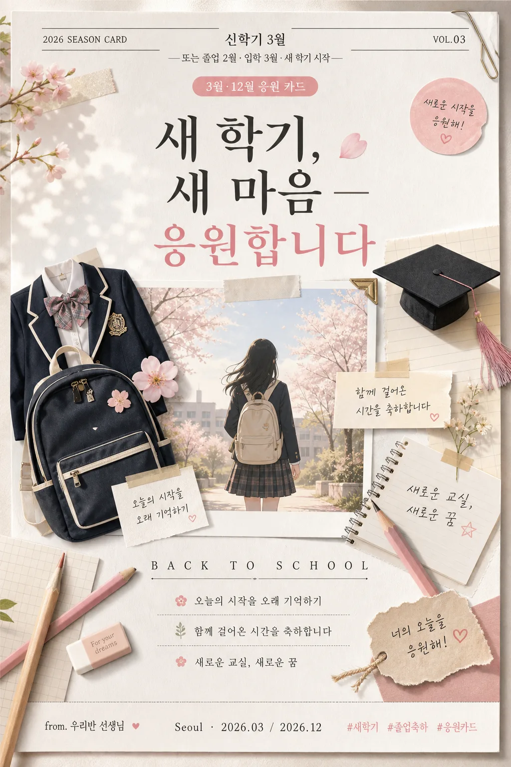
Korean seasonal greeting card for new semester and graduation season, portrait editorial layout for academy, church, and small-business encouragement use.
A warm vertical card for March back-to-school and year-end graduation messaging, designed like a photographed premium stationery piece with real printed details, seasonal captions, and keepsake-card texture.

[Composition]
- Main layout: centered 70% hero composition with a soft seasonal illustration cluster in the middle, headline occupying the upper 18% and message block the lower 22%, layered with realistic printed-card details.
- Background treatment: warm off-white paper texture with subtle spring haze, faint bokeh, airy sky gradient near the top, and lightly visible fibers, paper grain, and soft shadows from overlapping stationery.
- Framing direction: portrait greeting-card design with a balanced editorial hierarchy; include practical card details such as a date label, sender line, small caption, seasonal stickers, and a tiny keepsake tag while keeping the main message instantly readable on mobile.
- Use {시즌}, {메시지}, {비주얼}, {컬러 팔레트}, {타이포}, {비율} as user-customizable placeholders.

[3. CORE STRUCTURE]
1. Header zone (top 15%): set a small seasonal label based on {시즌}, aligned center, with thin separator rules above and below in charcoal gray; add realistic micro text such as “2026 SEASON CARD”, “VOL.03”, and a small date badge “3월·12월 응원 카드”.
2. Main hero zone (middle 50%): show {비주얼} as a friendly seasonal collage with school items arranged around a soft student silhouette; include layered notebook paper, a graduation cap ribbon, a pencil, tiny pressed-flower accents, translucent tape pieces, and a small photo-corner detail for depth.
3. Typography zone (upper-middle): place the main message {메시지} in a refined Korean serif style, large enough to dominate the card; include the required greeting line “새 학기, 새 마음 — 응원합니다” as a clear printed headline or subtitle.
4. Support line zone (lower-middle): place {타이포} as a smaller secondary line, spaced out with tracking, using a neat editorial arrangement; add short Korean card copy such as “오늘의 시작을 오래 기억하기”, “함께 걸어온 시간을 축하합니다”, and “새로운 교실, 새로운 꿈”.
5. Footer zone (bottom 15%): use seasonal accents that echo {컬러 팔레트}, with paper scraps, pencil marks, tiny leaf-like spring motifs, a small sender credit “from. 우리반 선생님”, a location/date line “Seoul · 2026.03 / 2026.12”, and tiny social-style tags “#새학기 #졸업축하 #응원카드”.

[4. STYLE RULES]
- Typography: Noto Serif KR or Nanum Myeongjo for the main Korean message, weight 600–700, headline size hint 58–72px; Pretendard or Inter for secondary English and micro labels, weight 500, 18–24px, wide letter spacing.
- Color palette: {컬러 팔레트} interpreted as beige #E9DDC9, white #FFFFFF, charcoal #2D2D2D, spring pink #F3B7C6 accents, with soft ink density variation like high-quality risograph or letterpress-inspired printing.
- Border/shadow: soft paper-edge shadow, 4px y-offset, 14px blur, 12% opacity; use gentle card-edge thickness, faint embossing on separator rules, subtle paper curl, and natural contact shadows between layered items.

[5. VISUAL STYLE]
- Camera / lens: studio poster look, 50mm standard lens feel, shallow-to-moderate depth of field like an editorial still life photographed on a full-frame camera.
- Lighting: diffused spring daylight from upper-left at 45°, very gentle fill from right, subtle rim highlight on the silhouette edges, with believable shadows under paper, pencil, ribbon, and sticker elements.
- Color grade: warm cream, dusty beige, charcoal, and soft blush pink with restrained saturation, like a modern stationery brand campaign; preserve tactile paper fibers, soft ink edges, and realistic printed texture.

[6. MOOD]
Premium seasonal greeting card — a restrained Korean stationery editorial feel, similar to a tasteful Kinfolk-style school-season campaign, but enriched with real keepsake-card details, handwritten-feeling captions, graduation/New Semester symbols, and warm encouragement.

[7. CRITICAL]
- Korean text accuracy: “새 학기, 새 마음 — 응원합니다” must appear exactly as written.
- Korean text accuracy: all visible Korean text must render with correct spacing, punctuation, and quotation marks if shown.
- Include realistic Korean printed details: “2026 SEASON CARD”, “VOL.03”, “3월·12월 응원 카드”, “from. 우리반 선생님”, “Seoul · 2026.03 / 2026.12”, “#새학기 #졸업축하 #응원카드”.
- Composition invariant: portrait orientation only, centered school-season collage, clear separation between headline and support line, with rich but controlled stationery details that support the greeting.

[8. 🚫 PROHIBITED]
- Fake official seals / certifications
- Broken Korean characters