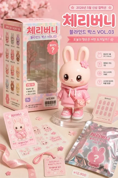
Merch/Mockups
K-pop 포토카드 (포카) 디자인
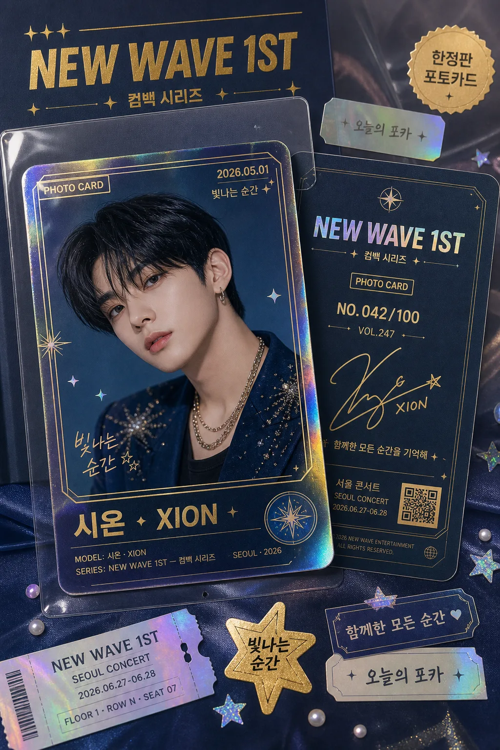
트레이딩 포토카드. 멤버 hero + 정보 + 시리얼 넘버.
K-pop 포토카드 (포카) 디자인 summary
Copy this ChatGPT image prompt to create Merch/Mockups results. Its subject, background, style, and composition are organized for quick iteration.
Related keywords: K-pop 포토카드 (포카) 디자인, K-pop 포토카드 (포카) 디자인 프롬프트, Merch/Mockups 프롬프트, Merch/Mockups AI 이미지 프롬프트, ChatGPT 이미지 프롬프트, AI 이미지 생성 프롬프트, AI 프롬프트, 이미지 프롬프트
How to use K-pop 포토카드 (포카) 디자인
Keep the prompt structure and swap the subject, background, palette, or composition to create new variations.
- Keep the main subject and adjust the palette and background for your brand, season, or channel.
- If the result feels busy, simplify the background and make the subject, composition, and lighting more specific.
- After copying, ask ChatGPT to adapt it for your platform, aspect ratio, or text requirements.
Original prompt
[Input]
- language: Korean
- output_size: 1024x1536

[Purpose]
K-pop trading photocard design, front-and-back presentation, collectible card mockup for fan merchandise and social sharing.
Vertical premium idol merchandise showcase inspired by BTS / NCT photocard aesthetics, with realistic printed-card texture, fan-collector details, and a tangible desk-styled presentation.

[Composition]
- Single tall photocard set in a vertical 1024x1536 frame; the front face is dominant while the back face peeks beside or behind it to show both sides at once.
- Keep the card edges crisp and rectangular, with a slight 3D tilt, realistic thickness, rounded-corner laminated finish, and a soft cast shadow that makes the card feel physically placed in the scene.
- Use {아티스트·시리즈}, {캐릭터}, {포토카드 결}, {컬러 톤}, {레이아웃}, {비율} as the customizable content elements.
- Surround the photocard with believable fan-merch context: a translucent protective sleeve, a partial album insert, tiny holographic confetti, sticker tabs, a small ticket-stub strip, and a satin or matte paper surface matching {컬러 톤}.
- Maintain a polished product-shot composition where the card remains the hero object, but include realistic reflections, printed edges, and collector-tabletop details.

[3. CORE STRUCTURE]
1. Main card area: build a collectible photocard with glossy premium coating; the front face shows the character portrait in an editorial idol style, while the back face is visible enough to reveal signature details, serial numbering, and fan-club style printed information.
2. Front face composition: place {캐릭터} as the hero portrait with polished studio styling, chest-up or waist-up depending on {비율}; include a small top label reading "PHOTO CARD", a date tag "2026.05.01", and a short Korean caption such as "빛나는 순간" or "오늘의 포카".
3. Back face details: include a neat autograph area, edition numbering such as "NO.042/100", series code "VOL.247", a small QR-like graphic block, a fan message line "함께한 모든 순간을 기억해", and compact custom series marks that feel like premium fan merch.
4. Collector details: add a tiny model-name credit line such as "MODEL: {캐릭터}", a series credit "SERIES: {아티스트·시리즈}", and a location/date label "SEOUL · 2026"; keep these printed elements sharp and integrated into the card design.
5. Surface effects: add subtle holographic foil accents along the border, rainbow refraction on corners, laminated sheen, light fingerprints on the protective sleeve, tiny dust specks caught in the light, and realistic paper thickness.
6. Text hierarchy: set the series title {아티스트·시리즈} as the strongest text element, then support it with smaller labels, serial info, caption text, sticker-like tags, and signature-style marks; all Korean and numeric text must remain crisp and fully legible.
7. Layout treatment: follow {레이아웃} with both sides visible in a balanced offset arrangement, slight overlap, dimensional separation, and fan-trading-card display energy rather than a flat mockup.
8. Decorative framing: include tasteful corner icons, star-sparkle sticker motifs, pearl or metallic dot accents, and a slim transparent sleeve highlight that echoes {포토카드 결} and {컬러 톤}.

[4. STYLE RULES]
- Typography: use Pretendard Bold for the main series title, Noto Sans KR Medium for labels, and a neat handwritten-signature style only for the autograph area; title size should feel like a card masthead, labels should stay compact and precise.
- Korean printed text examples to include where appropriate: "오늘의 포카", "빛나는 순간", "서울 콘서트", "함께한 모든 순간", "한정판 포토카드".
- Color palette: base the design on {컬러 톤}, with a dominant album signature hue, plus metallic gold #D4AF37 and holographic cyan-violet accents #7EE8FF / #A78BFA for foil details.
- Border/shadow: thin crisp border lines, soft drop shadow with 4px y-offset, 14px blur, 18% opacity, and a faint specular highlight to suggest coated card stock.
- Material realism: show glossy PET sleeve reflections, coated card-stock edges, foil-stamped micro accents, slightly raised typography, and realistic contact shadows on the tabletop or satin fabric.

[5. VISUAL STYLE]
- Camera / lens: studio product shot, 85mm f/1.8 portrait lens look with a shallow but controlled depth of field; front card remains tack sharp, background slightly softened.
- Lighting: softbox key light from upper-left at 45°, gentle fill from lower-right, and a narrow rim highlight along the card edge to emphasize the glossy finish.
- Color grade: polished idol-merch palette with clean neutrals, saturated signature color, gold foil glints, and a slight cool-magenta balance for holographic realism.
- Real-world presentation: macro-product photography feel, visible card thickness, believable reflections, fine paper grain, subtle foil flare, and a few fan-collector accessories placed around the card.

[6. MOOD]
Premium K-pop collectible merch editorial — glossy album photocard showcase with a BTS / NCT fan-trading-card display feel, warm fan-collection intimacy, and realistic unboxing-table styling.

[7. CRITICAL]
- Korean text accuracy: every Korean string must render perfectly and without broken characters.
- Must appear exactly as intended in the design: {아티스트·시리즈}, {캐릭터}, {포토카드 결}, {컬러 톤}, {레이아웃}, {비율}.
- Render added Korean text cleanly, including "오늘의 포카", "빛나는 순간", "서울 콘서트", "함께한 모든 순간", and "한정판 포토카드" if used.
- Serial formatting must stay clean and readable, such as "NO.042/100", "VOL.247", "SEOUL · 2026", and "2026.05.01".
- Preserve front-back card presentation in a single cohesive composition with realistic laminated photocard material, visible sleeve reflections, and sharp printed typography.
- No face distortion, no extra fingers or anatomy issues if any hand is shown, and no illegible microtext.

[8. 🚫 PROHIBITED]
- Fake official seals / certifications
- Broken Korean characters
- Celebrity composites or unauthorized real-person likeness