漫画・イラスト
세로 스크롤 웹툰 한 장
세로로 긴 웹툰 한 장. 패널 3~5개 세로 배치 + 대사.
세로 스크롤 웹툰 한 장の概要
漫画・イラスト画像を作るためのChatGPT画像プロンプトです。主題、背景、スタイル、構図を整理し、すぐに試せるよう構成しています。
関連キーワード: 세로 스크롤 웹툰 한 장, 세로 스크롤 웹툰 한 장 프롬프트, 漫画・イラスト 프롬프트, 漫画・イラスト AI 이미지 프롬프트, ChatGPT 이미지 프롬프트, AI 이미지 생성 프롬프트, AI 프롬프트, 이미지 프롬프트
세로 스크롤 웹툰 한 장の活用方法
元の構造を保ちながら、被写体、背景、色、構図を変更して別案に展開できます。
- 主題を維持し、ブランドや季節、媒体に合わせて色と背景を変更してください。
- 結果が複雑な場合は背景要素を減らし、被写体、構図、照明を具体化してください。
- コピー後、ChatGPTに媒体、アスペクト比、文字の有無を追加で指定できます。
プロンプト原文
[Input]
- language: Korean
- output_size: 1024x1536

[Purpose]
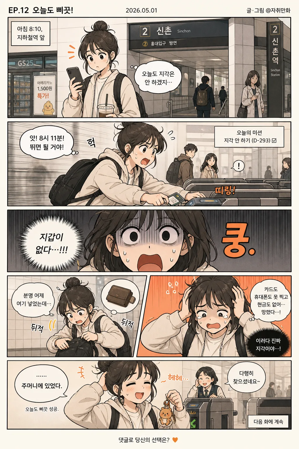
Vertical single-image webtoon page for social scrolling, designed as a polished Korean comic strip with 3–5 stacked scenes, readable dialogue, expressive pacing, and believable everyday visual detail.
A Naver Webtoon / Kakao Webtoon-style vertical episode page with flexibility for {장르·주제}, including everyday comedy, romance, fantasy, or thriller beats.

[Composition]
- Overall canvas: tall 9:16 vertical page with 3~5 panels stacked top-to-bottom, separated by warm webtoon gutters of consistent height for smooth scrolling.
- Episode framing: add a small top header strip before the first panel with a short Korean title label such as "EP.12 오늘도 삐끗!", a tiny date "2026.05.01", and a subtle creator credit "글·그림 @작가명".
- Scene rhythm: top panel as hook / middle panels for escalation / final panel for punchline or closing beat, with each panel showing enough background context to feel like a lived-in Korean webtoon scene.
- Character rendering: keep {캐릭터 결} consistent across every panel, with stable face proportions, line weight, hairstyle, accessories, and costume continuity.
- Dialogue placement: place {대사·말풍선} inside each panel with clear readable spacing around speech balloons; include occasional small Korean sound effects like "띠링!", "쿵", "헉", or "..." when they support the scene.
- Environmental detail: depending on {장르·주제}, include natural props and setting clues such as a convenience-store sign, phone screen, café table, subway handle, school hallway poster, office desk items, fantasy talisman, rainy window, or streetlight reflections.
- Color strategy: apply {컬러 톤} across the page with one accent color reserved for key reactions, highlights, motion lines, emotional effects, or punchline emphasis.
- Layout feel: use {레이아웃 결} with crisp panel rhythm, readable mobile pacing, varied shot sizes, and a satisfying final scroll beat.

[3. CORE STRUCTURE]
1. Opening panel — Introduce the situation using {장르·주제}, with the main subject(s) placed slightly off-center for comic timing and immediate readability; add a small location/time tag in Korean such as "아침 8:10, 지하철역 앞" or "방과 후, 2학년 복도".
2. Development panel(s) — Escalate the joke or tension through clear body language, expressive facial changes, props being used, background reactions from side characters, and dialogue beats from {대사·말풍선}.
3. Reaction panel — Make the strongest facial expression the focal point, using close-up framing, accent lines, tiny sweat marks, sparkles, gloom shadows, or comedic impact symbols that match {컬러 톤}.
4. Closing panel — End with a punchline or emotional beat, using a slightly larger reaction area, a final readable caption-like balloon if needed, and a small footer note such as "다음 화에 계속" or "댓글로 당신의 선택은?" when appropriate.
5. Optional extra panel — If the composition uses 5 panels, reserve the last panel for a delayed reaction, visual gag, final sting, or tiny after-caption, still matching the same {캐릭터 결} and maintaining continuity with earlier panels.

[4. STYLE RULES]
- Typography: use clean Korean comic lettering inspired by Pretendard or Noto Sans KR, medium to bold weight, with balloon text sized for mobile readability.
- Korean micro-text: add short legible webtoon details where useful, such as "오늘의 미션", "알림 3개", "특가", "동아리 모집", "출근 5분 전", or "마감 D-1".
- Color palette: build the page around {컬러 톤}; keep background whites slightly warm, shadows neutral charcoal, and use one saturated accent hue only where needed for reactions, objects, or dramatic emphasis.
- Panel treatment: use thin panel borders or implied panel separation with soft webtoon shadows, varied panel heights, occasional inset close-up, and tasteful vertical motion effects for scroll momentum.
- Text treatment: speech balloons should be crisp, evenly spaced, and highly legible; caption boxes, SFX lettering, and tiny UI labels should feel like part of a real Korean webtoon page.
- Detail density: include believable background textures and small props that support the scene while keeping the characters and dialogue as the clear reading path.

[5. VISUAL STYLE]
- Camera / lens: simulated comic framing, like a 35mm editorial documentary crop translated into illustration, with occasional tighter close-ups for reactions and one wider establishing panel for setting.
- Lighting: flat-to-soft studio-like lighting with gentle directional shading, consistent across panels, adapting to the chosen genre when needed through rain glow, café warmth, school fluorescent light, fantasy aura, or thriller shadow accents.
- Color grade: restrained cream / charcoal base with a single accent color, tuned for clean mobile reading and vertical-scroll clarity while preserving the richness of character expressions, props, and backgrounds.
- Rendering: modern Korean digital webtoon illustration with confident line art, cel-shaded faces, soft blush and shadow layers, expressive eyes, readable hands, and consistent costume folds across panels.

[6. MOOD]
Korean webtoon slice-of-life page — Naver Webtoon and Kakao Webtoon daily-scroll readability with crisp comedic timing, lively panel-to-panel acting, recognizable Korean setting details, and an episode-like finish.

[7. CRITICAL]
- Korean text accuracy: every visible Korean phrase in {대사·말풍선} and all added labels such as "EP.12 오늘도 삐끗!", "2026.05.01", "띠링!", "헉", "다음 화에 계속" must render clearly and without broken characters.
- Layout invariants: maintain a vertical stack of 3~5 panels, consistent gutters between panels, and readable balloon placement in each scene.
- Composition invariants: keep the page as one cohesive webtoon sheet, not a poster, magazine cover, newspaper, or multi-column comic.
- Visual consistency: preserve the same character style, line quality, costume continuity, and color treatment across all panels.
- Placeholder fidelity: keep {장르·주제}, {패널 구성}, {캐릭터 결}, {대사·말풍선}, {컬러 톤}, {레이아웃 결}, and {비율} reflected exactly as the guiding inputs.

[8. 🚫 PROHIBITED]
- Fake official seals or certifications
- Broken Korean characters