漫画・イラスト
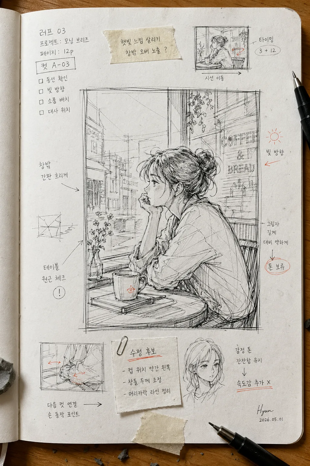
러프 펜 만화 컷 스케치
만화 컷 러프 스케치. 펜 자국·지운 흔적 살린 결.
러프 펜 만화 컷 스케치の概要
漫画・イラスト画像を作るためのChatGPT画像プロンプトです。主題、背景、スタイル、構図を整理し、すぐに試せるよう構成しています。
関連キーワード: 러프 펜 만화 컷 스케치, 러프 펜 만화 컷 스케치 프롬프트, 漫画・イラスト 프롬프트, 漫画・イラスト AI 이미지 프롬프트, ChatGPT 이미지 프롬프트, AI 이미지 생성 프롬프트, AI 프롬프트, 이미지 프롬프트
러프 펜 만화 컷 스케치の活用方法
元の構造を保ちながら、被写体、背景、色、構図を変更して別案に展開できます。
- 主題を維持し、ブランドや季節、媒体に合わせて色と背景を変更してください。
- 結果が複雑な場合は背景要素を減らし、被写体、構図、照明を具体化してください。
- コピー後、ChatGPTに媒体、アスペクト比、文字の有無を追加で指定できます。
プロンプト原文
[Input]
- language: Korean
- output_size: 1024x1536

[Purpose]
Rough pen comic cut sketch, hand-drawn notebook page style, vertical single-panel or small-scene illustration for editorial/mockup use.
A lived-in manga artist draft page with visible working notes, panel labels, pencil construction, tape marks, and analog desk-photo realism while preserving the raw sketch aesthetic.

[Composition]
- Main subject placement: {장면} occupies the central 60–70% of the sketchbook page, framed like a rough comic cut with natural handwritten notes and small thumbnail planning marks around it.
- Background treatment: {배경} with visible paper grain, slight edge noise, desk surface texture, faint paper curl, soft cast shadow, and realistic tabletop context as if photographed in an artist’s workspace.
- Spacing and framing: let the subject sit slightly off-center if the scene suggests action; use surrounding page area for arrows, timing marks, small margin doodles, correction circles, and Korean production notes.
- Line quality: {스케치 결} must read as rough pen + lightly erased pencil underdrawing, with imperfect contour breaks, repeated searching lines, hatching tests, pressure variation, and quick gesture strokes.
- Signature placement: {작가 사인} placed small in the lower-right corner, with a tiny date mark nearby like a real sketchbook signature.

[3. CORE STRUCTURE]
1. Canvas base — build a white sketchbook page on a vertical 1024x1536 layout, matching {비율}, with tactile paper fibers, faint gray shadow at the edges, slight page curl, subtle smudges, graphite dust, and warm desk reflection.
2. Subject block — draw {장면} as the dominant comic-cut subject, preserving a rough editorial sketch feel rather than a finished illustration; include visible staging marks such as action arrows, eye-line guides, and quick pose thumbnails.
3. Line construction — apply {스케치 결} with black pen lines, visible correction marks, light erased pencil traces, loose construction circles, cross-contour guides, hatching patches, and intentionally unfinished simplified forms.
4. Background layer — integrate {배경} as the scene context inside or around the comic cut, with enough environmental cues to feel specific and lived-in: floor lines, window shadow, speed lines, signage fragments, desk-edge shadow, or rough perspective guides when appropriate.
5. Accent color pass — apply {컬러} as selective marker or colored-pencil accents on key focus areas, note tabs, circled corrections, or one dramatic motion/detail area, leaving most of the drawing ink-and-graphite driven.
6. Artist mark — add {작가 사인} in the lower-right as a tiny handwritten signature, matching an analog sketchbook page; include small Korean annotations such as “컷 A-03”, “동선 확인”, “빛 방향”, “수정 후보”, and a date label like “2026.05.01”.

[4. STYLE RULES]
- Typography: no large polished title; any lettering should feel hand-lettered with pen, pencil, or thin marker. Render short Korean sketch notes clearly: “러프 03”, “컷 A”, “시선 이동”, “톤 보류”, “속도감 추가”.
- Color palette: black ink, white paper, warm gray shadows, graphite smears, and one accent tone from {컬러}; keep the accent restrained like real marker or colored pencil absorbed into paper.
- Border/shadow: soft drop shadow 4px y-offset, 12px blur, about 15% opacity; edges should feel like photographed paper rather than a digital frame, with tiny tape residue, page crease, and binder-hole or notebook-edge hints if they fit the composition.
- Real-world details: include subtle desk context such as a nearby pen tip, masking tape strip, eraser crumbs, paper clip shadow, ruler edge, or faint coffee-ring stain, without covering the main sketch.

[5. VISUAL STYLE]
- Camera / lens: overhead tabletop photo look, 50mm lens, f/4, as if documenting a sketchbook page laid flat on a desk.
- Lighting: soft diffused daylight from upper-left at about 45°, with a faint secondary fill from the right and gentle shadow falloff at the page edges.
- Color grade: neutral paper white with graphite gray shadows and a restrained accent hue; low-contrast, analog scan-like finish with realistic paper texture and pen bleed.

[6. MOOD]
Indie sketchbook editorial — raw zine illustration, like a behind-the-scenes notebook page from a comics artist’s working draft, energetic, tactile, and convincingly handmade.

[7. CRITICAL]
- Korean text accuracy: the rendered image must preserve clear Hangul in all handwritten notes, including “러프 03”, “컷 A-03”, “동선 확인”, “빛 방향”, “수정 후보”, and “톤 보류”, without broken characters or garbled spacing.
- Composition invariants: maintain a vertical sketchbook-page layout, rough pen-and-pencil construction lines, visible analog paper texture, enriched artist-workspace details, and a small lower-right signature.
- The overall look must remain unfinished, hand-drawn, and analog; do not replace it with a polished digital comic panel or perfectly clean vector line art.

[8. 🚫 PROHIBITED]
- Fake official seals / certifications
- Broken Korean characters