Comics/Illustration
웹툰 미리보기 4컷 댓글 목업
네이버·카카오웹툰 미리보기 화면 결. 4컷 + 댓글.
웹툰 미리보기 4컷 댓글 목업 summary
Copy this ChatGPT image prompt to create Comics/Illustration results. Its subject, background, style, and composition are organized for quick iteration.
Related keywords: 웹툰 미리보기 4컷 댓글 목업, 웹툰 미리보기 4컷 댓글 목업 프롬프트, Comics/Illustration 프롬프트, Comics/Illustration AI 이미지 프롬프트, ChatGPT 이미지 프롬프트, AI 이미지 생성 프롬프트, AI 프롬프트, 이미지 프롬프트
How to use 웹툰 미리보기 4컷 댓글 목업
Keep the prompt structure and swap the subject, background, palette, or composition to create new variations.
- Keep the main subject and adjust the palette and background for your brand, season, or channel.
- If the result feels busy, simplify the background and make the subject, composition, and lighting more specific.
- After copying, ask ChatGPT to adapt it for your platform, aspect ratio, or text requirements.
Original prompt
[Input]
- language: Korean
- output_size: 1024x1536

[Purpose]
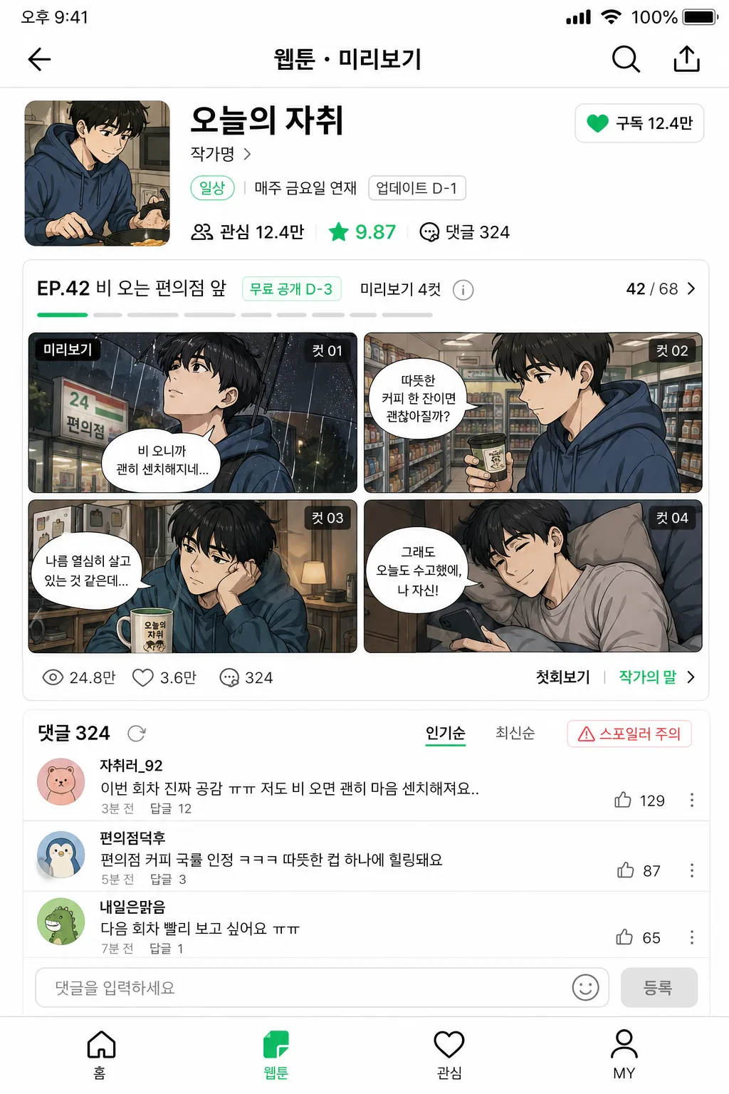
Webtoon preview mockup for a mobile platform UI, showing a content-rich 4-panel teaser layout plus a visible Korean comment section. Designed as a shareable 9:16 app-screen composite with realistic interface density, episode labels, engagement metrics, tabs, preview captions, and platform-native mobile details.

[Composition]
- Full-frame mobile screen composition: the main preview area occupies the upper 68–70% of the canvas, while the comment mockup sits in the lower 30–32% like a real platform feed panel.
- The overall framing should feel like a captured webtoon app screen, with a top status bar, app header, title information card, episode navigation, clean white gutters, thin separators, rounded cards, and small interactive UI icons.
- Use {웹툰명·작가} as the title/author header in the top information area, including a title line, author credit, genre tag, star rating, subscribe/like button, and a small update-day badge.
- Arrange {4컷 미리보기} as the featured episode preview block: four webtoon thumbnails in a 2x2 grid, each with small Korean panel captions, episode numbering, and tiny corner labels such as “미리보기”, “컷 01”, “컷 02”.
- Place {댓글 mockup} in a stacked comment area beneath the preview, aligned left with circular avatar placeholders, bold usernames, Korean comment text, timestamp labels, reply counts, and tiny like counters.
- Background treatment: crisp app UI white with subtle gray dividers, platform-accent green/yellow controls, thumbnail image content, small icons, status indicators, and a realistic bottom navigation bar.
- Keep spacing tight and app-native, with mobile-safe margins, dense but readable hierarchy, and realistic Korean app-screen information throughout.

[3. CORE STRUCTURE]
- Top phone/status area: include time “오후 9:41”, signal/Wi-Fi/battery icons, then an app header with a back arrow, search icon, share icon, and a small platform tab label such as “웹툰 · 미리보기”.
- Top header strip: display {웹툰명·작가} as a webtoon title and author line, with episode metadata, genre chips, update day, a small rating badge, and engagement counts near it. Example details may include “매주 금요일 연재”, “관심 12.4만”, “★ 9.87”, “댓글 324”.
- Main preview block (upper center): show {4컷 미리보기} as four thumbnail panels arranged in a polished 2x2 grid, each panel suggesting a different scene from the same episode with expressive webtoon-style characters, speech-bubble fragments, background scenery, and episode continuity.
- Preview metadata line: include compact episode info, small star rating, view count, like count, comment count, and light UI icons rendered in the style of a real Korean webtoon platform.
- Add a short episode strip above or below the thumbnails: “EP.42 비 오는 편의점 앞”, “무료 공개 D-3”, “미리보기 4컷”, with a small progress bar or carousel dot indicator.
- Comment section (lower area): render {댓글 mockup} as 3 realistic comment rows with circular avatars, bold usernames, Korean comment text, timestamps such as “3분 전”, tiny like counts, reply links, and a comment input field labeled “댓글을 입력하세요”.
- Add comment UI controls: sorting tabs “인기순 / 최신순”, a total count label “댓글 324”, a small spoiler warning chip “스포일러 주의”, and a bottom nav hint with icons for 홈, 웹툰, 관심, MY.
- UI separation: use thin gray dividers, rounded card edges, subtle shadows, and section labels to distinguish the preview area from the comment block, maintaining a polished app screenshot look.
- Platform styling cue: echo the feel of Naver Webtoon or Kakao Webtoon through green/white or yellow/black accent logic, while keeping the layout original and generic enough to read as a fictional mockup.

[4. STYLE RULES]
- Typography: Pretendard or Noto Sans KR, bold 700 for title, medium 500 for metadata, regular 400 for comments; title around 34–40px, episode labels around 24–28px, body comments around 22–26px, UI labels around 18–20px, micro metadata around 14–16px.
- Color palette: platform signature green #00D564, clean white #FFFFFF, soft gray #EAECEF, charcoal #222222, muted gray #7A7F87, optional Kakao-style yellow #FEE500 and black #111111 depending on the UI cue from {비주얼} and {컬러 톤}.
- Border/shadow: app UI shadows, 1px separators, subtle card shadow 0px 2px 8px rgba(0,0,0,0.08), rounded corners 16px, small pill chips with 999px radius.
- Webtoon thumbnail treatment: colorful comic panels, readable character silhouettes, speech bubbles, action marks, small background details, and slight panel-to-panel variation while preserving one coherent episode mood.
- Interface realism: include tappable buttons, icon labels, tab states, counters, microcopy, small carousel dots, bookmark/heart icons, and a bottom navigation area to make the image feel like an actual mobile app capture.

[5. VISUAL STYLE]
- Camera / lens: smartphone screenshot realism, flat UI capture style with no perspective distortion, as if viewed on an iPhone Pro Max screen in portrait orientation.
- Lighting: even studio-flat display glow, crisp screen clarity, slightly lifted whites to mimic a clean app interface, with vivid webtoon panel colors contained inside the preview thumbnails.
- Color grade: platform-native green/white or yellow/black palette with neutral whites and high readability, lightly contrast-enhanced for screenshot sharpness.
- Rendering detail: high-resolution UI edges, crisp Korean typography, believable icons, realistic thumbnail artwork, and subtle display-like anti-aliasing.

[6. MOOD]
Realistic mobile app mockup — polished Korean webtoon platform screenshot aesthetic, like a live preview page from a popular webtoon app with active readers, episode teasers, reactions, and comment engagement.

[7. CRITICAL]
- Korean text accuracy: “오늘의 자취”, “작가명”, “썸네일 4개”, “회차 정보”, “별점”, “이번 회차 진짜 공감 ㅠㅠ”, “다음 회차 빨리”, “EP.42 비 오는 편의점 앞”, “미리보기 4컷”, “무료 공개 D-3”, “댓글 324”, “인기순”, “최신순”, “스포일러 주의”, “댓글을 입력하세요”, “매주 금요일 연재”, “관심 12.4만”, “★ 9.87”.
- Include realistic Korean usernames such as “자취러_민”, “편의점단골”, “밤샘독자”, and short comments such as “이 장면에서 진짜 울컥함”, “작가님 컷 연출 미쳤다”, “다음 회차 빨리 주세요”.
- The composition must clearly show a 4-panel preview area and a separate comment section, both legible at mobile-screen scale.
- All Korean UI text should appear as clean, correctly rendered Hangul with no broken characters.
- Maintain the placeholders exactly: {웹툰명·작가}, {4컷 미리보기}, {댓글 mockup}, {비주얼}, {컬러 톤}, {비율}.

[8. 🚫 PROHIBITED]
- Fake official seals / certifications
- Broken Korean characters
- Celebrity composites / unauthorized likeness