인포그래픽/안내
디지털 사이니지 메뉴 디스플레이
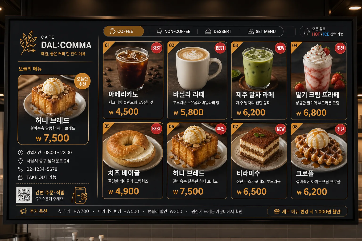
매장 디지털 사이니지 메뉴 화면. 음식 사진 + 가격 + 추천.
디지털 사이니지 메뉴 디스플레이 검색 요약
디지털 사이니지 메뉴 디스플레이은 인포그래픽/안내 결과물을 만들 때 바로 복사해 활용할 수 있는 ChatGPT 이미지 프롬프트입니다. 주제, 배경, 스타일, 구도 조건을 함께 담아 빠르게 시안을 만들 수 있도록 구성했습니다.
관련 키워드: 디지털 사이니지 메뉴 디스플레이, 디지털 사이니지 메뉴 디스플레이 프롬프트, 인포그래픽/안내 프롬프트, 인포그래픽/안내 AI 이미지 프롬프트, ChatGPT 이미지 프롬프트, AI 이미지 생성 프롬프트, AI 프롬프트, 이미지 프롬프트
디지털 사이니지 메뉴 디스플레이 활용 포인트
원본 구조를 유지하면서 피사체, 배경, 색감, 구도를 바꿔 다양한 시안으로 확장할 수 있습니다.
- 핵심 소재는 유지하고 브랜드, 계절, 채널 목적에 맞는 색감과 배경을 바꿔보세요.
- 결과가 산만하면 배경 요소를 줄이고 피사체, 구도, 조명 조건을 구체화하세요.
- 복사한 뒤 ChatGPT에서 플랫폼, 화면 비율, 텍스트 포함 여부를 추가로 요청할 수 있습니다.
프롬프트 원문
[Input]
- language: Korean
- output_size: 1536x1024

[Purpose]
Korean digital signage menu display for a cafe or food shop, designed as a large horizontal LCD menu board for in-store use.
Realistic retail signage layout with appetizing menu photos, names, prices, recommendation markers, store information, category labels, and practical ordering details, optimized for fast readability from a distance.

[Composition]
- Main display uses a wide LCD-like composition with {매장 종류} as the overall store context, framed like a mounted digital menu board in a real shop counter area.
- Left zone (about 28%): create a store identity and ordering-info panel with a logo-like brand block, store name, short Korean tagline, operating hours, address/contact line, and today’s recommended menu.
- Right zone (about 72%): arrange {메뉴 구성} in a structured grid or signage-style auto-sliding menu-card layout with clear category grouping and readable prices.
- Background treatment: dark charcoal digital screen surface with subtle matte LCD texture, soft reflections along the bezel, crisp edge contrast, and slight luminous UI glow.
- Add realistic menu-board details such as small category tabs, numbered item tags, “BEST”, “NEW”, “추천” badges, temperature icons like HOT / ICE, set-upgrade notice, takeout note, and decorative divider lines that support readability.
- The screen should feel like an actual commercial menu system installed in a cafe or food shop, with polished retail UI density rather than a flat poster.

[3. CORE STRUCTURE]
1. Top/left header area: place the store identity block in the left zone, with a compact logo-like placeholder area, a clean separator line, and Korean store text such as “오늘의 메뉴”, “주문은 카운터에서”, “영업시간 08:00–22:00”.
2. Store info band: include small practical lines like “서울시 중구 남대문로 24”, “02-1234-5678”, “TAKE OUT 가능”, and a tiny QR/order icon area rendered as graphic UI detail, not as an official certification.
3. Main menu field: render {메뉴 구성} as 6–8 items with each tile showing an appetizing food or drink photo, Korean menu name, price, short one-line description, and a small recommendation badge when needed.
4. Menu examples to visually populate the board: “아메리카노 ₩4,500”, “바닐라 라떼 ₩5,800”, “제주 말차 라떼 ₩6,200”, “딸기 크림 프라페 ₩6,800”, “치즈 베이글 ₩4,900”, “허니 브레드 ₩7,500”, using the requested {메뉴 구성} as the primary content direction.
5. Grid logic: align items in a balanced multi-column grid or signage-style auto-slide frame, making prices easy to scan instantly; include category headers such as “COFFEE”, “NON-COFFEE”, “DESSERT”, and “SET MENU”.
6. Text hierarchy: keep the menu name larger than supporting text, make the price the most visually prominent numeric element, and use short Korean microcopy like “부드러운 우유폼”, “시그니처 블렌드”, “오늘만 추천”.
7. Footer ticker: add a slim lower information strip with Korean notices such as “샷 추가 +₩700 · 디카페인 변경 +₩500 · 텀블러 할인 ₩300 · 원산지 표기는 카운터에서 확인”.
8. Surface behavior: use a realistic LCD signage look with sharp UI edges, subtle screen glow, laminated glass reflections, and commercial UI depth.

[4. STYLE RULES]
- Typography: Pretendard ExtraBold for headers, Noto Sans KR Bold for menu names, Pretendard SemiBold for prices; header 48–60px feel, item text 26–34px feel, prices 40–54px feel.
- Color palette: {컬러 톤} with concrete implementation such as charcoal #1E1E22, amber #D89A3A, off-white #F5F1E8, and muted gray #A6A6A6.
- Border/shadow: thin divider lines in 15% opacity white, soft screen glow, subtle shadow under menu tiles (0 6px 18px 12% opacity), and amber accent rules to mimic commercial LCD UI depth.
- Menu photography: food and beverage images should look realistic and appetizing, with ceramic cups, ice cubes, foam texture, pastry crumb texture, garnish, and natural highlights inside the menu tiles.
- Layout expression: follow {레이아웃} and {비율}; use {타이포} as the typographic mood while preserving strong distance readability.
- Include small retail details: category chips, item numbers, price alignment guides, promo ribbon “오늘의 추천”, allergen-style tiny icons, and a clean bottom service notice band.

[5. VISUAL STYLE]
- Camera / lens: front-facing product mockup look, equivalent to a 50mm lens at f/8 on a studio setup, perfectly square-on to the screen with minimal perspective distortion.
- Lighting: even studio softbox lighting from upper-left with a mild fill from the right, controlled highlight on screen edges, realistic LCD glass sheen, and subtle bezel reflection.
- Color grade: dark charcoal base with warm amber accents and clean white text, keeping a polished signage-system tone.
- Screen realism: include thin black LCD bezel, faint mounting shadow behind the display, crisp pixel-like UI sharpness, and slight glow around bright text and menu photos.

[6. MOOD]
Premium in-store digital menu signage — Starbucks / Ediya LCD board aesthetic with a clean retail UI finish, warm appetizing menu imagery, and practical Korean shop information.

[7. CRITICAL]
- Korean text accuracy: 반드시 아래 문구가 정확히 보여야 함
  - 디지털 사이니지 메뉴 디스플레이
  - {매장 종류}
  - {메뉴 구성}
  - {레이아웃}
  - {컬러 톤}
  - {타이포}
  - {비율}
- Also render realistic Korean signage microcopy where appropriate: “오늘의 추천”, “BEST”, “NEW”, “영업시간 08:00–22:00”, “샷 추가 +₩700”, “테이크아웃 가능”, “주문은 카운터에서”.
- Layout invariants: wide horizontal LCD menu board framing, left logo/store-info zone + right menu grid or auto-slide zone, clear price readability, consistent menu-card spacing, and visible category structure.
- All Korean characters must be cleanly rendered with no broken glyphs.

[8. 🚫 PROHIBITED]
- Fake official seals / certifications
- Broken Korean characters