周邊/模型
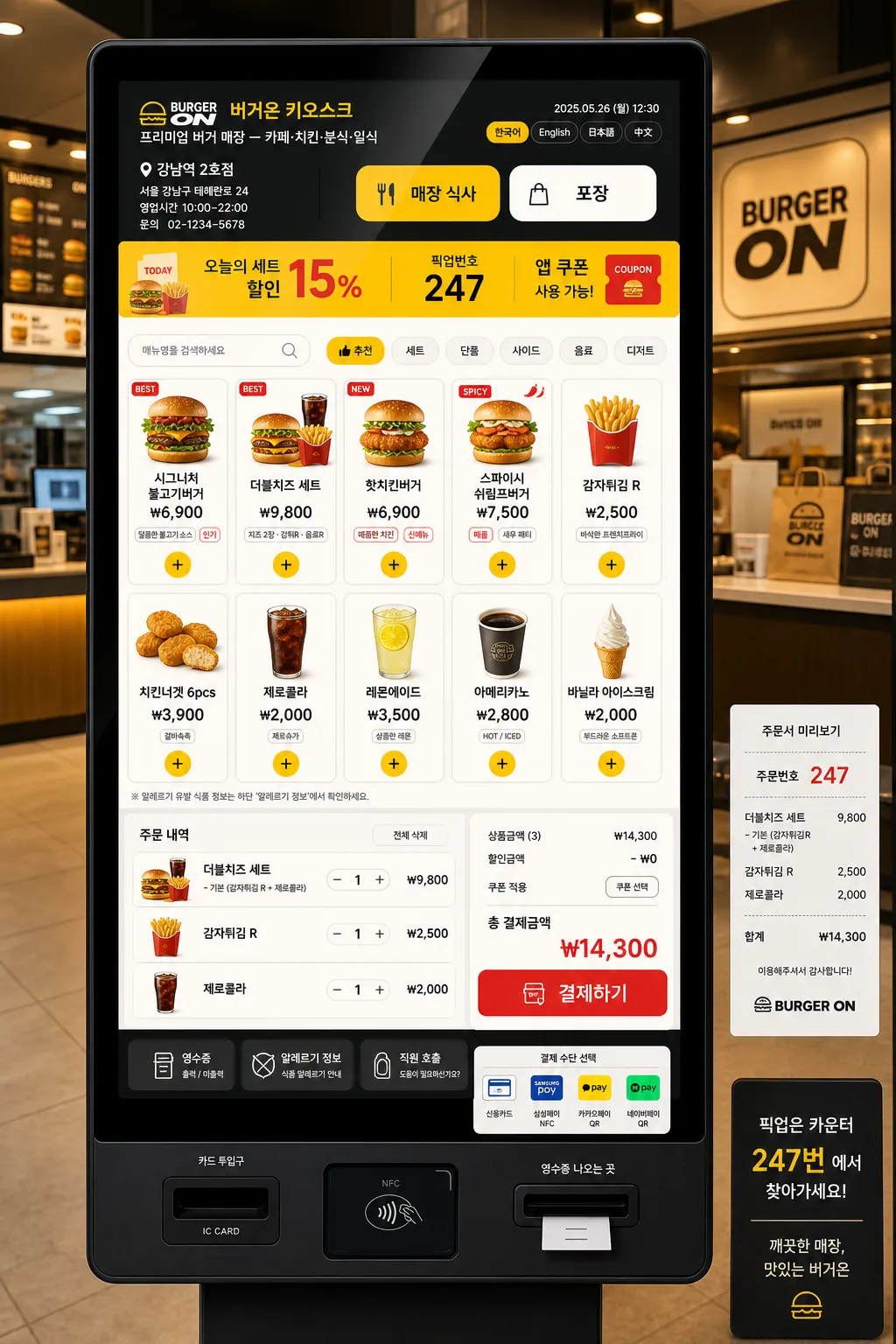
키오스크 셀프 주문 목업
셀프 주문 키오스크 UI 화면. 메뉴 그리드 + 장바구니.
키오스크 셀프 주문 목업摘要
這是用來製作周邊/模型內容的 ChatGPT 圖像提示詞,已整理主題、背景、風格與構圖,方便快速調整。
相關關鍵字: 키오스크 셀프 주문 목업, 키오스크 셀프 주문 목업 프롬프트, 周邊/模型 프롬프트, 周邊/模型 AI 이미지 프롬프트, ChatGPT 이미지 프롬프트, AI 이미지 생성 프롬프트, AI 프롬프트, 이미지 프롬프트
키오스크 셀프 주문 목업使用方式
保留原始結構並替換主體、背景、色彩或構圖,即可延伸出不同版本。
- 保留核心主體,並依品牌、季節或平台調整色彩與背景。
- 如果畫面太複雜,請減少背景元素並具體描述主體、構圖與光線。
- 複製後可要求 ChatGPT 配合平台、長寬比或文字需求調整。
提示詞原文
[Input]
- language: Korean
- output_size: 1024x1536

[Purpose]
Kiosk self-order UI mockup poster for a food service venue, vertical mobile-friendly presentation.
Realistic commercial UI showcase with a full kiosk ordering screen, menu pricing, cart summary, pickup guidance, and payment-ready flow for {매장명}.

[Composition]
- Center a tall kiosk touchscreen as the hero element, occupying about 70% of the frame height, set inside a realistic black or charcoal kiosk frame with tempered-glass reflections and a sturdy pedestal base.
- Background should show a softly blurred {매장유형} interior with counter lights, menu boards, trays, packaging, and warm service-area details, while keeping the kiosk screen clearly readable.
- Place {매장명} and {지점정보} in the kiosk header, small receipt preview, or background signage so the mockup feels like an actual in-store ordering machine.
- Build a dense but readable menu screen using {메뉴구성}: product photos, Korean item names, prices, option badges, spicy/popular/new tags, and + buttons on each card.
- Include an active order state: selected items in {장바구니내용}, quantity steppers, subtotal, discount line, total amount, and a large 결제하기 button.
- Add real kiosk details such as language selector, order type toggle, pickup number area, card/NFC/QR payment icons, receipt option, allergy info link, and staff-call button.

[3. CORE STRUCTURE]
- Top header zone: show {매장명}, store category label for {매장유형}, current date/time, order type buttons "매장 식사" and "포장", plus language controls "한국어 · English · 日本語 · 中文".
- Promotion strip: add {프로모션문구} as a bright horizontal banner with small food illustration stickers, coupon tag, or limited-time badge.
- Category navigation zone: include {UI디테일} as functional category tabs such as 추천, 세트, 단품, 사이드, 음료, 디저트, plus a compact search field.
- Main menu grid zone: display {메뉴구성} as 8–12 product tiles with appetizing thumbnail photos, item names, prices in 원, nutrition or spicy labels, sold-out/new/popular chips, and clear + buttons.
- Cart zone: position {장바구니내용} as a fixed summary panel on the lower third or right side of the kiosk UI, with selected items, option notes, quantity controls, subtotal, 쿠폰 적용, 총 결제금액, and payment CTA.
- Store information zone: include {지점정보}, business hours, pickup counter note, customer service phone, and a small receipt-style order preview near the bottom of the interface.
- Color system: apply {브랜드컬러} across active tabs, CTA buttons, price highlights, badges, dividers, and status chips so the kiosk reads as a cohesive franchise interface.
- Format zone: keep the full composition in a tall 1024x1536 poster layout, optimized for vertical product mockup presentation and kiosk-screen readability.

[4. STYLE RULES]
- Typography: use Pretendard or Noto Sans KR for the interface, with bold 700 weights for prices, order totals, and CTA buttons; medium 500 for item names; 12–22px UI hierarchy depending on distance.
- Color palette: use {브랜드컬러} with white #FFFFFF, charcoal #2B2B2B, warm light gray #F2F2F2, and a high-contrast accent color for active buttons, price highlights, and category states.
- UI components: use rounded 18px menu cards, 1px light-gray dividers, pill-shaped category tabs, soft status badges, visible touch targets, and a soft drop shadow of 0px 8px 24px rgba(0,0,0,0.12) for the kiosk frame.
- Content density: make the interface feel like a real operating kiosk with menu information, notices, prices, icons, receipt lines, and payment instructions arranged in a polished hierarchy.
- Product imagery: show realistic food thumbnails with slight overhead angles, glossy packaging, paper tray liners, drink cups, sauces, and side dishes matching {매장유형}.

[5. VISUAL STYLE]
- Camera / lens: 50mm standard lens look, front-facing product capture with slight perspective correction, like a premium UI presentation mockup.
- Lighting: soft studio lighting from upper-left with gentle fill from the right, controlled screen glare, crisp UI readability, and subtle reflections on the kiosk glass.
- Color grade: clean white + brand accent + charcoal with restrained saturation, matching a polished fast-food kiosk interface aesthetic.
- Material realism: matte metal kiosk body, faint fingerprints on glass edge, illuminated screen surface, plastic card reader module, QR scanner window, and receipt slot detail.

[6. MOOD]
Commercial fast-food kiosk presentation — McDonald's and Lotteria-style self-order UI reference with a polished franchise system feel, lively in-store realism, appetizing menu photography, and dependable checkout flow.

[7. CRITICAL]
- Korean text accuracy: include readable Korean UI strings such as "버거온 키오스크", "매장 식사", "포장", "추천 메뉴", "세트", "단품", "사이드", "음료", "장바구니", "쿠폰 적용", "총 결제금액", "결제하기", "주문번호 247", "영수증 출력".
- Example menu text may include "시그니처 불고기버거 ₩6,900", "더블치즈 세트 ₩9,800", "감자튀김 R ₩2,500", "제로콜라 ₩2,000", "치킨텐더 4조각 ₩4,200".
- Store info text may include "강남역 2호점", "서울 강남구 테헤란로 24", "영업시간 10:00–22:00", "문의 02-1234-5678".
- Maintain a realistic kiosk UI layout with clear hierarchy, legible buttons, balanced menu/cart separation, and no accidental overlapping labels.

[8. 🚫 PROHIBITED]
- Fake official seals / certifications
- Broken Korean characters or unreadable Hangul
- Celebrity composites or unauthorized likeness mashups