廣告/海報
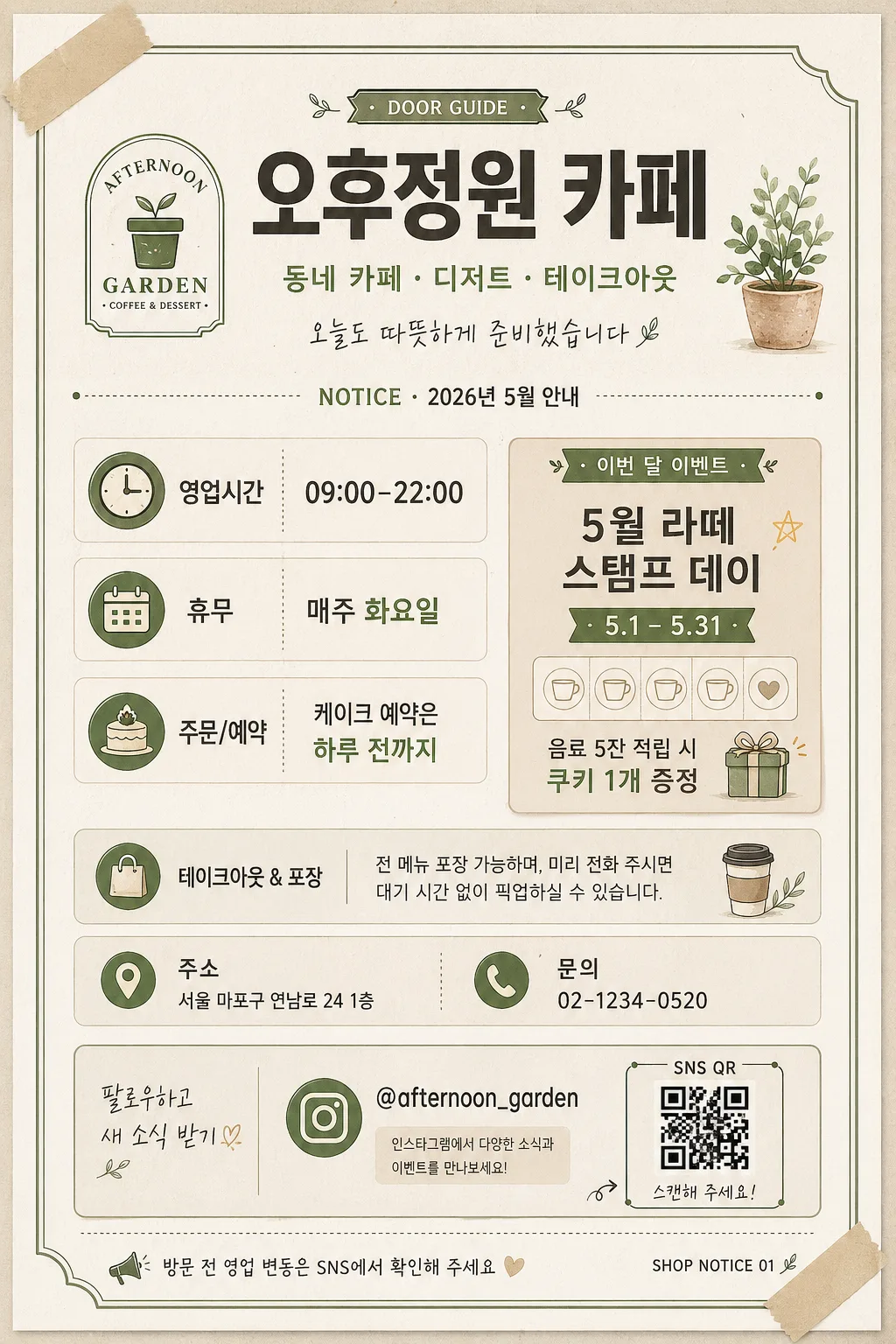
매장 안내 게시판 (영업시간·휴무·이벤트)
매장 안내판. 영업시간·휴무·이벤트·SNS.
매장 안내 게시판 (영업시간·휴무·이벤트)摘要
這是用來製作廣告/海報內容的 ChatGPT 圖像提示詞,已整理主題、背景、風格與構圖,方便快速調整。
相關關鍵字: 매장 안내 게시판 (영업시간·휴무·이벤트), 매장 안내 게시판 (영업시간·휴무·이벤트) 프롬프트, 廣告/海報 프롬프트, 廣告/海報 AI 이미지 프롬프트, ChatGPT 이미지 프롬프트, AI 이미지 생성 프롬프트, AI 프롬프트, 이미지 프롬프트
매장 안내 게시판 (영업시간·휴무·이벤트)使用方式
保留原始結構並替換主體、背景、色彩或構圖,即可延伸出不同版本。
- 保留核心主體,並依品牌、季節或平台調整色彩與背景。
- 如果畫面太複雜,請減少背景元素並具體描述主體、構圖與光線。
- 複製後可要求 ChatGPT 配合平台、長寬比或文字需求調整。
提示詞原文
[Input]
- language: Korean
- output_size: 1024x1536

[Purpose]
Create a vertical store notice board for small businesses, designed for door or wall display. Clear, printable Korean information poster for business hours, closed days, monthly events, SNS QR guidance, and quick customer contact details.

[Composition]
- Poster format: A4-style vertical layout, optimized for 1024x1536 print-ready signage.
- Main headline area at the top 16%: bold title for {매장명}, with a compact subtitle line showing {업종설명}.
- Include realistic storefront details: notice date {공지일자}, address {주소}, contact {연락처}, SNS handle {SNS계정}, and a small QR placeholder labeled for scanning.
- Information blocks stacked in a readable hierarchy: operating hours, closed day, monthly event, reservation or pickup note, and SNS QR area.
- Visuals should combine {비주얼요소} with small icons such as clock, calendar, gift, map pin, phone, and SNS symbol.
- Background should feel like premium printed board stock: off-white cream paper texture with subtle grain, faint ink absorption, and gentle card shadows.
- Add practical printed-board details such as thin dividers, small label chips, corner tape illustration, and a footer note so it feels like an actual notice posted at a shop entrance.

[3. CORE STRUCTURE]
- Top header band: place the main store name “{매장명}” and short descriptor “{업종설명}” in a centered or slightly left-aligned masthead, using {타이포스타일} with strong visual weight.
- Brand/identity area: integrate a logo placeholder or illustrated shop mark using {비주얼요소}; add a small tag line “오늘도 따뜻하게 준비했습니다”.
- Date label: near the header, include “NOTICE · {공지일자}” and a small shop bulletin label such as “DOOR GUIDE”.
- Information section 1: present operating details in clearly separated rows or cards: “영업시간 {영업시간}”, “휴무 {휴무일}”, “주문/예약 {예약안내}”.
- Information section 2: reserve one highlighted event area for “이번 달 이벤트”, showing {이벤트명}, {이벤트기간}, and a short benefit line {이벤트혜택} with a gift or star icon.
- Local information strip: include “주소 {주소}” and “문의 {연락처}” in smaller text with map pin and phone icons.
- QR/SNS zone: include a compact QR placeholder with a proper quiet zone inside the QR box, label it “SNS QR”, and place “{SNS계정}” plus “팔로우하고 새 소식 받기”.
- Footer strip: add a thin closing line with a practical notice such as “방문 전 영업 변동은 SNS에서 확인해 주세요” and a small page-like code “SHOP NOTICE 01”.

[4. STYLE RULES]
- Typography: use Pretendard Bold or Noto Sans KR ExtraBold for main headers, Pretendard Medium for subheads, and Pretendard Regular or Nanum Gothic for small information text; headline size around 70–90px equivalent, body around 26–34px equivalent, label text around 18–22px equivalent.
- Color palette: cream #F6F0E6, charcoal #2E2E2E, warm beige #D8C7B3, muted accent based on {컬러톤}; keep high contrast for readability.
- Border/shadow: use thin charcoal rules, rounded boxes, label ribbons, divider lines, and a very soft drop shadow with 4px vertical offset, 12px blur, 15% opacity for layered cards.
- Icon style: simple mono-line or filled Korean editorial icons, matched stroke weight, with small accent circles or stickers for event emphasis.
- Print realism: include subtle paper grain, slight ink texture on black text, and tiny registration-like footer marks without making the layout look like an official certificate.

[5. VISUAL STYLE]
- Camera / lens: clean flat graphic poster look, as if photographed with a 50mm standard lens and then converted into a precise editorial layout; no distortion, no perspective warp.
- Lighting: soft diffused daylight from upper-left, even exposure across the page, with only a faint paper-shadow feel around cards and icons.
- Color grade: warm cream + charcoal + muted store-sign accent, with lightly desaturated tones and print-friendly contrast.

[6. MOOD]
Practical small-business storefront signage — warm Korean print design with a Kinfolk-style editorial calm, friendly neighborhood-shop personality, and organized daily bulletin-board charm.

[7. CRITICAL]
- Korean text accuracy: 반드시 정확히 보여야 하는 문구: “매장 안내 게시판”, “{매장명}”, “영업시간 {영업시간}”, “휴무 {휴무일}”, “이번 달 이벤트”, “SNS QR”, “{SNS계정}”.
- Include realistic rendered notice details: “NOTICE · {공지일자}”, “주소 {주소}”, “문의 {연락처}”, “{이벤트명}”, “{이벤트기간}”, “{이벤트혜택}”.
- Layout invariant: vertical A4-style composition, legible at storefront distance, with rich but readable hierarchy and clearly separated information cards.
- Text must remain crisp and correctly spelled in Korean, with no broken or garbled characters.

[8. 🚫 PROHIBITED]
- Fake official seals / certifications
- Broken Korean characters
- Celebrity composites or face morphing