굿즈/목업
매장 향수·디퓨저 패키지 디자인
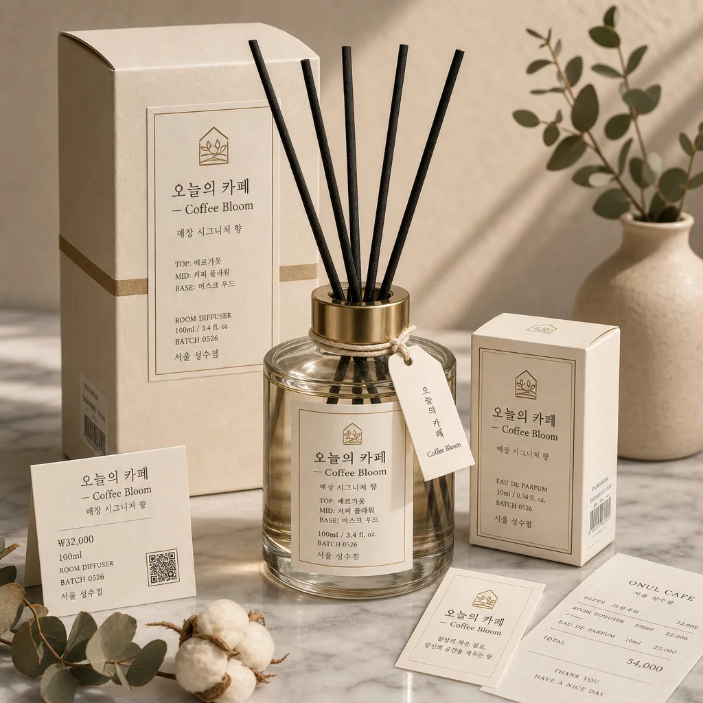
매장 시그니처 향수·디퓨저 패키지. 럭셔리 미니멀.
매장 향수·디퓨저 패키지 디자인 검색 요약
매장 향수·디퓨저 패키지 디자인은 굿즈/목업 결과물을 만들 때 바로 복사해 활용할 수 있는 ChatGPT 이미지 프롬프트입니다. 주제, 배경, 스타일, 구도 조건을 함께 담아 빠르게 시안을 만들 수 있도록 구성했습니다.
관련 키워드: 매장 향수·디퓨저 패키지 디자인, 매장 향수·디퓨저 패키지 디자인 프롬프트, 굿즈/목업 프롬프트, 굿즈/목업 AI 이미지 프롬프트, ChatGPT 이미지 프롬프트, AI 이미지 생성 프롬프트, AI 프롬프트, 이미지 프롬프트
매장 향수·디퓨저 패키지 디자인 활용 포인트
원본 구조를 유지하면서 피사체, 배경, 색감, 구도를 바꿔 다양한 시안으로 확장할 수 있습니다.
- 핵심 소재는 유지하고 브랜드, 계절, 채널 목적에 맞는 색감과 배경을 바꿔보세요.
- 결과가 산만하면 배경 요소를 줄이고 피사체, 구도, 조명 조건을 구체화하세요.
- 복사한 뒤 ChatGPT에서 플랫폼, 화면 비율, 텍스트 포함 여부를 추가로 요청할 수 있습니다.
프롬프트 원문
[Input]
- language: Korean
- output_size: 1024x1024

[Purpose]
Luxury store fragrance package mockup for a diffuser and small perfume box, designed as a premium, real retail-ready product presentation for brand promotion, boutique shelf display, and online catalog use. The image should feel like an actual photographed fragrance set with authentic label information, packaging details, material texture, and a coordinated store-brand identity.

[Composition]
- Center the main product cluster so the diffuser bottle occupies about 45% of the frame, with the small perfume box placed slightly forward-right to create depth and a believable retail bundle.
- Use {매장·시그니처 향} as the conceptual product identity, letting the label and package hierarchy feel like a refined store scent line with a clear fragrance name, notes, volume, batch code, and boutique location.
- Use {비율} to guide the relationship between the diffuser bottle, perfume box, label panels, and surrounding retail elements so the set feels balanced and commercially photographed.
- Build the layout so {패키지} reads as a coordinated set: diffuser bottle, reed sticks, outer box, small scent card, and matching paper tag should share the same label grid, color accents, and typography.
- Place the products on {배경}, such as marble, warm wood, limestone, or a boutique counter surface, with natural material grain, soft reflections, and tactile realism.
- Add subtle lifestyle retail details around the package: dried eucalyptus or cotton flower stem, folded off-white receipt card, small barcode sticker area on the box side, thin ribbon or paper belly band, and a tiny price / product information card.

[3. CORE STRUCTURE]
- Hero product zone (center 45%): render the diffuser bottle as the tallest element, with crisp glass edges, clear or lightly tinted liquid, 5–7 matte black or natural reed sticks, a premium front label, and a small neck tag tied with thin cotton string.
- Secondary package zone (lower-right 25%): place the small perfume box slightly angled at 10–15 degrees, close enough to feel bundled but separated enough to show the front panel, side barcode strip, and top flap seam.
- Label clarity zone (front-facing surfaces): place {라벨 정보} on the bottle and box with clean alignment; include readable Korean product hierarchy such as brand/store name, scent name, scent notes, volume, batch number, and location.
- Retail information zone (lower-left or near product base): include a small matching card with concise Korean details: “₩32,000”, “100ml”, “ROOM DIFFUSER”, “BATCH 0526”, “서울 성수점”, and a tiny QR-style square or barcode block for realism.
- Surface and backdrop zone (full frame): combine {배경} with a premium studio tabletop look; include believable stone/wood texture, contact shadows beneath each object, and slight paper fiber texture on labels and box surfaces.
- Color balance zone (entire composition): let {컬러 톤} define the palette across packaging, label accents, botanical props, ribbon/string, and background harmony.
- Type hierarchy zone (label area): use {타이포} for the packaging text structure, with clear spacing between brand name, scent name, support copy, volume, and batch details.

[4. STYLE RULES]
- Typography: use an elegant serif pairing such as Noto Serif KR or Nanum Myeongjo for the main Korean text, with a refined English serif companion; medium-to-light weight, 16–28 px label scale, tight but breathable tracking.
- Add realistic label text blocks in Korean and English: “오늘의 카페 — Coffee Bloom”, “매장 시그니처 향”, “향 이름”, “작은 카피”, “매장 위치”, “100ml / 3.4 fl. oz.”, “TOP: 베르가못”, “MID: 커피 플라워”, “BASE: 머스크 우드”.
- Color palette: base the scene on {컬러 톤}, plus off-white paper tones, muted stone gray, warm wood, translucent amber liquid, and restrained metallic gold accents; keep black text soft charcoal rather than pure black.
- Packaging finish: show matte paper box texture, slight embossing or debossed line detail, a thin gold foil rule, clean folded box edges, a realistic barcode panel, small manufacturing-style text, and subtle label adhesive edges.
- Border/shadow: add a soft drop shadow with 4px y-offset, 14px blur, 15% opacity; no hard outline, no neon edge glow.

[5. VISUAL STYLE]
- Camera / lens: studio product photography look with a Canon EOS R5 and 85mm f/1.4 lens, shot at f/4 for controlled depth and crisp package edges.
- Lighting: soft natural window light from upper-left at roughly 45°, with a faint fill on the right and gentle shadow falloff; keep highlights clean on the glass bottle, liquid meniscus, reed sticks, paper label, and box edges.
- Color grade: cream beige + gold + charcoal with subtle warm paper tones, inspired by Le Labo and Diptyque retail packaging photography.
- Realism details: include micro-scratches in glass highlights, mild paper grain on the label, tiny dust specks on the tabletop only where natural, precise contact shadows, and slightly varied reed-stick heights for a photographed product feel.

[6. MOOD]
Premium fragrance-brand editorial — quiet luxury boutique shelf aesthetic with Le Labo / Diptyque-inspired restraint, tactile retail packaging, warm café-like comfort, and meticulous product finish.

[7. CRITICAL]
- Korean text accuracy: the following Korean strings must appear correctly and cleanly in the rendered image: “오늘의 카페 — Coffee Bloom”, “매장 시그니처 향”, “매장 로고”, “향 이름”, “작은 카피”, “매장 위치”.
- Also include short realistic package details in Korean where space allows: “서울 성수점”, “₩32,000”, “100ml”, “BATCH 0526”, “커피 플라워 · 머스크 우드”, “시향 카드”.
- Keep the package composition balanced and premium, with all major label elements sharp and legible at thumbnail size.
- Maintain product realism: glass, liquid, paper, reed sticks, metallic foil, barcode area, and printed typography should look physically plausible and not warped.

[8. 🚫 PROHIBITED]
- Fake official seals / certifications
- Broken Korean characters