굿즈/목업
사장님 명함·QR 풀패키지
사장 명함 + QR 풀세트. 매장 + SNS + 결제 QR.
사장님 명함·QR 풀패키지 검색 요약
사장님 명함·QR 풀패키지은 굿즈/목업 결과물을 만들 때 바로 복사해 활용할 수 있는 ChatGPT 이미지 프롬프트입니다. 주제, 배경, 스타일, 구도 조건을 함께 담아 빠르게 시안을 만들 수 있도록 구성했습니다.
관련 키워드: 사장님 명함·QR 풀패키지, 사장님 명함·QR 풀패키지 프롬프트, 굿즈/목업 프롬프트, 굿즈/목업 AI 이미지 프롬프트, ChatGPT 이미지 프롬프트, AI 이미지 생성 프롬프트, AI 프롬프트, 이미지 프롬프트
사장님 명함·QR 풀패키지 활용 포인트
원본 구조를 유지하면서 피사체, 배경, 색감, 구도를 바꿔 다양한 시안으로 확장할 수 있습니다.
- 핵심 소재는 유지하고 브랜드, 계절, 채널 목적에 맞는 색감과 배경을 바꿔보세요.
- 결과가 산만하면 배경 요소를 줄이고 피사체, 구도, 조명 조건을 구체화하세요.
- 복사한 뒤 ChatGPT에서 플랫폼, 화면 비율, 텍스트 포함 여부를 추가로 요청할 수 있습니다.
프롬프트 원문
[Input]
- language: Korean
- output_size: 1536x1024

[Purpose]
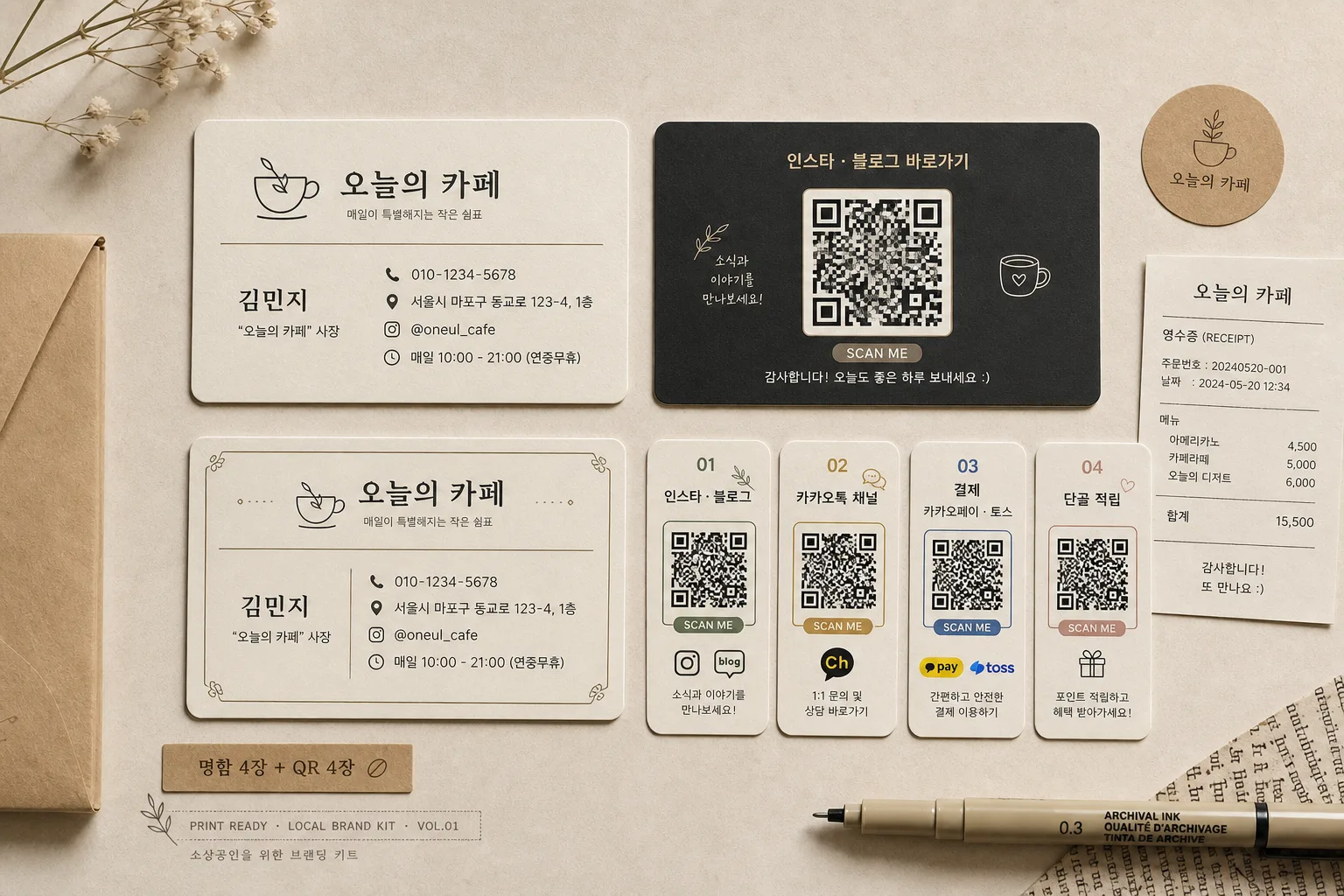
Korean small-business business-card and QR full package mockup collage, realistic flat lay presentation for a shop owner's branding kit.
Social-media-shareable horizontal collage showing 4 business cards + 4 QR cards with a cohesive owner-store identity system, enriched with practical contact details, QR purpose labels, small iconography, and local-shop stationery context.

[Composition]
- Main subject: 4 business-card mockups and 4 QR cards arranged as a polished flat lay collage, occupying about 78% of the frame while leaving enough surrounding paper surface to show realistic shadows and material texture.
- Background treatment: warm cream paper surface with subtle matte fibers, faint desk-use marks, a small receipt slip, kraft sticker, fine-tip pen edge, and tiny café-style stationery accents that support the small-business branding package without covering the cards.
- Spacing and framing: cards evenly separated with consistent gutters, slight rotation variation only enough to feel naturally hand-arranged, but the overall grid remains tidy and aligned for a professional catalog look.
- Use {사장·매장}, {명함 결}, {QR 종류}, {컬러 톤}, {레이아웃}, {비율} as the configurable content anchors.
- Add realistic print details: paper grain, slight card thickness, crisp rounded corners, subtle edge shadows, tiny registration marks, small divider lines, micro icons for phone / map / Instagram / blog / payment.

[Core Structure]
1. Top-left card cluster: one primary business card face showing the owner and store identity with strong Korean hierarchy, including owner name, shop name, title, phone number, address line, Instagram handle, and business hours.
2. Top-right card cluster: one business card back emphasizing QR use, with a large centered QR code, small label text such as “인스타·블로그 바로가기”, and short helper copy below the code.
3. Bottom-left card cluster: alternate business card variation with the same visual system, demonstrating consistency across the package through matching typography, accent color, divider rules, and icon set.
4. Bottom-right card cluster: QR-focused card variation with distinct QR purpose labeling, using four small QR card designs for “인스타·블로그”, “카카오톡 채널”, “결제”, and “단골 적립”.
5. Overall collage treatment: all 8 pieces should feel like a coordinated branding set, with print-ready sharp edges, realistic paper thickness, fine ink texture, and subtle shadow separation from the background.
6. Text content placement: integrate {사장·매장}, {명함 결}, and {QR 종류} so the package reads as a complete owner-brand kit rather than isolated samples.
7. Include a small package label strip near the layout reading “명함 4장 + QR 4장” and a tiny production-note style caption like “PRINT READY · LOCAL BRAND KIT · VOL.01”.

[Style Rules]
- Typography: Pretendard and Noto Sans KR for clean Korean sans-serif hierarchy, medium to semibold weights, title text around 26–34px equivalent, supporting labels 14–18px equivalent, micro contact text 9–12px equivalent but still legible.
- Color palette: cream #F4ECDD, charcoal #2F2F2F, warm beige #D8C6B3, muted brand accent from {컬러 톤}; use accent color for QR labels, dividers, small stickers, and tiny icon marks.
- Border/shadow: soft drop shadow with 4px y-offset, 14px blur, 16% opacity; thin paper-edge definition for each card, realistic matte card stock edges, slight rounded-corner highlights.
- Graphic details: fine line dividers, small rounded QR labels, tiny “SCAN ME” bilingual tag, dotted guide marks, subtle café receipt typography, and understated decorative corner marks that make the kit feel printed and real.

[Visual Style]
- Camera / lens: overhead flat lay look, 50mm equivalent on a high-resolution studio setup, crisp print detail and controlled perspective.
- Lighting: diffused softbox from upper-left with gentle fill from right, controlled shadow falloff, natural paper texture visible, evenly exposed with believable contact shadows under every card.
- Color grade: warm cream + charcoal + muted signature accent, slightly desaturated retail stationery catalog tone with realistic ink-on-paper contrast.
- Rendering quality: ultra-sharp Korean typography, crisp QR-code geometry, tactile matte paper, natural tabletop depth, premium branding portfolio realism.

[Mood]
Premium small-business stationery catalog spread — like a refined Korean local-brand identity mockup seen in a high-end branding portfolio, but with lived-in shop-owner details, practical QR use cases, and friendly neighborhood-store warmth.

[Critical]
- Korean text accuracy: the following strings must appear correctly and clearly in the rendered image: "사장님 명함·QR 풀패키지", "김민지 / \"오늘의 카페\" 사장", "앞면 이름·매장명·전화 / 뒷면 QR (인스타·블로그·결제)", "01 인스타·블로그 / 02 카카오톡 채널 / 03 결제 (카카오페이·토스) / 04 단골 적립", "크림 + 차콜 + 매장 시그니처 — 친근 결", "명함 4장 + QR 4장 평면 mockup 콜라주", "가로 1536x1024 (콜라주)", "사장 굿즈 결 (소상공인 명함 톤), 한글·QR 정확".
- Additional realistic Korean microcopy should appear on the cards where space allows: "김민지", "오늘의 카페", "대표", "서울 마포구 동교로 27길 18", "010-2458-1030", "@oneul_cafe", "매일 09:00–20:00", "QR로 빠르게 연결", "스탬프 적립", "결제하기", "채널 추가".
- All QR codes must be clean, scannable-looking, and consistently aligned with their card layouts, with each QR card clearly labeled by purpose.
- All card edges, typography, spacing, contact details, icons, and printed microcopy must remain crisp and orderly, with no warped Korean text.

[8. 🚫 PROHIBITED]
- Fake official seals / certifications
- Broken Korean characters
- Celebrity composites / unauthorized likeness