資訊圖表/指南
디자인 시스템 가이드 (컬러·타이포·아이콘)
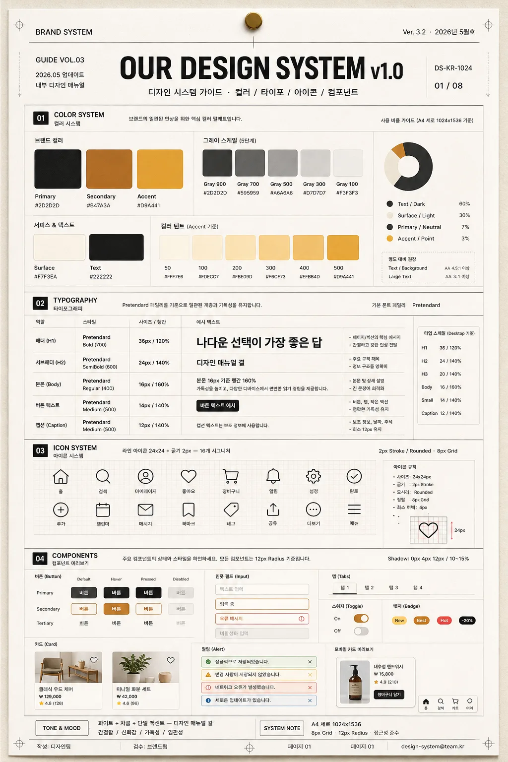
디자인 시스템 한 페이지. 컬러 팔레트·타이포·아이콘·컴포넌트.
디자인 시스템 가이드 (컬러·타이포·아이콘)摘要
這是用來製作資訊圖表/指南內容的 ChatGPT 圖像提示詞,已整理主題、背景、風格與構圖,方便快速調整。
相關關鍵字: 디자인 시스템 가이드 (컬러·타이포·아이콘), 디자인 시스템 가이드 (컬러·타이포·아이콘) 프롬프트, 資訊圖表/指南 프롬프트, 資訊圖表/指南 AI 이미지 프롬프트, ChatGPT 이미지 프롬프트, AI 이미지 생성 프롬프트, AI 프롬프트, 이미지 프롬프트
디자인 시스템 가이드 (컬러·타이포·아이콘)使用方式
保留原始結構並替換主體、背景、色彩或構圖,即可延伸出不同版本。
- 保留核心主體,並依品牌、季節或平台調整色彩與背景。
- 如果畫面太複雜,請減少背景元素並具體描述主體、構圖與光線。
- 複製後可要求 ChatGPT 配合平台、長寬比或文字需求調整。
提示詞原文
[Input]
- language: Korean
- output_size: 1024x1536

[Purpose]
1-2 English lines: a realistic, content-rich design system guide poster for color, typography, icons, tokens, and component previews, formatted like a printed brand manual page pinned inside a creative team documentation wall.
Concrete: portrait A4-style editorial layout for internal design documentation, suitable for slides, PDF cover pages, onboarding packs, or product design team reference sheets, with authentic versioning and spec details.

[Composition]
- Centered title block occupies the top 18% of the page, with {시스템 이름} as the primary hero text and a compact subtitle line beneath it: "디자인 시스템 가이드 · 컬러 / 타이포 / 아이콘 / 컴포넌트".
- Add realistic document metadata around the header: "GUIDE VOL.03", "2026.05 업데이트", "내부 디자인 매뉴얼", small document code "DS-KR-1024", and page marker "01 / 08".
- Main canvas uses a structured editorial grid with visible content density: color section, typography section, icon section, component previews, small token notes, usage callouts, and annotation labels arranged in balanced rows.
- Background treatment is warm off-white paper with subtle fiber grain, faint registration marks, small section tabs, hairline rulers, and printed-manual details that make the page feel physically produced.
- Keep strong alignment and a manual-like hierarchy; labels, captions, token names, and sample UI text must remain legible and evenly spaced.

[3. CORE STRUCTURE]
- Header zone (top 18%): Set {시스템 이름} centered in a bold modern sans-serif title style, with refined manual-like subtitle text below; include small top-left label "BRAND SYSTEM" and top-right metadata "Ver. 3.2 · 2026년 5월호".
- Color section (upper mid 22%): Display {컬러 팔레트} as organized swatches in a neat horizontal/grid arrangement, each chip labeled with Korean token names and HEX-like captions such as "Primary / #C8A76A", "Surface / #F7F3EA", "Text / #222222"; include grayscale steps, accent chips, and a small usage ratio note connected to {비율}.
- Typography section (mid 20%): Present {타이포} as a type scale specimen with hierarchy labels for header, body, caption, and button text; include Korean sample lines: "나다운 선택이 가장 좋은 답", "디자인 매뉴얼 결", "본문 16px 기준 행간 160%" aligned to a visible baseline grid.
- Icon section (lower mid 18%): Show {아이콘 시스템} as a compact icon sheet on a faint 8px grid, with icons for home, search, user, heart, cart, bell, settings, check, plus Korean labels like "홈", "검색", "알림", "설정" and stroke notes "2px Stroke / Rounded".
- Component section (bottom 16%): Lay out {컴포넌트} as miniature UI cards, buttons, chips, tabs, input fields, toggle states, alert banners, and small mobile-card previews; show states labeled "Default", "Hover", "Pressed", "Disabled" with consistent corner radius and subtle shadows.
- Tone strip / footer note (very bottom): Integrate {컬러 톤} and {비율} as a concise system note, visually separated by a thin divider line like a design spec footer; add footer details "작성: 디자인팀", "검수: 브랜드랩", "페이지 01", and tiny contact-style line "design-system@team.kr".

[4. STYLE RULES]
- Typography: Pretendard for all Korean UI text, with title 36px 700, section labels 16px 600, body 16px 400, captions 12px 500; use tight but readable tracking for the header and clean left alignment for explanatory text.
- Color palette: use {컬러 팔레트} as the actual swatch values, plus neutral white, soft warm gray, charcoal, and muted gold accent; include exact color chips, grayscale steps, tint variations, and small token labels in the layout.
- Border/shadow: thin 1px divider lines in muted gray, subtle soft shadow 0px 4px 12px at 10–15% opacity on cards only, precise 8px grid spacing, 12px card radius, and fine annotation arrows.
- Add realistic print/editorial details: small crop marks, micro page numbers, tab labels, token chips, baseline guides, caption boxes, version stamp text, and carefully placed Korean notes without covering the main sections.
- Section labels should appear as clear Korean headings: "01 컬러", "02 타이포", "03 아이콘", "04 컴포넌트", with short helper captions beneath each heading.

[5. VISUAL STYLE]
- Camera / lens: front-facing orthographic graphic design mockup look, equivalent to a 50mm normal-lens product documentation shot, perfectly square-on with no perspective distortion.
- Lighting: even studio softbox lighting from above and slightly left, low contrast, soft natural paper texture visible, clean diffuse surface finish with slight real-print depth on cards and swatches.
- Color grade: neutral white, charcoal, warm beige, and muted gold accent; precise design-manual color management with controlled saturation and realistic ink-on-paper contrast.
- Rendering quality: high-resolution printed editorial artifact, sharp Korean typography, clean vector-like UI elements, subtle tactile paper grain, and well-defined color chips.

[6. MOOD]
Premium design system specification page — feels like a refined Figma brand guideline export mixed with a professional product design manual, realistic team documentation, and a polished Korean brand book reference sheet.

[7. CRITICAL]
- Korean text accuracy: the following Korean strings must appear correctly and legibly in the rendered image: "디자인 시스템 가이드", "컬러", "타이포", "아이콘", "컴포넌트", "디자인 매뉴얼 결", "영문·한글 정확".
- Additional Korean detail text should appear as crisp realistic guide content: "2026년 5월호", "내부 디자인 매뉴얼", "페이지 01 / 08", "작성: 디자인팀", "나다운 선택이 가장 좋은 답", "본문 16px 기준".
- Layout invariants: preserve a clean A4 vertical guide-page structure with a top title block, four organized content sections, rich metadata/footer notes, and readable printed-manual details; all text must be sharp, aligned, and readable.

[8. 🚫 PROHIBITED]
- Fake official seals / certifications
- Broken Korean characters