漫画・イラスト
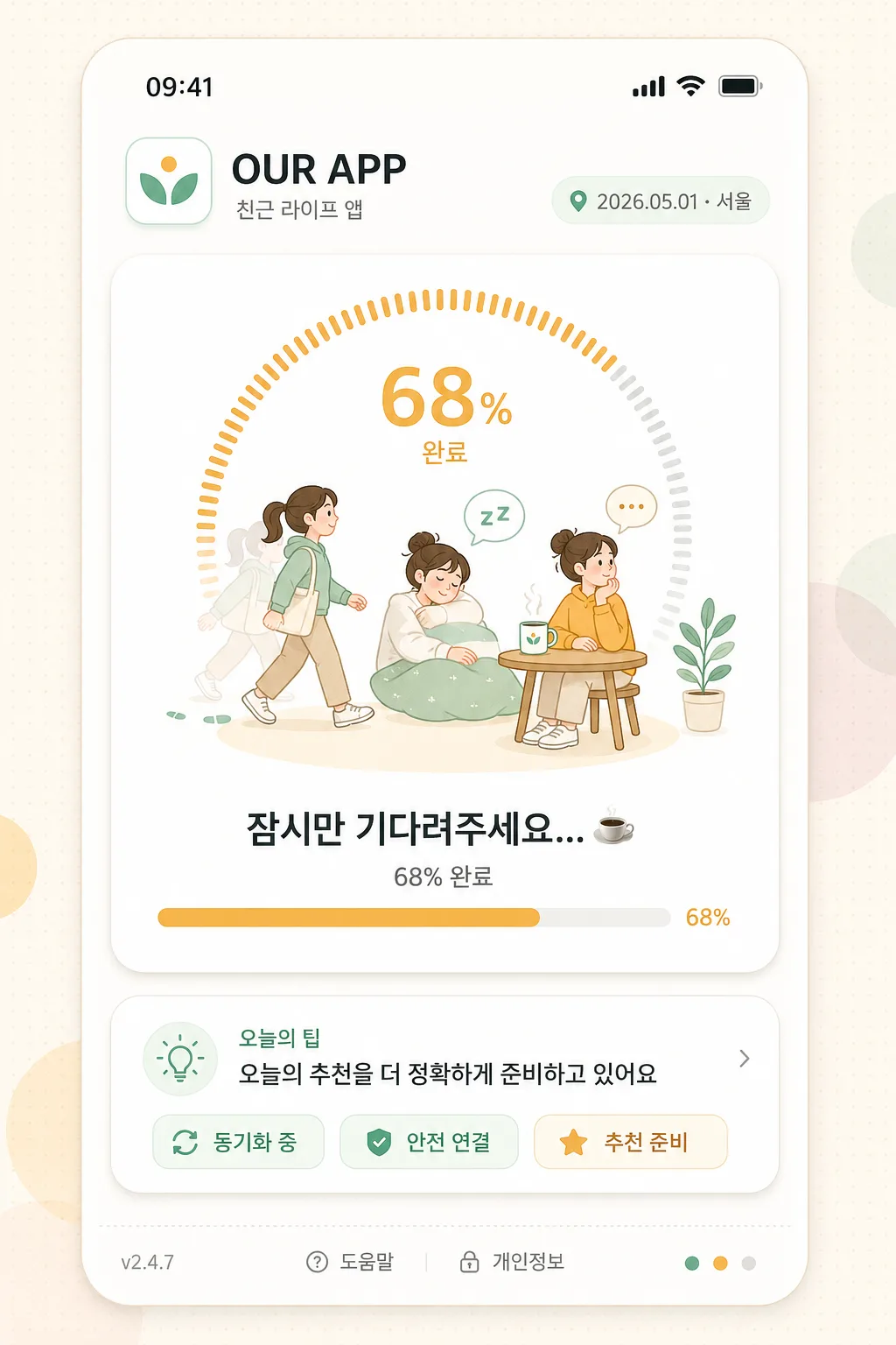
앱 로딩 화면 (애니메이션 정지컷)
앱 로딩 중 화면. 로딩 애니메이션 + 친근 메시지.
앱 로딩 화면 (애니메이션 정지컷)の概要
漫画・イラスト画像を作るためのChatGPT画像プロンプトです。主題、背景、スタイル、構図を整理し、すぐに試せるよう構成しています。
関連キーワード: 앱 로딩 화면 (애니메이션 정지컷), 앱 로딩 화면 (애니메이션 정지컷) 프롬프트, 漫画・イラスト 프롬프트, 漫画・イラスト AI 이미지 프롬프트, ChatGPT 이미지 프롬프트, AI 이미지 생성 프롬프트, AI 프롬프트, 이미지 프롬프트
앱 로딩 화면 (애니메이션 정지컷)の活用方法
元の構造を保ちながら、被写体、背景、色、構図を変更して別案に展開できます。
- 主題を維持し、ブランドや季節、媒体に合わせて色と背景を変更してください。
- 結果が複雑な場合は背景要素を減らし、被写体、構図、照明を具体化してください。
- コピー後、ChatGPTに媒体、アスペクト比、文字の有無を追加で指定できます。
プロンプト原文
[Input]
- language: Korean
- output_size: 1024x1536

[Purpose]
Mobile app loading screen still frame, static UI illustration for an animation stop-frame presentation. Friendly lifestyle app loading visual with realistic product details, app-store preview polish, and frozen micro-animation cues.

[Composition]
- Create a vertical 9:16 mobile loading screen mockup for {앱명}, designed as a believable in-app transition page rather than a blank splash screen.
- Center a rounded mobile UI canvas inside the frame, filling most of the 1024x1536 composition while keeping the status bar, header, loading card, tip module, and footer readable.
- Background should be {배경스타일}, with soft texture, gentle dot rhythm, or faint abstract shapes that support the UI without overpowering the main loading indicator.
- Arrange the hierarchy from top to bottom: phone status bar, app header/logo, main loading animation card, message/progress section, helpful tip card, version/footer microcopy.
- All visible UI copy must be guided by {앱명}, {앱설명}, {로딩장면}, {로딩메시지}, {진행률}, {팁문구}, {날짜위치}, {버전정보}, and {브랜드컬러}.

[3. CORE STRUCTURE]
- Status bar area (top 5%): render a realistic mobile status bar with time “09:41”, cellular/Wi‑Fi/battery icons, and soft screen-safe spacing.
- App header area (top 13%): place a small rounded app icon, {앱명} as the primary app label, and {앱설명} as a compact subtitle; include {날짜위치} as a small pill-shaped context label on the right or beneath the subtitle.
- Main loading card (middle 42%): create a lifted rounded card containing {로딩장면}; show a circular progress ring with segmented amber/brand-color ticks, a friendly character illustration frozen mid-motion, tiny step marks, coffee steam, sleep bubble, or waiting dots that imply animation frames in one still image.
- Message block (lower-middle 16%): set {로딩메시지} clearly under the loading motif, with {진행률} displayed as smaller supporting progress text; include a slim progress bar with softly rounded ends and a small percentage marker.
- Tip module (lower 14%): add a compact informational card labeled “오늘의 팁” containing {팁문구}, plus tiny UI chips such as “동기화 중”, “안전 연결”, or “추천 준비”.
- Footer area (bottom 8%): show {버전정보}, a small “도움말” link, “개인정보” microcopy, and tiny decorative app-style dots/icons aligned with the overall UI system.
- Color system layer: apply {브랜드컬러} to the app icon, progress ring, active chips, and character accents; keep white and warm off-white as the base with amber used for warmth and friendliness.
- Final polish: preserve a stop-frame animation feel through frozen motion ticks, segmented ring accents, small pose ghosts inside the illustration card, and crisp vector-like UI edges.

[4. STYLE RULES]
- Typography: use Pretendard or Noto Sans KR for all UI text, semibold for {앱명} and {로딩메시지}, medium for labels/chips, regular for progress, footer, and helper text; maintain real app-like spacing and baseline alignment.
- Color palette: white #FFFFFF and warm off-white #FFF8EF as the base, warm amber #F4B66A as the accent, soft brand color from {브랜드컬러}, muted gray #6B7280 for secondary text, light gray #EEF2F7 for dividers and inactive progress segments.
- Border/shadow: use subtle 1px soft gray outlines on cards and panels, with a gentle drop shadow of 0px 8px 24px at 12% opacity to lift the main loading card from the screen.
- Rounded geometry: keep cards around 18–28px radius, chips around 999px radius, app icon around 20px radius, with crisp UI edges and tactile product-design depth.
- Include realistic small interface details: tappable-looking chips, tiny icon buttons, micro dividers, progress numerals, and footer links, all visually consistent with a polished Korean lifestyle app.

[5. VISUAL STYLE]
- Camera / lens: front-facing UI mockup look, as if captured with a 50mm standard lens at f/5.6 in a studio product shot, straight-on and distortion-free.
- Lighting: soft diffused studio light from the upper-left with an even fill from the right, producing a clean screen-like glow and gentle card shadows.
- Color grade: bright white with warm amber accents and softened pastel brand tones, maintaining a fresh app-store preview aesthetic with realistic product mockup finish.

[6. MOOD]
Friendly premium lifestyle app loading screen — polished mobile product mockup feel, similar to a clean wellness, habit, or daily-life app onboarding visual with a gentle editorial UI finish and believable in-app microcopy.

[7. CRITICAL]
- Korean text accuracy: the following strings must appear exactly as written when defaults are used: “OUR APP”, “친근 라이프 앱”, “잠시만 기다려주세요... ☕”, “68% 완료”, “오늘의 팁”, “동기화 중”, “안전 연결”, “추천 준비”, “v2.4.7”.
- Render all Korean UI text clearly and neatly, including progress percentage, footer links, date/location label, and chip labels; no broken Korean characters or garbled punctuation.
- The loading motif must read as a still-frame animation stop-capture: circular progress + character illustration + frozen motion cues integrated into one coherent mobile UI.
- Maintain a vertical 9:16 mobile app-screen composition with stable alignment, realistic app interface hierarchy, and readable text at 1024x1536.

[8. 🚫 PROHIBITED]
- Fake official seals / certifications
- Broken Korean characters or garbled UI text
- Celebrity composites or recognizable real-person likenesses
- Sexualized or revealing content