광고/포스터
3D 제품 렌더 (음식·잡화·뷰티)
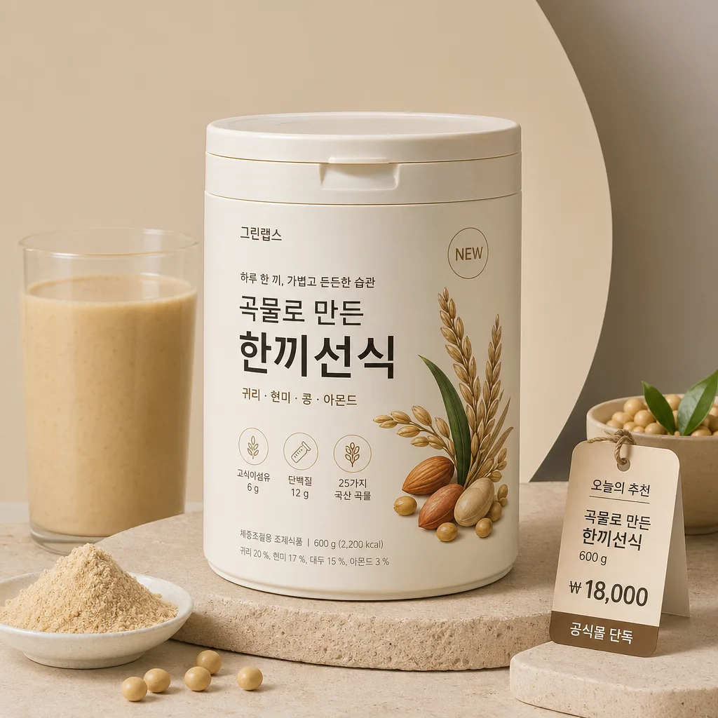
3D 렌더 제품 hero. 미니멀 무드 + 부드러운 그림자.
3D 제품 렌더 (음식·잡화·뷰티) 검색 요약
3D 제품 렌더 (음식·잡화·뷰티)은 광고/포스터 결과물을 만들 때 바로 복사해 활용할 수 있는 ChatGPT 이미지 프롬프트입니다. 주제, 배경, 스타일, 구도 조건을 함께 담아 빠르게 시안을 만들 수 있도록 구성했습니다.
관련 키워드: 3D 제품 렌더 (음식·잡화·뷰티), 3D 제품 렌더 (음식·잡화·뷰티) 프롬프트, 광고/포스터 프롬프트, 광고/포스터 AI 이미지 프롬프트, ChatGPT 이미지 프롬프트, AI 이미지 생성 프롬프트, AI 프롬프트, 이미지 프롬프트
3D 제품 렌더 (음식·잡화·뷰티) 활용 포인트
원본 구조를 유지하면서 피사체, 배경, 색감, 구도를 바꿔 다양한 시안으로 확장할 수 있습니다.
- 핵심 소재는 유지하고 브랜드, 계절, 채널 목적에 맞는 색감과 배경을 바꿔보세요.
- 결과가 산만하면 배경 요소를 줄이고 피사체, 구도, 조명 조건을 구체화하세요.
- 복사한 뒤 ChatGPT에서 플랫폼, 화면 비율, 텍스트 포함 여부를 추가로 요청할 수 있습니다.
프롬프트 원문
[Input]
- language: Korean
- output_size: 1024x1024

[Purpose]
3D product render for food, general goods, or beauty items, built as a square premium magazine-ad composition with a believable studio set. Suitable for ecommerce hero images, social ads, catalog thumbnails, launch teasers, and store-display visuals with rich material detail and realistic commercial styling.

[Composition]
- Center the {제품} as the hero object, occupying about 58–65% of the frame, with enough surrounding context to show a real styled product set rather than a sterile mockup.
- Place the product slightly above exact center so the contact shadow, surface texture, small label card, and supporting elements can sit naturally around the base; keep the main silhouette fully visible and avoid awkward cropping.
- Background uses {배경} with a tactile studio surface such as coated paper, ceramic tile, frosted acrylic, brushed metal, warm stone, linen paper, or a softly curved cyclorama, depending on the product category.
- Build a balanced square layout with the hero product in front, 2–4 small contextual supporting elements around it: ingredient pieces for food, swatches and applicators for beauty, or functional accessories and packaging details for general goods.
- Add commercial packaging realism: readable front label areas, cap seams, folded box edges, embossed logo-like shapes, small stickers, nutrition or usage micro-copy, barcode block, price tag, and batch/date markings where appropriate.
- Apply {비율} as a strict square crop while maintaining a product-first composition with natural editorial depth.

[3. CORE STRUCTURE]
- Hero object layer: {제품} rendered as a crisp 3D object with realistic material response, gentle micro-reflections, clean edge definition, believable thickness, seams, caps, lids, folds, wrappers, transparent plastic, glass, paper, foil, ceramic, or cream textures as appropriate.
- Packaging/detail layer: include small realistic surface details such as a printed label, tiny barcode area, manufacturing/date stamp, dosage/weight line, scent/flavor note, refill mark, Korean product micro-copy, or a small retail price tag. Example Korean text may include: “NEW”, “오늘의 추천”, “₩18,000”, “공식몰 단독”, “50ml”, “120g”, “제조 2026.05”.
- Surface layer: place the product on a physical studio base with visible fine texture, soft dust-free imperfections, a grounded contact shadow, reflected color bounce, and subtle ambient occlusion beneath the product.
- Background layer: build {배경} as an editorial product set with soft gradients, layered panels, fabric folds, tiled seams, curved paper sweep, translucent acrylic riser, small plinth, or category-relevant props that enhance scale and realism.
- Supporting element layer: add natural, non-distracting props that match {제품}: fruit pieces, grains, cocoa, ice, herbs, spoon, cup, tray, cosmetic smear, brush, puff, mirror shard, folded towel, paper insert, ribbon, refill pouch, sample sachet, or small retail tag.
- Lighting layer: shape the object with {조명} so highlights stay dimensional and reveal material texture; preserve readable edges, soft shadows, and realistic reflection behavior.
- Finish layer: apply {결} to keep the overall render looking like a premium magazine product ad with high-end CGI realism, not toy-like plastic.
- Color layer: use {컬러 톤} as the main palette, combining one dominant product hue, one neutral surface tone, and one tasteful accent drawn from the product label, ingredient, or prop.

[4. STYLE RULES]
- Typography: allow small product-label and ad-card typography when it improves realism. Use Pretendard or Helvetica Neue Bold for Korean/English labels, with tiny supporting text in Regular or Medium; keep it sharp, well-spaced, and printed onto packaging, tags, or small cards.
- Suggested Korean text strings for rendered details: “신제품”, “베스트”, “하루 한 번”, “공식몰 단독”, “₩18,000”, “제조 2026.05”, “사용기한 2028.05”, “가볍게, 선명하게”, “오늘의 루틴”. Use only a few, placed naturally.
- Color palette: use the provided {컬러 톤} as the core palette, paired with muted studio neutrals such as #F4F0E8, #E7E1D6, #D9D2C7, #2B2B2B, and one product accent color.
- Border/shadow: avoid a graphic frame; use layered realistic shadows, soft contact shadow with 4px y-offset, 14px blur, about 16% opacity, and faint ambient occlusion around the base, plus natural reflections on glossy or transparent materials.
- Material fidelity: make paper labels slightly fibrous, glass subtly thick at edges, plastic caps lightly satin, metal foils brushed or crinkled, creams and liquids viscous, and food surfaces varied rather than perfectly smooth.

[5. VISUAL STYLE]
- Camera / lens: studio product photography look, like a Phase One IQ4 with an 80mm macro lens at f/8, rendered in Octane / Cinema 4D realism.
- Lighting: soft multi-light studio setup, key light from upper-left at 45°, gentle fill from front-right, and a subtle rim light to separate the product from the background; include realistic bounce light from nearby props and surface color.
- Color grade: premium luxury grading with product signature colors preserved, neutral highlights, slightly warm off-white studio tones, rich but controlled contrast, and tactile texture visibility.

[6. MOOD]
Premium studio product editorial — Apple launch visual meets Daniel Wellington catalog polish, with the tactile richness of a high-end Korean lifestyle magazine product spread.

[7. CRITICAL]
- Korean text accuracy: if Korean text appears on labels, tags, stickers, captions, or price cards, it must be clean and legible, for example “신제품”, “오늘의 추천”, “공식몰 단독”, “₩18,000”, “제조 2026.05”, “50ml”, “120g”.
- Keep the product anatomy faithful to the source category: realistic proportions, clean geometry, correct cap/lid thickness, believable packaging seams, no warped edges, no melted surfaces, and no impossible material behavior.
- Supporting props must match the product category and scale; they should add realism, retail context, and tactile richness while keeping {제품} as the clear hero.
- Preserve the {컬러 톤}, {조명}, {결}, {배경}, and {비율} directives as the dominant art direction.

[8. 🚫 PROHIBITED]
- Fake official seals / certifications
- Broken Korean characters