Photo Edits/Filters
페인팅 질감 사진 변환
본인 사진 → 페인팅 결로 변환. 유화·수채·아니메·인상파.
페인팅 질감 사진 변환 summary
Copy this ChatGPT image prompt to create Photo Edits/Filters results. Its subject, background, style, and composition are organized for quick iteration.
Related keywords: 페인팅 질감 사진 변환, 페인팅 질감 사진 변환 프롬프트, Photo Edits/Filters 프롬프트, Photo Edits/Filters AI 이미지 프롬프트, ChatGPT 이미지 프롬프트, AI 이미지 생성 프롬프트, AI 프롬프트, 이미지 프롬프트
How to use 페인팅 질감 사진 변환
Keep the prompt structure and swap the subject, background, palette, or composition to create new variations.
- Keep the main subject and adjust the palette and background for your brand, season, or channel.
- If the result feels busy, simplify the background and make the subject, composition, and lighting more specific.
- After copying, ask ChatGPT to adapt it for your platform, aspect ratio, or text requirements.
Original prompt
[Input]
- reference_image: {참고 이미지}
- language: Korean
- output_size: 1024x1024

[Purpose]
i2i painting-texture transformation for a portrait photo, preserving the original subject identity while converting the image into a rich painterly illustration.
Square-format image suitable for profile art, poster-style share image, social avatar use, or a small editorial portrait card with subtle Korean metadata.

[Composition]
- Keep the original {참고 이미지} framing, pose, facial angle, and crop ratio as closely as possible, matching {비율}; the subject should occupy roughly 65-75% of the frame with the face as the strongest focal point.
- Preserve the original composition hierarchy: face remains central and recognizable, shoulders and upper torso stay readable, hairstyle silhouette is retained, and the portrait feels naturally derived from the reference image.
- Background should become {배경} with painterly depth, layered color fields, visible canvas or paper texture, soft brush transitions, and atmospheric tonal variation that supports the subject.
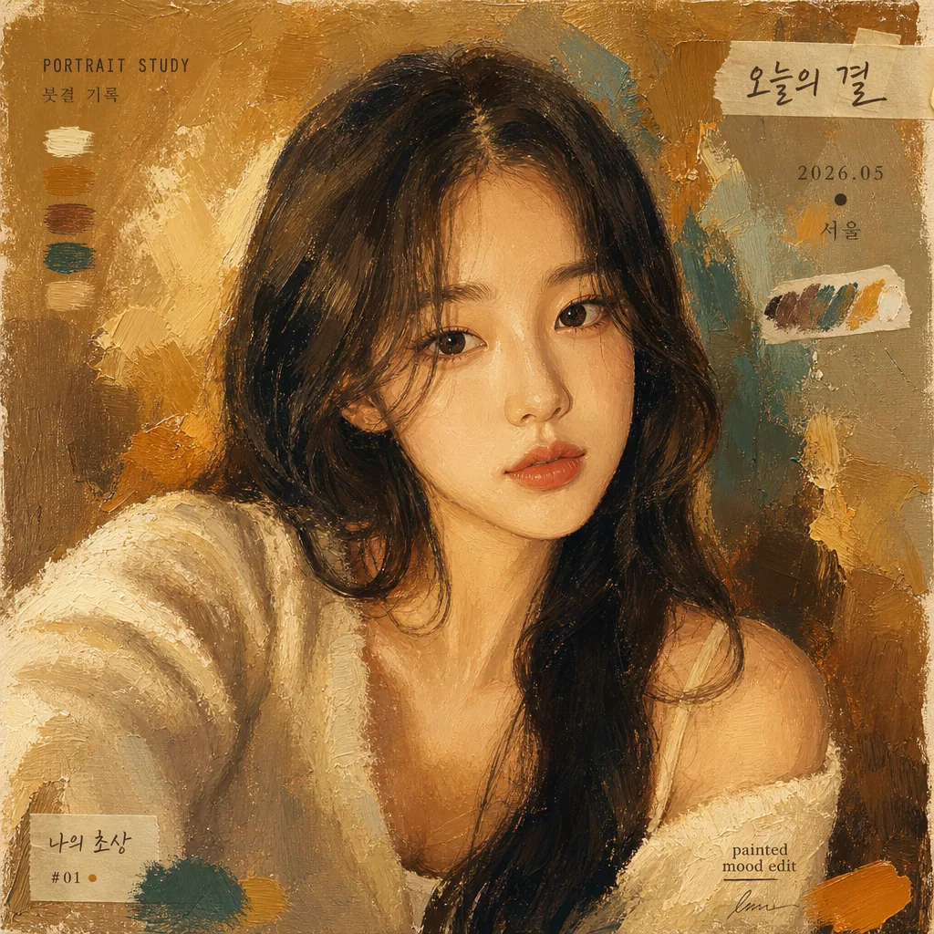
- Add tasteful portrait-card details around the image: a small date/location label such as “2026.05 · 서울”, a short caption such as “오늘의 결”, tiny decorative paint-swatch tags, and subtle sticker-like brush marks placed near corners or edges without covering the face.
- Let the silhouette breathe through tonal contrast and brush-driven edges; contours should feel hand-painted, with expressive transitions rather than sharp cutout lines.

[Core Structure]
- Subject conversion layer: Transform {참고 이미지} into a painted portrait with strong identity retention, keeping eye shape, nose bridge, lip line, hairstyle silhouette, skin tone relationships, and overall facial proportions consistent.
- Painting treatment layer: Apply {페인팅 결} across skin, hair, clothing, and background, using visible paint strokes that follow facial structure, clothing folds, and lighting planes.
- Brush texture layer: Add {브러시 디테일} with layered stroke direction changes, thicker impasto strokes on shadows, hair, and clothing, and finer strokes around eyes, nose, and mouth for legibility.
- Color application layer: Use {컬러 팔레트} as the dominant palette, with warm amber accents balanced by richer midtones, muted shadow browns, creamy highlights, and selective high-chroma strokes that look hand-mixed.
- Background layer: Render {배경} as a painterly field with abstract color blocks, faint canvas weave, translucent glaze marks, dry-brush edges, and small paint flecks that create an authentic art-print surface.
- Editorial detail layer: Include small Korean text elements rendered as part of the artwork, such as “PORTRAIT STUDY”, “2026.05”, “서울”, “붓결 기록”, and a tiny signature-like credit “painted mood edit”; keep them secondary and placed in margins or background areas.
- Final coherence layer: Ensure the entire image looks like one unified painting on textured canvas or fine art paper, not a photo with filters, and keep the original identity unmistakable.

[Style Rules]
- Typography: Use very small, tasteful Korean portrait-card typography only as supporting metadata; examples include “오늘의 결”, “2026.05 · 서울”, “붓결 기록”, or “나의 초상”. Text should be clean, legible, and integrated into the painted layout.
- Color palette: Use the exact mood of {컬러 팔레트}, with oil-paint warmth, amber highlights, muted teal-olive balance, creamy midtones, textured browns, and selective high-chroma accents.
- Surface detail: Emphasize realistic painted material — canvas tooth, layered pigment, palette-knife ridges, soft glazing, dry-brush strokes, and handmade edge variations.
- Frame treatment: A subtle painted paper edge, thin art-print margin, soft vignette, or natural canvas border is allowed if it enhances the finished portrait-card look.
- Decorative accents: Add small paint swatches, brush dabs, corner marks, or sticker-like tags in a restrained way so the portrait feels designed for sharing while still centered on the person.

[Visual Style]
- Camera / lens: Base the transformation on a portrait-photo look equivalent to an 85mm f/1.8 portrait lens, keeping natural facial proportions and soft background separation before the painterly conversion.
- Lighting: Preserve the original light direction implied by {참고 이미지}; translate it into painterly illumination with soft modeled shadows, gentle highlight roll-off, realistic facial plane structure, and expressive brush highlights.
- Color grade: Van Gogh / Monet-inspired painterly grade with warm amber, muted teal-olive balance, textured cream highlights, and hand-painted midtone variation, while keeping the original subject identifiable.
- Material realism: The finished image should feel like a photographed fine-art portrait print with tactile pigment, visible brush pressure, slight canvas grain, and organic color blending.

[Mood]
Painterly portrait conversion with museum-print illustration energy — a refined art-reproduction feel inspired by Van Gogh and Monet reinterpretations, enriched with modern Korean portrait-card details and a warm handmade atmosphere.

[Critical]
- Korean text accuracy: any Korean typography must be correctly rendered and legible, especially short labels like “오늘의 결”, “붓결 기록”, “서울”, and “나의 초상”.
- Preserve the original person’s identity, facial proportions, pose, and composition framing from {참고 이미지}.
- Keep the image as a single coherent painterly portrait; do not change the subject into a different person, gender expression, age group, or facial structure.
- All brushwork must look intentional and textured, with no AI-smooth plastic skin, no photorealistic retouching, and no broken anatomy.
- Decorative typography, paint swatches, and date/location labels must remain secondary and should never obscure the eyes, nose, mouth, or key facial features.

[8. 🚫 PROHIBITED]
- Fake official seals / certifications
- Broken Korean characters / 한글 깨짐
- Celebrity composites or unauthorized public-figure likeness