YouTube/Thumbnails
AI와 실사 분할 비교
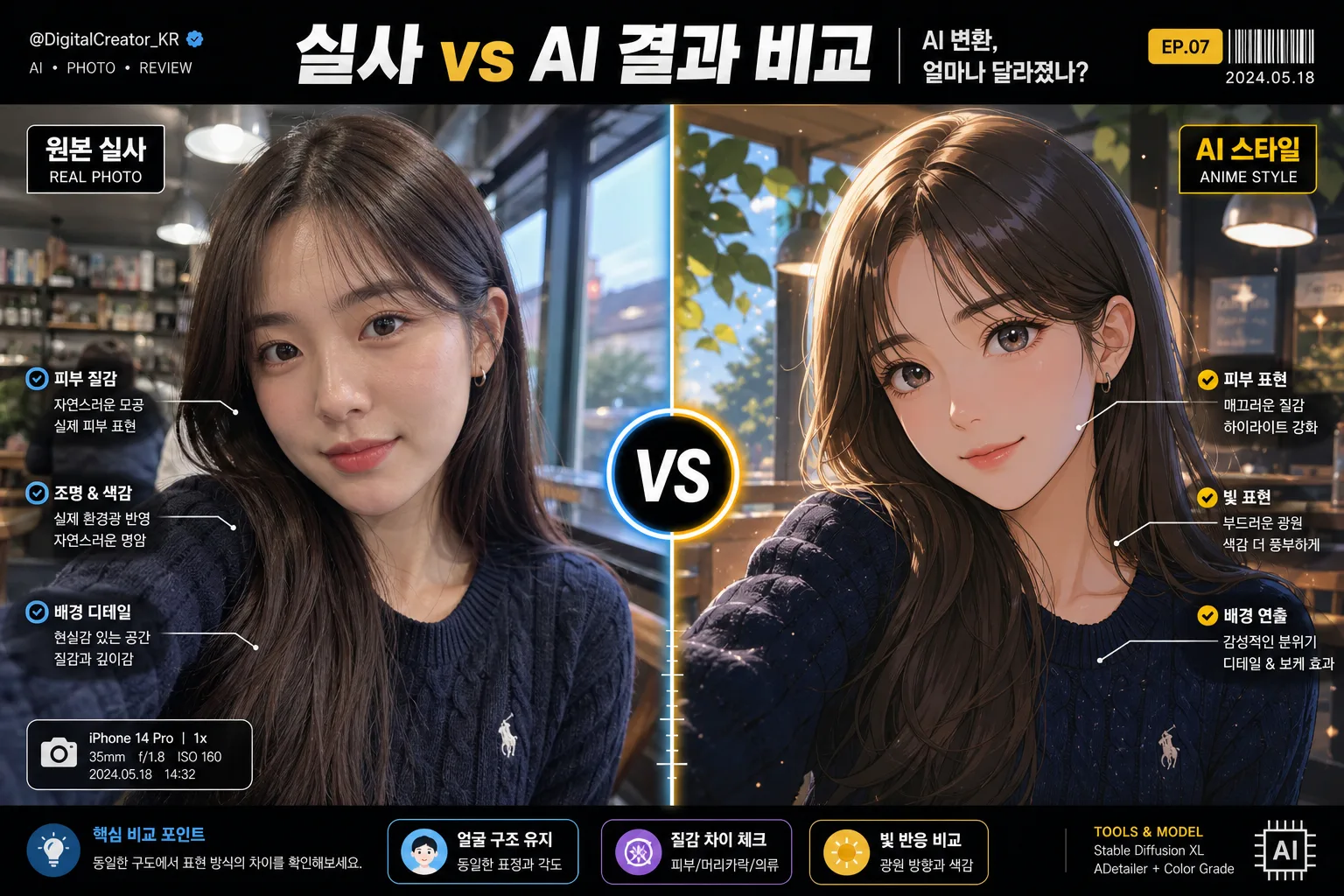
본인 사진 → 좌 실사 / 우 AI 일러 변환 비교.
AI와 실사 분할 비교 summary
Copy this ChatGPT image prompt to create YouTube/Thumbnails results. Its subject, background, style, and composition are organized for quick iteration.
Related keywords: AI와 실사 분할 비교, AI와 실사 분할 비교 프롬프트, YouTube/Thumbnails 프롬프트, YouTube/Thumbnails AI 이미지 프롬프트, ChatGPT 이미지 프롬프트, AI 이미지 생성 프롬프트, AI 프롬프트, 이미지 프롬프트
How to use AI와 실사 분할 비교
Keep the prompt structure and swap the subject, background, palette, or composition to create new variations.
- Keep the main subject and adjust the palette and background for your brand, season, or channel.
- If the result feels busy, simplify the background and make the subject, composition, and lighting more specific.
- After copying, ask ChatGPT to adapt it for your platform, aspect ratio, or text requirements.
Original prompt
[Input]
- reference_image: {참고 이미지}
- language: Korean
- output_size: 1536x1024

[Purpose]
Create a rich side-by-side comparison banner for AI transformation vs. real-photo preservation, designed for social sharing, YouTube-style thumbnail readability, and tech-review editorial appeal.
Clear split-screen composition that instantly shows the same person in two render modes: a faithful real-photo side and an AI-styled side, supported by readable Korean labels, small annotation chips, and realistic media-layout details.

[Composition]
- Main subject: {참고 이미지} kept as the visual anchor across both halves, with identical pose, face angle, eye line, shoulder crop, and framing for direct comparison.
- Layout: {레이아웃} with a hard center divider; maintain a strict 50:50 split while adding headline typography, label chips, small comparison notes, and subtle UI-like measurement markers that reinforce the before/after concept.
- Background treatment: left side uses a natural-real background with believable depth, realistic texture, ambient reflections, and lived-in photographic detail; right side shifts to a stylized AI background that matches {AI 결 스타일}, with comparable depth and lighting logic.
- Comparison texture: emphasize {비교 결} through close facial detail, hair edges, fabric weave, skin texture, highlight rolloff, and AI-rendered finish so the viewer can compare the result immediately.
- Format handling: compose for {비율} inside the 1536x1024 canvas, keeping the subject large enough for thumbnail impact while leaving room for labels, badges, and short Korean feature callouts.
- Color direction: apply {컬러 톤} so the two sides read as a controlled contrast rather than two unrelated images, using one strong accent tone for the center marker and secondary metadata chips.

[Core Structure]
1. Left panel: render {참고 이미지} in a photoreal style with natural skin texture, realistic pores, hair flyaways, fabric detail, and a grounded documentary feel; keep the face faithful and unaltered.
2. Right panel: render the same {참고 이미지} transformed into {AI 결 스타일}, preserving identity, pose, facial structure, gaze direction, and crop while clearly changing the visual rendering language.
3. Center divider: place a bold vertical separator exactly between panels, with a clear circular or hexagonal center badge reading "VS" or "→" aligned to the middle of the frame; add a thin glow or split-color edge to make the division feel intentional.
4. Comparison clarity: keep both sides at the same head size and crop level so the viewer can compare facial structure, lighting, skin finish, hair detail, and background rendering at a glance.
5. Editorial overlay system: add a top headline bar, small handle/date line, left/right panel labels, 2–3 short Korean callout blurbs, and tiny tick marks near the divider like a premium tech review graphic.
6. Realistic production details: include micro text such as a channel handle, episode label, subtle barcode-like decorative block, and small credit text along the bottom edge without covering key facial features.

[Style Rules]
- Typography: use Pretendard SemiBold or Noto Sans KR Bold for major Korean text at 44–64px, with smaller Noto Sans KR Medium micro-labels at 18–28px; prioritize crisp glyph rendering and strong hierarchy.
- Main headline: set a bold Korean title across the top or upper third, such as "AI 변환, 얼마나 달라졌나?" or "실사 vs AI 결과 비교"; keep it short and thumbnail-readable.
- Panel labels: add compact labels near the upper corners, such as "원본 실사" on the left and "AI 스타일" on the right, with small sublabels like "피부결 / 조명 / 배경".
- Feature blurbs: include 2–3 short Korean callouts, for example "얼굴 구조 유지", "질감 차이 체크", "빛 반응 비교"; use small arrows or bracket lines pointing to relevant areas.
- Metadata details: add realistic social-media or review elements such as "EP.07", "2026.05", "@ai.review_lab", "비교샷 저장용", and a small decorative barcode area in the lower corner.
- Color palette: use {컬러 톤} as the governing contrast, with neutral base blacks/whites and one accent tone for the VS marker; keep saturation balanced and controlled.
- Border/shadow: use a subtle 2–4px divider line with a soft 10–12px blur shadow at 15% opacity to separate halves cleanly without looking like a cheap sticker.

[Visual Style]
- Camera / lens: Canon EOS R5 full-frame portrait look with 85mm f/1.8 equivalent, shallow but not extreme depth of field, facial proportions kept natural.
- Lighting: left side should feel like soft window light from upper-left at about 45° with gentle front fill and natural catchlights; right side may echo the same base light but stylized to match the AI finish.
- Color grade: left uses natural skin tones and neutral documentary contrast; right uses the signature stylized palette of {AI 결 스타일}, with controlled separation and no color washout.
- Surface realism: retain visible skin microtexture, believable hair strands, clothing seams, lens softness, and slight photographic falloff on the real side; on the AI side, show the intended stylization while preserving believable facial geometry.
- Graphic finish: polished editorial thumbnail design with layered labels, translucent panels, accent strokes, tiny icons, and subtle grain/noise that make the layout feel produced rather than sterile.

[Mood]
Premium before/after editorial comparison — a high-impact Korean tech review thumbnail with magazine-style clarity, realistic portrait detail, and convincing visual evidence of the transformation.

[Critical]
- Korean text accuracy: render all Korean text crisply and correctly, including labels such as "원본 실사", "AI 스타일", "AI 변환, 얼마나 달라졌나?", "얼굴 구조 유지", "질감 차이 체크", "빛 반응 비교", "EP.07", "2026.05", and "@ai.review_lab".
- The same person must appear on both sides with consistent identity, identical pose, matching crop, same age impression, and comparable facial proportions.
- Keep the composition strictly 50:50 split with a clear center divider and a readable "VS" or "→" center marker.
- Do not beautify the face into an unrelated identity; preserve the source likeness while allowing only the right-side rendering style to change.

[8. 🚫 PROHIBITED]
- Fake official seals / certifications
- Broken Korean characters