SNS/카드뉴스
부동산 신축·구축 비교 카드뉴스
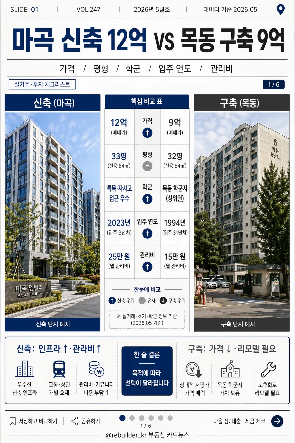
신축 vs 구축 아파트 비교 카드. 가격·단점·장점 표 결.
부동산 신축·구축 비교 카드뉴스 검색 요약
부동산 신축·구축 비교 카드뉴스은 SNS/카드뉴스 결과물을 만들 때 바로 복사해 활용할 수 있는 ChatGPT 이미지 프롬프트입니다. 주제, 배경, 스타일, 구도 조건을 함께 담아 빠르게 시안을 만들 수 있도록 구성했습니다.
관련 키워드: 부동산 신축·구축 비교 카드뉴스, 부동산 신축·구축 비교 카드뉴스 프롬프트, SNS/카드뉴스 프롬프트, SNS/카드뉴스 AI 이미지 프롬프트, ChatGPT 이미지 프롬프트, AI 이미지 생성 프롬프트, AI 프롬프트, 이미지 프롬프트
부동산 신축·구축 비교 카드뉴스 활용 포인트
원본 구조를 유지하면서 피사체, 배경, 색감, 구도를 바꿔 다양한 시안으로 확장할 수 있습니다.
- 핵심 소재는 유지하고 브랜드, 계절, 채널 목적에 맞는 색감과 배경을 바꿔보세요.
- 결과가 산만하면 배경 요소를 줄이고 피사체, 구도, 조명 조건을 구체화하세요.
- 복사한 뒤 ChatGPT에서 플랫폼, 화면 비율, 텍스트 포함 여부를 추가로 요청할 수 있습니다.
프롬프트 원문
[Input]
- language: Korean
- output_size: 1024x1536

[Purpose]
Korean real-estate comparison card news for new-build vs old-building investment and living decision-making.
Realistic editorial infographic with a side-by-side comparison layout, social card-news details, data labels, issue/date metadata, and enough visual context to feel like a published Korean finance-real-estate carousel slide.

[Composition]
- Overall layout: vertical 1024x1536 poster, strict 좌우 분할 composition with a centered comparison table bridging both sides.
- Left side occupies 42% of frame: 신축 visual panel, brighter modern apartment complex photo treatment with glass balcony lines, clean exterior walls, landscaped entrance, street trees, and subtle reflected daylight.
- Right side occupies 42% of frame: 구축 visual panel, more muted older apartment photo treatment with aged concrete texture, older balcony frames, ground-floor parking hints, mature trees, and lived-in neighborhood details.
- Center column occupies 16% of frame: comparison table and key differences stacked vertically, aligned to a strong grid with visible category rows, arrows, and small property-data chips.
- Use {비교 대상}, {비교 항목}, {장단점}, {비주얼}, {컬러}, {발행처}, {비율} placeholders as the exact user-editable content anchors.
- Background should use crisp white and subtle off-white paper texture with faint editorial grid marks, small section labels, a tiny map-pin motif, and light data-card accents that support the comparison theme.
- Spacing must feel like a professional finance/editorial card, with structured columns, clear gutters, readable labels, and a realistic card-news publishing rhythm.

[3. CORE STRUCTURE]
1. Top header area (15%): bold title line introducing 신축 vs 구축 comparison, with {비교 대상} displayed prominently in the main headline zone. Add small metadata above the title: SLIDE 01, VOL.247, 2026년 5월호, 데이터 기준 2026.05.
2. Subheader line (5%): {비교 항목} in smaller but highly legible text, separated by a thin divider rule. Include a small page indicator 1/6 and a compact tag line: 실거주·투자 체크리스트.
3. Main comparison zone (55%): {비주얼} arranged as a left-right split, with the left panel for 신축 and the right panel for 구축, each framed in editorial rectangular photo blocks. Add small captions under each photo panel: 신축 단지 예시 / 구축 단지 예시.
4. Center comparison table (embedded in main zone): a compact data table listing price, area, school district, move-in year, and management fee, with values visually balanced on both sides. Render the Korean row header exactly as 가격 / 평형 / 학군 / 입주 연도 / 관리비, with small arrow badges ↑ ↓ = and navy highlight chips for key differences.
5. Pros/cons strip (12%): {장단점} shown as short contrast bullets, using directional arrows, simple house/coin/wrench/school icons, and a small summary pill: 한 줄 결론. Keep the text concise and editorial.
6. Footer area (8%): {발행처} placed at the bottom in small publisher-credit style, aligned with the grid and separated by a thin line. Add carousel CTA and micro UI details: 저장하고 비교하기, 다음 장: 대출·세금 체크, @rebuilder_kr 부동산 카드뉴스, tiny save/share icons, and a discreet page progress bar.
7. Size reference: {비율} should be respected as the exact poster ratio and used as the rendering target.

[4. STYLE RULES]
- Typography: Pretendard or Noto Sans KR, bold for headline 700-800 weight, body 400-500 weight, title around 54-64px, labels 22-28px, footer 16-18px. Use compact Korean editorial hierarchy with strong headline contrast and precise table numerals.
- Color palette: pure white #FFFFFF, charcoal #222222, navy #1F3C88, cool gray #D9DEE7, light silver #EEF1F5, with {컬러} applied as the accent system for labels, highlights, chips, and divider emphasis.
- Border/shadow: thin 1px charcoal dividers, subtle card shadows with 4px y-offset, 12px blur, 12-15% opacity, clean photo-frame borders, small rounded data chips, and realistic printed-card depth.
- Table styling: clean grid lines, compact spacing, high contrast black text on white, navy accent for comparison highlights, small row icons, and consistent left/right alignment so both 신축 and 구축 remain clearly comparable.

[5. VISUAL STYLE]
- Camera / lens: straight-on graphic poster layout with a subtle 50mm editorial photo look on the building panels, no wide distortion. Building photo panels should feel like real Korean apartment reference photography embedded into a designed card-news layout.
- Lighting: soft overcast daylight style, even exposure across both panels, slight cool highlight on the new-build side and slightly flatter diffuse tone on the old-building side.
- Color grade: corporate real-estate editorial grade, white + charcoal + navy with restrained cool neutrals, realistic concrete and glass texture, readable shadows, and polished finance-magazine finish.

[6. MOOD]
Professional Korean real-estate editorial card-news — like a trusted finance magazine comparison spread with newsroom clarity, real apartment context, practical data cues, and shareable Instagram carousel energy.

[7. CRITICAL]
- Korean text accuracy: 반드시 정확히 보여야 하는 문자열: 신축, 구축, 가격 / 평형 / 학군 / 입주 연도 / 관리비, 신축: 인프라 ↑·관리비 ↑ / 구축: 가격 ↓·리모델 필요, @rebuilder_kr 부동산 카드뉴스.
- Additional Korean card-news text must be clean and readable: VOL.247, 2026년 5월호, 데이터 기준 2026.05, 실거주·투자 체크리스트, 저장하고 비교하기, 다음 장: 대출·세금 체크, 1/6.
- Layout invariants: strict 좌우 분할, centered comparison table, readable hierarchy, no merged columns, no swapped labels, 신축 always on the left and 구축 always on the right.
- All text must be clean Korean with no broken characters or random symbols.

[8. 🚫 PROHIBITED]
- Fake official seals / certifications
- Broken Korean characters
- Celebrity composites / unauthorized likeness