インフォグラフィック・案内
홈오피스·재택근무 인테리어
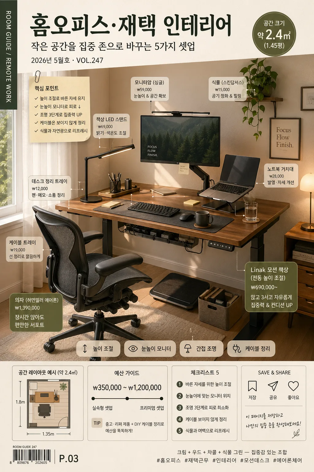
홈오피스 인테리어 카드. 책상·의자·조명·식물.
홈오피스·재택근무 인테리어の概要
インフォグラフィック・案内画像を作るためのChatGPT画像プロンプトです。主題、背景、スタイル、構図を整理し、すぐに試せるよう構成しています。
関連キーワード: 홈오피스·재택근무 인테리어, 홈오피스·재택근무 인테리어 프롬프트, インフォグラフィック・案内 프롬프트, インフォグラフィック・案内 AI 이미지 프롬프트, ChatGPT 이미지 프롬프트, AI 이미지 생성 프롬프트, AI 프롬프트, 이미지 프롬프트
홈오피스·재택근무 인테리어の活用方法
元の構造を保ちながら、被写体、背景、色、構図を変更して別案に展開できます。
- 主題を維持し、ブランドや季節、媒体に合わせて色と背景を変更してください。
- 結果が複雑な場合は背景要素を減らし、被写体、構図、照明を具体化してください。
- コピー後、ChatGPTに媒体、アスペクト比、文字の有無を追加で指定できます。
プロンプト原文
[Input]
- language: Korean
- output_size: 1024x1536

[Purpose]
Korean home office / remote-work interior inspiration poster, vertical editorial layout for social media. Focus on a realistic desk vignette hero with compact furniture labeling, practical setup notes, budget hints, and magazine-style interior guide details for a save-worthy reference image.

[Composition]
- Main scene: a home-office corner composition with a desk hero taking about 62% of the frame height, surrounded by readable editorial text blocks, item callouts, small price tags, and a bottom checklist strip.
- Space treatment: {공간} is staged as a lived-in but polished interior nook with matte painted wall, subtle floor texture, baseboard detail, cable tray, a nearby window edge or curtain, and realistic corner perspective.
- Key objects: {필수아이템} arranged as functional essentials on and around the desk, including small everyday details such as a notebook, charging cable, mug, keyboard, mouse pad, pen tray, sticky notes, and one personal decor item.
- Furniture emphasis: {추천가구} should appear as the main practical upgrade elements, positioned so the viewer can compare ergonomic desk height, chair support, monitor placement, and storage efficiency at a glance.
- Lighting setup: {조명} should be represented as layered workspace lighting with believable daylight, task light, warm accent glow, and visible light direction on the wall, desktop, and chair.
- Color direction: {컬러} should dominate room surfaces, furniture finishes, textile accessories, plant leaves, cable color, and small stationery accents.
- Visual framing: {비주얼} with small Korean furniture labels placed near key objects, plus a title header, date stamp, room-size badge, budget note, and mini floor-plan icon integrated into the poster.

[3. CORE STRUCTURE]
1. Header editorial zone: at the top, place the main Korean title “{포스터제목}”, subtitle “{부제}”, and issue/date line “{발행정보}” in a clean magazine-poster style; include a small vertical spine credit on the left edge reading “ROOM GUIDE / REMOTE WORK”.
2. Background and room base: build a realistic interior backdrop using {공간} with matte wall, baseboard, subtle floor grain, curtain or window-edge highlight, and gentle shadows that show real scale.
3. Desk hero zone: place a compact or medium desk in the lower-middle area, styled with {필수아이템}; the working surface should look usable and inhabited, with tidy stationery, device cables, a water glass or mug, and a small paper note.
4. Furniture highlight zone: feature {추천가구} as the most prominent upgrade items; show the chair angled slightly toward the desk, motion desk legs visible, monitor arm joint clear, and a small under-desk cable tray or footrest.
5. Lighting layer: render {조명} as a believable combination of side daylight, desk task light, and ambient lamp glow; add soft contact shadows below monitor, keyboard, chair wheels, plant pot, and storage items.
6. Color and material pass: apply {컬러} across wall tone, wood grain, desktop, chair mesh or fabric, plant leaves, lamp finish, organizer trays, and small accessories; finishes should feel tactile, matte, and residential.
7. Label and info treatment: integrate {비주얼} with neat Korean callout labels near desk, chair, monitor arm, lamp, plant, cable tray, and storage box; add small pill-shaped tags such as “높이 조절”, “눈높이 모니터”, “간접 조명”, “케이블 정리”.
8. Practical poster details: add a bottom information strip containing “공간 크기 {공간크기}”, “예산 {예산}”, “체크리스트 5”, and a save/share icon row; include a tiny barcode-like catalog mark and page number “P.03” as editorial decoration.
9. Final crop logic: keep the vertical 1024x1536 composition grounded with the desk and chair occupying the main visual weight, while text badges and callouts wrap naturally around the furniture without hiding key objects.

[4. STYLE RULES]
- Typography: Pretendard and Noto Sans KR, medium to semi-bold weight, high Korean readability for title, labels, captions, and small guide text.
- Color palette: cream, wood brown, charcoal, plant green, soft gray, muted black, and one small accent color from {강조색}; align with {컬러} and keep the palette warm and editorial.
- Poster graphics: use thin dividers, rounded label pills, small numbered dots, transparent overlay cards, barcode-style catalog mark, and tiny save/share micro icons suitable for Korean social media interior content.
- Shadows and depth: very subtle soft drop shadows under desk objects and furniture, 4px y-offset, 12px blur, 15% opacity; use natural contact shadows and ambient occlusion for realism.
- Text hierarchy: title largest, subtitle second, callouts medium, checklist and metadata small but legible; Korean spacing and punctuation must be clean.

[5. VISUAL STYLE]
- Camera / lens: 35mm full-frame interior photo look, f/5.6, straight-on three-quarter room view with moderate depth and crisp furniture edges.
- Lighting: soft daylight from a side window at upper-left, supplemented by a desk LED from front-right and a warm ambient lamp near the back, with realistic shadow falloff.
- Color grade: creamy neutral base with warm wood, charcoal accents, and fresh green plant notes, similar to a premium Scandinavian workspace editorial.
- Rendering detail: realistic fabric/mesh chair texture, fine wood grain, matte wall surface, ceramic mug, paper fibers on notes, soft plant leaf variation, small cable shadows, and believable scale between monitor, chair, and desk.

[6. MOOD]
Premium home-office editorial — a calm Scandinavian apartment feature with the practical clarity of an IKEA catalog spread, the tactile warmth of a lived-in Seoul apartment, and the polished restraint of Kinfolk styling.

[7. CRITICAL]
- Korean text accuracy: 반드시 아래 한국어 문자열이 정확히 보여야 함: “홈오피스·재택 인테리어”.
- Render these Korean poster elements clearly: “{부제}”, “{발행정보}”, “공간 크기 {공간크기}”, “예산 {예산}”, “체크리스트 5”, “높이 조절”, “눈높이 모니터”, “간접 조명”, “케이블 정리”, “P.03”.
- Layout invariant: desk hero, chair, monitor arm, light, and plant must all read as a coherent work zone, with realistic interior scale and no distorted furniture proportions.
- Text rendering: all Korean labels must be clean, legible, correctly spaced, and placed as part of the designed poster rather than floating randomly.

[8. 🚫 PROHIBITED]
- Fake official seals / certifications
- Broken Korean characters
- Celebrity composites or unauthorized public-figure likeness mashups