社群/圖卡
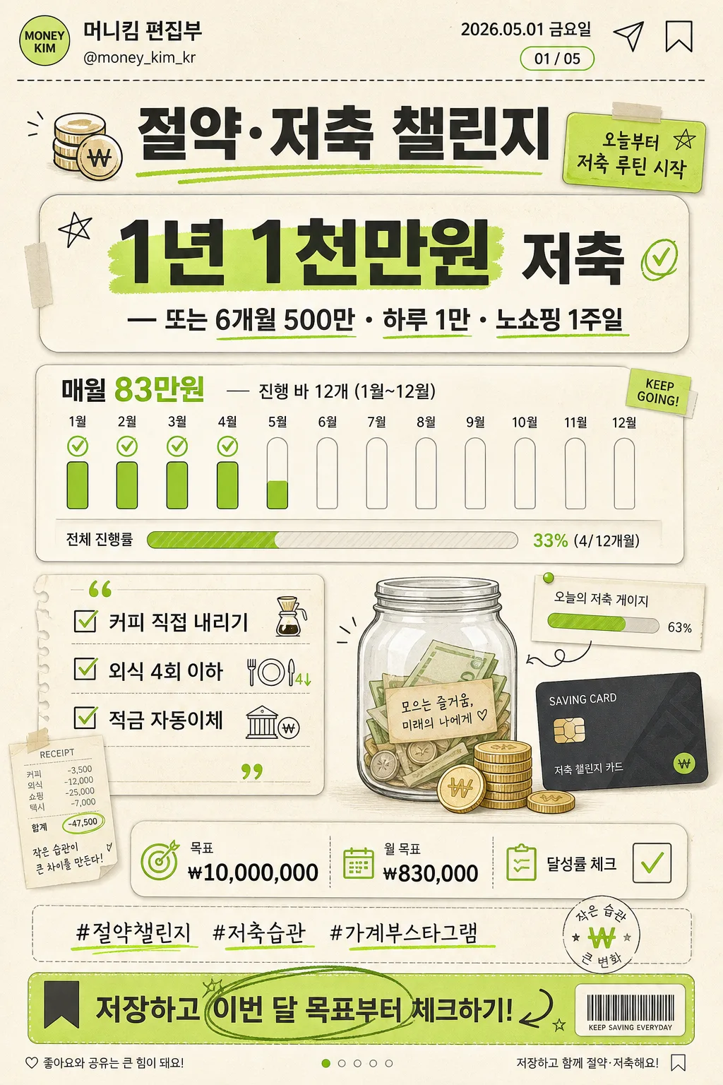
절약·저축 챌린지 카드 (1년 1천만원)
절약 챌린지 카드. 월별 목표 + 팁.
절약·저축 챌린지 카드 (1년 1천만원)摘要
這是用來製作社群/圖卡內容的 ChatGPT 圖像提示詞,已整理主題、背景、風格與構圖,方便快速調整。
相關關鍵字: 절약·저축 챌린지 카드 (1년 1천만원), 절약·저축 챌린지 카드 (1년 1천만원) 프롬프트, 社群/圖卡 프롬프트, 社群/圖卡 AI 이미지 프롬프트, ChatGPT 이미지 프롬프트, AI 이미지 생성 프롬프트, AI 프롬프트, 이미지 프롬프트
절약·저축 챌린지 카드 (1년 1천만원)使用方式
保留原始結構並替換主體、背景、色彩或構圖,即可延伸出不同版本。
- 保留核心主體,並依品牌、季節或平台調整色彩與背景。
- 如果畫面太複雜,請減少背景元素並具體描述主體、構圖與光線。
- 複製後可要求 ChatGPT 配合平台、長寬比或文字需求調整。
提示詞原文
[Input]
- language: Korean
- output_size: 1024x1536

[Purpose]
Korean savings challenge card, vertical social-post infographic for personal finance motivation, habit tracking, and card-news style sharing.
Clean MZ-style editorial finance poster that communicates a yearly savings goal, monthly target, realistic saving tips, and social-card CTA at a glance.

[Composition]
- Center the main hero infographic on a tall 1024x1536 canvas, with a compact social header at the top, the title block occupying the upper 16%, and the savings tracker content filling the middle body.
- Use a cream paper-like background with visible soft grain, faint ledger lines, tiny receipt textures, charcoal text, and lime green accent shapes based on {컬러}.
- Build the layout as a layered personal-finance planner page: title, challenge statement, progress tracker, checklist tips, jar-and-coin illustration, and social footer each have their own card panel, sticker tab, divider, or label.
- {챌린지}, {월별 목표}, {팁}, {비주얼}, {저축현황}, {미션태그}, {해시태그}, and {CTA} should be arranged as distinct infographic sections with varied typography scale and realistic editorial hierarchy.
- Add small Instagram-card details: handle line, date label, save/share micro icons, slide indicator, and a light decorative tracker sticker to make the post feel published rather than blank.

[3. CORE STRUCTURE]
1. Social header strip: place {발행처} on the left, {발행일} on the right, with tiny save/share/bookmark micro icons and the page label {카드번호} in a small rounded pill.
2. Top title band: place the title “절약·저축 챌린지” in a bold Korean display style, centered or slightly left-aligned, with a lime green underline, a small coin doodle, and a soft sticker tab reading {미션태그}.
3. Main challenge block: present {챌린지} as the biggest text element inside a rounded card or label shape; emphasize “1년 1천만원” using lime highlight marker strokes and charcoal shadow text.
4. Monthly target block: show {월별 목표} as a compact 12-month progress tracker with 12 bars or dots labeled 1월~12월, including small check marks for completed months and a slim total-progress bar.
5. Tips block: set {팁} inside a quote-style checklist panel with three checkboxes, small separators, and tiny receipt-like icons; make each tip look like a practical habit memo.
6. Visual motif area: integrate {비주얼} as flat finance illustrations — a transparent money jar with bills, stacked coins, a debit-card-shaped tracker, a mini receipt, and a lime progress gauge — arranged around the text while keeping readability high.
7. Status and CTA footer: place {저축현황} as a small stat row, {해시태그} as hashtag-style text, and {CTA} as a bold end-card prompt near the bottom; include a thin divider, page indicator, and tiny decorative barcode-like tracker mark that is clearly graphic, not official.

[4. STYLE RULES]
- Typography: use Pretendard or Noto Sans KR for the main body, with bold 700–800 weight for headings and medium 500 for supporting text; title size should feel like a card-news cover masthead, body text compact but readable.
- Color palette: cream #F4F0E6, charcoal #2B2B2B, lime green #B8E35A, warm off-white #FFF9EA, coin beige #D8C58A, and soft gray support tones taken from {컬러}.
- Border/shadow: rounded card edges with soft drop shadow around 4px y-offset, 12px blur, 14% opacity; paper panels may include faint folds, taped corners, dotted dividers, and marker highlights.
- Graphic details: use line icons, sticker labels, checkboxes, progress bars, hand-drawn arrows, tiny won-symbol marks, and subtle receipt/ledger textures to create a believable personal-finance planner aesthetic.
- Keep the hierarchy mobile-readable: title and challenge phrase first, monthly tracker second, tips third, footer CTA last.

[5. VISUAL STYLE]
- Camera / lens: top-down flat-layout poster look, like a carefully designed editorial infographic photographed with a 50mm lens at f/8, even perspective, no distortion.
- Lighting: soft studio light from upper-left with gentle fill from right, low contrast, matte surface response, no harsh specular shine.
- Color grade: cream + charcoal base with lime green accents, slightly desaturated and clean, similar to a modern productivity planner and Korean finance card-news aesthetic.

[6. MOOD]
Modern Korean personal-finance editorial — a practical savings planner meets friendly Instagram card news, optimistic, organized, and habit-building.

[7. CRITICAL]
- Korean text accuracy: 반드시 정확히 표시할 문자열 — “절약·저축 챌린지”, “{챌린지}”, “{월별 목표}”, “{팁}”, “{저축현황}”, “{미션태그}”, “{해시태그}”, “{CTA}”, “{발행처}”, “{발행일}”, “{카드번호}”.
- All Korean characters, numbers, won symbols, month labels “1월~12월”, hashtags, and handle text must be rendered cleanly and sharply, with no broken glyphs or spacing errors.
- Keep the layout strictly vertical and infographic-like, with the challenge block, 12-month progress tracker, tips checklist, visual jar motif, and social footer visible in one frame.
- Micro icons for 저장, 공유, 북마크 should remain small decorative UI marks and must not cover the finance text.

[8. 🚫 PROHIBITED]
- Fake official seals / certifications
- Broken Korean characters
- Celebrity composites or recognizable public figures
- Misleading bank, government, or legal guarantee marks