Social/Card News
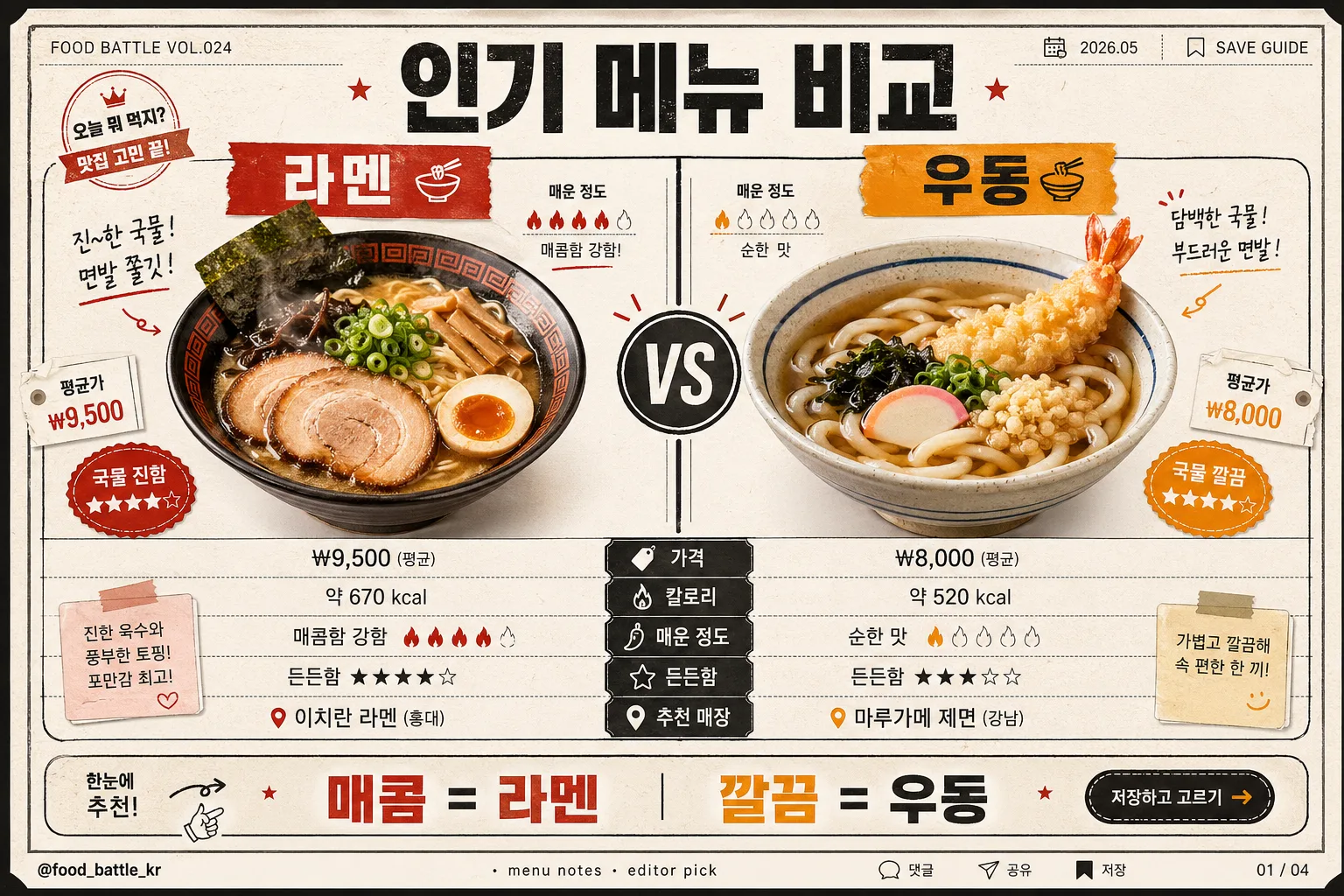
인기 메뉴 비교 카드 (라멘 vs 우동·치킨 vs 피자)
인기 메뉴 비교 카드. 두 메뉴 대결 + 가격·맛.
인기 메뉴 비교 카드 (라멘 vs 우동·치킨 vs 피자) summary
Copy this ChatGPT image prompt to create Social/Card News results. Its subject, background, style, and composition are organized for quick iteration.
Related keywords: 인기 메뉴 비교 카드 (라멘 vs 우동·치킨 vs 피자), 인기 메뉴 비교 카드 (라멘 vs 우동·치킨 vs 피자) 프롬프트, Social/Card News 프롬프트, Social/Card News AI 이미지 프롬프트, ChatGPT 이미지 프롬프트, AI 이미지 생성 프롬프트, AI 프롬프트, 이미지 프롬프트
How to use 인기 메뉴 비교 카드 (라멘 vs 우동·치킨 vs 피자)
Keep the prompt structure and swap the subject, background, palette, or composition to create new variations.
- Keep the main subject and adjust the palette and background for your brand, season, or channel.
- If the result feels busy, simplify the background and make the subject, composition, and lighting more specific.
- After copying, ask ChatGPT to adapt it for your platform, aspect ratio, or text requirements.
Original prompt
[Input]
- language: Korean
- output_size: 1536x1024

[Purpose]
Korean social-media comparison card for popular menu battles, designed as a rich split-screen infographic post with realistic food-magazine details.
Single-slide food matchup layout that reads instantly on mobile and feels like a shareable snackable recommendation card, complete with slide metadata, quick stats, micro icons, and a practical takeaway.

[Composition]
- Use {비교 메뉴} as the main matchup subject, centered across a strong left-vs-right split with a bold vertical divider and a clear “vs” anchor in the middle.
- Keep the upper title zone compact but information-rich, the middle comparison zone dominant, and the bottom recommendation zone as a practical conclusion strip.
- Background should be an off-white paper-card base with subtle grain, faint receipt-like ruling, charcoal framing lines, and food-signature accent colors from {컬러}.
- Fill each menu side with realistic editorial details: illustrated or cutout-style food hero visuals from {비주얼}, small price-tag labels, heat/portion icons, short taste notes, and tiny checklist marks that naturally belong on a food comparison post.
- Place {발행처} as a small social handle footer, aligned to one corner with tiny save/share/comment micro icons and a page indicator.
- Compose for {비율}, keeping the left and right halves balanced while allowing small decorative stickers, dotted dividers, and tab labels to enrich the card.

[3. CORE STRUCTURE]
1. Header area (top 14%): set a bold Korean title reading “인기 메뉴 비교” in a modern infographic style, centered and slightly condensed, with strong visual hierarchy. Add small metadata near the title such as “FOOD BATTLE VOL.024”, “2026.05”, and “SAVE GUIDE” in tiny type.
2. Main comparison strip (middle 52%): split the canvas into left and right menu columns using {비주얼}; each side should hold one realistic menu hero block with garnish details, small steam or crunch accent marks, a menu-name tab, and a clear “vs” mark at center inside a circular badge.
3. Comparison rows (middle-lower 24%): list {비교 항목} as stacked comparison labels, aligned evenly across both sides like a scorecard. Add short Korean micro-values under each side, such as “₩9,500”, “진한 국물”, “든든함 ★★★★☆”, “혼밥 추천”, while preserving readability.
4. Recommendation band (bottom 10%): place {추천} as a concise takeaway line inside a boxed strip, using a bolder accent color for emphasis. Include a tiny CTA chip such as “저장하고 고르기” and a small arrow marker.
5. Publisher/footer (bottom corner): place {발행처} in small type, balanced with a page indicator like “01 / 04”, tiny bookmark/share icons, and a thin credit line reading “menu notes · editor pick”.

[4. STYLE RULES]
- Typography: Pretendard or Noto Sans KR for all Korean text; title in Bold 44–56px, labels in Medium 22–28px, footer in Regular 14–16px, with tiny metadata and caption text in 10–13px.
- Color palette: use {컬러} as the core palette, interpreted as food-signature accent colors plus off-white and charcoal; keep divider and primary text in deep charcoal, with warm reds, oranges, yellows, or browns applied to badges, tabs, underlines, and icon chips.
- Border/shadow: thin 1.5px charcoal rules, subtle card shadow 4px y-offset, 12px blur, 14% opacity; use matte ink texture, dotted separators, receipt-ticket corners, and small sticker-like highlights.
- Add realistic infographic density: compact nutrition-style chips, price labels, star ratings, mini arrows, and tiny caption boxes, while preserving a clear left-vs-right reading order.

[5. VISUAL STYLE]
- Camera / lens: editorial flat infographic look, simulated top-down 35mm product layout, inspired by clean magazine comparison cards and Korean food-guide posts rather than a photographic table scene.
- Lighting: even studio-style illumination with soft diffused light, crisp edge contrast, and gentle paper texture visibility for maximum readability.
- Color grade: white / charcoal base with accent pops pulled from food-specific reds, oranges, yellows, or browns; maintain high contrast and controlled saturation so food visuals and text remain sharp.
- Rendering: realistic printed social-card aesthetic with tactile paper grain, ink-like dividers, subtle shadowed stickers, and clear food cutouts or illustrations that match {비주얼}.

[6. MOOD]
Competitive, helpful, and appetizing — a Korea-localized menu battle card with the crisp clarity of a modern lifestyle magazine comparison spread and the practical detail of a saved Instagram food guide.

[7. CRITICAL]
- Korean text accuracy: the following strings must appear exactly as written: “인기 메뉴 비교”, “가격 / 칼로리 / 매운 정도 / 추천 매장”, “매콤 = 라멘 / 깔끔 = 우동”, “@food_battle_kr”.
- Also include realistic small Korean labels such as “FOOD BATTLE VOL.024”, “2026.05”, “01 / 04”, “저장하고 고르기”, and “오늘의 선택 가이드” without overwhelming the core comparison.
- Layout invariant: the composition must remain a left-vs-right split comparison card with a centered “vs” marker and a compact footer handle.
- All Korean text must render cleanly with no broken characters, no garbling, and no extra copy-heavy slogans.

[8. 🚫 PROHIBITED]
- Fake official seals / certifications
- Broken Korean characters