Infographics/Guides
스포츠 결과 인포그래픽
스포츠 결과 인포 카드. 점수·MVP·통계.
스포츠 결과 인포그래픽 summary
Copy this ChatGPT image prompt to create Infographics/Guides results. Its subject, background, style, and composition are organized for quick iteration.
Related keywords: 스포츠 결과 인포그래픽, 스포츠 결과 인포그래픽 프롬프트, Infographics/Guides 프롬프트, Infographics/Guides AI 이미지 프롬프트, ChatGPT 이미지 프롬프트, AI 이미지 생성 프롬프트, AI 프롬프트, 이미지 프롬프트
How to use 스포츠 결과 인포그래픽
Keep the prompt structure and swap the subject, background, palette, or composition to create new variations.
- Keep the main subject and adjust the palette and background for your brand, season, or channel.
- If the result feels busy, simplify the background and make the subject, composition, and lighting more specific.
- After copying, ask ChatGPT to adapt it for your platform, aspect ratio, or text requirements.
Original prompt
[Input]
- language: Korean
- output_size: 1024x1536

[Purpose]
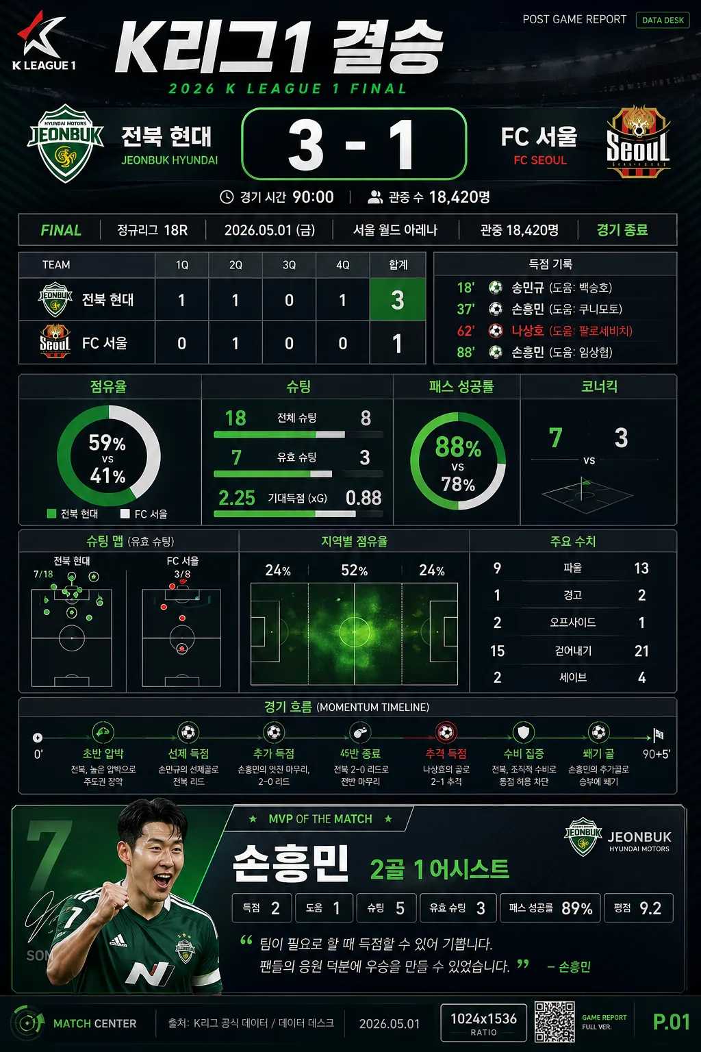
Sports results infographic poster for a vertical mobile-ready layout, designed to summarize a single match or season result with clear hierarchy, realistic broadcast-data density, and quick scan readability.
Editorial scoreboard-style sports recap graphic with a top headline, central stat chart dashboard, bottom MVP highlight, match metadata, ranking notes, and small newsroom-style labels.

[Composition]
- Vertical poster with the main result block occupying the top 28% of the frame, the statistics dashboard centered in the middle 42%, and the MVP module anchored in the bottom 20%, plus a slim footer strip for source/date/page details.
- Background treatment: deep dark base with subtle arena-light texture, faint diagonal motion streaks, low-opacity field/court line geometry, and layered gradient panels using {컬러} as the dominant palette language with crisp white text areas and green accent chart elements.
- Use a strong editorial grid with dense but readable sports-broadcast modules: top league label, score capsule, quarter/inning/set breakdown strip, central comparison bars, small sparkline chart, timeline markers, and bottom player-card styling.
- Place {비주얼} as the structural blueprint for the layout, but make it look like a polished post-game broadcast graphic captured from a major sports newsroom package rather than a simple flat mockup.
- Add realistic data-publishing details: “POST GAME REPORT”, “DATA DESK”, “MATCH CENTER”, page number “P.01”, date label “2026.05.01”, and a small QR/barcode-style information block in the lower corner.

[3. CORE STRUCTURE]
1. Top headline band: display {경기·종목} as the primary title, large and bold, spanning nearly the full width; place {주요 결과} directly beneath it in a prominent scoreboard line, with the main score number visually emphasized in a thick outlined score capsule.
2. Result metadata row: include compact Korean labels such as “FINAL”, “정규리그 18R”, “2026.05.01”, “서울 월드 아레나”, “관중 18,420명”, and “경기 종료” arranged like a broadcast lower-third.
3. Period-by-period strip: add a small table for “1Q / 2Q / 3Q / 4Q / 합계” or an equivalent sport-appropriate breakdown, with believable numeric cells and a highlighted final total.
4. Central stats section: render {통계} as a compact set of infographic charts, horizontal comparison bars, donut percentage indicator, shot-map or possession heat strip, and small KPI tiles; use thin dividers, small Korean labels, numeric callouts, and accent green chart highlights.
5. Momentum timeline: add a mid-lower mini timeline with dots and short Korean captions such as “초반 압박”, “역전 득점”, “수비 집중”, “결정적 장면”, keeping it aligned with the core statistics dashboard.
6. MVP highlight block: show {MVP} in a dedicated lower panel with stronger contrast, making the player name and contribution the focal point; include a jersey-number badge, “MVP OF THE MATCH”, stat chips such as “득점”, “도움”, “리바운드/세이브/공격포인트”, and a short quote-style Korean caption.
7. Visual hierarchy support: keep {비주얼} consistent with a scoreboard infographic, ensuring the top result, middle charts, and lower MVP all read in one glance while adding believable sports-media details.
8. Composition finish: use {컬러} to separate sections with accents, team-tone blocks, chart highlights, and small broadcast UI frames; include a small “{비율}” ratio badge in the footer as a production-spec label.

[4. STYLE RULES]
- Typography: use Pretendard or Noto Sans KR for all Korean text, with heavy weight for the main score and medium weight for labels; headline size should feel like 72–96px on a 1024x1536 canvas, stat labels around 24–30px, and micro-labels around 14–18px but still legible.
- Color palette: apply team signature tones from {컬러} with dark charcoal or navy base, white text, green accent highlights, and small red/yellow situational markers for momentum or key events; include precise contrast blocks for readability.
- Border/shadow: use thin 1px divider lines, scoreboard-style panel frames, subtle inner glows, transparent glassmorphism overlays, and a soft drop shadow at 4px y-offset, 12px blur, 15% opacity for elevated panels.
- Graphic details: include realistic sports-data UI elements such as percentage rings, segmented bars, possession arrows, tiny icons for score/assist/foul/time, data-source footnote, section marker “SPORTS RESULT INFO”, and a compact bottom sponsor/data partner area.
- Korean headline accents: include short supporting blurbs like “승부처는 3쿼터”, “수비 집중력으로 마무리”, “MVP 활약 집중 분석”, and “다음 경기 체크”.

[5. VISUAL STYLE]
- Camera / lens: graphic design poster treatment, simulated as a clean 50mm editorial composition with flat vector-infographic presentation rather than photographic depth.
- Lighting: studio-like even illumination with broadcast-style rim glow around major panels, crisp contrast between dark background and bright text, as if lit by a premium live sports graphics package.
- Color grade: dark navy/charcoal base with white, green, and team-tone accents from {컬러}; high-contrast sports newsroom finish with subtle arena atmosphere and clean digital-panel reflections.

[6. MOOD]
Major-league broadcast recap graphic — ESPN post-game scoreboard meets modern Korean sports editorial poster, energetic, data-rich, decisive, and polished for mobile sharing.

[7. CRITICAL]
- Korean text accuracy: the following Korean strings must appear clearly in the image: “스포츠 결과 인포그래픽”, “스포츠 결과 인포”, “{경기·종목}”, “{주요 결과}”, “{MVP}”, “{통계}”, “{비주얼}”, “{컬러}”, “{비율}”.
- Preserve a strict three-part hierarchy: top result, middle stats chart dashboard, bottom MVP highlight.
- Add realistic Korean microcopy and labels such as “경기 요약”, “주요 기록”, “팀 비교”, “하이라이트 타임라인”, “MVP 리포트”, “FINAL SCORE”, “MATCH CENTER”, “P.01”, and “2026.05.01”.
- All text must remain sharp, correctly spelled in Korean, and aligned to the grid.

[8. 🚫 PROHIBITED]
- Fake official seals / certifications
- Broken Korean characters
- Unauthorized celebrity or real-player likeness composites