광고/포스터
챌린지 비포·애프터 (운동·다이어트·머리)
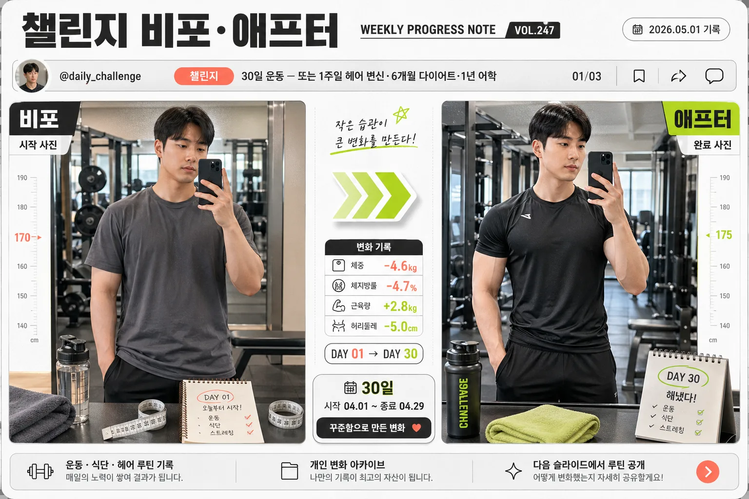
챌린지 비포·애프터 분할 카드. 변화 강조.
챌린지 비포·애프터 (운동·다이어트·머리) 검색 요약
챌린지 비포·애프터 (운동·다이어트·머리)은 광고/포스터 결과물을 만들 때 바로 복사해 활용할 수 있는 ChatGPT 이미지 프롬프트입니다. 주제, 배경, 스타일, 구도 조건을 함께 담아 빠르게 시안을 만들 수 있도록 구성했습니다.
관련 키워드: 챌린지 비포·애프터 (운동·다이어트·머리), 챌린지 비포·애프터 (운동·다이어트·머리) 프롬프트, 광고/포스터 프롬프트, 광고/포스터 AI 이미지 프롬프트, ChatGPT 이미지 프롬프트, AI 이미지 생성 프롬프트, AI 프롬프트, 이미지 프롬프트
챌린지 비포·애프터 (운동·다이어트·머리) 활용 포인트
원본 구조를 유지하면서 피사체, 배경, 색감, 구도를 바꿔 다양한 시안으로 확장할 수 있습니다.
- 핵심 소재는 유지하고 브랜드, 계절, 채널 목적에 맞는 색감과 배경을 바꿔보세요.
- 결과가 산만하면 배경 요소를 줄이고 피사체, 구도, 조명 조건을 구체화하세요.
- 복사한 뒤 ChatGPT에서 플랫폼, 화면 비율, 텍스트 포함 여부를 추가로 요청할 수 있습니다.
프롬프트 원문
[Input]
- language: Korean
- output_size: 1536x1024

[Purpose]
Challenge before/after comparison graphic for fitness, dieting, or hairstyle transformation. Landscape social card with a split-screen progress story, designed to make change feel measurable, personal, and shareable like a real transformation post.

[Composition]
- Main layout: strict 좌우 분할 50:50 composition, with {비포} on the left and {애프터} on the right, separated by a bold center divider and a small arrow pointing from left to right.
- Subject scale: each side should occupy about 42% of the frame width, leaving a narrow central lane for the arrow, stat badges, and challenge markers.
- Background treatment: bright editorial white and cool-gray base with realistic paper-card grain, faint measurement ticks, calendar marks, soft photo shadows, and small wellness-related visual cues that support the transformation theme.
- Framing direction: keep both sides aligned on the same baseline so body shape, hair silhouette, or pose change is easy to compare; preserve similar camera distance and crop between the left and right panels.
- Use {챌린지}, {기간 정보}, {비주얼}, {컬러} as the customizable text and layout directions.
- Add social-card realism: include a small profile strip, handle text “@daily_challenge”, slide number “01/03”, tiny save/share icons, and a compact date label “2026.05.01 기록”.

[Core Structure]
1) Top header band: place the title text “챌린지 비포·애프터” across the upper 12–15% of the canvas in a clean editorial banner style, with a small issue-style label such as “WEEKLY PROGRESS NOTE” and “VOL.247”.
2) Social metadata row: under or beside the header, add “챌린지” as a category pill, the value {챌린지} as the challenge subtitle, “@daily_challenge”, “01/03”, and tiny micro icons for save/share/comment.
3) Left panel: render {비포} as a realistic everyday starting-point photo with honest natural lighting, casual posture, and context details appropriate to {비주얼} such as a gym mirror edge, bathroom scale, tape measure, comb, towel, water bottle, or calendar note.
4) Right panel: render {애프터} with visible improvement cues—sharper posture, cleaner styling, more defined shape, refreshed haircut finish, or more polished grooming depending on the challenge type—while keeping the same person, crop, and stance comparable.
5) Center connector: place a thick arrow or stacked chevrons in the middle lane, colored from {컬러}, with a raised stat badge beneath it reading “변화 기록” and a small numeric-style chip such as “DAY 01 → DAY 30”.
6) Progress text block: show {기간 정보} as a compact chip or footer label, aligned near the bottom center for quick readability; add a second small caption line in Korean such as “꾸준함으로 만든 변화”.
7) Panel labels: place bold labels “비포” and “애프터” at the top-left of each panel, plus small caption strips under each image such as “시작 사진” and “완료 사진”.
8) Footer details: include realistic fine-print style text along the bottom such as “운동 · 식단 · 헤어 루틴 기록”, “개인 변화 아카이브”, and “다음 슬라이드에서 루틴 공개”.
9) Visual balance: keep both panels visually equivalent in size and crop, but make the right side slightly more luminous, confident, and polished to reinforce transformation.

[Style Rules]
- Typography: use Pretendard Bold for the header, Pretendard SemiBold for labels, and Noto Sans KR Medium for the date/stat chips; header size should feel like 38–52 px equivalent in a 1536x1024 layout.
- Color palette: {컬러} should translate to crisp white #FFFFFF, charcoal #2B2B2B, lime green #B8E94E, and coral #FF6F61, with light gray #E9ECEF for separators, card surfaces, metadata rows, and caption strips.
- Border/shadow: use a thin charcoal divider line with a very soft shadow, plus a subtle 4px y-offset drop shadow on the center arrow badge at 15% opacity; add realistic photo-card shadows around each panel.
- Graphic treatment: use modern infographic shapes, sticker-like date chips, measurement-line accents, small check marks, progress dots, and editorial card layering; avoid excessive 3D, heavy blur, or glossy gradients.
- Text hierarchy: large readable title, medium panel labels, compact metadata, and tiny but legible footer microcopy; Korean text should feel like a real social transformation card rather than a blank template.

[Visual Style]
- Camera / lens: studio editorial flat composition, equivalent to a 50mm standard lens look with controlled perspective distortion, optimized for comparison graphics rather than portrait drama.
- Lighting: even softbox lighting from upper-left at about 45°, with a gentle fill from the right so both sides remain readable and skin/hair/fabric detail stays natural.
- Color grade: high-key white base with charcoal contrast, lime-green progress accents, and coral highlights; keep saturation moderate and print-friendly.
- Realism cues: visible fabric texture, natural hair strands, subtle skin detail, realistic floor or wall hints inside the photo panels, and believable shadows under props and card layers.

[Mood]
Modern wellness infographic — clean magazine explainer page feel, similar to a premium fitness editorial spread and an Instagram carousel cover with crisp before/after storytelling, practical progress labels, and motivational personal-record energy.

[Critical]
- Korean text accuracy: the following strings must appear exactly as written in the rendered image: “챌린지 비포·애프터”, “챌린지”, “비포”, “애프터”, “기간 정보”.
- Placeholder fidelity: render the visible values of {챌린지}, {비포}, {애프터}, {기간 정보}, {비주얼}, {컬러}, and {비율} according to their meaning without changing the placeholder names in this prompt.
- Additional Korean text may include: “변화 기록”, “시작 사진”, “완료 사진”, “꾸준함으로 만든 변화”, “다음 슬라이드에서 루틴 공개”, “2026.05.01 기록”.
- Composition invariant: maintain exact 좌우 분할 50:50 with a centered arrow and compact stats area.
- Readability: all Korean text must be clean, fully formed, and free of broken characters.

[8. 🚫 PROHIBITED]
- Fake official seals / certifications
- Broken Korean characters
- Celebrity composites or unauthorized likeness