SNS/카드뉴스
AI 도구 비교 카드 (ChatGPT·Claude·Gemini)
AI 도구 비교 카드. 강점·약점·가격.
AI 도구 비교 카드 (ChatGPT·Claude·Gemini) 검색 요약
AI 도구 비교 카드 (ChatGPT·Claude·Gemini)은 SNS/카드뉴스 결과물을 만들 때 바로 복사해 활용할 수 있는 ChatGPT 이미지 프롬프트입니다. 주제, 배경, 스타일, 구도 조건을 함께 담아 빠르게 시안을 만들 수 있도록 구성했습니다.
관련 키워드: AI 도구 비교 카드 (ChatGPT·Claude·Gemini), AI 도구 비교 카드 (ChatGPT·Claude·Gemini) 프롬프트, SNS/카드뉴스 프롬프트, SNS/카드뉴스 AI 이미지 프롬프트, ChatGPT 이미지 프롬프트, AI 이미지 생성 프롬프트, AI 프롬프트, 이미지 프롬프트
AI 도구 비교 카드 (ChatGPT·Claude·Gemini) 활용 포인트
원본 구조를 유지하면서 피사체, 배경, 색감, 구도를 바꿔 다양한 시안으로 확장할 수 있습니다.
- 핵심 소재는 유지하고 브랜드, 계절, 채널 목적에 맞는 색감과 배경을 바꿔보세요.
- 결과가 산만하면 배경 요소를 줄이고 피사체, 구도, 조명 조건을 구체화하세요.
- 복사한 뒤 ChatGPT에서 플랫폼, 화면 비율, 텍스트 포함 여부를 추가로 요청할 수 있습니다.
프롬프트 원문
[Input]
- language: Korean
- output_size: 1024x1536

[Purpose]
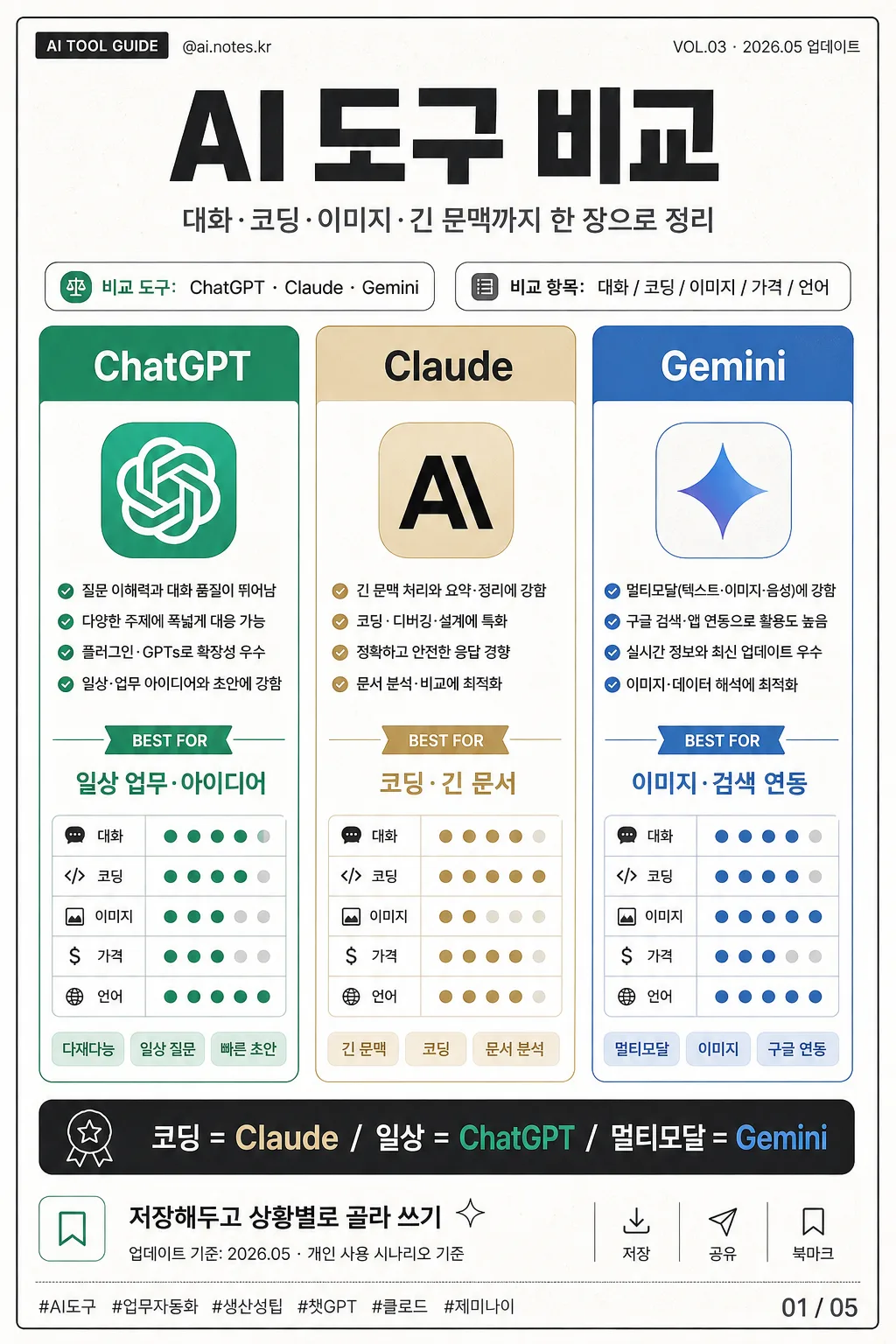
Korean AI tool comparison card for social media carousel, blog thumbnail, or newsletter feature image, presented as a polished vertical editorial infographic.
3-column comparison layout for ChatGPT, Claude, and Gemini with quick at-a-glance evaluation, practical notes, update metadata, and shareable card-news details.

[Composition]
- Vertical poster composition: three equal columns across the page, each column occupying about 30% width with 5% gutters, framed by a refined thin outer rule and realistic printed-card edge treatment.
- Top headline band takes 14% of height, main comparison grid takes 72%, bottom recommendation strip takes 14%.
- Use {비교 도구}, {비교 항목}, {강점·약점}, {추천}, {비주얼}, {컬러}, {비율} as editable text content.
- Background should be crisp white with subtle paper grain, faint off-white editorial texture, charcoal dividers, and restrained accent colors per tool.
- Add realistic social-card metadata: top-left small label “AI TOOL GUIDE”, top-right “VOL.03 · 2026.05 업데이트”, a tiny handle “@ai.notes.kr”, and a slide marker “01 / 05” near the lower corner.
- Include small save/share/bookmark micro icons and hashtag-like footer text such as “#AI도구 #업무자동화 #생산성팁” while keeping the 3-column comparison dominant.

[3. CORE STRUCTURE]
- Header area (top 14%): set the main title as a bold Korean masthead, centered, with compact line spacing and strong hierarchy. Main headline must read “AI 도구 비교”; add a smaller subtitle line: “대화·코딩·이미지·긴 문맥까지 한 장으로 정리”.
- Comparison grid (middle 72%): build exactly 3 vertical cards side by side; each card contains one tool name at the top, a small circular or rounded-square icon area beneath, then 3–5 short bullet lines for strengths, weaknesses, and quick use-case notes.
- Above the cards, place {비교 도구} and {비교 항목} as readable supporting labels, styled like small category tabs: “비교 도구: ChatGPT · Claude · Gemini” and “비교 항목: 대화 / 코딩 / 이미지 / 가격 / 언어”.
- Tool 1 card: place ChatGPT content in the left column with green accent bars, checklist dots, a compact score row, and small Korean tags such as “다재다능”, “일상 질문”, “빠른 초안”; keep the card balanced and evenly padded.
- Tool 2 card: place Claude content in the center column with beige accent bars, document-style marks, a compact score row, and small Korean tags such as “긴 문맥”, “코딩”, “문서 분석”; match the same text hierarchy as the other cards.
- Tool 3 card: place Gemini content in the right column with blue accent bars, subtle sparkle/geometric marks, a compact score row, and small Korean tags such as “멀티모달”, “이미지”, “구글 연동”; maintain equal visual weight.
- In each card, add a tiny “BEST FOR” ribbon and short Korean line: ChatGPT “일상 업무·아이디어”, Claude “코딩·긴 문서”, Gemini “이미지·검색 연동”.
- Add a small row of evaluation chips inside each card for “대화”, “코딩”, “이미지”, “가격”, “언어” using dots, short bars, or 5-step markers rather than long paragraphs.
- Recommendation strip (bottom 14%): show {추천} inside a high-contrast bar or rounded label row, with the exact conclusion sentence “코딩 = Claude / 일상 = ChatGPT / 멀티모달 = Gemini”.
- Below the recommendation sentence, add a subtle CTA line: “저장해두고 상황별로 골라 쓰기” plus a tiny source/date note “업데이트 기준: 2026.05 · 개인 사용 시나리오 기준”.
- Use {비주얼}, {컬러}, and {비율} as small production-note labels in the lower metadata area or side note, integrated naturally without creating extra panels.

[4. STYLE RULES]
- Typography: use Pretendard or Noto Sans KR for all Korean text; headline weight 800–900, body weight 500–600, small labels 400–500. Keep letter spacing tight and clean.
- Color palette: white #FFFFFF, charcoal #1F1F1F, ChatGPT green #10A37F, Claude beige #D8C3A5, Gemini blue #4285F4, light gray #EAECEF for separators.
- Border/shadow: thin 1px charcoal rules, soft drop shadow 4px y-offset, 12px blur, 12% opacity for the cards; no heavy neon glow.
- Add editorial details such as hairline dividers, tiny page-number text, small corner brackets, check icons, rating dots, and lightly textured paper fibers to make the card feel like a finished magazine-style infographic.
- Icons should be simple original geometric marks inspired by each tool category, not official certification marks; brand names “ChatGPT”, “Claude”, and “Gemini” must remain clearly readable.

[5. VISUAL STYLE]
- Camera / lens: clean editorial flat graphic layout, top-down poster design feel, simulated with crisp vector-like rendering rather than photographic depth.
- Lighting: even studio-like illumination with gentle contact shadows around the printed card edges, giving a realistic premium social-media graphic finish while keeping all text readable.
- Color grade: neutral white base with controlled accent saturation in green, beige, and blue; overall balanced and modern.
- Rendering quality: high-resolution digital editorial design, sharp typography, realistic paper texture, precise grid alignment, tactile card layering, and polished UI-thumbnail clarity.

[6. MOOD]
Practical editorial comparison sheet — like a polished Notion-style infographic mixed with a sharp product roundup from The Verge, upgraded into a saved-worthy Korean Instagram carousel card with useful real-world labels and decision cues.

[7. CRITICAL]
- Korean text accuracy: 반드시 정확히 보여야 하는 문자열 — “AI 도구 비교”, “ChatGPT”, “Claude”, “Gemini”, “대화”, “코딩”, “이미지”, “가격”, “언어”, “다재다능”, “긴 문맥”, “멀티모달”, “코딩 = Claude / 일상 = ChatGPT / 멀티모달 = Gemini”.
- Additional Korean microcopy must be clean and legible: “VOL.03 · 2026.05 업데이트”, “AI TOOL GUIDE”, “@ai.notes.kr”, “저장해두고 상황별로 골라 쓰기”, “#AI도구 #업무자동화 #생산성팁”.
- Layout invariant: exactly 3 columns, one tool per column, with equal visual weight and no extra fourth panel.
- All Korean text must be clean, correctly spelled, and fully legible.

[8. 🚫 PROHIBITED]
- Fake official seals / certifications
- Broken Korean characters
- Celebrity composites / unauthorized likeness