SNS/카드뉴스
노코드 툴 가이드 (Notion·Zapier·Bubble)
노코드 툴 가이드 카드뉴스. 사용법·활용 사례.
노코드 툴 가이드 (Notion·Zapier·Bubble) 검색 요약
노코드 툴 가이드 (Notion·Zapier·Bubble)은 SNS/카드뉴스 결과물을 만들 때 바로 복사해 활용할 수 있는 ChatGPT 이미지 프롬프트입니다. 주제, 배경, 스타일, 구도 조건을 함께 담아 빠르게 시안을 만들 수 있도록 구성했습니다.
관련 키워드: 노코드 툴 가이드 (Notion·Zapier·Bubble), 노코드 툴 가이드 (Notion·Zapier·Bubble) 프롬프트, SNS/카드뉴스 프롬프트, SNS/카드뉴스 AI 이미지 프롬프트, ChatGPT 이미지 프롬프트, AI 이미지 생성 프롬프트, AI 프롬프트, 이미지 프롬프트
노코드 툴 가이드 (Notion·Zapier·Bubble) 활용 포인트
원본 구조를 유지하면서 피사체, 배경, 색감, 구도를 바꿔 다양한 시안으로 확장할 수 있습니다.
- 핵심 소재는 유지하고 브랜드, 계절, 채널 목적에 맞는 색감과 배경을 바꿔보세요.
- 결과가 산만하면 배경 요소를 줄이고 피사체, 구도, 조명 조건을 구체화하세요.
- 복사한 뒤 ChatGPT에서 플랫폼, 화면 비율, 텍스트 포함 여부를 추가로 요청할 수 있습니다.
프롬프트 원문
[Input]
- language: Korean
- output_size: 1024x1536

[Purpose]
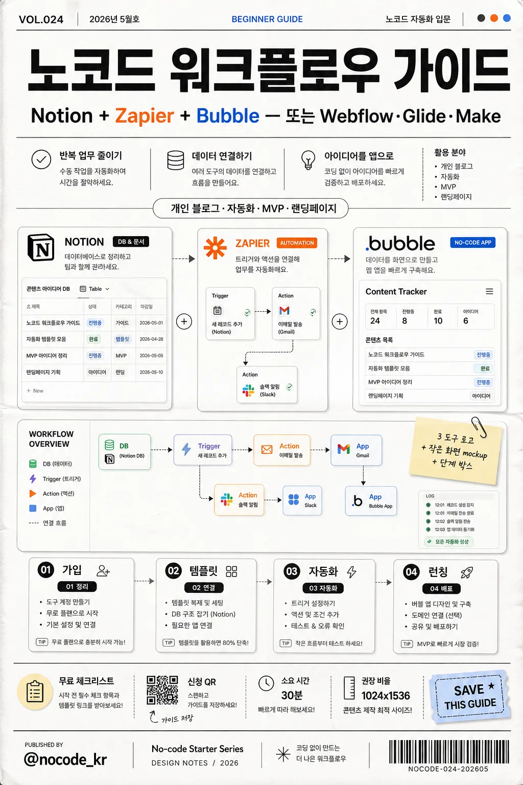
Korean no-code tool guide poster for social media, editorial infographic layout with a realistic printed product-marketing feel.
Designed to explain Notion, Zapier, and Bubble workflow basics for beginners, creators, and small teams, while looking like an actual workshop guide poster or downloadable resource cover.

[Composition]
- Center layout: a tall poster composition with the main title in the upper 18%, a practical guide metadata strip below it, a three-tool visual cluster in the center 46%, and step boxes plus CTA details in the lower 26%.
- Background treatment: matte white base with subtle light-gray paper grain, faint folded-poster texture, thin charcoal divider lines, small accent blocks using {컬러}, tiny UI dots, arrows, connector lines, and sticker-like labels that support the workflow theme.
- Printed-poster details: add a small issue/date label such as "VOL.024", "2026년 5월호", a tiny barcode or QR-code area labeled "가이드 저장", and a publisher credit line using {발행처}.
- Information density: include short Korean feature blurbs, small section markers, tool labels, micro captions, and a footer info row so the image feels like a finished editorial guide rather than a blank mockup.
- Use {도구}, {활용 사례}, {단계}, {비주얼}, {컬러}, {발행처}, {비율} as editable content placeholders.

[3. CORE STRUCTURE]
- Header zone (top 18%): place the main title as a bold Korean masthead, with a smaller subtitle line directly beneath it using {도구}. Add small metadata around the masthead: "VOL.024", "2026년 5월호", "BEGINNER GUIDE", and "노코드 자동화 입문".
- Context line (top-mid 10%): set {활용 사례} as a compact descriptor in a lighter weight, supported by two or three short Korean blurbs such as "반복 업무 줄이기", "데이터 연결하기", "아이디어를 앱으로".
- Hero visual zone (mid 46%): show a 3-part cluster with stylized representations of Notion, Zapier, and Bubble, paired with a miniature screen mockup suggesting a workflow dashboard; include realistic dashboard details such as connected cards, small table rows, progress chips, calendar blocks, automation arrows, and labeled nodes reading "DB", "Trigger", "Action", "App". Keep the tools as editorial icon illustrations and UI cards, not copied brand artwork.
- Visual note area: place {비주얼} as a small caption tag near the dashboard, like a design annotation or sticky label.
- Step section (lower 26%): render {단계} as four evenly spaced rounded boxes or numbered chips, each with clear hierarchy and consistent spacing. Add short supporting labels inside or below the chips: "01 정리", "02 연결", "03 자동화", "04 배포".
- CTA and details band: add a narrow event/resource strip with "무료 체크리스트", "신청 QR", "소요 시간 30분", "권장 비율 {비율}" and a small ticket-style label reading "SAVE THIS GUIDE".
- Footer zone (bottom 8%): place {발행처} as a publisher mark or social handle, plus small spine/credit text such as "No-code Starter Series / Design notes / 2026" and a barcode-style block aligned to one corner.

[4. STYLE RULES]
- Typography: use Pretendard Bold for the title, Pretendard Medium for body labels, and Noto Sans KR Regular for small metadata; title size should feel poster-large, body text compact and highly legible.
- Color palette: matte white #FFFFFF, charcoal #222222, soft gray #E9E9E9, plus small accent touches pulled from {컬러}; include restrained Notion black-white, Zapier orange, and Bubble blue-inspired accents in tiny UI elements.
- Border/shadow: thin 1px charcoal rules, subtle card shadows with 0px x-offset, 4px y-offset, 10px blur, 12% opacity; add realistic paper edge softness and slight ink density variation.
- Graphic details: use arrows, dotted connector paths, numbered badges, tiny tabs, page markers, sticky-note shapes, sponsor/resource blocks, and compact caption labels to create a credible guide-poster layout.
- Text hierarchy: every headline and key label must remain readable at poster scale, while secondary metadata can be smaller like real printed editorial matter.

[5. VISUAL STYLE]
- Camera / lens: 50mm standard editorial framing, front-facing graphic layout, no perspective distortion.
- Lighting: soft studio light from upper-left with even fill, gentle card shadows for separation, and realistic matte paper surface response.
- Color grade: clean white-and-charcoal base with selective signature accents from Notion, Zapier, and Bubble-inspired hues.
- Rendering: high-resolution printed poster realism, crisp vector-like typography, tactile paper grain, precise alignment, detailed UI micro-elements, and believable ink-on-paper texture.

[6. MOOD]
Modern startup editorial infographic — Notion-style UI meets Swiss poster clarity, with the practical energy of a creator workshop handout and a polished SaaS learning guide.

[7. CRITICAL]
- Korean text accuracy: 반드시 정확히 표시할 문자열: "노코드 툴 가이드", "{도구}", "{활용 사례}", "{단계}", "{비주얼}", "{컬러}", "{발행처}", "{비율}".
- Additional Korean text to render clearly where used: "노코드 자동화 입문", "반복 업무 줄이기", "데이터 연결하기", "아이디어를 앱으로", "무료 체크리스트", "신청 QR", "소요 시간 30분", "권장 비율", "가이드 저장", "정리", "연결", "자동화", "배포".
- Layout invariant: 3-tool cluster + small screen mockup + four step boxes must all be visible in one tall poster.
- Keep all Korean characters crisp, complete, and correctly spaced.

[8. 🚫 PROHIBITED]
- Fake official seals / certifications
- Broken Korean characters