廣告/海報
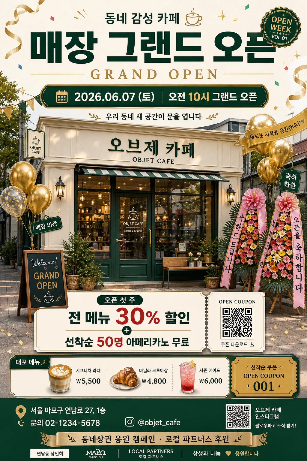
매장 그랜드 오픈 포스터
매장 새 오픈 그랜드 오프닝 포스터. 일자·이벤트.
매장 그랜드 오픈 포스터摘要
這是用來製作廣告/海報內容的 ChatGPT 圖像提示詞,已整理主題、背景、風格與構圖,方便快速調整。
相關關鍵字: 매장 그랜드 오픈 포스터, 매장 그랜드 오픈 포스터 프롬프트, 廣告/海報 프롬프트, 廣告/海報 AI 이미지 프롬프트, ChatGPT 이미지 프롬프트, AI 이미지 생성 프롬프트, AI 프롬프트, 이미지 프롬프트
매장 그랜드 오픈 포스터使用方式
保留原始結構並替換主體、背景、色彩或構圖,即可延伸出不同版本。
- 保留核心主體,並依品牌、季節或平台調整色彩與背景。
- 如果畫面太複雜,請減少背景元素並具體描述主體、構圖與光線。
- 複製後可要求 ChatGPT 配合平台、長寬比或文字需求調整。
提示詞原文
[Input]
- language: Korean
- output_size: 1024x1536

[Purpose]
Grand opening poster for a storefront, vertical promotional print design for social media, street display, elevator notice boards, and in-store window posting.
Clear Korean headline hierarchy, festive launch announcement, offer blocks, venue information, opening schedule, and local promotional details.

[Composition]
- Main subject placement: the {업종} storefront for {매장명} occupies the lower-middle 50–55% of the frame, with visible signage, entrance door, window display, sidewalk sign, flower stands, and celebratory balloons.
- Top announcement zone: place a large Korean headline in the upper 20–24%, with English "GRAND OPEN" as a supporting line and a small launch badge such as "NEW SHOP" or "OPEN WEEK".
- Central information zone: place {오픈일}, {오픈시간}, and {이벤트혜택} in layered ribbon cards, coupon labels, or rounded promotional panels that feel like realistic retail advertising.
- Environmental details: include {비주얼요소}, small confetti pieces, ribbon streamers, price-tag icons, a QR coupon card, a map-pin icon near the address, and subtle neighborhood sidewalk details.
- Footer utility zone: include {주소}, {연락처}, {SNS계정}, sponsor/support text {스폰서문구}, and a small coupon/ticket-style strip reading "OPEN COUPON 001".
- Use {매장명}, {업종}, {오픈일}, {오픈시간}, {주소}, {연락처}, {SNS계정}, {이벤트혜택}, {대표메뉴}, {스폰서문구}, {비주얼요소}, {컬러팔레트}, {타이포스타일} as editable text/content and visual-spec placeholders.

[3. CORE STRUCTURE]
1. Top header area (upper 18–22%): render the main title "매장 그랜드 오픈" in bold Korean, place "GRAND OPEN" directly underneath, and add a small issue-like opening badge with "OPEN WEEK / VOL.01" for a polished campaign feel.
2. Launch details band (upper-middle 12–15%): show {오픈일} and {오픈시간} in a clear date-time capsule, with a short celebratory subcopy such as "우리 동네 새 공간이 문을 엽니다".
3. Mid hero area (middle 40–45%): create a realistic illustrated or photo-composite-style exterior of {매장명}, including its storefront sign, glass reflections, flower wreaths, balloons, banner bunting, sandwich board, and {비주얼요소} arranged around the facade.
4. Offer and menu area (lower-middle 18–22%): place {이벤트혜택} in a prominent promotional box; add a smaller "대표 메뉴" panel listing {대표메뉴} and an opening coupon/ticket strip such as "선착순 쿠폰 · OPEN COUPON 001".
5. Footer information area (bottom 10–12%): include {주소}, {연락처}, {SNS계정}, {스폰서문구}, a tiny QR-code placeholder, map-pin icon, and sponsor/supporter micro logos or text blocks.
6. Whole-page polish: maintain a clear reading order from headline to date/time to storefront to offer to footer, while allowing festive retail elements, decorative graphics, and realistic store-opening details to make the poster feel commercially complete.

[4. STYLE RULES]
- Typography: use {타이포스타일}; use Pretendard ExtraBold or Noto Sans KR Black for the main Korean headline at 64–88px, a condensed uppercase sans for "GRAND OPEN" at 28–40px, and Pretendard SemiBold for event/date copy at 30–46px.
- Color palette: build from {컬러팔레트}, with white or cream base tones, warm gold accents #D8B25C or #C9A24A, and one strong brand color for ribbons, badges, balloons, and CTA buttons.
- Poster graphics: use layered paper-card panels, rounded coupon boxes, gold separator lines, small confetti, tiny spark icons, ribbon banners, hanging garlands, map-pin icon, phone icon, SNS icon, and a compact sponsor/support area.
- Storefront detail: render readable but fictional signage for {매장명}, window reflections, door handle, menu board, potted plants, flower stands with Korean congratulatory ribbons, and sidewalk textures appropriate to a local shopping street.
- Border/shadow: apply soft drop shadows under storefront, balloons, coupon panels, and paper labels, about 4px y-offset, 14px blur, 15% opacity; use thin gold dividers and sticker-like labels for hierarchy.

[5. VISUAL STYLE]
- Camera / lens: polished commercial poster look, equivalent to a 35mm lens at f/5.6 for the storefront hero, with mild perspective correction so the facade stays straight.
- Lighting: bright soft daylight simulation from upper-left, with a gentle fill from front-right to keep the signage readable; add subtle specular highlights on balloons, glass windows, metallic gold accents, and glossy coupon labels.
- Color grade: crisp retail-poster finish with warm gold highlights, slightly saturated signature colors, believable shadows, tactile paper-panel overlays, and realistic storefront materials.
- Rendering approach: high-resolution Korean promotional poster design, clean vector typography combined with semi-realistic storefront illustration/photo-collage textures, suitable for 1024x1536 vertical output.

[6. MOOD]
Modern neighborhood retail launch poster — festive, welcoming, and polished Korean local-brand opening campaign aesthetic with a premium yet friendly street-level atmosphere.

[7. CRITICAL]
- Korean text accuracy must be sharp and legible: "매장 그랜드 오픈", "그랜드 오픈", "GRAND OPEN", "오픈 기념", "우리 동네 새 공간이 문을 엽니다".
- Render key information clearly: "{매장명}", "{오픈일}", "{오픈시간}", "{주소}", "{연락처}", "{SNS계정}".
- Include realistic promotional copy: "{이벤트혜택}", "대표 메뉴: {대표메뉴}", "선착순 쿠폰", "OPEN COUPON 001".
- Add footer/support text: "{스폰서문구}", "QR 쿠폰", "오시는 길", "문의".
- Maintain a strict vertical poster hierarchy: headline first, date/time second, storefront third, offer and coupon fourth, footer information last.

[8. 🚫 PROHIBITED]
- Fake official seals / certifications
- Broken Korean characters
- Celebrity composites or recognizable public figures
- Distorted storefront geometry