広告・ポスター
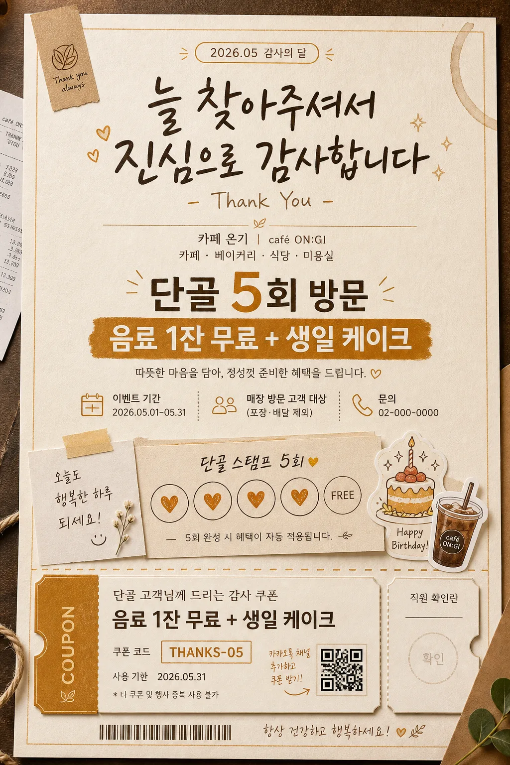
단골 감사 이벤트 카드
매장 단골 감사 이벤트. 쿠폰·생일·VIP.
단골 감사 이벤트 카드の概要
広告・ポスター画像を作るためのChatGPT画像プロンプトです。主題、背景、スタイル、構図を整理し、すぐに試せるよう構成しています。
関連キーワード: 단골 감사 이벤트 카드, 단골 감사 이벤트 카드 프롬프트, 広告・ポスター 프롬프트, 広告・ポスター AI 이미지 프롬프트, ChatGPT 이미지 프롬프트, AI 이미지 생성 프롬프트, AI 프롬프트, 이미지 프롬프트
단골 감사 이벤트 카드の活用方法
元の構造を保ちながら、被写体、背景、色、構図を変更して別案に展開できます。
- 主題を維持し、ブランドや季節、媒体に合わせて色と背景を変更してください。
- 結果が複雑な場合は背景要素を減らし、被写体、構図、照明を具体化してください。
- コピー後、ChatGPTに媒体、アスペクト比、文字の有無を追加で指定できます。
プロンプト原文
[Input]
- language: Korean
- output_size: 1024x1536

[Purpose]
Korean regular-customer appreciation event card, vertical poster-style loyalty promo for in-store display or social sharing.
Realistic printed coupon-based thank-you card with handwritten warmth, local café/editorial stationery detail, and practical event information customers can immediately read.

[Composition]
- Center the main thank-you message in the upper-middle 42% of the frame, with the coupon/event element anchored in the lower 28% like a tear-off voucher.
- Use a soft cream paper background with visible tactile grain, slightly warm and matte, with natural ink absorption and subtle printed imperfections.
- Compose as a real printed card photographed flat-lay on a warm café counter or textured paper surface, with small believable edge details such as a kraft tape tab, tiny stamp marks, a receipt corner, or a soft coffee-ring trace near the outer edge.
- Place {매장} as the business context in a small supporting line near the header area, and keep {이벤트} as the most prominent sales-facing text.
- Integrate {비주얼} as layered paper-cut or sticker-like elements, such as a small coupon stack, loyalty stamp row, tiny cake icon, drink cup sticker, ticket stub, or hand-drawn sparkle marks.
- Use {컬러} consistently across headers, accents, coupon borders, stamp icons, date chips, divider rules, and tiny decorative marks.
- Set {타이포} as the type direction for the headline and subline, with the main title slightly tilted or hand-drawn for a human touch.
- Maintain a clear vertical hierarchy: headline first, event details second, visual accent third, coupon/CTA last, with enough real promotional information to feel like an actual in-store event card.

[3. CORE STRUCTURE]
- Header area (top 18%): a short gratitude title in bold handwritten Korean, with a small English subline "Thank You" underneath in lighter weight, centered; add a tiny date label such as "2026.05 감사의 달" and a small store line using {매장}.
- Main message area (middle 24%): {이벤트} rendered as the largest text block, with the key benefit line emphasized using a stronger weight or a small highlight strip; include short Korean event copy such as "단골 5회 방문", "음료 1잔 무료", "생일 케이크" as clearly readable reward lines.
- Brand context area (upper-lower transition): {매장} shown as a small descriptor line, subtle and secondary, to clarify the venue type without overpowering the headline; include realistic micro information such as "이벤트 기간 2026.05.01–05.31", "매장 방문 고객 대상", and "문의 02-000-0000" in small Korean type.
- Visual motif area (mid-lower 22%): {비주얼} appears as a compact gratitude card stack, ticket stub, loyalty stamp card, or coupon illustration with soft shadows, slightly rounded corners, perforation dots, stamped hearts, handwritten arrows, and small sticker labels.
- Color application area: {컬러} should define the card border, divider lines, highlight chips, coupon perforation, loyalty stamp circles, CTA badge, and small accent icons such as stars, hearts, check marks, or spark marks.
- Texture area: {결} should be visible as warm paper grain, slightly rough fiber edges, letterpress-like ink pressure, stamped ink variation, and gentle ink absorption for a handcrafted printed feel.
- Footer/coupon area (bottom 26%): {비율} respected as a tall vertical layout, with a coupon-like block that feels detachable and clearly structured for quick reading; add coupon details such as "COUPON", "THANKS-05", "사용 기한 2026.05.31", "직원 확인란", a tiny QR-code-like square graphic, and a barcode-style strip area.
- Final polish: keep the whole composition aligned and balanced like a premium local-business promo card, while allowing realistic printed marks, labels, dividers, stickers, shadows, and café-stationery details to enrich the scene.

[4. STYLE RULES]
- Typography: use Pretendard Bold or Noto Sans KR Bold for the main benefit line, a hand-drawn Korean script style for the gratitude title, and a small clean sans serif for "Thank You"; headline around 54–72px, subline 18–24px, body 28–40px, micro details 12–18px.
- Color palette: cream #F6F0E6, warm amber #D98A3A, soft brown #7A5432, muted signature accent from {컬러}, and dark cocoa #3E2A1F for text.
- Border/shadow: use a thin 2px border in warm brown with a soft drop shadow of 4px y-offset, 12px blur, 15% opacity; coupon block can have a slightly stronger shadow for layered depth.
- Printed details: include dotted perforation line above the coupon, small loyalty stamp circles, tiny rule lines, date chips, a hand-written memo label, and a realistic paper edge shadow so the card feels physically printed.
- Text hierarchy: make the offer text and coupon CTA legible at first glance, while micro-copy, contact, code, and date information remain crisp enough to read up close.

[5. VISUAL STYLE]
- Camera / lens: flat-lay poster look shot as a high-resolution studio still, simulated with a 50mm lens at f/5.6 for crisp text edges and gentle depth separation.
- Lighting: soft studio softbox from upper-left at about 45°, with a faint fill from the right and no harsh specular highlights.
- Color grade: warm cream + amber + cocoa with slightly desaturated midtones, like a boutique stationery brand shoot.
- Realism: show subtle paper thickness, tactile fibers, tiny ink misregistration, shallow shadow under layered stickers, and natural surface variation from the café counter or paper backing.

[6. MOOD]
Premium local-business appreciation card — Kinfolk-style stationery spread meets warm neighborhood café branding, friendly, sincere, gift-like, and ready to be placed near a cashier counter.

[7. CRITICAL]
- Korean text accuracy: 반드시 다음 문구가 또렷하게 정확히 보여야 함: "단골", "감사", "이벤트", "Thank You", "단골 5회 방문", "음료 1잔 무료", "생일 케이크".
- Additional Korean micro-copy should be clean and realistic: "2026.05 감사의 달", "이벤트 기간 2026.05.01–05.31", "매장 방문 고객 대상", "사용 기한 2026.05.31", "직원 확인란", "THANKS-05".
- Layout invariant: vertical single-card composition, with headline top-centered, offer details central, visual motif mid-lower, and coupon block bottom-anchored.
- Text must remain clean and fully legible with correct Korean character rendering, no broken glyphs.

[8. 🚫 PROHIBITED]
- Fake official seals / certifications
- Broken Korean characters
- Celebrity composites or unauthorized likeness