광고/포스터
신메뉴 출시 카드 (시즌 한정·시그니처)
매장 신메뉴 출시 카드. 메뉴 + 가격 + 시즌.
신메뉴 출시 카드 (시즌 한정·시그니처) 검색 요약
신메뉴 출시 카드 (시즌 한정·시그니처)은 광고/포스터 결과물을 만들 때 바로 복사해 활용할 수 있는 ChatGPT 이미지 프롬프트입니다. 주제, 배경, 스타일, 구도 조건을 함께 담아 빠르게 시안을 만들 수 있도록 구성했습니다.
관련 키워드: 신메뉴 출시 카드 (시즌 한정·시그니처), 신메뉴 출시 카드 (시즌 한정·시그니처) 프롬프트, 광고/포스터 프롬프트, 광고/포스터 AI 이미지 프롬프트, ChatGPT 이미지 프롬프트, AI 이미지 생성 프롬프트, AI 프롬프트, 이미지 프롬프트
신메뉴 출시 카드 (시즌 한정·시그니처) 활용 포인트
원본 구조를 유지하면서 피사체, 배경, 색감, 구도를 바꿔 다양한 시안으로 확장할 수 있습니다.
- 핵심 소재는 유지하고 브랜드, 계절, 채널 목적에 맞는 색감과 배경을 바꿔보세요.
- 결과가 산만하면 배경 요소를 줄이고 피사체, 구도, 조명 조건을 구체화하세요.
- 복사한 뒤 ChatGPT에서 플랫폼, 화면 비율, 텍스트 포함 여부를 추가로 요청할 수 있습니다.
프롬프트 원문
[Input]
- language: Korean
- output_size: 1024x1536

[Purpose]
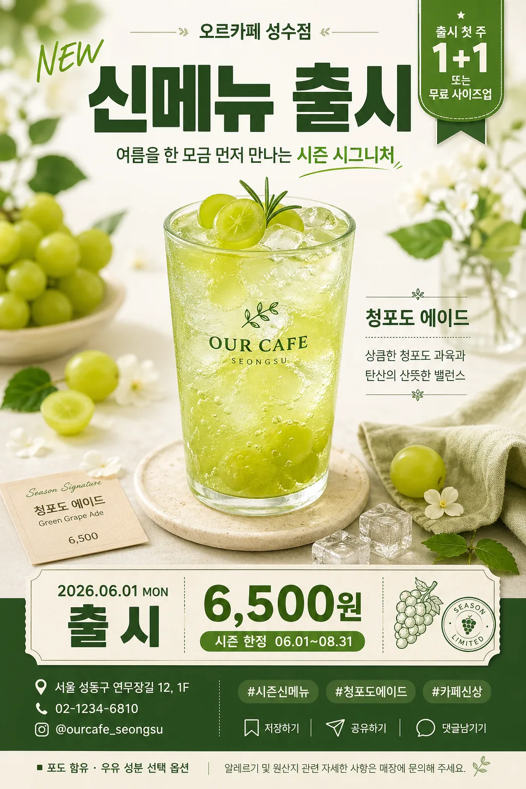
Seasonal new-menu announcement card for social media feed, story repost, and in-store countertop promo use, designed as a tall editorial product poster.
Showcase a single signature drink or dessert hero with clear launch price, period, opening-week event callout, cafe identity, and realistic purchase information.

[Composition]
- Main subject: {신메뉴} placed as the central hero occupying about 58% of the frame, surrounded by practical seasonal styling and tactile cafe details.
- Brand header: {매장명} and {슬로건} placed near the top with a small English NEW accent, giving the card a real cafe campaign identity.
- Launch information: {출시일} and {가격·기간} anchored in the lower third as a readable product-info block, with price emphasized as the second-most visible text after the headline.
- Product copy: {제품설명} placed near the hero as a short editorial tasting note, like a real seasonal menu card.
- Seasonal accent props: {비주얼} arranged around the hero in a natural tabletop or studio-still-life frame, including small leaves, fruit slices, florals, napkin texture, spoon, coaster, condensation, or paper menu pieces when appropriate.
- Color direction: {컬러} applied through background tint, garnish accents, menu strip, and small highlight elements, while keeping the product itself true-to-life.
- Typography block: {타이포} set in a stacked promotional hierarchy with one dominant Korean headline, compact secondary line, and a small English NEW accent.
- Event badge: {이벤트} placed as a rounded chip, ribbon, or sticker-style callout near the top-right or bottom-right corner for fast readability.
- Footer information: include {주소}, {연락처}, {인스타핸들}, {해시태그}, small save/share micro icons, and a compact allergy/origin note {원산지·알레르기} along the bottom edge like a realistic cafe promo card.

[3. CORE STRUCTURE]
1) Header zone (top 14%): set "신메뉴 출시" in bold Korean display type, with {매장명}, {슬로건}, and a small "NEW" accent nearby; spacing should feel editorial and campaign-ready.
2) Hero zone (center 55–60%): render {신메뉴} as the clear focal object, sharply lit, with realistic surface texture, condensation, crema, frosting, cake crumb, fruit pulp, ice, foam, garnish, label, straw, spoon, or topping detail depending on the item.
3) Seasonal staging: add {비주얼} as a surrounding layer—leaf, flower, fruit slice, ice cube, linen napkin, kraft paper texture, menu slip, coaster, teaspoon, or small tray—so the product feels tied to the season and cafe setting.
4) Editorial product note: place {제품설명} as a short caption beside or below the hero, using a smaller text size and a light divider line for magazine-like hierarchy.
5) Offer zone (lower third): place {가격·기간} and {출시일} inside a contrasting label strip or paper-ticket block, making price and campaign period instantly readable.
6) Promotion chip: place {이벤트} as a compact badge with rounded corners, ribbon tail, or small sticker texture; keep it secondary but highly legible.
7) Footer utility row: show {인스타핸들}, {해시태그}, {주소}, {연락처}, and small outline micro icons for save/share/comment, plus {원산지·알레르기} in tiny but formed Korean type.
8) Final balance: use {컬러} to unify background, props, typography highlights, label strip, and footer details, ensuring the composition feels polished, seasonal, and launch-ready.

[4. STYLE RULES]
- Typography: Pretendard ExtraBold or Noto Sans KR Black for the main Korean headline, Pretendard SemiBold for price details, Pretendard Regular for footer information, and a small condensed sans for the English NEW accent; headline size should feel poster-scale, with tight line spacing and strong hierarchy.
- Color palette: derive from {컬러}, grounded with one light neutral base and one deep contrast tone; apply accent colors to the badge, divider lines, fruit/floral props, and product-info block for readability and product separation.
- Border/shadow: use a soft drop shadow under the hero at 4px y-offset, 14px blur, 16% opacity; use crisp product edges, refined sticker texture on the event badge, and subtle paper depth in the footer strip.
- Surface treatment: matte paper, soft gradient backdrop, or lightly textured cafe poster stock with fine grain; allow natural gloss, condensation, syrup shine, crema sheen, frosting texture, or fruit moisture when the menu item requires it.
- Information design: make price, period, store contact, handle, hashtag, and allergy/origin note feel like real printed cafe collateral rather than placeholder text.

[5. VISUAL STYLE]
- Camera / lens: 85mm f/1.8 product-portrait look, slightly compressed perspective, framed like a premium cafe campaign poster.
- Lighting: soft window light from upper-left at about 45°, with a gentle reflector fill from lower-right and a faint rim highlight to separate the product from background.
- Color grade: seasonal signature tones with controlled saturation, clean whites, and slightly warm highlights; preserve appetizing but realistic product color.

[6. MOOD]
Premium seasonal cafe launch editorial — a polished Korean dessert-cafe promo card with tactile menu-board realism, seasonal still-life styling, and social-media-ready typography.

[7. CRITICAL]
- Korean text accuracy: 반드시 아래 문구가 깨지지 않고 정확히 보여야 함: "신메뉴 출시", "NEW", "{매장명}", "{신메뉴}", "{제품설명}", "{가격·기간}", "{출시일}", "{이벤트}", "{인스타핸들}", "{해시태그}", "{주소}", "{연락처}", "{원산지·알레르기}"
- Layout invariant: the hero product must remain the dominant subject, and the launch copy must stay readable without overlapping the product core.
- Render the footer like a real cafe card: "저장", "공유", "댓글" micro labels may appear beside simple icons if space allows.
- If text is rendered, Korean characters must be fully legible and correctly formed; no partial glyphs, no warped spacing.

[8. 🚫 PROHIBITED]
- Fake official seals or certifications
- Broken Korean characters
- Fake government, medical, or award-style certification marks
- Celebrity composites or impersonation-style faces