廣告/海報
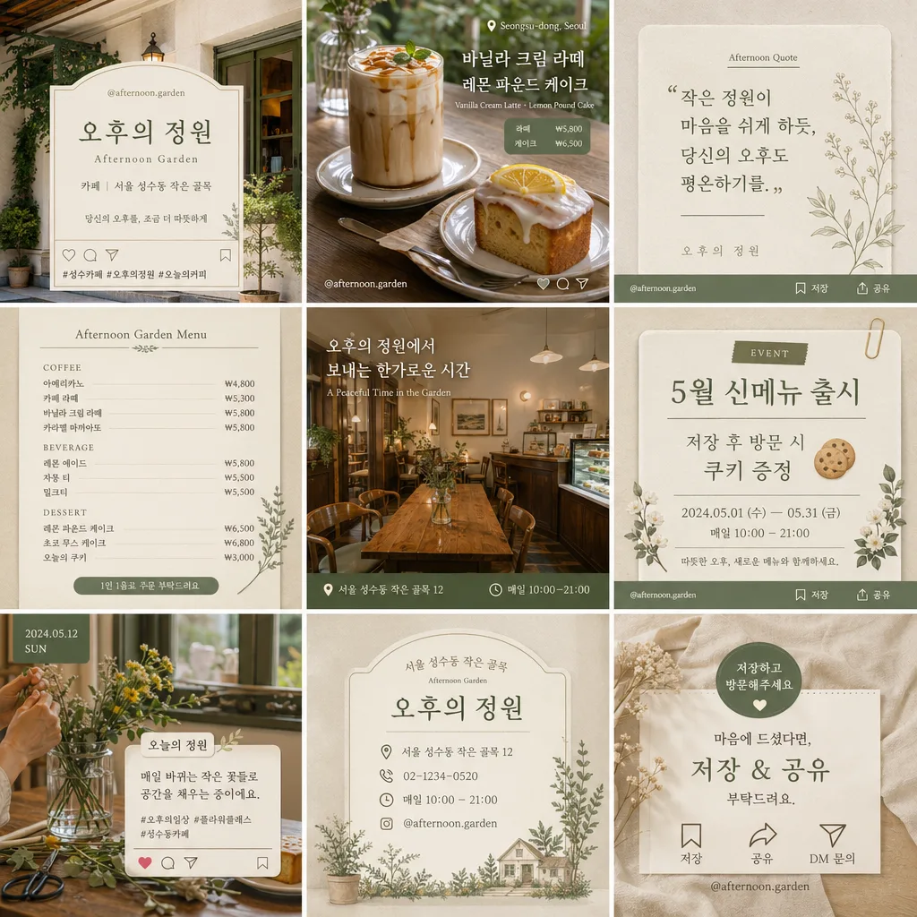
매장 인스타그램 9분할 피드 디자인
매장 인스타 9분할 피드. 통일된 BI.
매장 인스타그램 9분할 피드 디자인摘要
這是用來製作廣告/海報內容的 ChatGPT 圖像提示詞,已整理主題、背景、風格與構圖,方便快速調整。
相關關鍵字: 매장 인스타그램 9분할 피드 디자인, 매장 인스타그램 9분할 피드 디자인 프롬프트, 廣告/海報 프롬프트, 廣告/海報 AI 이미지 프롬프트, ChatGPT 이미지 프롬프트, AI 이미지 생성 프롬프트, AI 프롬프트, 이미지 프롬프트
매장 인스타그램 9분할 피드 디자인使用方式
保留原始結構並替換主體、背景、色彩或構圖,即可延伸出不同版本。
- 保留核心主體,並依品牌、季節或平台調整色彩與背景。
- 如果畫面太複雜,請減少背景元素並具體描述主體、構圖與光線。
- 複製後可要求 ChatGPT 配合平台、長寬比或文字需求調整。
提示詞原文
[Input]
- language: Korean
- output_size: {비율}

[Purpose]
{매장유형} 매장 계정을 위한 9-grid Instagram feed design. 9개의 정사각형 타일이 하나의 통일된 BI처럼 보이는 cohesive square social-media template로 구성한다.
상품 사진, 메뉴 카드, 매장 인테리어 컷, 문구 카드, 일상 포스트, 이벤트 공지, 저장/공유하기 좋은 Instagram micro information이 모두 같은 브랜드 룩으로 이어지는 피드 디자인이다.

[Composition]
- 전체 캔버스는 {비율} 기준의 정사각형이며, 3x3 그리드로 정확히 9칸을 나누고 각 칸의 간격과 정렬 기준을 동일하게 유지한다.
- 각 타일은 {매장명}의 개성을 반영하되, 전체적으로 같은 톤과 필터가 적용된 듯한 일관된 인스타그램 피드 느낌을 유지한다.
- 사진/메뉴/매장/인용/일상/이벤트 콘텐츠가 섞여도 모두 같은 프레임 규칙, 같은 색감, 같은 타이포 시스템을 따른다.
- 상단/중앙/하단 9칸 모두 실제 매장 피드처럼 자연스러운 소품, 질감, 메뉴판, 영수증, 컵, 패브릭, 식물, 조명 반사, 손글씨 라벨 등을 포함해 생활감 있는 브랜드 무드를 만든다.
- {피드구성}, {그리드구성}, {컬러팔레트}, {타이포스타일}, {피드무드}는 실제 피드 콘셉트를 정의하는 핵심 스타일 지시로 반영한다.
- 각 타일 안에 Instagram card 요소를 자연스럽게 배치한다: {계정명}, {해시태그}, 저장/공유 micro icons, 짧은 캡션, 위치 라벨, 날짜 라벨, 작은 CTA 문구.

[3. CORE STRUCTURE]
1) Grid foundation: 3x3 equal tiles, precise gutters, all nine panels aligned with identical spacing and consistent cropping rules.
2) Content rhythm: alternate visual types across the grid so the feed reads as balanced — product/photo tiles, menu/info tiles, interior/store tiles, quote tiles, daily-life tiles, event notice tiles — while preserving one unified identity.
3) Suggested tile plan: top-left brand intro with {계정명} and {매장명}; top-center hero product photo featuring {대표메뉴}; top-right quote card with a short Korean line; middle-left menu card with prices; middle-center interior/lifestyle photo; middle-right event notice with date/time; bottom-left behind-the-scenes daily post; bottom-center location/contact card; bottom-right save/share CTA end-card.
4) Store identity tiles: use {매장명}, {매장유형}, {위치라벨}, {연락처}, {영업시간} as repeated real-account details across multiple panels, making the feed feel ready for an actual Instagram account.
5) Typography tiles: integrate short Korean headlines, hashtag-style text, menu names, price labels, and caption snippets in the same serif-led system, with Instagram micro UI details such as ♡, 저장, 공유, DM 문의, 위치 태그.
6) Texture and realism: include natural paper grain, ceramic or glass reflections, menu board edges, napkin folds, counter texture, seasonal flowers or small table objects that match {컬러팔레트} and {피드무드}.
7) Uniform finish: apply the same editorial-style finish across all 9 tiles so the final feed looks curated, premium, and intentionally planned as a single store account set.

[4. STYLE RULES]
- Typography: {타이포스타일}을 기준으로 한글 헤드라인, 작은 영문 부제, 가격, 캡션, 해시태그, micro UI 텍스트의 위계를 명확히 만든다. Korean serif in a refined traditional style, such as Noto Serif KR or Nanum Myeongjo, with medium-to-bold weight for headers and small English sublabels in Pretendard Light or Inter.
- Color palette: {컬러팔레트} should translate into a signature palette paired with white, cream, warm amber, and tactile neutral tones; use the accent color repeatedly in labels, dividers, stickers, underlines, and small Instagram UI marks.
- Instagram identity details: display {계정명} like a real handle on at least two tiles, include {해시태그} on hashtag/caption tiles, and include tiny save/share/heart/comment icons as decorative micro UI elements.
- Store information: include realistic information blocks such as {영업시간}, {위치라벨}, {연락처}, {대표메뉴}, {가격표기}, and {이벤트문구} as if the feed is announcing actual store content.
- Dividers and cards: use fine hairline dividers, small labels, rounded caption stickers, paper-note overlays, subtle shadows around 4px y-offset, 12px blur, 15% opacity, and neatly aligned card blocks to separate content inside each tile.

[5. VISUAL STYLE]
- Camera / lens: clean editorial social-media grid look, shot consistently as if with a Canon EOS R5 and 35mm f/1.8 for general scenes, plus 50mm f/1.8 for tighter detail tiles; flat-lay panels can use a 24mm top-down setup.
- Lighting: soft diffused daylight from a large window at 45° upper-left, with gentle fill from the opposite side; keep shadows light, even, and repeatable across all tiles.
- Color grade: warm cream, amber, muted neutral tones, and a subtle signature accent derived from {컬러팔레트}, with slightly reduced saturation for a polished feed look.
- Surface detail: show realistic tabletop texture, paper fibers, cup glaze, menu card ink, flower petals, fabric weave, glass highlights, and small sticker edges so the feed feels photographed and designed rather than empty.

[6. MOOD]
Curated boutique Instagram grid — {피드무드}를 중심으로, 따뜻한 daily-life storytelling, consistent store identity, and save-worthy card design for {매장명}.

[7. CRITICAL]
- Korean text accuracy: the rendered image must preserve clear, legible Korean typography with no broken characters.
- Verbatim Korean strings that must appear correctly when used in the design: {매장명}, {계정명}, {해시태그}, {대표메뉴}, {영업시간}, {위치라벨}, {연락처}, {가격표기}, {이벤트문구}.
- Include realistic Korean feed text examples where appropriate: “오늘의 추천”, “저장하고 방문하기”, “DM 예약 가능”, “신메뉴 출시”, “이번 주 이벤트”, “가까운 날에 만나요”.
- All 9 panels must share the same grid logic, same tone, and same overall visual system; the set should read as one planned Instagram feed.
- Text must remain sharp, properly spaced, and aligned to the grid; no distorted Hangul, no merged syllables, no mirrored letters.
- 최종 이미지는 {비율} 출력에 맞춰 9개 타일이 잘리지 않도록 안전 여백을 유지한다.

[8. 🚫 PROHIBITED]
- Fake official seals / certifications
- Broken Korean characters
- Unauthorized celebrity face composites
- Fake government or legal document styling