廣告/海報
매장 SNS 광고 풀세트
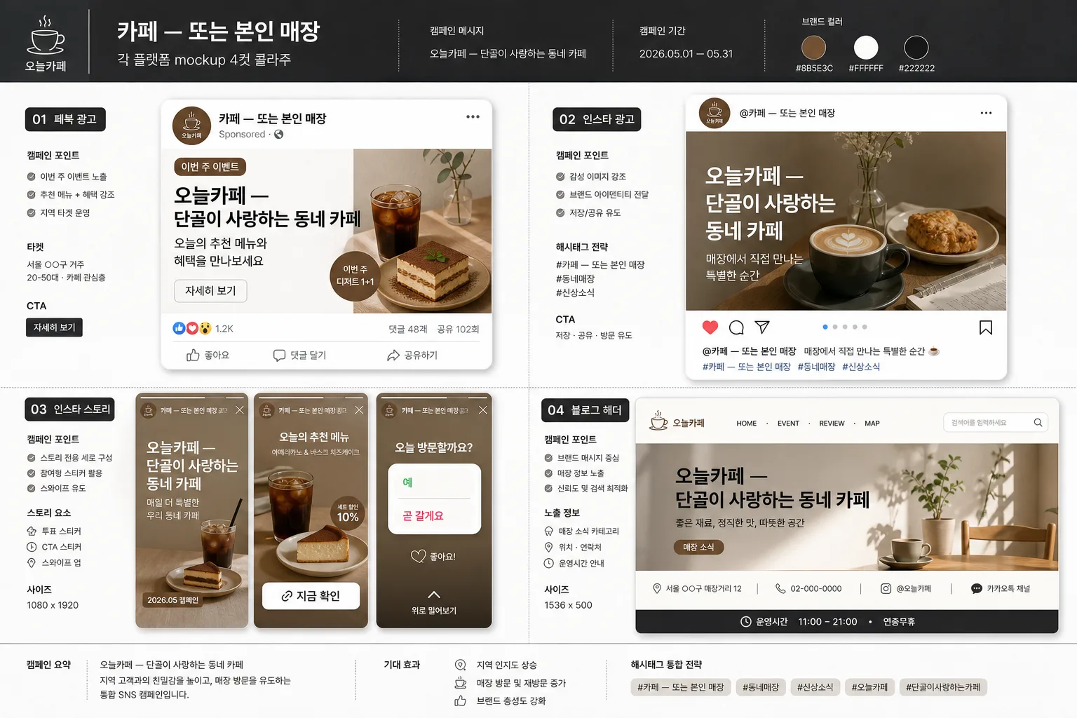
매장 SNS 광고 풀세트 4종 mockup.
매장 SNS 광고 풀세트摘要
這是用來製作廣告/海報內容的 ChatGPT 圖像提示詞,已整理主題、背景、風格與構圖,方便快速調整。
相關關鍵字: 매장 SNS 광고 풀세트, 매장 SNS 광고 풀세트 프롬프트, 廣告/海報 프롬프트, 廣告/海報 AI 이미지 프롬프트, ChatGPT 이미지 프롬프트, AI 이미지 생성 프롬프트, AI 프롬프트, 이미지 프롬프트
매장 SNS 광고 풀세트使用方式
保留原始結構並替換主體、背景、色彩或構圖,即可延伸出不同版本。
- 保留核心主體,並依品牌、季節或平台調整色彩與背景。
- 如果畫面太複雜,請減少背景元素並具體描述主體、構圖與光線。
- 複製後可要求 ChatGPT 配合平台、長寬比或文字需求調整。
提示詞原文
[Input]
- language: Korean
- output_size: 1536x1024

[Purpose]
Create a full social-media ad set presentation for a local store, showing four platform-specific ad mockups in one polished composite. Designed as a realistic promotional portfolio image for brand owners or marketers, with enough interface detail, campaign copy, and store information to feel like a finished SNS advertising package.

[Composition]
- Main subject: a 4-panel collage of platform ad mockups for {광고 4종}, with the store identity {매장} tied consistently across all panels.
- Layout: editorial 2x2 grid with four distinct ad formats: Facebook feed ad, Instagram square post, Instagram Story ad, and blog header banner. Each panel should feel like a real deliverable from a campaign presentation, with active UI cues, campaign labels, and supporting copy.
- Background treatment: white presentation base with charcoal framing accents, soft paper texture, realistic card shadows, faint alignment marks, and subtle brand swatches using {컬러}.
- Composition details: include small campaign notes, platform labels, handle text, engagement micro-icons, CTA buttons, and readable Korean promotional snippets around {키 메시지} without changing the core 4-panel arrangement.
- Use {매장}, {광고 4종}, {키 메시지}, {비주얼}, {컬러}, {타이포}, {비율} placeholders throughout the design.

[3. CORE STRUCTURE]
1. Overall canvas: build a professional advertising showcase sheet in a 4-cut collage layout, with all four mockups aligned neatly and visually unified as a real agency presentation board.
2. Panel 1: render the Facebook ad mockup as a rectangular feed-style ad using the store colors from {컬러}. Include a profile row with circular store avatar, store name {매장}, small label "Sponsored", headline {키 메시지}, short body copy such as "오늘의 추천 메뉴와 혜택을 만나보세요", a compact CTA button "자세히 보기", reaction/comment/share row, and a small promo badge "이번 주 이벤트".
3. Panel 2: render the Instagram ad mockup as a square social post with tighter image framing. Include handle "@{매장}", save/share/heart/comment micro icons, a bold Korean headline using {키 메시지}, caption text "매장에서 직접 만나는 특별한 순간", hashtags such as "#{매장} #동네매장 #신상소식", and a small carousel dot indicator.
4. Panel 3: render the Instagram Story mockup as a tall vertical ad with native story details: top progress bars, profile icon, "{매장} · 광고", bold vertical hierarchy, sticker-style CTA "지금 확인", swipe cue "위로 밀어보기", poll sticker text "오늘 방문할까요? 예 / 곧 갈게요", and a date label "2026.05 캠페인".
5. Panel 4: render the blog header mockup as a wide banner-style format with the key message {키 메시지} centered or slightly left-weighted for header use. Add blog navigation details such as "HOME · EVENT · REVIEW · MAP", category tag "매장 소식", a search field, a small address/contact line "서울 ○○구 매장거리 12 · 02-000-0000", and a footer strip reading "운영시간 11:00–21:00".
6. Unifying treatment: keep all four mockups stylistically related through matching palette, typography language, repeated logo/avatar treatment, and the same store identity {매장}, while still reflecting each platform’s native format and {비율}.
7. Visual emphasis: make {비주얼} read as a polished mockup collage rather than a literal screenshot, with crisp card edges, realistic printed/poster-card surface, layered shadows, platform UI details, small annotation labels, and presentation-grade alignment.

[4. STYLE RULES]
- Typography: use Pretendard or Noto Sans KR for platform UI text, with bold 700–800 weights for headlines and medium 500 weights for supporting copy; apply {타이포} as the campaign typography direction and keep Korean characters sharp and legible.
- Color palette: apply {컬러} as the main brand palette, anchored by white #FFFFFF and charcoal #2B2B2B; add practical accent blocks, CTA buttons, tiny highlight stickers, and platform-label chips using the same palette.
- Border/shadow: add soft drop shadows with 4px vertical offset, 12px blur, and 15% opacity for each mockup card; use thin separators, UI dividers, rounded cards, and subtle paper grain to make the composite feel tactile and production-ready.
- Content density: include realistic ad components such as profile handles, comment counts, captions, hashtags, story stickers, blog navigation, schedule/contact lines, campaign date labels, and CTA buttons while keeping hierarchy clear.

[5. VISUAL STYLE]
- Camera / lens: studio product-style presentation, shot like a precise flat-lay editorial layout with a 50mm standard lens look and no perspective distortion.
- Lighting: soft diffused studio light from upper-left at about 45°, with a gentle fill from the right to preserve crisp edges and readable text.
- Color grade: clean commercial grade with white, charcoal, and store-brand accents from {컬러}; keep the overall tone crisp, modern, high-clarity, and suitable for a real marketing portfolio.

[6. MOOD]
A polished boutique marketing deck — refined agency presentation sheet with realistic SNS campaign details, lively local-store promotion energy, and a finished client-preview feel.

[7. CRITICAL]
- Korean text accuracy: the following Korean strings must appear correctly and clearly in the rendered image: {매장}, {광고 4종}, {키 메시지}, {비주얼}, {컬러}, {타이포}, {비율}.
- Also render short Korean campaign/UI text clearly, such as "오늘의 추천", "이번 주 이벤트", "지금 확인", "자세히 보기", "매장 소식", "운영시간 11:00–21:00", and "2026.05 캠페인".
- Keep all four platform mockups visually coherent and correctly formatted for their respective ad sizes, with Facebook feed, Instagram post, Instagram Story, and blog header each instantly recognizable.
- Maintain exact readability, realistic interface detail, and clean spacing; no broken Korean characters, no garbled typography.

[8. 🚫 PROHIBITED]
- Fake official seals / certifications
- Broken Korean characters
- Celebrity composites / unauthorized likeness