인포그래픽/안내
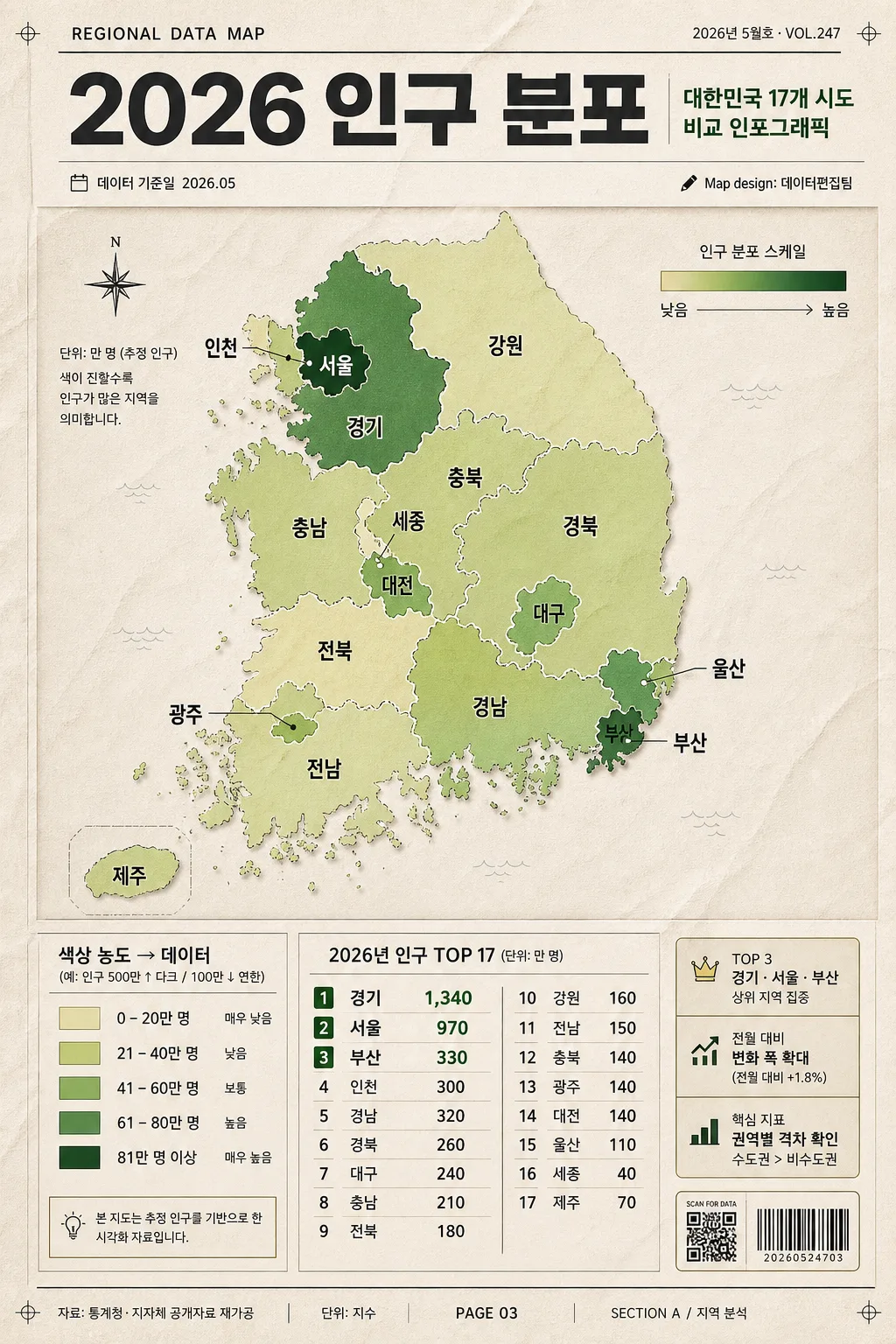
한국 시도 지역 지도 인포그래픽
한국 17개 시도 지역 지도 인포. 색상별 데이터.
한국 시도 지역 지도 인포그래픽 검색 요약
한국 시도 지역 지도 인포그래픽은 인포그래픽/안내 결과물을 만들 때 바로 복사해 활용할 수 있는 ChatGPT 이미지 프롬프트입니다. 주제, 배경, 스타일, 구도 조건을 함께 담아 빠르게 시안을 만들 수 있도록 구성했습니다.
관련 키워드: 한국 시도 지역 지도 인포그래픽, 한국 시도 지역 지도 인포그래픽 프롬프트, 인포그래픽/안내 프롬프트, 인포그래픽/안내 AI 이미지 프롬프트, ChatGPT 이미지 프롬프트, AI 이미지 생성 프롬프트, AI 프롬프트, 이미지 프롬프트
한국 시도 지역 지도 인포그래픽 활용 포인트
원본 구조를 유지하면서 피사체, 배경, 색감, 구도를 바꿔 다양한 시안으로 확장할 수 있습니다.
- 핵심 소재는 유지하고 브랜드, 계절, 채널 목적에 맞는 색감과 배경을 바꿔보세요.
- 결과가 산만하면 배경 요소를 줄이고 피사체, 구도, 조명 조건을 구체화하세요.
- 복사한 뒤 ChatGPT에서 플랫폼, 화면 비율, 텍스트 포함 여부를 추가로 요청할 수 있습니다.
프롬프트 원문
[Input]
- language: Korean
- output_size: 1024x1536

[Purpose]
Korean provincial and metropolitan city map infographic poster for data presentation, designed as a polished editorial data page that feels like a real report insert, magazine infographic, and social-share poster.

[Composition]
- Top header occupies about 14% of the frame; main Korea 17-region map hero takes about 58% in the middle; bottom insight / legend / source area fills the remaining 28%.
- Use {주제} as the headline concept, with a strong single-line or stacked Korean title treatment. Add a small publication-style kicker above it such as "REGIONAL DATA MAP" and a date label such as "2026년 5월호 · VOL.247".
- The map should be a full Korea 17-region outline infographic with each region separated clearly, including small Korean region labels such as "서울", "부산", "대구", "인천", "광주", "대전", "울산", "세종", "경기", "강원", "충북", "충남", "전북", "전남", "경북", "경남", "제주".
- Background treatment should be a realistic warm off-white report paper surface with visible fine paper grain, faint registration marks, subtle folded-paper impression, and editorial print texture.
- Place {범례} and {주요 데이터} in a structured bottom block with aligned columns for easy reading; include source note, page number, section marker, and a small barcode / QR-style information box for realism.

[3. CORE STRUCTURE]
- Header area (top 14%): set {주제} in a bold Korean infographic title style, centered or slightly left-aligned, with strong contrast and tight leading. Add small supporting text: "대한민국 17개 시도 비교 인포그래픽", "데이터 기준일 2026.05", and a tiny credit line "Map design: 데이터편집팀".
- Main map area (middle 58%): render {지도 결} as a clean Korea map hero, with each region legible, borders crisp, island placement carefully handled, and color intensity changing by data level. Add fine leader lines for compact regions when needed.
- Data emphasis: apply {컬러} across the map regions as a step-gradient system, keeping the darkest tone for the highest value regions and the lightest tone for the lowest. Include a subtle mini-scale strip beside the map showing "낮음 → 높음".
- Legend block (bottom-left): display {범례} as a compact explanatory key using small color chips, thin rules, short Korean labels, and sample value ranges such as "0–20", "21–40", "41–60", "61–80", "81+".
- Insight block (bottom-right): place {주요 데이터} as a concise ranked or listed summary, aligned vertically with numeric emphasis. Add small badges like "TOP 3", "전월 대비", "핵심 지표" and short Korean blurbs such as "상위 지역 집중", "변화 폭 확대", "권역별 격차 확인".
- Footer information strip: include realistic report elements such as "자료: 통계청·지자체 공개자료 재가공", "단위: 지수", "PAGE 03", "SECTION A / 지역 분석", and a small barcode area with micro text "SCAN FOR DATA".
- Use {비주얼} to keep the whole composition editorial and structured, with layered paper panels, ruled dividers, data callout boxes, small arrows, dot markers, and tidy alignment between title, map, and data panels.
- Maintain {비율} as a tall infographic poster ratio with strong vertical hierarchy suitable for a 1024x1536 vertical report poster.

[4. STYLE RULES]
- Typography: Pretendard Bold for the title, Pretendard SemiBold for labels, Pretendard Regular for supporting text; title around 52–68px, body labels 22–28px, numeric highlights 30–36px, micro metadata 12–16px.
- Color palette: warm beige #F4EBDD, off-white #FAF7F2, muted black #1F1F1F, step-gradient greens from #DCECC3 to #2F6B3C, optional accent sand #D8C39A. Use {컬러} as the visible data-map palette reference.
- Border/shadow: thin charcoal divider lines, hairline grid marks, soft drop shadow under map panel (0px x, 6px y, 14px blur, 10% opacity), lightly printed ink edges, and realistic paper-depth layering.
- Add small editorial details: section tabs, map coordinate ticks, callout dots, source footnote, page number, date stamp, and a compact barcode / QR placeholder box while keeping the map and data hierarchy dominant.

[5. VISUAL STYLE]
- Camera / lens: flat graphic design poster, top-down infographic layout, equivalent to a 35mm editorial layout view with no perspective distortion.
- Lighting: soft diffuse studio light 느낌, even illumination across the entire page, with gentle paper texture and natural print finish.
- Color grade: warm neutral paper tone with controlled green data gradation, slightly desaturated for a report-ready, magazine-infographic finish.
- Rendering: high-resolution editorial print mockup look, crisp vector-style map boundaries, tactile paper grain, precise Korean typography, and subtle CMYK print realism.

[6. MOOD]
Modern data editorial infographic — reminiscent of Bloomberg Businessweek chart pages and Monocle-style information design, but enriched with realistic Korean report-poster details, source notes, ranking modules, and magazine-like metadata.

[7. CRITICAL]
- Korean text accuracy: the following Korean strings must appear correctly and legibly if shown: {주제}, {범례}, {주요 데이터}, {지도 결}, {컬러}, {비주얼}, and any rendered regional or numeric labels included in {주요 데이터}.
- Include realistic Korean infographic text such as "대한민국 17개 시도", "데이터 기준일 2026.05", "자료: 통계청·지자체 공개자료 재가공", "TOP 3", "전월 대비", "PAGE 03", and "SECTION A / 지역 분석".
- Map layout must show all 17 Korean administrative regions clearly separated and consistently styled, including 제주 placement and compact metropolitan regions.
- Text must be crisp Korean typography with no broken characters, no garbling, and no misread numerals.

[8. 🚫 PROHIBITED]
- Fake official seals / certifications
- Broken Korean characters