인포그래픽/안내
프로세스 단계 인포그래픽
프로세스 단계 인포 카드. 작업·서비스 흐름.
프로세스 단계 인포그래픽 검색 요약
프로세스 단계 인포그래픽은 인포그래픽/안내 결과물을 만들 때 바로 복사해 활용할 수 있는 ChatGPT 이미지 프롬프트입니다. 주제, 배경, 스타일, 구도 조건을 함께 담아 빠르게 시안을 만들 수 있도록 구성했습니다.
관련 키워드: 프로세스 단계 인포그래픽, 프로세스 단계 인포그래픽 프롬프트, 인포그래픽/안내 프롬프트, 인포그래픽/안내 AI 이미지 프롬프트, ChatGPT 이미지 프롬프트, AI 이미지 생성 프롬프트, AI 프롬프트, 이미지 프롬프트
프로세스 단계 인포그래픽 활용 포인트
원본 구조를 유지하면서 피사체, 배경, 색감, 구도를 바꿔 다양한 시안으로 확장할 수 있습니다.
- 핵심 소재는 유지하고 브랜드, 계절, 채널 목적에 맞는 색감과 배경을 바꿔보세요.
- 결과가 산만하면 배경 요소를 줄이고 피사체, 구도, 조명 조건을 구체화하세요.
- 복사한 뒤 ChatGPT에서 플랫폼, 화면 비율, 텍스트 포함 여부를 추가로 요청할 수 있습니다.
프롬프트 원문
[Input]
- language: Korean
- output_size: 1024x1536

[Purpose]
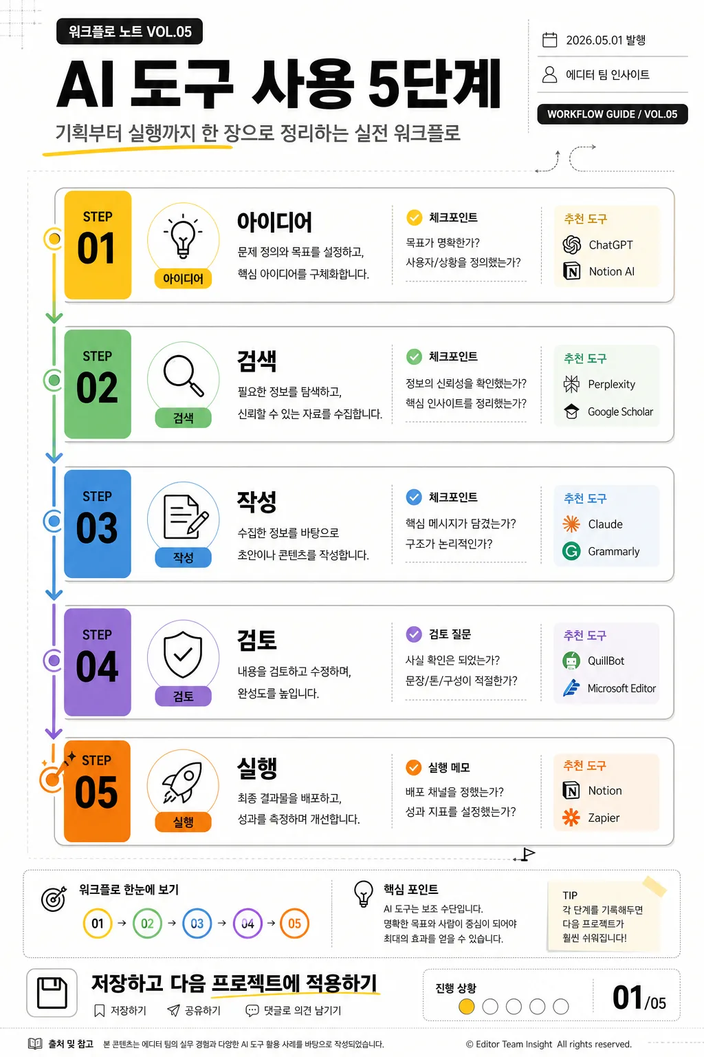
Korean process-step infographic poster, vertical editorial layout, designed for a clear and shareable 5-step workflow guide.
Suitable for social sharing, presentation slides, internal onboarding documents, workshop handouts, and educational carousel first pages.

[Composition]
- Vertical poster in 1024x1536 format with a structured editorial infographic layout: top masthead/title zone about 14%, main step-flow zone about 70%, and footer/CTA zone about 16%.
- Main composition uses {비주얼구성} with five connected step nodes, arrows, numbered labels, icon blocks, short descriptions, and a small progress indicator.
- Background is a warm white paper-like design surface with faint grid ticks, light section dividers, small annotation labels, and subtle geometric accents that support the workflow theme.
- Add realistic infographic-poster details: a small series label, issue/date line, author or team credit, bottom CTA, page indicator, and a compact reference note area.
- Use {주제}, {부제}, {단계목록}, {단계설명}, {컬러팔레트}, {타이포스타일}, {프로젝트명}, {작성자}, {발행일}, {하단CTA}, {페이지표시}, {아이콘스타일}, {장식요소}, {비율} as the content anchors for the layout.

[3. CORE STRUCTURE]
1) Header block (top 14%): place a small label such as {프로젝트명} above the main headline, set {주제} as the large bold headline, and add {부제} as a one-line editorial subtitle beneath it.
2) Metadata strip: near the title or top-right corner, include {발행일}, {작성자}, and a compact label like “WORKFLOW GUIDE / VOL.05” to make the poster feel like a real published learning asset.
3) Step flow area (middle 70%): build five stacked or sequential step boxes for {단계목록}; each box contains a STEP number, icon from {아이콘스타일}, step title, and a short explanation line from {단계설명}.
4) Connector logic: connect each step with clear arrows, dotted guide paths, or directional lines; show the flow from start to finish with consistent spacing and visual rhythm.
5) Visual hierarchy: make Step 01 and Step 05 slightly more emphasized through scale, accent color, badge treatment, or stroke weight while maintaining the same design system across all five steps.
6) Detail layer: add small helpful microcopy such as “체크포인트”, “추천 도구”, “검토 질문”, or “실행 메모” inside or beside the step boxes where appropriate.
7) Footer area (bottom 16%): include {하단CTA}, {페이지표시}, a short source/note line, small save/share-style micro icons, and a thin divider or decorative bar derived from {장식요소}.

[4. STYLE RULES]
- Typography: use Pretendard ExtraBold or Noto Sans KR Bold for the title, Pretendard SemiBold for step titles, Pretendard Medium for descriptions, and Inter Bold for STEP numbers and small metadata labels.
- Color palette: use warm white #FAFAF7 and charcoal #2B2B2B as the base, with step-by-step accent colors derived from {컬러팔레트}; allow small pastel fills, badge labels, and connector accents for clarity.
- Border/shadow: use thin 1px dividers, lightly rounded cards, small pill labels, and a soft drop shadow of 0px y-offset, 8px blur, 12% opacity; keep all effects flat and print-friendly.
- Layout accents may include small arrows, dot grids, timeline ticks, rounded number badges, underlines, marker highlights, and tiny UI-like labels, aligned to a strict editorial grid.
- Icons should be simple but recognizable: lightbulb for idea, magnifier for search, pencil/document for writing, check shield for review, rocket/play button for execution.

[5. VISUAL STYLE]
- Camera / lens: flat graphic design look, as if composed in a clean vector-editor mockup; no photographic lens distortion, no perspective tilt.
- Lighting: even studio-like front illumination, no directional shadow drama, no glare.
- Color grade: neutral warm white + charcoal base with readable step accents, similar to modern startup slide decks, editorial magazine infographics, and Notion-style workflow systems.

[6. MOOD]
Modern editorial infographic — practical startup workflow guide with a magazine-like information design feel, friendly learning-poster energy, and polished Korean typography.

[7. CRITICAL]
- Korean text accuracy: 반드시 정확히 표시되어야 하는 문구: “프로세스 단계 인포그래픽”, “AI 도구 사용 5단계”, “아이디어 → 검색 → 작성 → 검토 → 실행”, “기획부터 실행까지 한 장으로 정리하는 실전 워크플로”, “간단 한 줄 + 작은 도구 추천”, “화이트 + 차콜 + 단계별 컬러 코딩”, “굵은 한글 + 영문 STEP 번호”, “1024x1536”.
- Realistic poster text elements to include in Korean: “워크플로 노트 VOL.05”, “2026.05.01 발행”, “에디터 팀 인사이트”, “저장하고 다음 프로젝트에 적용하기”, “01/05”.
- All five steps must be visually consistent as one cohesive system, with all arrows present, no duplicated panels, and precise alignment.
- Korean typography must remain crisp and fully legible with proper spacing, especially inside step titles, captions, CTA, and metadata labels.

[8. 🚫 PROHIBITED]
- Fake official seals / certifications
- Broken Korean characters
- Celebrity composites or unauthorized portrait likenesses