インフォグラフィック・案内
월간 리포트 디자인 (매출·KPI·인사이트)
월간 리포트 한 페이지 디자인. KPI + 차트 + 인사이트.
월간 리포트 디자인 (매출·KPI·인사이트)の概要
インフォグラフィック・案内画像を作るためのChatGPT画像プロンプトです。主題、背景、スタイル、構図を整理し、すぐに試せるよう構成しています。
関連キーワード: 월간 리포트 디자인 (매출·KPI·인사이트), 월간 리포트 디자인 (매출·KPI·인사이트) 프롬프트, インフォグラフィック・案内 프롬프트, インフォグラフィック・案内 AI 이미지 프롬프트, ChatGPT 이미지 프롬프트, AI 이미지 생성 프롬프트, AI 프롬프트, 이미지 프롬프트
월간 리포트 디자인 (매출·KPI·인사이트)の活用方法
元の構造を保ちながら、被写体、背景、色、構図を変更して別案に展開できます。
- 主題を維持し、ブランドや季節、媒体に合わせて色と背景を変更してください。
- 結果が複雑な場合は背景要素を減らし、被写体、構図、照明を具体化してください。
- コピー後、ChatGPTに媒体、アスペクト比、文字の有無を追加で指定できます。
プロンプト原文
[Input]
- language: Korean
- output_size: 1024x1536

[Purpose]
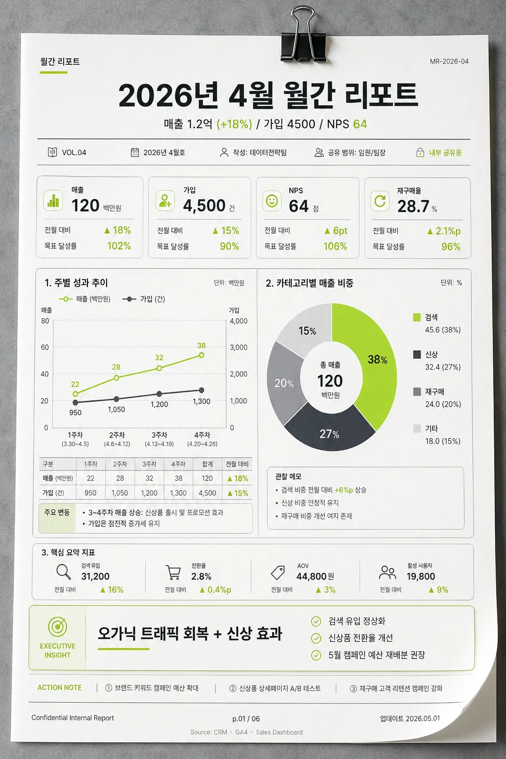
Korean monthly report editorial layout, consulting-style data dashboard poster for business performance review.
Vertical printed report design optimized for presentation, internal sharing, and executive summary reading, with realistic report-page details such as issue metadata, chart annotations, footer notes, and page indicators.

[Composition]
- Overall layout: structured 3-zone vertical composition with top header occupying 14%, middle chart block 58%, and bottom insight panel 28%.
- Page structure: precise consulting-report grid with clear hierarchy, visible page metadata, small executive-report labels, and a realistic premium report sheet placed on a cool gray office surface.
- Header area: centered title block with {기간} as the main headline, followed by {주요 KPI} in a smaller subheadline line; add compact metadata such as "VOL.04", "2026.04", "데이터전략팀", "내부 공유용", and a small document code "MR-2026-04".
- Middle zone: {차트} placed as the main analytical centerpiece, with clear separation between chart modules, readable axes, Korean month/week labels, legends, annotations, and mini KPI cards.
- Bottom zone: {인사이트} placed inside a restrained executive summary card, accompanied by short supporting bullets, a tiny action-note row, and a page indicator.
- Background treatment: matte white report paper with realistic fine paper grain, faint page curl, subtle desk shadow, small binder-clip impression near the top edge, and cool gray UI surfaces; keep the chart area prominent and highly legible.

[3. CORE STRUCTURE]
1. Top header band: place {기간} centered in a bold report-title style, with compact spacing and a thin divider line beneath; {주요 KPI} appears immediately below as a single readable KPI strip. Add small header labels: "월간 리포트", "VOL.04", "2026년 4월호", "작성: 데이터전략팀", "공유 범위: 임원/팀장".
2. Main analytics block: render {차트} in the center with a dashboard-like arrangement, using one primary weekly line chart and one category donut chart area with crisp Korean labels, thin gridlines, restrained annotations, and realistic data markers. Include short chart labels such as "1주차", "2주차", "3주차", "4주차", "매출", "가입", "검색", "신상", "재구매".
3. Supporting metric framing: place small data labels, mini cards, delta arrows, and summary callouts around the chart block without blocking the graphs. Add realistic business-report microcopy such as "전월 대비", "목표 달성률", "주요 변동", "관찰 메모", and "단위: 백만원".
4. Bottom insight card: place {인사이트} inside a refined rectangular panel with subtle emphasis, designed to read like a consultant’s highlight note rather than a marketing slogan. Include 2–3 concise Korean bullets: "검색 유입 정상화", "신상품 전환율 개선", "5월 캠페인 예산 재배분 권장".
5. Footer balance: include a professional report footer with "Confidential Internal Report", "p.01 / 06", "업데이트 2026.05.01", and a tiny source line "Source: CRM · GA4 · Sales Dashboard" while keeping the exact top-header / middle-chart / bottom-insight structure intact.

[4. STYLE RULES]
- Typography: Pretendard or Noto Sans KR, headline in Bold 700–800, KPI line in Medium 500–600, body labels in Regular 400; title size large, chart labels small but legible, metadata text very small but readable.
- Color palette: use {컬러} as the guiding palette while preserving white #FFFFFF, charcoal #1F2933, soft gray #E5E7EB, deep gray #374151, lime accent #A3E635 or #B7F000 for key highlights.
- Border/shadow: thin 1px gray rules, subtle card borders, very soft shadow 0px 8px 24px rgba(31,41,51,0.08) for report cards, plus a natural paper shadow on the desk surface.
- Layout accents: use disciplined spacing, crisp alignment, editorial separators, tiny index tabs, small table rows, chart legends, and realistic analyst annotations; avoid gimmicky presentation effects.
- Visual ratio: reflect {비율} in the chart emphasis and composition density, keeping the vertical 1024x1536 report-page format.

[5. VISUAL STYLE]
- Camera / lens: top-down graphic poster style, equivalent to a clean flat-lay composition with 50mm perspective and orthographic-like precision; the full report page is visible with slight realistic paper depth.
- Lighting: even studio lighting with softbox diffusion, gentle contact shadows along the page edges, no harsh glare, and crisp chart edges.
- Color grade: cool neutral consulting palette, white + charcoal + lime, with very light gray UI surfaces, realistic printed ink behavior, and high readability.
- Material detail: use {비주얼} as the visual direction; show matte paper texture, subtle toner-like ink edges, fine gray gridlines, small punched guide marks or binding hint, and a professional office-report finish.

[6. MOOD]
McKinsey-style business report slide meets modern editorial infographic — crisp, analytical, boardroom-ready, and believable as a real monthly KPI report printed for an executive review meeting.

[7. CRITICAL]
- Korean text accuracy: 반드시 정확히 표시되어야 하는 문자열: "월간 리포트", "2026년 4월 월간 리포트", "매출 1.2억 (+18%) / 가입 4500 / NPS 64", "주별 라인 + 카테고리별 도넛", "\"오가닉 트래픽 회복 + 신상 효과\"".
- Additional Korean microtext should be accurate and legible: "VOL.04", "2026년 4월호", "데이터전략팀", "내부 공유용", "전월 대비", "목표 달성률", "5월 액션 아이템", "p.01 / 06".
- Typography and layout must remain aligned and highly legible; all chart text, legends, table labels, and annotations must be correctly rendered in Korean.
- Preserve the exact report-like composition: top header, middle chart block, bottom insight card.
- Keep all placeholders exactly as written: {기간}, {주요 KPI}, {차트}, {인사이트}, {비주얼}, {컬러}, {비율}.

[8. 🚫 PROHIBITED]
- Fake official seals / certifications
- Broken Korean characters
- Any layout that removes the clear top-header / middle-chart / bottom-insight structure