資訊圖表/指南
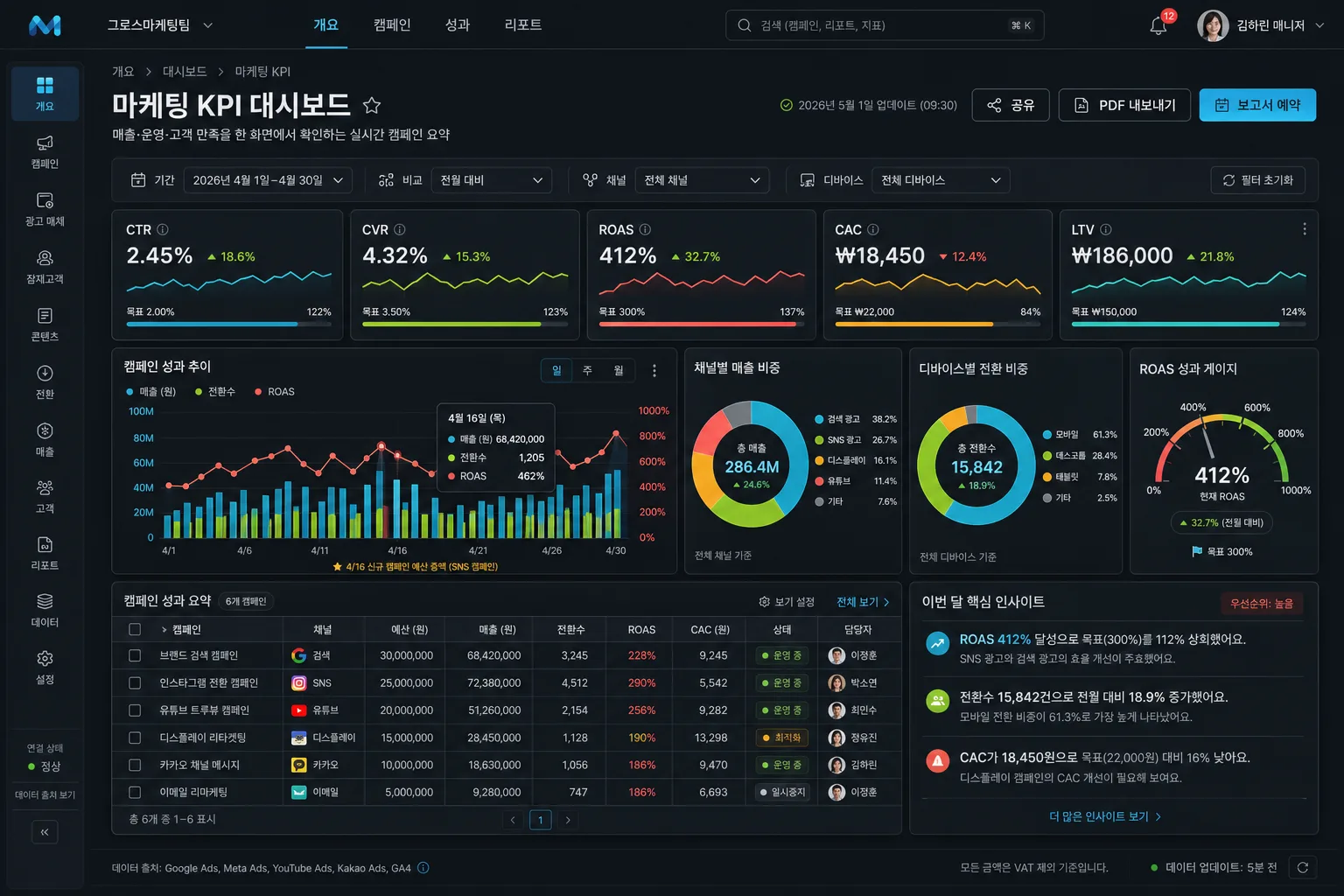
KPI 대시보드 목업
KPI 대시보드 화면 mockup. 차트·지표·필터.
KPI 대시보드 목업摘要
這是用來製作資訊圖表/指南內容的 ChatGPT 圖像提示詞,已整理主題、背景、風格與構圖,方便快速調整。
相關關鍵字: KPI 대시보드 목업, KPI 대시보드 목업 프롬프트, 資訊圖表/指南 프롬프트, 資訊圖表/指南 AI 이미지 프롬프트, ChatGPT 이미지 프롬프트, AI 이미지 생성 프롬프트, AI 프롬프트, 이미지 프롬프트
KPI 대시보드 목업使用方式
保留原始結構並替換主體、背景、色彩或構圖,即可延伸出不同版本。
- 保留核心主體,並依品牌、季節或平台調整色彩與背景。
- 如果畫面太複雜,請減少背景元素並具體描述主體、構圖與光線。
- 複製後可要求 ChatGPT 配合平台、長寬比或文字需求調整。
提示詞原文
[Input]
- language: Korean
- output_size: 1536x1024

[Purpose]
KPI dashboard mockup for a marketing performance presentation, designed as a polished UI/UX hero image for business reporting, executive slide cover use, and SaaS product showcase.

[Composition]
- Main dashboard panel occupies about 90% of the canvas, centered in a 1536x1024 landscape frame with a thin top app bar, visible side navigation rail, and realistic product chrome.
- Use {대시보드제목} as the main title, {부제} as the supporting subtitle, {KPI카드} as the row of KPI summary cards, {차트구성} as the analytic modules, {필터탭} as the control strip, {색상테마} as the visual theme, and {비주얼스타일} as the overall presentation style.
- Background should be a deep matte charcoal workspace with subtle noise texture, soft monitor glow, fine panel reflections, and crisp UI separation.
- Layout should feel like a premium SaaS product screenshot: strong grid, readable density, precise alignment, natural executive-report content, and no perspective tilt.
- Include realistic business UI details such as an account avatar, notification chip, export button, updated timestamp, small status badges, source note, and a compact insight callout so the dashboard feels like an actively used analytics product.

[3. CORE STRUCTURE]
- Top app bar (top 7%): show product-style navigation labels such as "개요", "캠페인", "성과", "리포트", a search field, notification dot, user avatar for {사용자}, and a small workspace label for {팀명}.
- Header area (next 12%): place {대시보드제목}, {부제}, breadcrumb labels, the timestamp {업데이트시간}, and right-side buttons reading "공유", "PDF 내보내기", "보고서 예약"; use precise spacing and thin divider lines.
- Filter strip (below header): render {필터탭} as pill tabs with active-state emphasis, tiny icon markers, dropdown arrows, and readable values such as {기간라벨}; include a small comparison selector reading "전월 대비".
- KPI summary row (upper analytic band): show 5 metric cards for {KPI카드}, each card with a bold numeric value, small trend arrow, sparkline, target progress bar, and micro-label; keep equal card widths and consistent padding.
- Main chart zone (middle 46%): arrange {차트구성} as a 2-column analytic board, with one large primary line-and-bar chart on the left and three smaller supporting charts on the right; include clear axes, legend chips, hover-style tooltip card, annotations, and subtle grid lines.
- Lower intelligence zone (bottom 18%): add a compact campaign table with channel rows, budget, conversions, ROAS, owner, status chips, plus a right-side insight card titled {인사이트제목} with 3 short bullet findings and a priority tag.
- Data accent layer: integrate {색상테마} through chart lines, bars, donut segments, gauge indicators, status chips, and CTA accents, while preserving a charcoal base and high contrast readability.
- Visual framing: make {비주얼스타일} look like a high-fidelity product mockup, with sharp corners, 1px borders, inset panel shadow, soft glass highlights, and a workspace-like dashboard environment.

[4. STYLE RULES]
- Typography: use Pretendard and Inter, with bold 700 for title text, 600 for KPI values, and 400–500 for labels; keep Korean text crisp, geometric, and highly legible.
- Color palette: charcoal #1B1E23, slate #2A2F36, cyan #3DD6FF, lime #A6E22E, coral #FF6B6B, amber #FFB020, soft white #F3F5F7.
- Border/shadow: 1px cool-gray borders, soft drop shadow 0px 10px 24px rgba(0,0,0,0.28), subtle inner glow on active cards, faint separators between modules.
- UI realism: include consistent icon sizes, tab hover states, checkbox-style row selectors, chart legends, page indicator text, and realistic values that match the marketing KPI theme.
- Text hierarchy: title and KPI numbers should be readable at thumbnail scale, while table rows and annotations remain plausible and neatly typeset.

[5. VISUAL STYLE]
- Camera / lens: front-facing screen-capture aesthetic, equivalent to a 50mm f/8 clean product documentation shot, perfectly orthographic and distortion-free.
- Lighting: controlled studio monitor glow with soft ambient edge light from upper-left, faint reflective highlight on panel edges, no harsh reflections.
- Color grade: dark UI neutral base with cyan/lime/coral/amber data accents, slightly cool-toned contrast, crisp whites, and restrained saturation.

[6. MOOD]
Premium SaaS analytics dashboard — executive-ready, data-rich, modern Korean B2B reporting interface with Notion x Stripe x linear.app product presentation feel.

[7. CRITICAL]
- Korean text accuracy: must render exactly these Korean strings where applicable: "마케팅 KPI", "매출·운영·고객 만족", "CTR", "CVR", "ROAS", "CAC", "LTV", "기간", "채널", "디바이스".
- Add realistic Korean UI labels: "2026년 5월 1일 업데이트", "실시간 캠페인 요약", "필터: 기간 · 채널 · 디바이스", "전월 대비", "공유", "PDF 내보내기", "보고서 예약", "데이터 출처: GA4 · CRM · 광고 관리자", "목표 달성률", "예산 소진", "전환 수", "캠페인 상태".
- KPI values must be legible and plausible: "CTR 4.8%", "CVR 3.2%", "ROAS 486%", "CAC ₩18,400", "LTV ₩142,000" with trend arrows and short Korean micro-labels.
- Campaign table should include readable rows such as "검색 광고", "리타겟팅", "브랜드 캠페인", "카카오 채널", with status chips "정상", "주의", "상승".
- All charts, cards, tabs, tooltips, and table rows must remain neatly aligned to a strict grid with consistent spacing and readable labels.
- No distorted Korean glyphs, no placeholder gibberish, no broken UI text, and no illegible axis labels.

[8. 🚫 PROHIBITED]
- Fake official seals / certifications
- Broken Korean characters
- Garbled chart labels, missing UI text, or illegible dashboard numbers
- Celebrity composites or unauthorized portrait likenesses