취미/라이프
인디·신인 앨범 자켓
인디·신인 아티스트 앨범 자켓. 감성·전위 결.
인디·신인 앨범 자켓 검색 요약
인디·신인 앨범 자켓은 취미/라이프 결과물을 만들 때 바로 복사해 활용할 수 있는 ChatGPT 이미지 프롬프트입니다. 주제, 배경, 스타일, 구도 조건을 함께 담아 빠르게 시안을 만들 수 있도록 구성했습니다.
관련 키워드: 인디·신인 앨범 자켓, 인디·신인 앨범 자켓 프롬프트, 취미/라이프 프롬프트, 취미/라이프 AI 이미지 프롬프트, ChatGPT 이미지 프롬프트, AI 이미지 생성 프롬프트, AI 프롬프트, 이미지 프롬프트
인디·신인 앨범 자켓 활용 포인트
원본 구조를 유지하면서 피사체, 배경, 색감, 구도를 바꿔 다양한 시안으로 확장할 수 있습니다.
- 핵심 소재는 유지하고 브랜드, 계절, 채널 목적에 맞는 색감과 배경을 바꿔보세요.
- 결과가 산만하면 배경 요소를 줄이고 피사체, 구도, 조명 조건을 구체화하세요.
- 복사한 뒤 ChatGPT에서 플랫폼, 화면 비율, 텍스트 포함 여부를 추가로 요청할 수 있습니다.
프롬프트 원문
[Input]
- language: Korean
- output_size: 1024x1024

[Purpose]
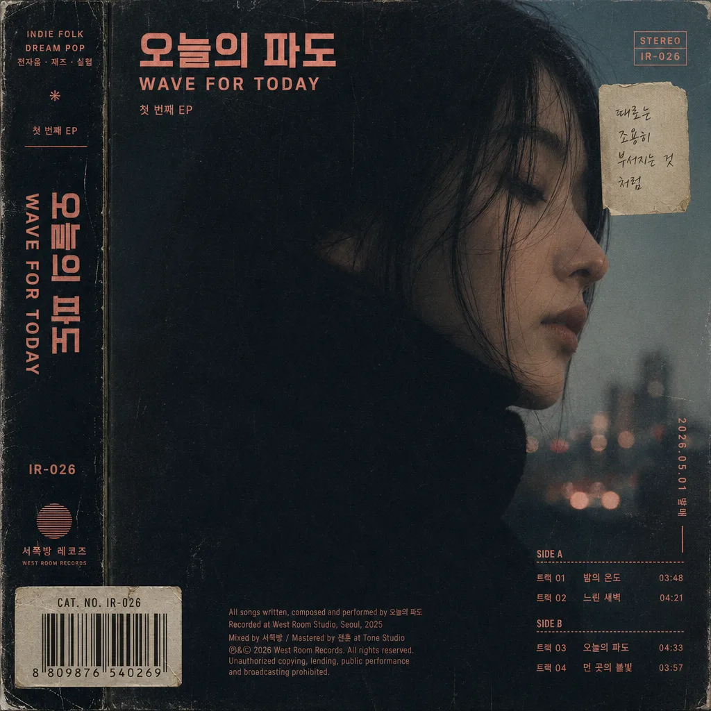
Indie and rookie artist album jacket, square cover art for streaming platforms and digital music release.
Create a realistic, emotionally layered LP/EP jacket aesthetic with tactile print details, artist identity, release information, and a believable Korean indie label design system.

[Composition]
- Square album cover with {비주얼} as the main visual occupying about 60–70% of the frame, composed like a finished streaming cover and physical record sleeve artwork.
- Use {장르·아티스트} as the conceptual anchor, with {컨셉} expressed through symbolic composition, light, surface marks, and small production details that feel connected to the artist.
- {비주얼} should remain the focal element while being surrounded by believable album-jacket information: artist name, album title zone, small catalog code, release date, label credit, and short track-list fragments.
- Background treatment: deep toned surface with visible tactile texture, such as grainy paper stock, matte vinyl ink, risograph speckles, folded sleeve scuffs, faint dust, soft gradient wash, or hand-scanned print marks depending on {컬러}.
- Typography area: integrate {타이포} as a clear title or artist mark, with supporting Korean microtext such as “첫 번째 EP”, “2026.05.01 발매”, “SIDE A”, and “서쪽방 레코즈”.
- Add realistic sleeve details: tiny spine-style text along one edge, a small barcode-like rectangle or catalog-number block, compact credit line, and 2–4 short track titles placed in a tasteful album-cover layout.
- Keep the overall framing balanced and editorial, with the density of a real indie release package rather than a plain concept mockup.

[3. CORE STRUCTURE]
1. Main visual block — Place {비주얼} in the central field, scaled to dominate the composition with deliberate cropping, tactile edges, and designed interaction with the surrounding album text.
2. Concept layer — Encode {컨셉} through abstract cues such as silhouette, texture, light falloff, environmental hints, handwritten markings, sticker residue, sleeve creases, or subtle object traces related to the mood.
3. Color treatment — Apply {컬러} as the dominant palette logic, using one strong accent color against a dark base, with vintage-modern contrast, controlled saturation, and realistic print behavior.
4. Typography block — Integrate {타이포} with a primary title/artist lockup and secondary lines: “첫 번째 EP”, “오늘의 파도”, “2026.05.01 발매”, “트랙 01 밤의 온도”, “트랙 02 느린 새벽”, “CAT. NO. IR-026”.
5. Album mood layer — Blend the full frame into a cohesive indie jacket structure, making the final piece feel like a curated record sleeve with real release metadata, not a generic poster or advertisement.
6. Surface finish — Add subtle paper grain, faint print noise, matte coating texture, slight misregistration, tiny ink spread, sleeve corner wear, and scan-like dust to reinforce {결} and avoid sterile digital smoothness.

[4. STYLE RULES]
- Typography: use Pretendard or Noto Sans KR for Korean, paired with a clean grotesk or condensed sans for English; weight 500–700 for title, 300–400 for subtext, with tight but readable sizing.
- Color palette: follow {컬러} with dark charcoal, near-black, muted navy, deep brown, coral accent, cyan accent, or antique gold highlights; keep palette focused to 2–4 primary tones while allowing print texture variation.
- Cover information system: include a small artist/title credit, release date label, catalog number, tiny label imprint, compact track-list snippet, and spine/edge text such as “{장르·아티스트} / 첫 번째 EP / IR-026”.
- Graphic accents: allow one or two tactile graphic elements such as a translucent price sticker, small punched registration dot, torn paper strip, handwritten Korean note, or barcode-area rectangle if they support {컨셉}.
- Border/shadow: use a soft vignette or thin perimeter shadow, 10–15% opacity, with subtle print-edge softness, corner rubbing, and matte sleeve depth rather than hard framing.

[5. VISUAL STYLE]
- Camera / lens: editorial still-life look shot on a Canon EOS R5 with an 85mm f/1.4 lens, shallow depth feel, centered composition, album-cover clarity.
- Lighting: controlled studio softbox at 45° from upper-left with a very light fill from right; keep shadows smooth and readable, with natural paper sheen, soft sleeve texture, and no harsh glare.
- Color grade: muted charcoal base with one accent hue, slightly desaturated, analog print-like contrast, and a faint film grain finish.
- Rendering quality: make the cover feel physically printed and photographed or scanned, with believable ink density, micro-scratches, dust flecks, and crisp but human-designed Korean typography.

[6. MOOD]
Indie record label cover — Quiet luxury meets underground zine and modern Korean music editorial, like a refined Kinfolk x Aesop x contemporary album sleeve hybrid with the tangible feeling of a newly released Korean rookie artist EP.

[7. CRITICAL]
- Korean text accuracy: 반드시 정확히 보여야 하는 문구: "한글 정확"
- Render Korean cover text accurately where used: "첫 번째 EP", "오늘의 파도", "2026.05.01 발매", "트랙 01 밤의 온도", "트랙 02 느린 새벽", "서쪽방 레코즈".
- Layout invariants: maintain a square album-jacket composition, keep {비주얼} cleanly centered or deliberately offset with clear intent, and ensure {타이포} plus all release metadata remain legible without overlapping key visual details.
- Preserve {장르·아티스트}, {컨셉}, {비주얼}, {컬러}, {타이포}, {결}, and {비율} as the guiding inputs for subject, palette, texture, typography, and composition.

[8. 🚫 PROHIBITED]
- Fake official seals / certifications
- Broken Korean characters