廣告/海報
바우하우스 미니멀 아트 포스터
모던 아트 포스터. Bauhaus·미니멀 결.
바우하우스 미니멀 아트 포스터摘要
這是用來製作廣告/海報內容的 ChatGPT 圖像提示詞,已整理主題、背景、風格與構圖,方便快速調整。
相關關鍵字: 바우하우스 미니멀 아트 포스터, 바우하우스 미니멀 아트 포스터 프롬프트, 廣告/海報 프롬프트, 廣告/海報 AI 이미지 프롬프트, ChatGPT 이미지 프롬프트, AI 이미지 생성 프롬프트, AI 프롬프트, 이미지 프롬프트
바우하우스 미니멀 아트 포스터使用方式
保留原始結構並替換主體、背景、色彩或構圖,即可延伸出不同版本。
- 保留核心主體,並依品牌、季節或平台調整色彩與背景。
- 如果畫面太複雜,請減少背景元素並具體描述主體、構圖與光線。
- 複製後可要求 ChatGPT 配合平台、長寬比或文字需求調整。
提示詞原文
[Input]
- language: Korean
- output_size: 1024x1536

[Purpose]
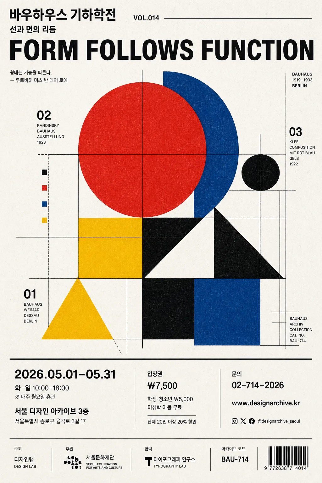
Modern Bauhaus-inspired art poster for an exhibition announcement, editorial wall print, and design portfolio showcase.
Create a real, content-rich vertical poster with geometric abstraction, bold Korean typography, practical event information, ticket details, sponsor area, and authentic print-production cues.

[Composition]
- Canvas is a vertical exhibition poster where the main geometric cluster occupies about 55% of the frame and sits slightly above center for a museum-poster balance, with additional information blocks arranged on a precise modular grid.
- Background treatment: matte white or warm off-white paper surface with visible fine paper grain, subtle ink absorption, slight CMYK registration character, and a printed-poster finish.
- Use {결}, {구성}, {텍스트}, {컬러}, {타이포}, {결 추가} as customizable creative directions while keeping the layout structured, editorial, and poster-like.
- The composition should feel grid-based and modular: align circles, triangles, rectangles, rules, numeric labels, and sponsor marks to an invisible Bauhaus grid with precise spacing, sharp edges, measured visual tension, and believable printed detail.
- Include practical poster content: exhibition title, short subtitle, date/time/venue, ticket price, website or contact line, sponsor strip, and small archival catalog text.

[3. CORE STRUCTURE]
- Upper zone (top 18%): place the main title text block in a clean header area using compact tracking and strong grid alignment. Let {텍스트} appear as the largest Korean typographic statement, supported by smaller lines such as '바우하우스 기하학전', '선과 면의 리듬', and 'VOL.014'.
- Central zone (middle 50%): build the primary abstract structure from circles, triangles, squares, rectangles, thin black rules, and modular numeric markers. Use one dominant shape as the anchor and smaller shapes orbiting with controlled asymmetry; allow overlapping flat color fields, visible overprint edges, and light ink registration offsets.
- Secondary balance points: add smaller geometric accents, section numbers, thin divider lines, and micro labels near the lower-left and upper-right areas to stabilize the design and make it feel like a finished exhibition print.
- Information zone (lower 25%): include event details in Korean, arranged with strict hierarchy: '2026.05.01–05.31', '화–일 10:00–18:00', '서울 디자인 아카이브 3층', '입장권 ₩7,500', '문의 02-714-2026', and 'www.designarchive.kr'.
- Sponsor / credit strip: place a small bottom strip with simple wordmark-style text such as '주최 디자인랩', '후원 서울문화재단', '협력 타이포그래피 연구소', plus a tiny barcode-like ticket block or catalog code 'BAU-714'.
- Text integration: {텍스트} should appear as a prominent typographic statement, set with modern industrial clarity and exact legibility, integrated as part of the poster design rather than a separate caption.
- Color application: use {컬러} as the explicit palette logic, assigning bold flat color fills to geometric shapes, with subtle print grain, overprint touches, and slight ink density variation for realism.
- Typography treatment: {타이포} should appear in a Bauhaus-informed sans-serif arrangement, with bold weight for the main phrase, medium weight for event details, and tiny condensed text for credits and catalog notes.
- Texture cue: {결 추가} may be expressed as paper grain, ink bleed at edges, faint halftone speckling, letterpress-like pressure, or analog screen-print registration detail.
- Format control: {비율} defines a tall poster layout with crisp vertical flow and a complete exhibition-poster hierarchy.

[4. STYLE RULES]
- Typography: Helvetica Neue or Arial-inspired grotesk, bold weight for headline, medium weight for secondary text, condensed small caps feeling for credits, with tight but readable line spacing and precise geometric alignment.
- Color palette: Bauhaus signature palette with red #E53935, yellow #F4C430, blue #1E5AA8, black #111111, and white #F7F5EF; maintain {컬러} as the active palette direction.
- Graphic detail: use thin black rules, numbered grid coordinates, small catalog labels, ticket-code blocks, and sponsor text to create the impression of a professionally printed exhibition poster.
- Print realism: include slight paper waviness, natural ink density changes, mild registration offset, and tiny edge imperfections while keeping the poster front-facing and legible.

[5. VISUAL STYLE]
- Camera / lens: front-facing graphic poster render, equivalent to an 85mm straight-on product shot feel with zero distortion, perfectly orthographic and centered.
- Lighting: even studio light from the front with soft diffuse coverage, faint paper-surface relief, and gentle print-like edge separation.
- Color grade: clean neutral whites, saturated primary accents, high contrast black text, and slightly muted paper warmth for a gallery-print finish.

[6. MOOD]
Museum-quality Bauhaus exhibition poster — disciplined, historical, tactile, and editorial, like a well-preserved design archive print prepared for a contemporary Korean gallery event.

[7. CRITICAL]
- Korean text accuracy: no broken Korean characters in any supporting labels or custom text.
- Render Korean poster copy clearly, including {텍스트} plus supporting text such as '바우하우스 기하학전', '선과 면의 리듬', '2026.05.01–05.31', '서울 디자인 아카이브 3층', '입장권 ₩7,500', and '주최 디자인랩'.
- Layout invariant: maintain a strict geometric grid, flat Bauhaus color logic, balanced asymmetry, and a complete exhibition-poster information system.
- The design must preserve the original concept of a modern art poster with Bauhaus and constructivist geometry while feeling like a real printed event poster.

[8. 🚫 PROHIBITED]
- Fake official seals / certifications
- Broken Korean characters