漫畫/插畫
서울 도시 일러스트 (랜드마크·골목)
서울 도시 일러스트. 랜드마크·골목 컬렉션.
서울 도시 일러스트 (랜드마크·골목)摘要
這是用來製作漫畫/插畫內容的 ChatGPT 圖像提示詞,已整理主題、背景、風格與構圖,方便快速調整。
相關關鍵字: 서울 도시 일러스트 (랜드마크·골목), 서울 도시 일러스트 (랜드마크·골목) 프롬프트, 漫畫/插畫 프롬프트, 漫畫/插畫 AI 이미지 프롬프트, ChatGPT 이미지 프롬프트, AI 이미지 생성 프롬프트, AI 프롬프트, 이미지 프롬프트
서울 도시 일러스트 (랜드마크·골목)使用方式
保留原始結構並替換主體、背景、色彩或構圖,即可延伸出不同版本。
- 保留核心主體,並依品牌、季節或平台調整色彩與背景。
- 如果畫面太複雜,請減少背景元素並具體描述主體、構圖與光線。
- 複製後可要求 ChatGPT 配合平台、長寬比或文字需求調整。
提示詞原文
[Input]
- language: Korean
- output_size: 1536x1024

[Purpose]
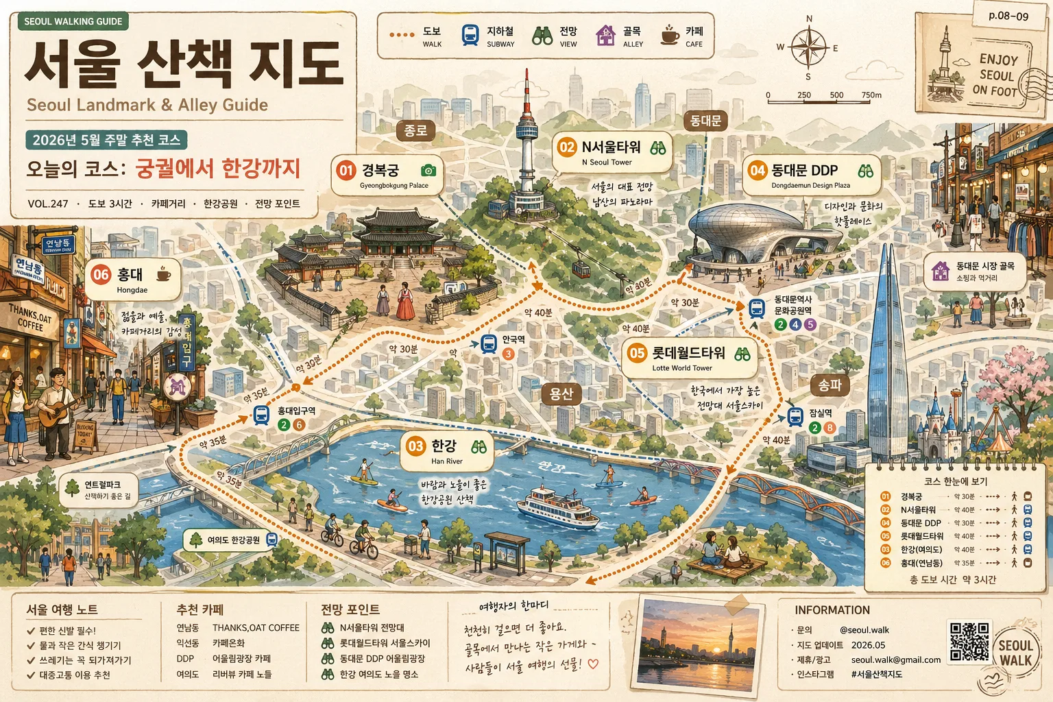
Korean city illustration map-style composition for Seoul, combining landmark highlights, neighborhood alley details, and guided-tour editorial information.
Travel-guidebook-style visual that works as a poster, city intro graphic, or editorial spread, with enough real-world information cues to feel like a printed Seoul walking guide.

[Composition]
- Main composition: {레이아웃} in a 1536x1024 horizontal format, with {랜드마크} distributed as clearly separated illustrated landmarks connected by friendly walking-route lines.
- Subject placement: large landmarks occupy the central city-map flow, while smaller street and neighborhood details fill foreground corners, river edges, and alley pockets with café signs, stair rails, buses, trees, rooftop plants, street lamps, and tiny pedestrians drawn as simple illustration icons.
- Background treatment: layered Seoul cityscape with simplified building blocks, bridges, road curves, Han River shapes, Namsan hillside contours, subway-route hints, and soft paper-grain surface texture.
- Information design: include a title block reading {타이틀}, a small English subtitle {부제}, date label {가이드_날짜}, route name {코스명}, and a compact legend showing 도보, 지하철, 전망, 골목, 카페 icons.
- Label system: landmark names should sit inside small rounded label plaques or map pins, with connecting leader lines, route numbers 01–06, and small English secondary captions under selected Korean labels.
- Style direction: combine cute editorial city-map readability with balanced tourist-guide clarity, using {일러스트_결} and {편집_콘셉트}.

[3. CORE STRUCTURE]
1. Base scene: build the overall Seoul skyline and district silhouette first, with a low horizon and a wide urban overview that supports the {비율} travel poster format.
2. Landmark layer: place {랜드마크} as the primary visual anchors, each simplified into recognizable shapes and proportions without losing their iconic identity.
3. Street / neighborhood layer: add {골목_디테일} around Hongdae-style streets, palace walls, riverside paths, underpass corners, café awnings, local store signs, crosswalk marks, bicycle racks, and leafy sidewalk details.
4. Route / map layer: draw warm amber route lines, dotted walking paths, subway color dashes, bridge arrows, tiny compass rose, scale bar, and district chips such as 종로, 용산, 송파, 동대문, 마포.
5. Typography layer: apply {타이포} as neat Korean landmark labels, route numbers, micro captions, and one understated English subtitle line beside the main title zone.
6. Editorial detail pass: add {지도_마이크로텍스트}, a small “SEOUL WALKING GUIDE” tag, issue-style note “VOL.247”, page marker “p.08–09”, and a bottom information strip containing {하단정보}.
7. Finish pass: unify all illustration elements with a warm guidebook-like finish, subtle print texture, light shadow separation, and cohesive Seoul travel illustration mood.

[4. STYLE RULES]
- Typography: use Pretendard or Noto Sans KR for Korean labels, medium weight 500–600, with a simple sans serif English subtitle in a lighter weight; route numbers may use a rounded condensed style for guidebook character.
- Color palette: {컬러팔레트} should be expressed as specific tones such as #E8D8B8 beige, #B68A5A wood brown, #D89A3A amber, #7E9F63 natural green, and dancheong-inspired accent reds/teals used sparingly.
- Illustration linework: clean vector-style outlines, slightly imperfect hand-drawn corners, soft 8%–12% shadow separation, muted paper grain, and small colored badges for landmarks, cafés, transit, and river activities.
- Poster/editorial details: include a compact sponsor/info area styled as travel-guide metadata, not an official government seal; add tiny pictogram icons, caption boxes, route badges, and decorative map ornaments inspired by Seoul streets.

[5. VISUAL STYLE]
- Camera / lens: conceptual city-guide illustration, inspired by an overhead travel map and editorial infographic layout rather than a real camera capture; if perspective is needed, use a wide 24mm architectural viewpoint feel.
- Lighting: even daylight illustration with subtle warm sunlight from upper-left, gentle contrast, and soft shadows under buildings, signs, trees, route plaques, and bridge shapes.
- Color grade: warm cream + amber + beige base with natural green and restrained dancheong color accents, keeping the overall tone airy, readable, and print-friendly.

[6. MOOD]
Travel guidebook editorial illustration — a friendly Seoul city feature with Kinfolk-meets-city-map clarity, lively alley storytelling, and practical walking-tour poster energy.

[7. CRITICAL]
- Korean text accuracy: the following Korean strings must appear correctly in the image: 서울, 서울 산책 지도, 경복궁, N서울타워, 롯데월드타워, 동대문 DDP, 한강, 홍대.
- Additional rendered Korean details should include: 2026 서울 여행 노트, 오늘의 코스, 도보 3시간, 종로, 용산, 송파, 동대문, 마포, 카페거리, 한강공원.
- Korean labels, captions, route chips, and bottom information text must be crisp, evenly spaced, and fully legible with no broken or mirrored characters.
- Composition must remain a Seoul landmark-and-alley illustration with real Seoul cues; do not replace with unrelated cities, fantasy landmarks, or generic non-Seoul streets.

[8. 🚫 PROHIBITED]
- Fake official seals / certifications
- Broken Korean characters
- Celebrity composites or recognizable public figures
- Misleading official government/emergency insignia