취미/라이프
추상 페인팅 무드보드
추상 페인팅 무드보드. 색감 + 텍스처.
추상 페인팅 무드보드 검색 요약
추상 페인팅 무드보드은 취미/라이프 결과물을 만들 때 바로 복사해 활용할 수 있는 ChatGPT 이미지 프롬프트입니다. 주제, 배경, 스타일, 구도 조건을 함께 담아 빠르게 시안을 만들 수 있도록 구성했습니다.
관련 키워드: 추상 페인팅 무드보드, 추상 페인팅 무드보드 프롬프트, 취미/라이프 프롬프트, 취미/라이프 AI 이미지 프롬프트, ChatGPT 이미지 프롬프트, AI 이미지 생성 프롬프트, AI 프롬프트, 이미지 프롬프트
추상 페인팅 무드보드 활용 포인트
원본 구조를 유지하면서 피사체, 배경, 색감, 구도를 바꿔 다양한 시안으로 확장할 수 있습니다.
- 핵심 소재는 유지하고 브랜드, 계절, 채널 목적에 맞는 색감과 배경을 바꿔보세요.
- 결과가 산만하면 배경 요소를 줄이고 피사체, 구도, 조명 조건을 구체화하세요.
- 복사한 뒤 ChatGPT에서 플랫폼, 화면 비율, 텍스트 포함 여부를 추가로 요청할 수 있습니다.
프롬프트 원문
[Input]
- language: Korean
- output_size: 1024x1024

[Purpose]
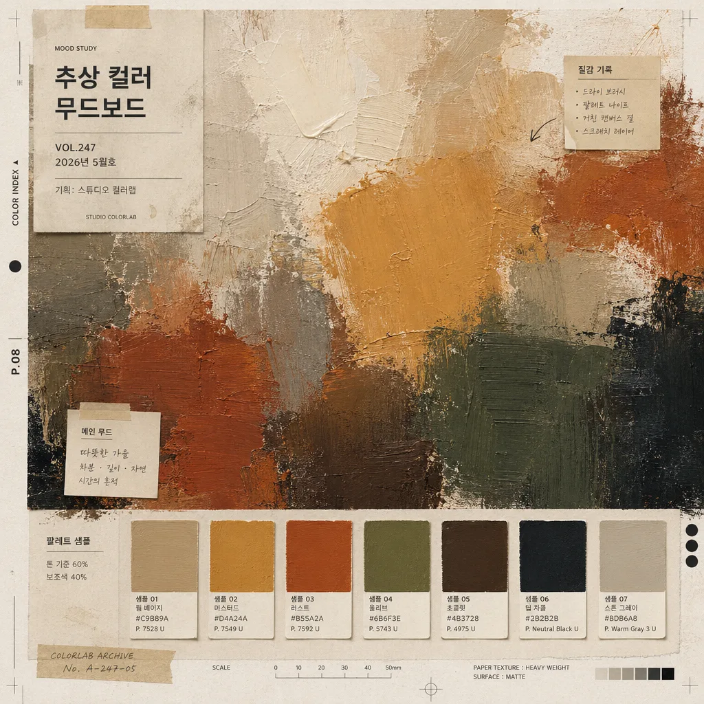
Abstract color moodboard for editorial presentation, designed as a square graphic poster with layered paint textures, palette swatches, studio annotations, and small printed reference labels.
Gallery-magazine style visual reference board that feels like a curated palette study photographed from a real art director’s table, not a single finished painting.

[Composition]
- Main canvas: full-bleed abstract painted surface occupying most of the frame, with visible brush marks, pigment buildup, dry-brush streaks, scraped edges, paint drag, and tactile canvas or heavy-paper grain.
- Palette chips: small color swatches arranged as a refined secondary row or clustered sample strip, each chip separated by consistent spacing, tiny Korean captions, palette code numbers, and paper-label margins.
- Editorial details: include a small title block reading "추상 컬러 무드보드", issue-style notation such as "VOL.247", date label "2026년 5월호", curator credit "기획: 스튜디오 컬러랩", and tiny texture-note labels like "질감 기록" and "팔레트 샘플".
- Layout balance: one large expressive painted field, one supporting text/label area, one compact swatch zone, and a few realistic art-board details such as crop marks, small tape tabs, registration dots, pencil alignment ticks, or printed sample IDs.
- Use {무드}, {결}, {컬러 팔레트}, {레이아웃}, {타이포}, {결 추가}, {비율} as the configurable visual direction cues.

[3. CORE STRUCTURE]
- Base layer: build a textured abstract painting first, using broad opaque strokes, layered translucent washes, visible canvas grain, feathered pigment blooms, and uneven hand-applied paint density across the square composition.
- Color field layer: map the mood into a dominant palette based on {무드}, with 1–2 anchor hues and several supporting tones distributed in large blocks, imperfect gradients, overlapping swaths, rubbed transitions, and visible underpainting.
- Texture layer: emphasize {결} through thick impasto ridges, bristle marks, palette-knife scrapes, cracked dry patches, speckled pigment deposits, and occasional rough areas that reveal underlayers.
- Swatch layer: place small rectangular color chips derived from {컬러 팔레트} in an editorial arrangement; add tiny labels such as "샘플 01", "샘플 02", "톤 기준", "보조색", and concise hex-like or pigment-code marks.
- Typographic layer: apply {타이포} as refined Korean editorial labeling, mixing clean sans-serif captions with small studio-note text; keep the title, date, palette labels, and curator credit legible but subordinate to the painted surface.
- Reference layer: add realistic printed-board information including "MOOD STUDY", "COLOR INDEX", page marker "P.08", a small scale tick strip, and subtle annotation arrows pointing to selected texture areas.
- Finishing layer: add {결 추가} as polished art-book presentation quality, with crisp printed labels, tactile paper fibers, delicate ink registration, and a believable photographed-art-board finish.
- Final framing: maintain {비율} as a centered square composition with rectified overhead perspective, letting the painted field remain dominant while the surrounding editorial marks and labels make it feel like a real curated moodboard page.

[4. STYLE RULES]
- Typography: Pretendard or Noto Sans KR, light to regular weight for small notes, medium weight for the title, 18–28px for labels, subtle tracking, with a magazine-reference hierarchy rather than sterile UI text.
- Color palette: use {컬러 팔레트} as the direct swatch set; keep neutrals like warm gray #CFC7BC, off-white #F4F1EA, charcoal #2B2B2B, muted kraft paper, and faint graphite only as supporting anchors when needed.
- Surface details: allow realistic paper fibers, matte pigment granulation, small dust specks, faint pencil marks, label-sticker edges, tiny tape shadows, and natural paint thickness variations.
- Border/shadow: avoid heavy framing; if a sheet edge appears, use a faint paper-edge shadow at 3px y-offset, 10px blur, 12% opacity, with subtle crop marks or printed trim indicators for an art-book production feel.

[5. VISUAL STYLE]
- Camera / lens: overhead flat-lay look as if shot with a Phase One IQ4 and 80mm lens at f/8, perfectly rectified square framing.
- Lighting: soft diffused studio lighting from upper-left at 45°, gentle fill from lower-right, controlled highlights on raised impasto ridges, preserving matte paint texture and paper relief.
- Color grade: editorial art-book grade with muted pigment realism, balanced contrast, slightly warm neutral whites, and accurate color separation so the palette remains the main visual statement.

[6. MOOD]
Curated gallery-poster moodboard — like a Kinfolk x ARTnews art direction spread with contemporary studio-paint texture, real printed annotations, palette research details, and tactile working-studio authenticity.

[7. CRITICAL]
- Korean text accuracy: all visible labels must render clean Korean without broken characters.
- Verbatim Korean strings that must appear correctly: "추상 컬러 무드보드", "2026년 5월호", "기획: 스튜디오 컬러랩", "질감 기록", "팔레트 샘플".
- Composition invariant: the image must remain a square abstract moodboard with one large painted field plus small swatches, title block, date/credit labels, and editorial studio notes; do not turn it into a figurative illustration.

[8. 🚫 PROHIBITED]
- Fake official seals / certifications
- Broken Korean characters