광고/포스터
이케아 카탈로그 톤 가구 광고
이케아 카탈로그 결 — 가구 + 룸 셋 + 가격 + 미니멀 톤
이케아 카탈로그 톤 가구 광고 검색 요약
이케아 카탈로그 톤 가구 광고은 광고/포스터 결과물을 만들 때 바로 복사해 활용할 수 있는 ChatGPT 이미지 프롬프트입니다. 주제, 배경, 스타일, 구도 조건을 함께 담아 빠르게 시안을 만들 수 있도록 구성했습니다.
관련 키워드: 이케아 카탈로그 톤 가구 광고, 이케아 카탈로그 톤 가구 광고 프롬프트, 광고/포스터 프롬프트, 광고/포스터 AI 이미지 프롬프트, ChatGPT 이미지 프롬프트, AI 이미지 생성 프롬프트, AI 프롬프트, 이미지 프롬프트
이케아 카탈로그 톤 가구 광고 활용 포인트
원본 구조를 유지하면서 피사체, 배경, 색감, 구도를 바꿔 다양한 시안으로 확장할 수 있습니다.
- 핵심 소재는 유지하고 브랜드, 계절, 채널 목적에 맞는 색감과 배경을 바꿔보세요.
- 결과가 산만하면 배경 요소를 줄이고 피사체, 구도, 조명 조건을 구체화하세요.
- 복사한 뒤 ChatGPT에서 플랫폼, 화면 비율, 텍스트 포함 여부를 추가로 요청할 수 있습니다.
프롬프트 원문
[Input]
- language: Korean
- output_size: 1024x1536

[Purpose]
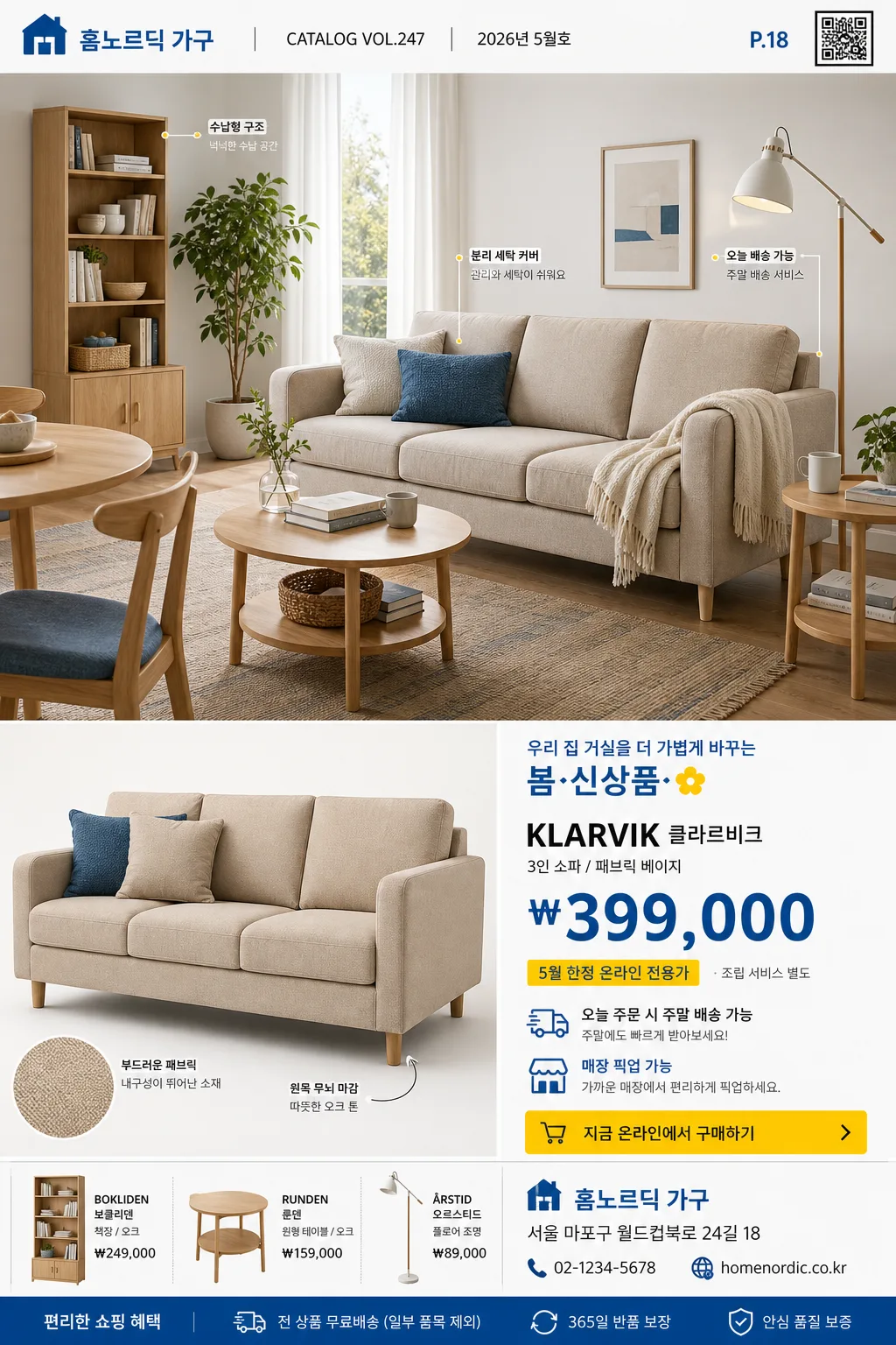
Korean IKEA-style furniture catalog advertisement, approachable retail poster with a room-set hero, product detail modules, realistic prices, and store information.
Vertical catalog ad for furniture promotion, designed to feel like a mass-market Scandinavian home goods print spread with practical shopping cues and lived-in home details.

[Composition]
- Overall composition: a tall 1024x1536 retail poster with a dominant upper room-set hero occupying about 55% of the frame, a secondary single-product cutout or close product view at lower-left, and a compact price/store information block at lower-right.
- Background treatment: bright white walls, pale oak wood floor, soft daylight, a woven rug, stacked books, ceramic mug, fabric throw, cushion texture, small framed print, and one or two green plants so the room feels like a real furnished home.
- Spacing and framing: editorial catalog grid with visible module divisions, practical print-ad alignment, a top catalog label strip, lower shopping information area, and readable product callouts connected to the furniture.
- Use {브랜드톤}, {시그니처룩}, {메인제품}, {룸세팅}, {조명분위기}, {컬러팔레트}, {헤드라인}, {모델명}, {가격}, {프로모션문구}, {매장명}, {주소}, {연락처}, {카탈로그번호}, {발행일}, {배송정보}, {레이아웃}, {비율} to control the final retail identity.

[3. CORE STRUCTURE]
1) Top catalog strip: add a small retail header with {매장명}, {카탈로그번호}, {발행일}, a simple page mark such as “P.18”, and a tiny barcode or QR-style shopping code; keep it believable as a printed catalog page rather than a blank poster.
2) Top hero panel: show a Scandinavian-inspired room scene based on {룸세팅}, with {메인제품} staged naturally in a real home environment; include cushions, lamps, a side table, books, plant leaves, fabric texture, wood grain, and small everyday objects that support the furniture lifestyle.
3) Lower-left product panel: show the featured furniture item from {메인제품} as a catalog cutout, angled close-up, or neat product crop; include material details from the scene such as weave, stitching, wood edge, metal leg, shelf grain, or lamp shade texture.
4) Lower-right information panel: place {헤드라인}, {모델명}, {가격}, {프로모션문구}, {배송정보}, {주소}, and {연락처} in a compact shopping block with price hierarchy, short bullet specs, and a small yellow call-to-action label.
5) Product callouts: add 2–3 small Korean callout labels near the furniture, for example “분리 세탁 커버”, “수납형 구조”, “오늘 배송 가능”, or “원목 무늬 마감”, connected with fine guide lines.
6) Brand treatment: keep the overall retail system aligned with {브랜드톤} and {시그니처룩}, using consistent grid logic, clear product hierarchy, and friendly price-driven catalog communication.
7) Color integration: apply {컬러팔레트} across header strip, price tag, callout dots, small labels, delivery badge, and CTA elements; let the room photography carry natural white, beige, oak, fabric, and plant colors.
8) Typography placement: use the header, model line, price, promo copy, specs, store address, and contact hierarchy with strict alignment, practical line breaks, and clear print readability.

[4. STYLE RULES]
- Typography: use a modern sans-serif such as Noto Sans KR or Pretendard, bold for furniture names and headline, medium for model lines and item specs, and regular for address/contact copy; the price should be prominent and immediately scannable.
- Color palette: use {컬러팔레트} with white as the base, IKEA-like blue as the primary accent, bright yellow as the secondary accent, and beige/wood tones for warmth; use small red or gray micro text only if needed for pricing or delivery notes.
- Catalog graphics: include realistic retail details such as product code, small barcode, QR-style square, page number, discount tag, delivery icon row, material swatch dots, and short spec bullets, all integrated into the grid.
- Border/shadow: use crisp editorial edges with very subtle drop shadows only, around 4px y-offset, 12px blur, 15% opacity, so the cutout/product modules feel clean and realistic.
- Image texture: furniture should show fabric weave, wood grain, seams, screw caps, shelf thickness, cushion compression, paper catalog texture, and natural floor reflections rather than flat vector surfaces.

[5. VISUAL STYLE]
- Camera / lens: high-resolution interior photography look, like a Canon EOS R5 with a 24mm or 35mm lens for the room hero, and an 85mm equivalent for the product cutout to keep proportions clean and commercial.
- Lighting: natural daylight from a large window at upper-left, soft diffuse fill across the room, gentle shadow falloff on the floor, and no harsh contrast.
- Color grade: bright Scandinavian retail grade with white walls, cool blue accents, warm oak wood, restrained yellow highlights, realistic textile texture, and neutral clean whites.

[6. MOOD]
Mass-market Scandinavian retail catalog — friendly home goods brochure and practical showroom print-ad feel, with affordable shopping energy, readable price information, and a believable lived-in room set.

[7. CRITICAL]
- Korean rendered text must appear correctly and legibly if shown: “{매장명}”, “{헤드라인}”, “{모델명}”, “{가격}”, “{프로모션문구}”, “{배송정보}”, “{주소}”, “{연락처}”, “{카탈로그번호}”, “{발행일}”.
- Include realistic catalog microcopy such as “P.18”, “온라인 전용가”, “재고 확인”, “매장 픽업 가능”, “조립 서비스 별도”, and “QR로 제품 보기” where it fits the layout.
- Keep the composition as a furniture advertisement with a room-set hero on top, product block below-left, and price/store information block below-right.
- Typography must remain legible, aligned, and commercial; no broken Korean characters.

[8. 🚫 PROHIBITED]
- Fake official seals / certifications
- Broken Korean characters
- Celebrity composites or unauthorized celebrity likeness