広告・ポスター
무지 미니멀 라이프 광고
MUJI 톤 — 미니멀·자연·일본 결 라이프 제품
무지 미니멀 라이프 광고の概要
広告・ポスター画像を作るためのChatGPT画像プロンプトです。主題、背景、スタイル、構図を整理し、すぐに試せるよう構成しています。
関連キーワード: 무지 미니멀 라이프 광고, 무지 미니멀 라이프 광고 프롬프트, 広告・ポスター 프롬프트, 広告・ポスター AI 이미지 프롬프트, ChatGPT 이미지 프롬프트, AI 이미지 생성 프롬프트, AI 프롬프트, 이미지 프롬프트
무지 미니멀 라이프 광고の活用方法
元の構造を保ちながら、被写体、背景、色、構図を変更して別案に展開できます。
- 主題を維持し、ブランドや季節、媒体に合わせて色と背景を変更してください。
- 結果が複雑な場合は背景要素を減らし、被写体、構図、照明を具体化してください。
- コピー後、ChatGPTに媒体、アスペクト比、文字の有無を追加で指定できます。
プロンプト原文
[Input]
- language: Korean
- output_size: 1024x1024

[Purpose]
MUJI-inspired Korean lifestyle advertisement, square hero composition for social media or brand promo use.
Realistic product-centric retail campaign image that feels like a quiet in-store catalog moment with tactile materials, useful everyday objects, and credible shopping information.

[Composition]
- Center the main product cluster in a square hero frame, occupying about 58–65% of the image, with balanced surrounding room for retail copy, price notes, and small catalog details.
- Build a warm lifestyle setting: off-white paper backdrop, pale beige wall, matte tabletop, light wood tray or shelf edge, cotton/linen texture, and subtle natural shadows.
- Place supporting labels, price cues, catalog number, barcode/QR-style area, and store information near the lower corners or side edge, aligned on a clean invisible grid.
- Use {브랜드 톤} as the overall brand voice, with {시그니처 결} reflected in the object selection, material finish, stacking rhythm, paper tags, and fabric textures.
- Build the scene around {제품·소재}, adding realistic companion items such as a folded linen cloth, kraft hangtag, ceramic cup, wooden spoon, cotton pouch, notebook, or small dried branch when they reinforce the everyday retail story.

[3. CORE STRUCTURE]
1) Hero area (center 60%): arrange {제품·소재} as the primary subject, neatly stacked or slightly offset in a calm showroom-style arrangement, with crisp product edges, believable contact shadows, and tactile surface details.
2) Surface and backdrop: use a matte beige tabletop or pale wood surface with visible fine grain; background stays soft white to warm gray-beige with natural paper fiber, wall corner, faint shelf line, or soft fabric fold.
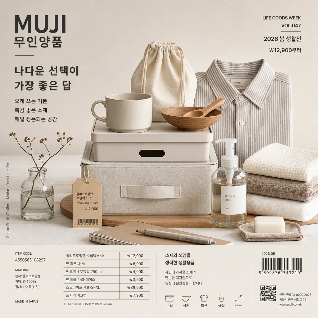
3) Real retail cues: include a small kraft product tag, simple price label, barcode area, item code, and mini catalog note such as "LIFE GOODS WEEK", "VOL.047", "2026 봄 생활전", "₩12,900부터", and "소재와 쓰임을 생각한 생활용품".
4) Typography zone: place {카피·타이포} in a precise Korean ad layout, using clear hierarchy with a short main copy line such as "나다운 선택이 가장 좋은 답" and 2–3 short supporting blurbs like "오래 쓰는 기본", "촉감 좋은 소재", "매일 정돈되는 공간".
5) Additional information strip: add small spine/credit-style text along one side or bottom edge: "Photo: Studio Calm", "Model/Product: Daily Linen Set", "매장 안내 02-0000-2026", "서울시 중구 생활로 12", plus a tiny barcode/QR-style block that reads as retail packaging detail.
6) Layout discipline: keep {레이아웃} with measured spacing, strong alignment, realistic product scale, and a premium retail-catalog feel.
7) Format and output: maintain {비율} as a square composition with balanced breathing room on all sides and enough detail to feel like a photographed lifestyle advertisement.

[4. STYLE RULES]
- Typography: use Pretendard or Noto Sans KR for Korean copy, paired with a clean sans-serif English title; regular to medium weight, readable small-to-medium hierarchy, tight but natural tracking, clean editorial spacing.
- Color palette: {컬러 팔레트} interpreted as hex-like tones such as #E8DDCF beige, #F7F4EE white, #B79C7A wood, #3B3A36 charcoal, plus one muted accent from the palette on a tag, label stripe, sticker, or folded fabric edge.
- Retail graphic details: include a small price table, item code line, barcode/QR-style rectangle, date label "2026.05", and short Korean care/material notes, all printed sharply and aligned.
- Shadow and finish: soft realistic product shadows with 4px y-offset, 14px blur, about 12% opacity; matte materials, natural paper fibers, linen weave, ceramic pores, wood grain, and subtle shelf reflections where appropriate.

[5. VISUAL STYLE]
- Camera / lens: Canon EOS R5 with RF 85mm f/1.2L lens stopped to f/5.6, studio product photo look, front-facing catalog framing with very low distortion and crisp mid-depth detail.
- Lighting: {무드·라이팅}; diffused natural daylight from upper-left at about 45°, gentle fill from right, controlled soft shadows, believable highlights on paper, wood, fabric, ceramic, or matte plastic.
- Color grade: warm neutral beige + paper white + light wood brown + soft charcoal, with low saturation, calm contrast, and realistic material separation.

[6. MOOD]
Quiet premium retail campaign — MUJI flagship catalog aesthetics with the restrained clarity of a Japanese lifestyle magazine spread, enriched by tactile everyday objects, believable store information, and Korean lifestyle-ad details.

[7. CRITICAL]
- Korean text accuracy: the following verbatim Korean strings must appear correctly if shown in the design: "브랜드 톤", "시그니처 결", "제품·소재", "무드·라이팅", "컬러 팔레트", "카피·타이포", "레이아웃", "비율".
- Render short Korean ad text clearly and without corruption, including examples such as "나다운 선택이 가장 좋은 답", "오래 쓰는 기본", "촉감 좋은 소재", "매일 정돈되는 공간", "2026 봄 생활전", and "₩12,900부터".
- Maintain a square hero composition with aligned retail typography, believable product scale, natural material textures, and undistorted objects.
- If human figures are included at all, keep them realistic and anatomically correct; otherwise keep the scene product-only.

[8. 🚫 PROHIBITED]
- Fake official seals or certifications
- Broken Korean characters
- Celebrity composites or unauthorized likeness