광고/포스터
Costco 톤 창고형 마트 광고
Costco 톤 — 벌크·가성비·창고 결
Costco 톤 창고형 마트 광고 검색 요약
Costco 톤 창고형 마트 광고은 광고/포스터 결과물을 만들 때 바로 복사해 활용할 수 있는 ChatGPT 이미지 프롬프트입니다. 주제, 배경, 스타일, 구도 조건을 함께 담아 빠르게 시안을 만들 수 있도록 구성했습니다.
관련 키워드: Costco 톤 창고형 마트 광고, Costco 톤 창고형 마트 광고 프롬프트, 광고/포스터 프롬프트, 광고/포스터 AI 이미지 프롬프트, ChatGPT 이미지 프롬프트, AI 이미지 생성 프롬프트, AI 프롬프트, 이미지 프롬프트
Costco 톤 창고형 마트 광고 활용 포인트
원본 구조를 유지하면서 피사체, 배경, 색감, 구도를 바꿔 다양한 시안으로 확장할 수 있습니다.
- 핵심 소재는 유지하고 브랜드, 계절, 채널 목적에 맞는 색감과 배경을 바꿔보세요.
- 결과가 산만하면 배경 요소를 줄이고 피사체, 구도, 조명 조건을 구체화하세요.
- 복사한 뒤 ChatGPT에서 플랫폼, 화면 비율, 텍스트 포함 여부를 추가로 요청할 수 있습니다.
프롬프트 원문
[Input]
- language: Korean
- output_size: 1024x1536

[Purpose]
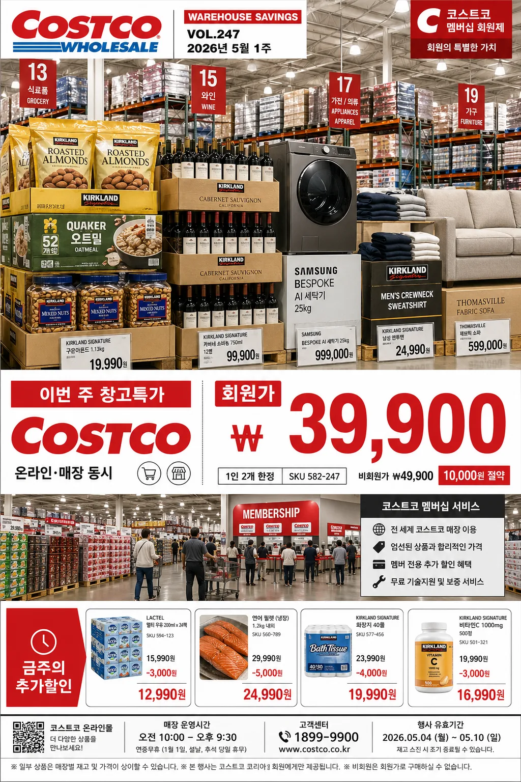
Costco-style warehouse club advertisement poster, tall vertical retail promo for bulk goods, membership pricing, and limited-time warehouse deals.
Commercial ad layout that feels like a real big-box weekly flyer photographed inside a busy warehouse store: stacked pallets, aisle signage, price cards, coupon-style information, and strong instant price hierarchy.

[Composition]
- Top hero zone takes about 42% of the frame: {제품·소재} presented as the main commercial subject, arranged with bold scale contrast, visible bulk packaging, palletized quantity, shrink-wrap edges, shelf labels, and clear product mass.
- Mid-zone pricing area takes about 20%: oversized sale copy and membership price block placed immediately below the hero for fast scanning, with a coupon-card feel, SKU line, savings note, and short Korean promo phrase.
- Lower zone takes about 24%: warehouse interior cues, stacked pallets, aisle depth, checkout/member desk hints, store information panels, additional small deal tiles, and membership-service copy to reinforce the big-box retail setting.
- Background treatment: bright warehouse ceiling, visible metal beams, hanging aisle number signs, pallet stacks, concrete floor reflections, shopping cart silhouettes, yellow safety bollards, and realistic retail signage surfaces.
- Maintain strong left-to-right reading flow with layered retail details around the hero and price block: shelf talkers, small product labels, coupon strips, barcode/QR-style area, date label, and fine-print legal line.
- Use {브랜드 톤}, {시그니처 결}, and {레이아웃} as the core customizable structure while preserving the warehouse-club advertisement format.

[3. CORE STRUCTURE]
1. Hero product block: place {제품·소재} in the upper-center with oversized scale, crisp edges, and a store-floor realism look; if multiple items appear, group them like a bulk-endcap display with visible packaging volume, repeated units, carton seams, pallet wood texture, shrink-wrap highlights, and retail shelf tags.
2. Price emphasis block: position {카피·타이포} directly beneath the hero in a dominant hierarchy, using a large bold price figure and smaller membership note beneath it, as if printed for a warehouse weekly flyer. Add supporting Korean microcopy such as "이번 주 창고특가", "온라인·매장 동시", "1인 2개 한정", "SKU 582-247" where it fits naturally.
3. Brand cue block: integrate {브랜드 톤} near the upper-left or upper-right as a strong retail identity anchor, with a flyer header line such as "WAREHOUSE SAVINGS", "VOL.247", "2026년 5월 1주", and a small member-service strip.
4. Signature retail texture: render {시그니처 결} through stacked cartons, pallet shrink-wrap, warehouse shelving depth, wide aisle perspective, price-tag rails, hanging category signs, floor reflections, and practical in-store materials.
5. Mood and lighting layer: apply {무드·라이팅} across the entire scene so the store feels bright, practical, high-traffic, and commercially real, with clear visibility on product surfaces, packaging nutrition/label blocks, price signage, and carton texture.
6. Color system: apply {컬러 팔레트} across headers, sale tags, coupon bands, member-price panels, aisle signs, and small informational badges; red pricing elements should stand out instantly against white, black, gray, and warehouse-neutral surfaces.
7. Layout anchor: follow {레이아웃} exactly, ensuring the top hero, central price, and bottom store/member information remain in clear stacked order while adding realistic flyer details such as store hours, date validity, barcode area, contact line, and secondary deal blurbs.
8. Format lock: keep {비율} as the final framing standard, with fully legible Korean typography, intact price figures, realistic product geometry, and preserved warehouse depth.

[4. STYLE RULES]
- Typography: bold condensed sans-serif for headline pricing, resembling Helvetica Neue Condensed Bold or Pretendard ExtraBold; price size should be the largest text on the poster, with smaller supporting copy in Noto Sans KR Medium. Use compact flyer typography for SKU, date, and fine print.
- Color palette: {컬러 팔레트} should be expressed with Costco-like red #E31837, white #FFFFFF, and black #111111, with cool gray warehouse neutrals, steel shelving, beige cardboard, yellow safety accents, and subtle blue membership-strip accents.
- Retail graphic details: include a top red header bar, membership-price card, small barcode/QR-style box, coupon clipping line, "기간 2026.05.01–05.07", "전국 창고형 매장", "오전 10시–오후 10시", and two or three short feature blurbs in Korean such as "대용량으로 더 알뜰하게", "회원 전용 즉시할인", "주말 장보기 추천".
- Border/shadow: use realistic print-ad panel shadows under product stacks and text panels, about 4px y-offset, 12px blur, 15% opacity, with rectangular price blocks, thin divider rules, and small red corner tabs.

[5. VISUAL STYLE]
- Camera / lens: 35mm full-frame documentary retail shot, f/5.6, eye-level to slightly low angle for a warehouse-endcap perspective, with enough depth to show aisle structure.
- Lighting: bright overhead LED warehouse lighting combined with daylight spill from storefront openings, slight cool fill from the left, crisp visibility on packaging edges, price cards, pallet wrap, and floor reflections.
- Color grade: high-contrast commercial retail grade with vivid red accents, neutral whites, steel-gray shelving, beige cardboard texture, yellow safety details, and clean black typography.

[6. MOOD]
High-volume warehouse club flyer — practical big-box retail editorial with the straightforward punch of Costco weekly promo design, enriched with real store atmosphere, member-only urgency, stacked inventory abundance, and believable weekly-sale information.

[7. CRITICAL]
- Korean text accuracy: 반드시 정확히 보여야 하는 문구: "Costco", "KRW 39,900", "회원가".
- Additional Korean flyer text should be sharp and readable where present: "이번 주 창고특가", "기간 2026.05.01–05.07", "전국 창고형 매장", "대용량으로 더 알뜰하게", "회원 전용 즉시할인".
- Layout invariant: keep the vertical hierarchy of top hero product, central oversized price, and bottom store/member information.
- Typography invariant: the price must be the most visually dominant text element on the poster.

[8. 🚫 PROHIBITED]
- Fake official seals / certifications
- Broken Korean characters
- Celebrity composites / unauthorized likeness