광고/포스터
홈플러스 마트 광고
홈플러스 톤 — 한국 대형 마트
홈플러스 마트 광고 검색 요약
홈플러스 마트 광고은 광고/포스터 결과물을 만들 때 바로 복사해 활용할 수 있는 ChatGPT 이미지 프롬프트입니다. 주제, 배경, 스타일, 구도 조건을 함께 담아 빠르게 시안을 만들 수 있도록 구성했습니다.
관련 키워드: 홈플러스 마트 광고, 홈플러스 마트 광고 프롬프트, 광고/포스터 프롬프트, 광고/포스터 AI 이미지 프롬프트, ChatGPT 이미지 프롬프트, AI 이미지 생성 프롬프트, AI 프롬프트, 이미지 프롬프트
홈플러스 마트 광고 활용 포인트
원본 구조를 유지하면서 피사체, 배경, 색감, 구도를 바꿔 다양한 시안으로 확장할 수 있습니다.
- 핵심 소재는 유지하고 브랜드, 계절, 채널 목적에 맞는 색감과 배경을 바꿔보세요.
- 결과가 산만하면 배경 요소를 줄이고 피사체, 구도, 조명 조건을 구체화하세요.
- 복사한 뒤 ChatGPT에서 플랫폼, 화면 비율, 텍스트 포함 여부를 추가로 요청할 수 있습니다.
프롬프트 원문
[Input]
- language: Korean
- output_size: 1024x1536

[Purpose]
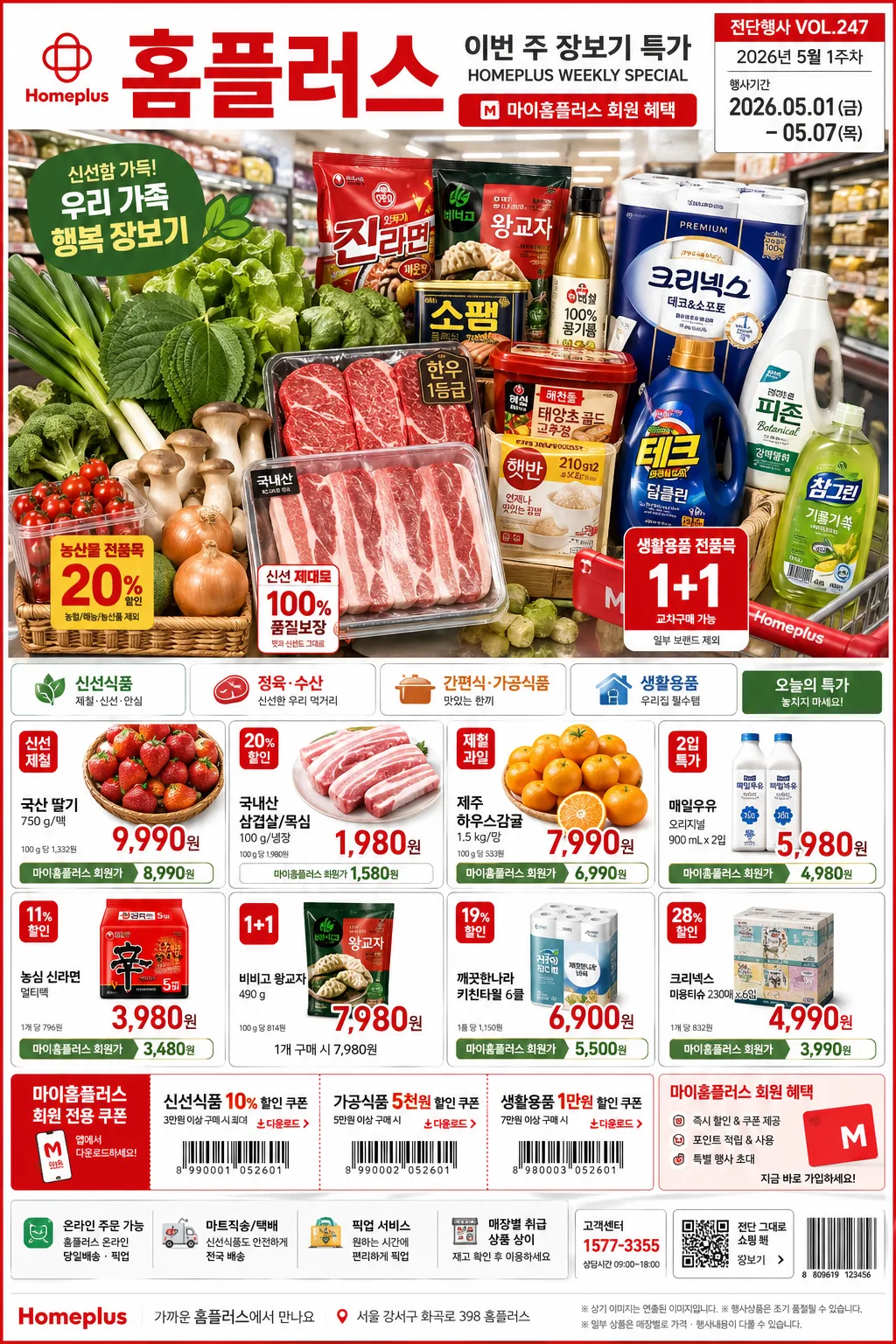
Korean supermarket promotional ad poster, vertical retail flyer for fresh groceries and household essentials.
Designed for a Homeplus-style in-store campaign with clear pricing, product emphasis, weekly-deal urgency, and family-shopping appeal.
Make it look like a real printed mart advertisement photographed or rendered with practical retail detail: product bundles, price tags, aisle context, coupon blocks, date labels, membership notes, and a credible mass-market flyer finish.

[Composition]
- Main hero area occupies the upper 52% of the frame, showing {제품·소재} arranged as the primary visual cluster with strong shelf-like retail clarity, abundant stacking, visible package faces, fresh produce texture, and small promotional tag cards tucked between items.
- Brand headline zone sits in the top 12% with {카피·타이포} set as the most readable element, accompanied by a small campaign label such as "전단행사 VOL.247", "2026년 5월 1주차", and "행사기간 05.01(금)–05.07(목)".
- Price and category modules fill the lower third in a grid-like retail layout, with {레이아웃} balanced for quick scanability and including multiple item cards, red discount badges, membership price notes, barcode area, coupon strip, and tiny store-information text.
- Background uses a realistic store-inspired surface with subtle aisle depth, refrigerated-case glow, shopping-cart handle glimpses, bright white base, and fresh green accents to support {브랜드 톤}.
- Compose with practical flyer density: readable blocks, overlapping sale stickers, receipt-like microcopy, shelf labels, small icons for delivery/pickup/member benefit, and tactile printed-paper shadows.

[3. CORE STRUCTURE]
- Header strip (top 12%): Place the main Korean masthead in bold, highly legible retail typography, with {카피·타이포} centered and strong visual weight. Include supporting header details: "홈플러스", "이번 주 장보기 특가", "마이홈플러스 회원 혜택", "행사기간 2026.05.01–05.07", plus a small issue/date label on the right.
- Hero product block (upper-middle 40%): Showcase {제품·소재} as a fresh, abundant arrangement with a realistic supermarket display feel, including neat stacking, slight perspective depth, visible condensation on chilled items, produce stems and leaves, crinkled packaging, carton edges, and shelf-price tabs.
- Secondary category chips (mid-lower left/right): Add small retail category tags that echo {시그니처 결}, using compact boxes and clean alignment. Example Korean chips: "신선식품", "정육·수산", "간편식", "생활용품", "오늘의 특가", "1+1 모음".
- Price table area (lower 26%): Present pricing modules in a structured grid with large numerals, small Korean labels, and clear separation lines for immediate readability. Include realistic sample cards such as "제철 과일 모음 7,990원", "국내산 삼겹살 100g 1,980원", "우유 2입 5,980원", "라면 멀티팩 3,980원", "키친타월 6롤 6,900원", "마이홈플러스 회원가".
- Footer emphasis (bottom 10%): Use a concise brand-supporting strip that reinforces {브랜드 톤}. Add store and campaign utility details: "가까운 홈플러스에서 만나요", "온라인 주문 가능", "매장별 취급 상품 상이", "고객센터 1577-3355", a small barcode block, QR-style coupon square, address-line placeholder like "서울 강서구 화곡로 398 홈플러스", and tiny legal-style retail microcopy.

[4. STYLE RULES]
- Typography: Pretendard and Noto Sans KR for the main Korean copy, bold 700–900 weight for headline, medium 500–600 for supporting text, price numbers at very large display size. Use compressed retail numerals for prices and smaller caption text for unit pricing and membership notes.
- Color palette: Homeplus signature red, pure white, fresh green, and neutral light gray; use exact-feeling tones like #D6001C, #FFFFFF, #2F8F4E, #F4F4F4. Add small yellow/orange sale accents for discount bursts and coupon highlights while keeping {컬러 팔레트} recognizable.
- Border/shadow: thin clean dividers, subtle 2px lines, soft drop shadow 4px y-offset, 10px blur, 12% opacity on product cards. Add printed flyer textures, slight paper grain, tiny crop marks, glossy label highlights, and natural shadows under stacked products.
- Retail graphic detail: include red price flags, green freshness ribbons, small delivery/pickup icons, membership badge shapes, coupon perforation marks, barcode area, QR-like square, and store aisle signage elements integrated around the main offer.
- Copy style: Korean retail phrasing should feel believable and short, using text such as "놓치면 아쉬운 7일 특가", "오늘 장보기 끝", "신선함을 담은 가격", "회원 전용 혜택", and "한정 수량" without making unrealistic claims.

[5. VISUAL STYLE]
- Camera / lens: commercial retail photography look, full-frame 35mm lens at f/5.6 for product clarity, slight overhead angle mixed with front-facing poster composition.
- Lighting: bright store ambient light with soft diffused overhead panels, mild amber fill from the front, controlled highlights on fresh produce and package edges, gentle reflections on plastic wrap and refrigerated product labels.
- Color grade: clean supermarket commercial grade with vivid red accents, neutral whites, saturated greens, and warm amber balance.
- Material realism: products should have natural imperfections, readable-ish packaging blocks, paper price labels, sticker edges, produce texture, condensation beads, folded flyer corners, and realistic shadow contact points.

[6. MOOD]
Mainstream Korean supermarket weekly-deal poster — practical, high-clarity retail advertising with the feel of a large chain flyer, in-store promotional signage, and a busy but readable family grocery campaign.
The mood is energetic, trustworthy, value-focused, and fresh, like a real mart entrance poster customers would stop to scan before shopping.

[7. CRITICAL]
- Korean text accuracy: 반드시 아래 문구가 정확히 보여야 함: "홈플러스", "이번 주 장보기 특가", "행사기간 2026.05.01–05.07", "마이홈플러스 회원가", 가격 정보, 카테고리 표기, 한글 부제.
- Include realistic visible Korean flyer details: "전단행사 VOL.247", "제철 과일", "정육·수산", "간편식", "생활용품", "온라인 주문 가능", "매장별 취급 상품 상이", and at least four large won prices such as "7,990원", "1,980원", "5,980원", "3,980원".
- Layout invariants: the composition must stay vertical, product hero must remain dominant in the upper half, and pricing modules must stay cleanly organized in the lower section.
- Preserve all placeholder-driven styling: {브랜드 톤}, {시그니처 결}, {제품·소재}, {무드·라이팅}, {컬러 팔레트}, {카피·타이포}, {레이아웃}, {비율}.
- Do not distort or stylize Korean characters into unreadable forms.

[8. 🚫 PROHIBITED]
- Fake official seals / certifications
- Broken Korean characters