広告・ポスター
농협 하나로마트 광고 (한국 농산물)
하나로마트 톤 — 한국 농산물·신선 식품
농협 하나로마트 광고 (한국 농산물)の概要
広告・ポスター画像を作るためのChatGPT画像プロンプトです。主題、背景、スタイル、構図を整理し、すぐに試せるよう構成しています。
関連キーワード: 농협 하나로마트 광고 (한국 농산물), 농협 하나로마트 광고 (한국 농산물) 프롬프트, 広告・ポスター 프롬프트, 広告・ポスター AI 이미지 프롬프트, ChatGPT 이미지 프롬프트, AI 이미지 생성 프롬프트, AI 프롬프트, 이미지 프롬프트
농협 하나로마트 광고 (한국 농산물)の活用方法
元の構造を保ちながら、被写体、背景、色、構図を変更して別案に展開できます。
- 主題を維持し、ブランドや季節、媒体に合わせて色と背景を変更してください。
- 結果が複雑な場合は背景要素を減らし、被写体、構図、照明を具体化してください。
- コピー後、ChatGPTに媒体、アスペクト比、文字の有無を追加で指定できます。
プロンプト原文
[Input]
- language: Korean
- output_size: 1024x1536

[Purpose]
Korean agricultural supermarket advertisement poster for Hanaro Mart, vertical retail campaign visual with fresh local produce emphasis.
Editorial retail poster designed for social feed, store entrance signage, aisle-end promotion, and local weekly flyer usage, balancing premium grocery appeal with trustworthy farm-direct messaging and realistic retail information.

[Composition]
- Main hero composition: a full-height produce arrangement occupies the lower 58% of the frame, with a recognizable brand header zone at the top 18% and a practical promotion / price / store-info zone integrated across the lower right and bottom band.
- Subject hierarchy: {제품·소재} is the primary focal point, displayed as abundant, fresh Korean produce in crates, baskets, trays, or neat retail packaging, with secondary farm-origin visual cues such as a small illustrated field horizon, farmer-market tag, Korean map pin, or harvest label behind or beside the hero.
- Background treatment: soft off-white to beige retail poster backdrop with tactile paper-grain texture, subtle printed flyer grain, faint produce silhouettes, small green line graphics, and warm supermarket lighting so the poster feels like a real in-store agricultural campaign.
- Spacing and framing: create a clear scan path from brand title to headline, hero produce, item prices, promotion period, and store contact; allow natural retail details such as price tags, small coupon blocks, divider lines, and shelf-label accents while keeping the product hero dominant.
- Use {브랜드 톤}, {시그니처 결}, {제품·소재}, {무드·라이팅}, {컬러 팔레트}, {카피·타이포}, {레이아웃}, {비율} as configurable content cues.

[3. CORE STRUCTURE]
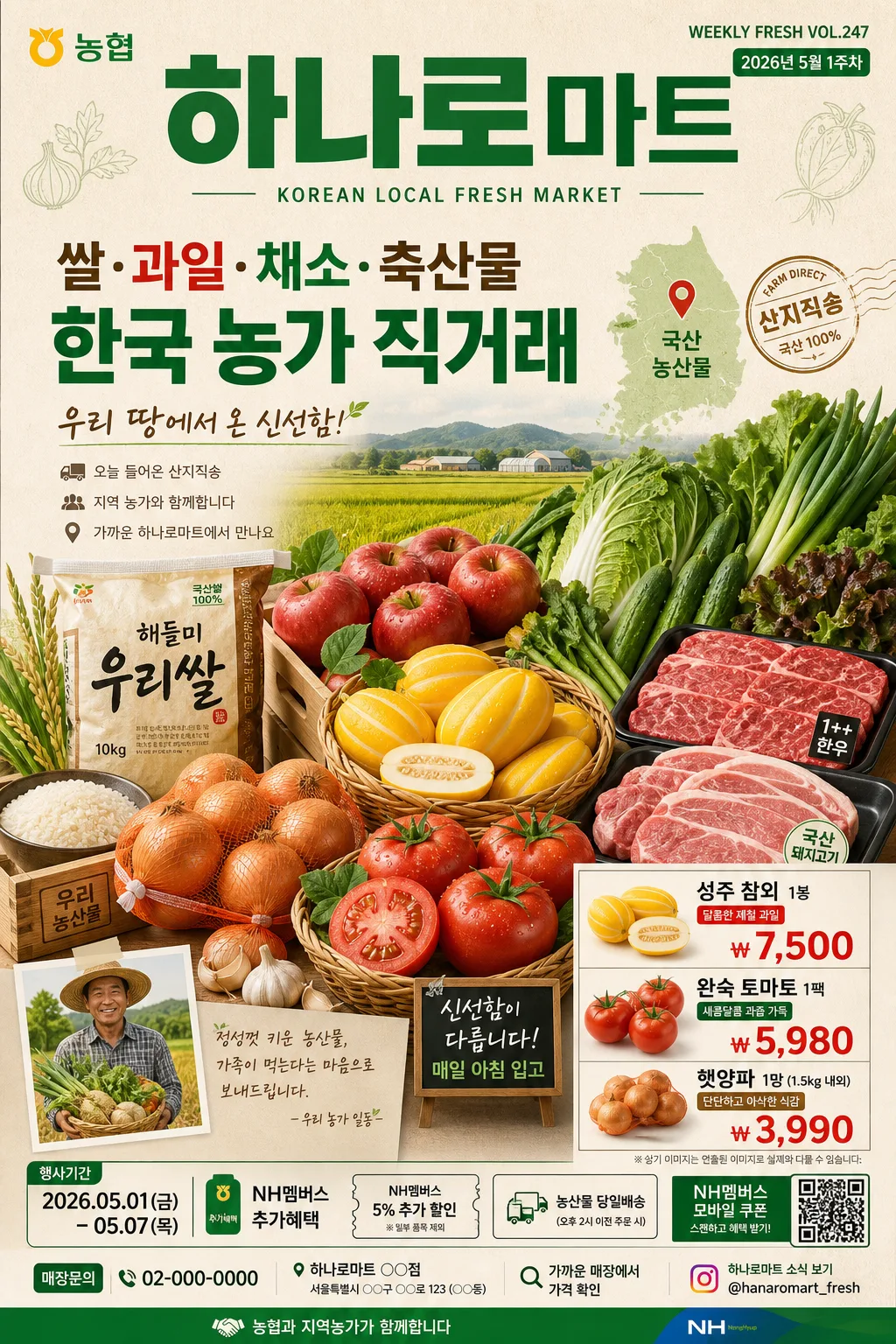
1. Header area (top 18%): place the main Korean brand title in a strong, highly legible masthead treatment reading “하나로마트”, with a smaller English subline such as “KOREAN LOCAL FRESH MARKET” directly beneath it; add a tiny campaign code like “WEEKLY FRESH VOL.247” and a date label such as “2026년 5월 1주차” near the edge.
2. Main hero area (middle 50–58%): feature {제품·소재} as large, fresh, and abundant, with crisp edges, natural surface detail, believable stems, leaves, moisture, packaging edges, labels, rubber bands, paper wraps, or wooden-crate textures; add a subtle farm-direct visual element such as a small rice-field illustration, harvest truck icon, “국산 농산물” tag, or local origin placard.
3. Supporting message area: integrate short agricultural copy and trust cues near the hero, using compact line spacing and clear hierarchy. Include realistic Korean lines such as “우리 땅에서 온 신선함”, “오늘 들어온 산지직송”, “지역 농가와 함께합니다”, or “가까운 하나로마트에서 만나요”.
4. Price/callout area (lower right or lower left): create a supermarket-realistic price panel with 2–3 item rows and bold won pricing, for example “성주 참외 1봉 ₩7,500”, “완숙 토마토 1팩 ₩5,980”, “햇양파 1망 ₩3,990”; use small shelf-label shapes, green/red accent tabs, and handwritten-style freshness stickers without overpowering the hero.
5. Event and store detail band: add a bottom information strip with promotion period, store/branch placeholder, address/contact line, and a compact QR/coupon-style box. Example readable Korean strings: “행사기간 2026.05.01–05.07”, “매장문의 02-000-0000”, “NH멤버스 추가혜택”, “가까운 매장에서 가격 확인”.
6. Footer balance: use a practical retail anchor at the bottom edge such as a narrow Hanaro-green band, small sponsor/partner area reading “농협과 지역농가가 함께합니다”, tiny social handle “@hanaromart_fresh”, simple divider icons, and a small barcode or QR coupon area to make the poster feel printed and real.

[4. STYLE RULES]
- Typography: use Pretendard Bold or Noto Sans KR Bold for the main headline, Pretendard Medium for subcopy, and a clean sans serif for English support text; headline size should dominate the top band while prices use thick retail flyer numerals and captions stay compact but readable.
- Color palette: {컬러 팔레트} should be interpreted as Hanaro Mart green, fresh red accents, warm white, beige paper tones, and natural produce colors; use green as the primary brand anchor and red for price tabs, stickers, or limited-time callouts.
- Retail graphic details: include realistic flyer elements such as thin divider rules, rounded price labels, small origin tags, coupon stamp shapes, farm-icon line art, QR/coupon box, barcode-like strip, and tiny production/credit text such as “사진은 연출된 이미지입니다” and “기획·디자인 하나로마트 신선식품팀”.
- Border/shadow: add a soft drop shadow around hero produce, price labels, stickers, and coupon blocks, about 4px vertical offset, 12px blur, 15% opacity, with gentle paper-layer depth and no harsh outline.

[5. VISUAL STYLE]
- Camera / lens: commercial food-photography look shot on a full-frame DSLR or medium-format system, equivalent to a 50mm or 85mm lens at f/4 for a natural retail-ad perspective with crisp product separation.
- Lighting: bright store-like ambient light combined with soft diffused key light from upper-left at roughly 45°, plus gentle fill from the front-right to preserve texture on fruits, vegetables, grains, meats, labels, paper tags, and packaging surfaces.
- Color grade: fresh green, clean white, warm beige, and restrained red accent grading with realistic saturation, slightly lifted highlights, natural shadow density, and believable printed-ad texture.

[6. MOOD]
Premium Korean grocery campaign — fresh, friendly, practical supermarket editorial with a trustworthy farm-direct retail feel, similar in clarity to modern food advertising seen in high-end grocery flyers, store entrance posters, and seasonal local-produce campaigns.

[7. CRITICAL]
- Korean text accuracy: 반드시 정확히 보이게 해야 하는 문자열: “하나로마트”.
- Korean text accuracy: include several readable Korean retail strings such as “우리 땅에서 온 신선함”, “이번 주 장보기 특가”, “행사기간 2026.05.01–05.07”, “국산 농산물”, “산지직송”, “매장문의 02-000-0000”, and 2–3 realistic item-price labels like “성주 참외 1봉 ₩7,500”.
- Korean text accuracy: if English subcopy is used, keep it clean and properly spelled without broken characters.
- Composition invariants: maintain a tall vertical ad structure with a dominant produce hero, compact brand header, practical supermarket price details, event period, coupon/store-info band, and clear retail hierarchy.
- Product realism: fruits, vegetables, rice, or meat must look fresh, clean, and commercially presentable, with natural proportions, varied textures, believable packaging edges, readable small labels where visible, and authentic Korean grocery-store presentation.

[8. 🚫 PROHIBITED]
- Fake official seals / certifications
- Broken Korean characters