廣告/海報
애플 미니멀 제품 광고
Apple 톤 — 미니멀·럭셔리·제품 hero
애플 미니멀 제품 광고摘要
這是用來製作廣告/海報內容的 ChatGPT 圖像提示詞,已整理主題、背景、風格與構圖,方便快速調整。
相關關鍵字: 애플 미니멀 제품 광고, 애플 미니멀 제품 광고 프롬프트, 廣告/海報 프롬프트, 廣告/海報 AI 이미지 프롬프트, ChatGPT 이미지 프롬프트, AI 이미지 생성 프롬프트, AI 프롬프트, 이미지 프롬프트
애플 미니멀 제품 광고使用方式
保留原始結構並替換主體、背景、色彩或構圖,即可延伸出不同版本。
- 保留核心主體,並依品牌、季節或平台調整色彩與背景。
- 如果畫面太複雜,請減少背景元素並具體描述主體、構圖與光線。
- 複製後可要求 ChatGPT 配合平台、長寬比或文字需求調整。
提示詞原文
[Input]
- language: Korean
- output_size: 1024x1536

[Purpose]
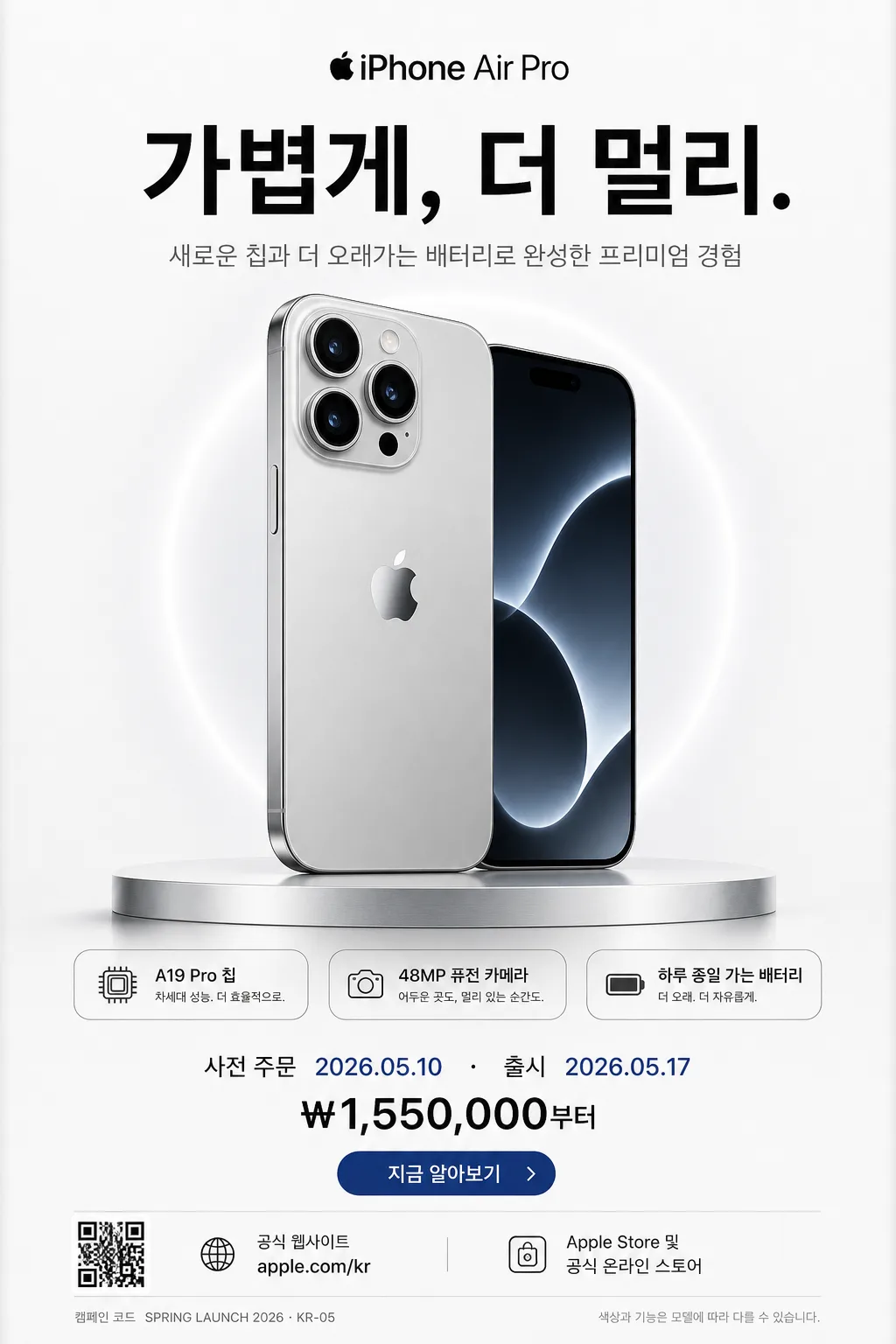
{브랜드 톤}의 정제된 프리미엄 제품 광고 포스터. 세로형 1024x1536 소셜 광고, 런칭 캠페인, 온라인 스토어 히어로 배너에 바로 사용할 수 있는 단일 제품 중심의 editorial product ad.
제품의 형태와 소재감을 강하게 보여주면서도 실제 런칭 광고처럼 헤드라인, 기능 포인트, 출시일, 가격, CTA, 판매 채널 정보를 포함한다.

[Composition]
- Hero product placement: {제품명} / {제품 카테고리·소재}를 프레임 중앙에 배치하고 전체 높이의 약 45–55%를 차지하게 한다. 제품 모서리, 카메라 렌즈, 금속·유리 소재의 반사와 그림자를 현실적으로 표현한다.
- Header zone: 상단 12–15%에는 {핵심 헤드라인}을 크게 배치하고, 바로 아래에 {한글 부제}를 얇은 두께의 한글 서브카피로 정렬한다.
- Feature detail zone: 제품 주변 또는 하단 초입에 작은 rounded spec chips 3개를 배치한다: {핵심 기능 1}, {핵심 기능 2}, {핵심 기능 3}. 각 칩은 1px hairline, 작은 아이콘, 정교한 자간으로 구성한다.
- Commercial information zone: 하단 18–22%에는 {출시 정보}, {가격 정보}, {구매 CTA}, {웹사이트}, {판매 채널}을 실제 광고 하단 고지처럼 정리한다. 작은 QR-style square, legal microcopy, campaign code를 함께 배치한다.
- Background treatment: {배경 질감}을 사용한 smooth studio background. {컬러 팔레트} 기반의 matte finish, 부드러운 tonal transition, 제품 뒤의 은은한 halo light, 얇은 알루미늄 단상 또는 반사면을 허용한다.
- Framing direction: {레이아웃}을 기준으로 대칭형 프리미엄 광고 구도를 유지하되, 실제 제품 런칭 광고에 필요한 정보 레이어와 미세한 그래픽 장식을 자연스럽게 포함한다.

[3. CORE STRUCTURE]
1. Top headline area: {핵심 헤드라인}을 SF Pro-like sans serif 또는 Pretendard 700–800 weight로 크게 조판한다. {한글 부제}는 300–400 weight로 짧고 선명하게 배치한다.
2. Central hero area: {제품명}을 가장 강한 focal point로 표현한다. {제품 카테고리·소재}의 질감이 보이도록 macro product photography 느낌의 세밀한 edge definition, contact shadow, soft reflection을 적용한다.
3. Feature chips: 제품의 좌우 또는 하단 가까이에 {핵심 기능 1}, {핵심 기능 2}, {핵심 기능 3}을 작고 정교한 정보 태그로 배치한다. 아이콘은 단순한 선형 그래픽, 원형 dot, 작은 battery/camera/chip symbol을 사용한다.
4. Purchase information band: 하단에 {출시 정보}, {가격 정보}, {구매 CTA}를 hierarchy 있게 배치한다. CTA는 작은 pill button 또는 얇은 underline text로 표현한다.
5. Brand and channel details: {웹사이트}, {판매 채널}, {캠페인 코드}, {법적 고지}를 6–9pt 수준의 micro text로 넣어 실제 광고 하단처럼 보이게 한다.
6. Accent control: {컬러 팔레트}의 accent tone을 CTA, 작은 dot, spec chip outline, 제품 halo 중 1–2곳에 사용해 시선을 유도한다.
7. Final balance pass: 제품, 헤드라인, 기능 정보, 구매 정보가 하나의 고급 테크 광고 시스템처럼 연결되도록 spacing, alignment, kerning, shadow depth를 정밀하게 조정한다.

[4. STYLE RULES]
- Typography: Helvetica Neue, SF Pro-like sans serif, or Pretendard for Korean. Headline 700–800 weight, subcopy 300–400 weight, commercial info 500–600 weight, legal microcopy 300 weight.
- Color palette: {컬러 팔레트} with white #FFFFFF, near-black #111111, soft gray #D9D9D9, brushed aluminum gray #BFC3C7, and one restrained accent tone.
- Graphic system: 1px hairline dividers, rounded spec chips, small dot indicators, QR-style square, subtle CTA pill, precise baseline grid.
- Shadow / reflection: ultra-soft drop shadow, 4px y-offset, 16px blur, 12–18% opacity; add a refined contact reflection where the product meets the surface.
- Text treatment: crisp kerning, disciplined tracking, clean line breaks, premium Apple-ad adjacency, Korean punctuation and spacing rendered naturally.
- Decorative product details: allow faint halo glow, polished metal highlight, glass reflection, tiny interface glint, and material swatch-like accent geometry when it supports the product story.

[5. VISUAL STYLE]
- Camera / lens: high-end studio product photography, 85mm macro or 100mm macro, f/8 to f/11, perfectly controlled sharpness and clean edges.
- Lighting: large softbox key light from upper-left at 45°, gentle fill from right, faint rim separation, polished studio reflections controlled to reveal glass, aluminum, ceramic, or matte texture.
- Color grade: neutral high-key grade with subtle cool whites, deep blacks, soft gray transitions, and a single restrained accent matching the product signature color.
- Rendering quality: premium product campaign still, precise highlights on curved edges, realistic screen/glass behavior, physically plausible shadow falloff.

[6. MOOD]
Premium Apple keynote campaign still — sleek product-luxury editorial with the disciplined clarity of a 2024–2026 tech launch poster. Quiet confidence, refined materials, launch-day anticipation, and polished commercial realism.

[7. CRITICAL]
- Korean text accuracy: render all Korean strings perfectly, especially “{핵심 헤드라인}”, “{한글 부제}”, “{출시 정보}”, “{가격 정보}”, “{구매 CTA}”, “{판매 채널}”, and “{법적 고지}”. No spacing errors, missing 받침, or broken syllables.
- Composition invariant: {제품명} must remain the clear hero, centered and dominant, while the headline, spec chips, launch details, CTA, and legal line support the product without taking over.
- Typography invariant: the poster must feel like a premium tech advertisement, not a playful sale flyer. Use refined sans serif hierarchy, accurate alignment, and polished micro typography.
- Commercial realism: include the visible ad details “{캠페인 코드}”, “{웹사이트}”, QR-style square, and three feature chips so the final image looks like a finished launch campaign asset.

[8. 🚫 PROHIBITED]
- Fake official seals / certifications
- Broken Korean characters
- Celebrity composites or unauthorized likeness blending