廣告/海報
Dyson 가전 광고 (테크 럭셔리)
Dyson 톤 — 테크 럭셔리·미니멀
Dyson 가전 광고 (테크 럭셔리)摘要
這是用來製作廣告/海報內容的 ChatGPT 圖像提示詞,已整理主題、背景、風格與構圖,方便快速調整。
相關關鍵字: Dyson 가전 광고 (테크 럭셔리), Dyson 가전 광고 (테크 럭셔리) 프롬프트, 廣告/海報 프롬프트, 廣告/海報 AI 이미지 프롬프트, ChatGPT 이미지 프롬프트, AI 이미지 생성 프롬프트, AI 프롬프트, 이미지 프롬프트
Dyson 가전 광고 (테크 럭셔리)使用方式
保留原始結構並替換主體、背景、色彩或構圖,即可延伸出不同版本。
- 保留核心主體,並依品牌、季節或平台調整色彩與背景。
- 如果畫面太複雜,請減少背景元素並具體描述主體、構圖與光線。
- 複製後可要求 ChatGPT 配合平台、長寬比或文字需求調整。
提示詞原文
[Input]
- language: Korean
- output_size: 1024x1536

[Purpose]
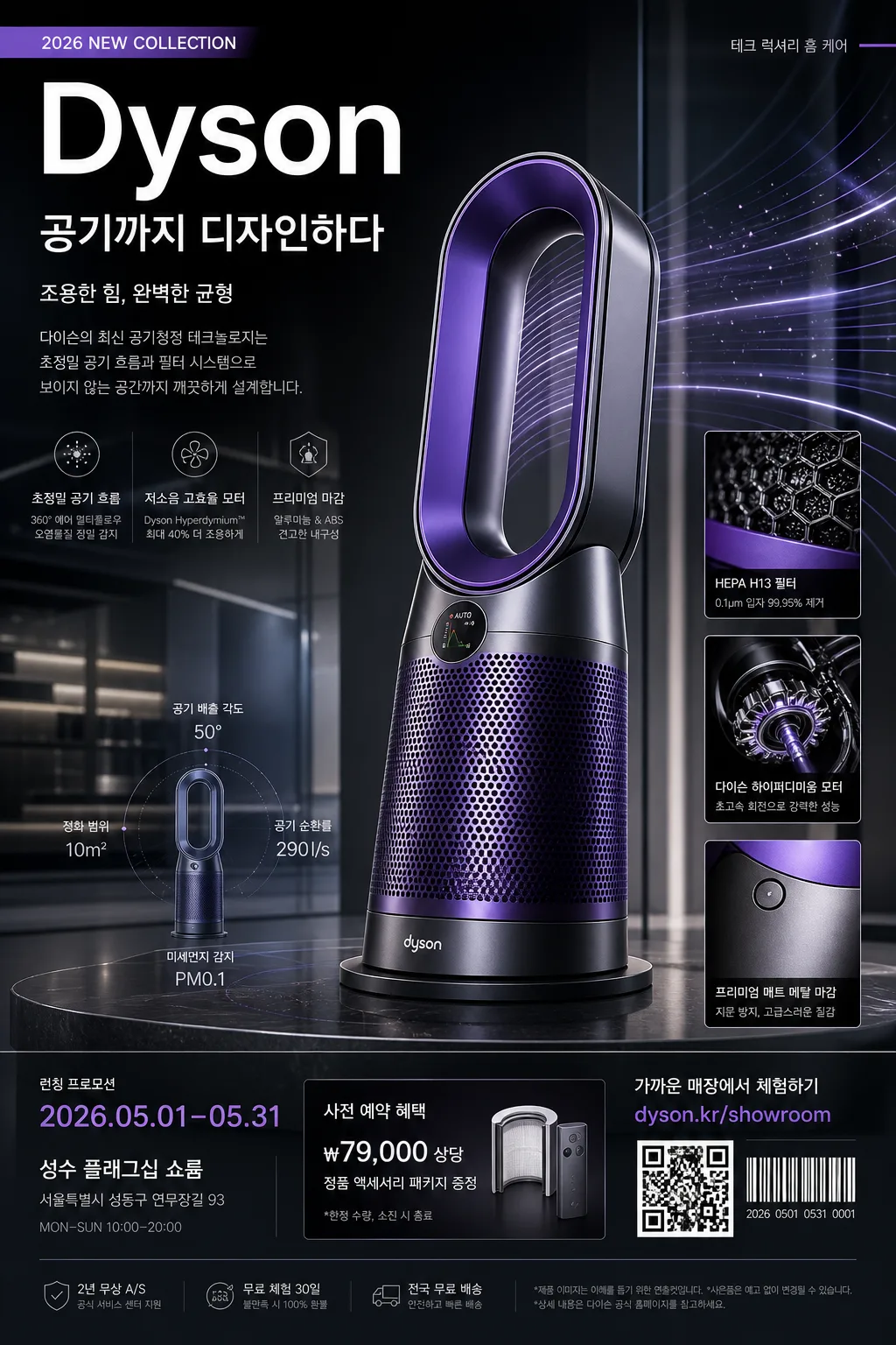
Luxury-tech advertising poster for Dyson-style home appliances, designed as a vertical product hero with editorial detail emphasis, premium retail-campaign polish, and realistic launch-poster information.
Create a high-end appliance campaign visual for social, showroom display, brand launch, and premium store window graphics, with believable product callouts, date/venue details, and retail microcopy.

[Composition]
- Main product hero occupies the lower-mid 55% of the frame, angled slightly 15° toward camera, with crisp silhouette separation, refined studio shadow, and reflective material realism.
- Upper area carries {카피·타이포} as the main campaign headline, supported by a short Korean subheadline such as “공기까지 디자인하다” or “조용한 힘, 완벽한 균형”.
- Background uses a premium studio environment with charcoal glass, soft white panels, brushed-metal platform surfaces, faint engineered airflow arcs, and subtle showroom reflections that make the appliance feel physically present.
- Use {브랜드 톤} to guide the overall brand voice, and keep {시그니처 결} visible in every edge, reflection, intake detail, vent line, button surface, and material transition.
- Add realistic poster elements: small launch label “2026 NEW COLLECTION”, date strip “2026.05.01–05.31”, venue line “성수 플래그십 쇼룸”, QR/barcode-style information block, price or reservation note “사전 예약 혜택 ₩79,000 상당”, and compact legal fine print at the bottom.

[3. CORE STRUCTURE]
1. Header zone (top 18%): place {카피·타이포} with strong hierarchy; use a clean luxury-tech wordmark feel, precise alignment, and a premium headline lockup. Include a small campaign tag in Korean: “테크 럭셔리 홈 케어”.
2. Hero zone (mid 45%): show {제품·소재} as the main subject, rendered with sharp product edges, polished material realism, accurate vents, seams, controls, and a premium showroom presence.
3. Motion/detail zone: integrate {무드·라이팅} through controlled motion streaks, airflow curves, engineered light trails, translucent particle glints, and small macro-detail inset panels that show filter texture, motor intake, or surface finish.
4. Palette zone: apply {컬러 팔레트} as a refined brand system, with one accent color used on controls, highlights, callout arrows, QR frame, energy lines, and thin divider rules.
5. Layout zone: build {레이아웃} so the product remains dominant while 2–3 compact technology callouts support the story, for example “초정밀 공기 흐름”, “저소음 고효율 모터”, “프리미엄 매트 메탈 마감”.
6. Format zone: maintain {비율} as a tall poster layout with clear vertical flow, layered editorial spacing, launch details, retail CTA, barcode/QR area, and bottom credit text.

[4. STYLE RULES]
- Typography: use Helvetica Neue, Pretendard, or Noto Sans KR for Korean copy; bold weight for the main brand word, medium weight for subcopy, 18–42px scale hierarchy, crisp anti-aliased edges.
- Color palette: use Dyson 보라, clean white, deep charcoal, and one accent tone from {컬러 팔레트}; keep saturation controlled and highlights clean.
- Poster information design: include short Korean feature blurbs, date/time/venue line, showroom CTA “가까운 매장에서 체험하기”, website-style text “dyson.kr/showroom”, and a small barcode/QR-style block in the lower-right.
- Border/shadow: apply a soft studio shadow with 4px y-offset, 14px blur, 18% opacity; allow glossy reflections on glass or polished stone surfaces while keeping product edges sharp.
- Decorative graphic elements: use thin technical grid ticks, micro arrows, circular airflow diagrams, translucent measurement labels, and small specification chips that feel like a premium tech campaign rather than a flat mockup.

[5. VISUAL STYLE]
- Camera / lens: Phase One IQ4 with 80mm medium-format look for the hero, plus a 100mm macro feel for detail inserts; f/8 for the main product, f/4 for accent detail shots.
- Lighting: studio key light from upper-left at 45° with a large softbox, subtle fill from front-right, thin rim light on product edges, and controlled shadow falloff.
- Color grade: high-end commercial grade with purple-white-charcoal balance, cool-neutral whites, and clean metallic highlights.
- Surface realism: show believable fingerprints-free metal, molded plastic seams, vent perforations, satin finish, glass reflection, tiny dust-free highlight specks, and accurate contact shadows on the display platform.

[6. MOOD]
Premium tech-luxury campaign — Apple product launch simplicity meets Aesop-level material restraint, with Dyson showroom precision, editorial launch-poster richness, and a confident Korean retail-campaign atmosphere.

[7. CRITICAL]
- Korean text accuracy: the following verbatim Korean strings must appear correctly: {브랜드 톤}, {시그니처 결}, {제품·소재}, {무드·라이팅}, {컬러 팔레트}, {카피·타이포}, {레이아웃}, {비율}.
- Also render supporting Korean poster text clearly: “공기까지 디자인하다”, “테크 럭셔리 홈 케어”, “2026 NEW COLLECTION”, “성수 플래그십 쇼룸”, “사전 예약 혜택”, “가까운 매장에서 체험하기”.
- Keep the product shape clean and realistic; no distorted geometry, no extra parts, no blurry controls, no broken reflections.
- Maintain a premium ad composition with strong vertical hierarchy, realistic launch details, clear brand readability, and polished commercial finish.

[8. 🚫 PROHIBITED]
- Fake official seals / certifications
- Broken Korean characters