広告・ポスター
스타벅스 시즌 한정 광고
스타벅스 톤 — 시즌·미니멀·럭셔리
스타벅스 시즌 한정 광고の概要
広告・ポスター画像を作るためのChatGPT画像プロンプトです。主題、背景、スタイル、構図を整理し、すぐに試せるよう構成しています。
関連キーワード: 스타벅스 시즌 한정 광고, 스타벅스 시즌 한정 광고 프롬프트, 広告・ポスター 프롬프트, 広告・ポスター AI 이미지 프롬프트, ChatGPT 이미지 프롬프트, AI 이미지 생성 프롬프트, AI 프롬프트, 이미지 프롬프트
스타벅스 시즌 한정 광고の活用方法
元の構造を保ちながら、被写体、背景、色、構図を変更して別案に展開できます。
- 主題を維持し、ブランドや季節、媒体に合わせて色と背景を変更してください。
- 結果が複雑な場合は背景要素を減らし、被写体、構図、照明を具体化してください。
- コピー後、ChatGPTに媒体、アスペクト比、文字の有無を追加で指定できます。
プロンプト原文
[Input]
- language: Korean
- output_size: 1024x1536

[Purpose]
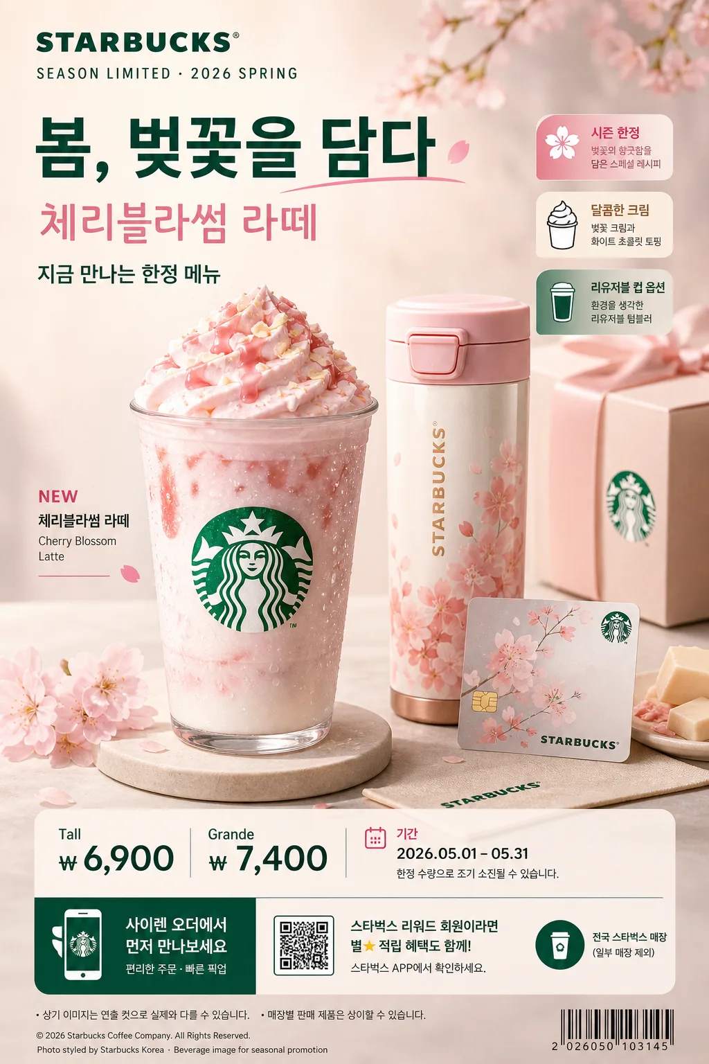
Korean seasonal limited beverage advertisement poster in a premium cafe retail style, vertical 1024x1536 format for social media feed, store entrance standee, and counter-top promo signage.
Starbucks seasonal campaign visual with a polished commercial look, combining one hero drink, real cafe accessories, seasonal ingredients, concise Korean headline copy, price callout, campaign period, store/app purchase cue, and small retail-detail typography.

[Composition]
- Main subject placement: {제품·소재} occupies the center-left hero zone at about 55% of the frame height, with supporting props arranged diagonally to the right and foreground for realistic depth.
- Background treatment: premium cafe studio set with a warm off-white to muted seasonal gradient, subtle paper stock or matte acrylic texture, faint counter surface seam, soft reflections, and small retail display details that feel natural for a seasonal beverage campaign.
- Framing and spacing: follow {레이아웃} and {비율}; reserve the top area for the Starbucks header and campaign headline, the center for the hero drink, and the lower area for price, event period, QR/app cue, and fine print.
- Brand expression: apply {브랜드 톤} across the overall visual language, with {시그니처 결} reflected in cup styling, sleeve texture, reusable tumbler finish, card design, printed label, and prop arrangement.

[3. CORE STRUCTURE]
1. Header zone (top 15%): place a Starbucks wordmark area and the main Korean campaign line from {카피·타이포}, styled as a premium commercial headline aligned upper-left or upper-center. Add a small date label such as "SEASON LIMITED · 2026 SPRING" and a short Korean subline like "지금 만나는 한정 메뉴".
2. Hero zone (middle 50%): feature {제품·소재} as the dominant focal point, rendered with glossy beverage surface, crisp cup edges, condensation droplets, whipped cream, foam, syrup drizzle, ice texture, or seasonal garnish depending on the drink concept.
3. Supporting props zone (mid-right and lower-right): add seasonal accents and product companions from {제품·소재}, such as a branded tumbler, paper sleeve, gift card, loyalty card, napkin, straw wrapper, mini tray, menu tag, ingredient pieces, ribbon, or small dessert plate. Arrange them with controlled overlap, believable contact shadows, and premium retail styling.
4. Seasonal mood layer: integrate {무드·라이팅} through warm highlights, soft shadows, rim reflections on the cup, gentle bokeh-like cafe glow in the far background, and seasonal surface color accents so the set feels like a real polished cafe campaign shoot.
5. Accent, price, and campaign info area (lower 15%): place a compact price label and promotional line near the bottom, for example "Tall ₩6,900" / "Grande ₩7,400" and "기간: 2026.05.01–05.31". Include a small app-order cue such as "사이렌 오더에서 먼저 만나보세요", a tiny QR code placeholder block, and a one-line store availability note.
6. Retail detail layer: add 2–3 short Korean feature blurbs in small badges or side labels, such as "시즌 한정", "달콤한 크림", "리유저블 컵 옵션". Add small footer credit text like "Photo styled by Starbucks Korea · Beverage image for seasonal promotion" and a tiny barcode/stock-code area to make the poster feel printed and realistic.
7. Color anchoring: use {컬러 팔레트} as the dominant palette, with deep green, cream white, and a season-specific accent color applied to the headline underline, small label tabs, garnish, props, or thin divider rules.

[4. STYLE RULES]
- Typography: use Pretendard or Noto Sans KR for Korean copy, with bold sans weight for the main line and medium weight for supporting text; headline around 54–72px, subhead around 30–40px, price around 36–46px, fine print around 14–18px.
- Font handling: pair a clean English sans-serif for "Starbucks" with a neat Korean subtitle, maintaining tight kerning, strong hierarchy, and realistic print-ad alignment.
- Korean copy system: Set bold cover-style ad line in Korean from {카피·타이포}; add small supporting copy such as "스타벅스 시즌 한정", "오늘의 달콤한 리프레시", "앱 주문 가능", and "일부 매장 제외" where appropriate.
- Color palette: prioritize {컬러 팔레트}; use soft off-white background tones, deep Starbucks green, warm cream, and a seasonal accent such as blush pink, pumpkin orange, berry red, icy mint, or golden caramel depending on the selected season.
- Surface and shadow: use soft studio shadows under the drink and props, about 4px y-offset, 14px blur, 15% opacity. Preserve real material texture: paper sleeve fibers, plastic lid highlights, cup condensation, ice refraction, cream ridges, matte tray finish, and printed ink texture on labels.

[5. VISUAL STYLE]
- Camera / lens: commercial product photography look, 85mm lens at f/4 for the hero drink and props, crisp focus with shallow background separation.
- Lighting: studio key light from upper-left at 45° with a large softbox, subtle fill from front-right, and a faint rim highlight to define glass or cup edges.
- Color grade: warm cream + Starbucks green + seasonal accent, with controlled contrast, appetizing highlights, realistic shadows, and glossy cafe retail finish.
- Realism details: include small imperfections that make the image believable, such as tiny condensation beads, slight paper curl on a receipt or card, fine dusting of topping powder, subtle cup seam, gentle reflection on the counter, and readable micro typography where placed.

[6. MOOD]
Premium seasonal cafe campaign — polished Starbucks retail advertisement aesthetic with warm in-store realism, appetizing beverage detail, collectible seasonal props, and a refined commercial poster finish.

[7. CRITICAL]
- Korean text accuracy: the following strings must appear exactly and without broken characters: "스타벅스", plus the season-specific Korean subtitle and season name used in {카피·타이포}.
- Include realistic poster text elements in Korean: a short headline, 2–3 feature blurbs, price callout such as "Tall ₩6,900", campaign period such as "2026.05.01–05.31", and footer/app cue such as "사이렌 오더에서 먼저 만나보세요".
- Layout invariants: maintain a clear hero-product-first composition, with one dominant beverage, supporting seasonal props, retail campaign details, and a compact pricing element; the image must still feel premium and product-led.
- Typography must remain legible and correctly aligned; no warped letters, no fake gibberish text, no mixed-up Korean syllables.

[8. 🚫 PROHIBITED]
- Fake official seals, certifications, or award badges
- Broken Korean characters or illegible mixed scripts
- Celebrity composites or unauthorized human likeness