광고/포스터
Marriott 럭셔리 호텔 광고
Marriott 톤 — 럭셔리 호텔 + 글로벌
Marriott 럭셔리 호텔 광고 검색 요약
Marriott 럭셔리 호텔 광고은 광고/포스터 결과물을 만들 때 바로 복사해 활용할 수 있는 ChatGPT 이미지 프롬프트입니다. 주제, 배경, 스타일, 구도 조건을 함께 담아 빠르게 시안을 만들 수 있도록 구성했습니다.
관련 키워드: Marriott 럭셔리 호텔 광고, Marriott 럭셔리 호텔 광고 프롬프트, 광고/포스터 프롬프트, 광고/포스터 AI 이미지 프롬프트, ChatGPT 이미지 프롬프트, AI 이미지 생성 프롬프트, AI 프롬프트, 이미지 프롬프트
Marriott 럭셔리 호텔 광고 활용 포인트
원본 구조를 유지하면서 피사체, 배경, 색감, 구도를 바꿔 다양한 시안으로 확장할 수 있습니다.
- 핵심 소재는 유지하고 브랜드, 계절, 채널 목적에 맞는 색감과 배경을 바꿔보세요.
- 결과가 산만하면 배경 요소를 줄이고 피사체, 구도, 조명 조건을 구체화하세요.
- 복사한 뒤 ChatGPT에서 플랫폼, 화면 비율, 텍스트 포함 여부를 추가로 요청할 수 있습니다.
프롬프트 원문
[Input]
- language: Korean
- output_size: 1536x1024

[Purpose]
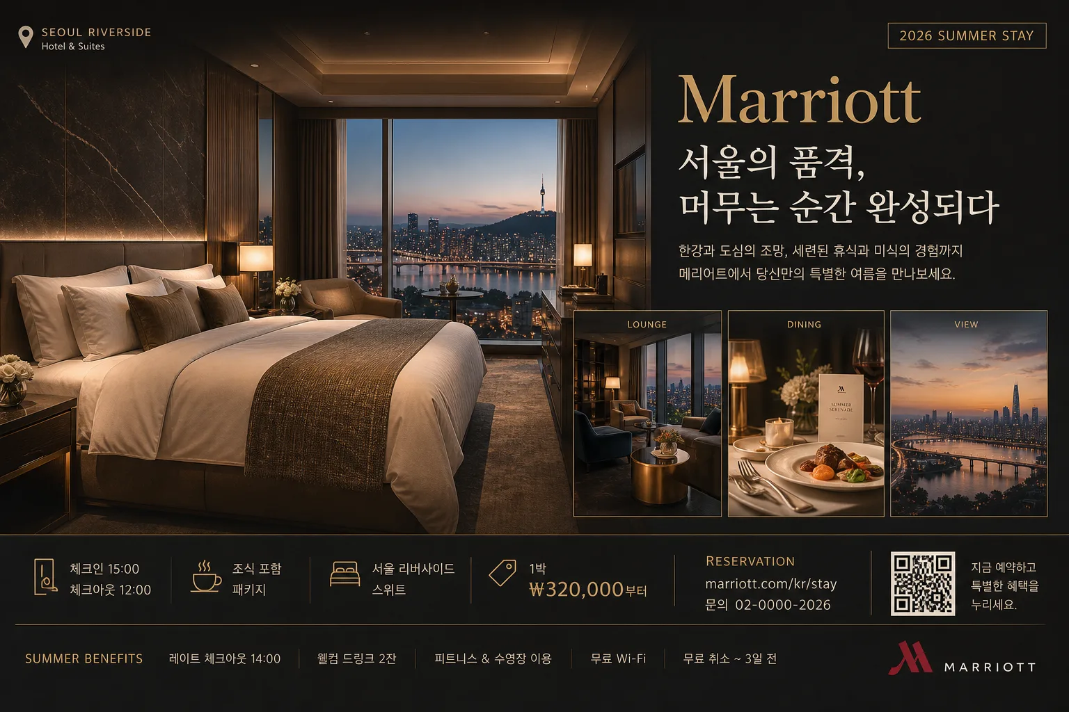
Luxury hotel advertisement hero layout for Marriott-style brand marketing, combining room hero, lounge, dining, and scenic hospitality cues into a polished editorial ad.
Designed for premium web banners, hospitality campaign posters, and social ads with a global magazine-like finish, with realistic booking information, campaign copy, and hospitality details integrated into the image.

[Composition]
- Main subject area: {제품·소재} arranged as a layered hospitality showcase, with the 객실 hero taking about 60% of the frame and the supporting 라운지·식당·풍경 elements integrated as secondary visual blocks.
- Background treatment: deep charcoal-to-warm-neutral hotel interior surface with visible marble veining, woven linen bedding, walnut wood, brushed brass, ceramic tableware, velvet seating, folded towels, fresh flowers, a room key card, and warm lamp reflections.
- Framing direction: strong horizontal premium-ad composition with a refined editorial grid; use a dedicated typography panel over the darker architectural portion while allowing the room, dining table, skyline window, and lounge vignette to feel inhabited and believable.
- Brand feel: apply {브랜드 톤} as the dominant visual voice, while keeping the scene aligned to {시그니처 결}.
- Realistic ad additions: include a small booking information strip, property/location label, campaign date label, rate line, website/contact line, and a discreet QR or barcode-style reservation area.

[3. CORE STRUCTURE]
- Hero zone (left or center-left, 55–60%): a cinematic luxury hotel room scene with crisp bedding, layered pillows, a textured throw blanket, elegant bedside lighting, polished marble nightstand, city-view window, warm reflections, and premium architectural depth.
- Secondary story zone (right or lower band, 25–30%): {제품·소재} elements such as lounge seating with a brass side table, refined dining details with wine glass, plated dessert or breakfast tray, menu card, linen napkin, and a softly lit exterior or cityscape cue, arranged as a curated hospitality story rather than a flat montage.
- Typography zone (upper-right or upper-center, 15–20%): place the main Marriott brand headline and supporting Korean subcopy in a crisp hierarchy, aligned to the grid and balanced with the imagery.
- Detail accents: introduce subtle gold highlights, soft edge glows, thin divider lines, small campaign tabs, corner labels, and premium editorial annotations so the advertisement reads as upscale corporate hospitality.
- Copy integration: place {카피·타이포} so the English and Korean text feel balanced, with the headline visually dominant and the smaller information supporting it.
- Information strip: add realistic short Korean ad details such as 2026 SUMMER STAY, 서울 리버사이드 스위트, 체크인 15:00, 조식 포함 패키지, 1박 ₩320,000부터, 예약 marriott.com/kr/stay, 문의 02-0000-2026.
- Layout logic: follow {레이아웃} exactly, keeping the hero image dominant and the text hierarchy clear.
- Proportion: maintain {비율} with a premium banner/poster feeling suitable for 1536x1024.

[4. STYLE RULES]
- Typography: use Pretendard or Noto Sans KR for Korean body copy, paired with a clean serif or high-end sans serif for the headline; headline weight bold or semibold, subcopy medium, small info regular, with generous tracking on the brand line.
- Color palette: {컬러 팔레트}; Marriott dark charcoal #1C1C1C, gold #C8A76A, warm white #F7F4EE, beige #D8CBB8, deep brown #4A3A2A.
- Border/shadow: soft luxury drop shadow with 4px y-offset, 14px blur, 18% opacity; thin gold separators, small label rules, and subtle frame lines may be used where they support the editorial ad hierarchy.
- Surface finish: polished editorial print look with slight paper grain or satin poster texture, not glossy plastic.
- Graphic details: include tasteful campaign microtext, tiny reservation icons, a small QR/barcode reservation block, and sponsor/partner-style text lines without making them look like official certification seals.

[5. VISUAL STYLE]
- Camera / lens: full-frame architectural/hospitality photography look, 24mm wide-angle for room and layout balance, plus 50mm or 85mm detail feel for accents; f/4 to f/5.6 for clean depth separation.
- Lighting: {무드·라이팅}; soft natural daylight from large windows on one side, combined with warm amber practical lamps and a gentle rim light to define furniture edges; reflections controlled and realistic.
- Color grade: warm cream, gold, espresso brown, and charcoal black with a refined editorial contrast, similar to a luxury hospitality campaign in Condé Nast Traveler or The New York Times T Magazine style.
- Material realism: show believable hotel-scale proportions, natural fabric folds, real marble reflections, brushed metal edges, glass highlights, wood grain, and soft shadows from furniture and table objects.

[6. MOOD]
Premium global hotel campaign — Condé Nast Traveler / T Magazine hospitality editorial feel with a refined Marriott corporate-luxury finish.
The mood should feel like a real luxury suite advertisement photographed during golden hour: inviting, polished, aspirational, and ready for booking.

[7. CRITICAL]
- Korean text accuracy: render these exact visible text elements clearly where appropriate: Marriott, 한글 부제, 럭셔리 카피, 서울 리버사이드 스위트, 2026 SUMMER STAY, 조식 포함 패키지, 1박 ₩320,000부터, 예약하기.
- Include short Korean feature blurbs in the layout, such as 도심 속 프라이빗 휴식, 라운지 애프터눈 티, 한강 전망 스위트, 주말 한정 혜택.
- The composition must clearly present one dominant luxury hotel hero scene plus supporting hospitality scenes, without looking like a generic collage.
- Keep all typography sharp, evenly spaced, and fully legible; no broken Korean characters.
- Maintain upscale, realistic hotel proportions and materials; architecture, furniture, bedding, tableware, and window perspective must feel physically plausible.

[8. 🚫 PROHIBITED]
- Fake official seals / certifications
- Broken Korean characters
- Celebrity composites or unauthorized likeness